


Brand Designer, Illustrator, Motion Designer





Designing for connection ⋆˚꩜。


Designing for connection ⋆˚꩜。



Design Partner for Frontier Tech



Creative Wizard for hire
Creative Wizard for hire


Seriously playful design.
- $1k+
- Earned
- 2x
- Hired
- 5.0
- Rating
- 91
- Followers
Seriously playful design.
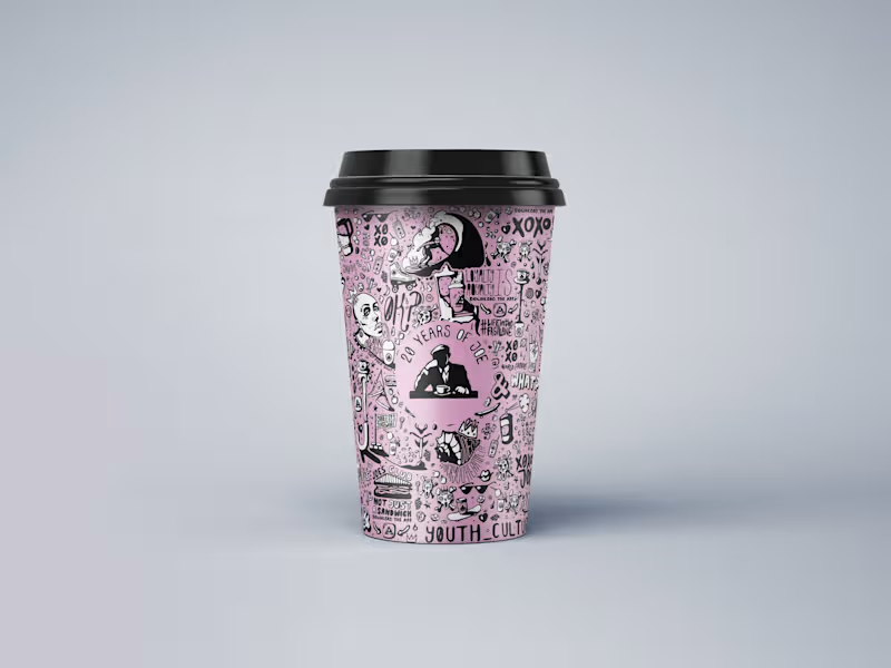
JOE & THE JUICE 20th Anniversary Artwork by FLM Studio (https://www.flm.studio)
To celebrate 20 years of JOE & THE JUICE, FLM Studio created a bold, hand-illustrated artwork celebrating two decades of energy, flavour and community, while staying rooted in JOE’s distinctive visual world.
Hand-drawn. Playful. Unapologetically indie. Packed with JOE-themed motifs, expressive characters and playful concepts, the artwork was designed to feel vibrant, energetic and unmistakably JOE.
A bespoke illustration created for JOE’s signature pink cups, with applications across packaging, social media and limited-edition merchandise.
#branding #branddesign #illustration #packaging #foodandbeverage
2
2
255
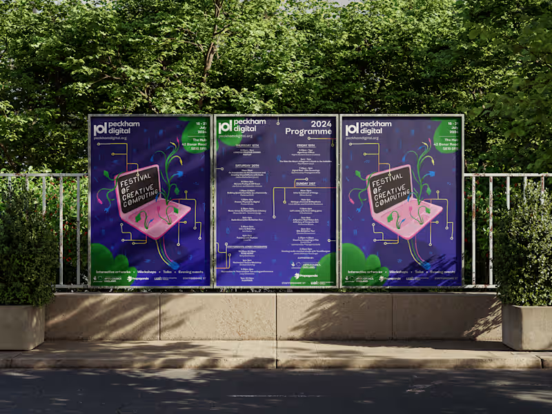
Peckham Digital (https://peckhamdigital.org) Festival of Creative Computing 2024 by FLM Studio (https://www.flm.studio)
Peckham Digital brings together artists, performers and creative technologists for a celebration of digital creativity in South East London. For its third edition, FLM Studio created an identity that brought creativity, humanity and computing together.
Entirely hand-drawn. Early digital graphics. Glitch aesthetics. DIY coding culture. The identity was designed to soften the often sterile feel of tech with something warmer, more expressive and human.
A flexible brand identity, custom illustration system, large-scale posters, signage and a full suite of social assets.
#campaignposter #posterdesign #brandidentity #illustration #festivalbranding
2
6
400
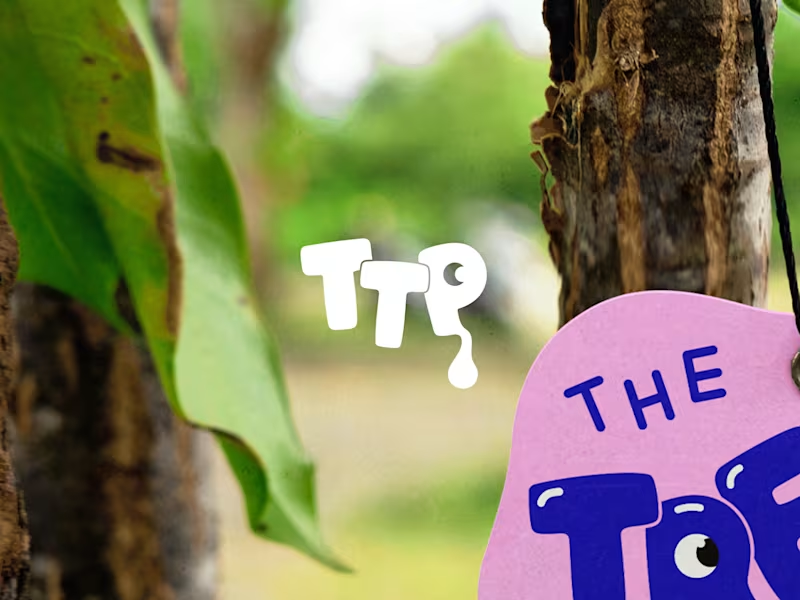
The Treat Plug Brand Identity | The UK's Favourite Freeze-Dried Sweets by FLM Studio
(https://www.linkedin.com/company/flm-studio/)The Treat Plug was born on TikTok back in 2020 with a product people were obsessed with, and a brand that hadn't been built yet. They came with a name, FLM Studio (https://www.linkedin.com/company/flm-studio/) built the rest.
Bold colour. Playful energy. A nostalgic hit with a modern edge. The identity was designed to stop the scroll and own a noisy market.
A full and comprehensive brand identity, custom illustrations, and pouch packaging from the ground up.
#branding (https://www.linkedin.com/search/results/all/?keywords=%23branding&origin=HASH_TAG_FROM_FEED) #branddesign (https://www.linkedin.com/search/results/all/?keywords=%23branddesign&origin=HASH_TAG_FROM_FEED) #brandidentity (https://www.linkedin.com/search/results/all/?keywords=%23brandidentity&origin=HASH_TAG_FROM_FEED) #packaging (https://www.linkedin.com/search/results/all/?keywords=%23packaging&origin=HASH_TAG_FROM_FEED) #packagingdesign (https://www.linkedin.com/search/results/all/?keywords=%23packagingdesign&origin=HASH_TAG_FROM_FEED)
6
19
1.5K


Brand & Digital Consultant
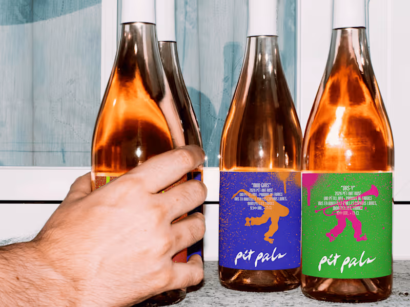
Pét Pals is an identity for rosé pét-nats made for Fête de la Musique 🎺
Made for 21 June, when music spills into the streets, squares, bars and gardens of France. Three low-intervention rosés. Three personalities. All made to be served cold, passed around and enjoyed wherever the sound takes you. Hear something good? Follow it. Spot your people? Join them. Pét Pals goes where the music goes.
Good wine. Loud music. Your pals.
You can read the full case study here (https://jeremiahhaastrup.com/work/pet-pals).
7
16
565

Last week, I created Poco A Poco, a concept identity system for a Venezuelan street-food truck in New York.
The project was made for a competition raising donations for families affected by the earthquakes in Venezuela. This sat close to home. I have family who were there during the earthquakes, and who are now part of rescue teams helping to find people beneath the rubble.
Poco a poco means “little by little.”
That phrase became the heart of the project. Food discovered bite by bite. Recipes carried between generations. A migrant community building new ties in a different city.
The identity grew from three ideas: origin, adaptation and community.
Research into San José de Barlovento and Afro-Venezuelan culture shaped the direction. I wanted the system to feel immediate from the street and richer the closer you get.
Little by little. Bite by bite.
View the full project here: https://jeremiahhaastrup.com/work/poco-a-poco
5
24
558

Not every coffee moment needs a rush.
Nocaff is my recent brand identity concept, created for people who want the ritual, flavour, and comfort of coffee without the caffeine kick.
Built around a French Vanilla profile and an identity rooted in ease, the brand was designed to feel calm, modern, and distinct on shelf. From the wordmark to the sloth illustration, every detail was made to turn decaf into something memorable, not ordinary.
It was a chance to explore how quiet can still stand out.
View the full project on Behance:
https://www.behance.net/gallery/248626219/Nocaff-Decaf-Coffee-Brand-Identity-Packaging
16
44
1.6K

My new portfolio is live!
Over the past few months, I have been refining the work, rewriting the case studies and rebuilding the site to give a clearer view of my practice and where it's heading.
My portfolio brings together identity systems, packaging and websites, with a focus on the strategy behind each project and how design can give brands more direction.
https://jeremiahhaastrup.com
(https://jeremiahhaastrup.com)I’d be interested to hear which project leaves the strongest impression!
1
3
181

Creative Making Brands Stand Out

Branding, Design & Sound for visionaries at heart
- 1x
- Hired
- 5.0
- Rating
- 5
- Followers
Branding, Design & Sound for visionaries at heart


