Projects using Jitter in Warsaw
Sign Up
Post a job
Sign Up
Log In
Filters
2
Projects
People
Message
40
Daniella
pro
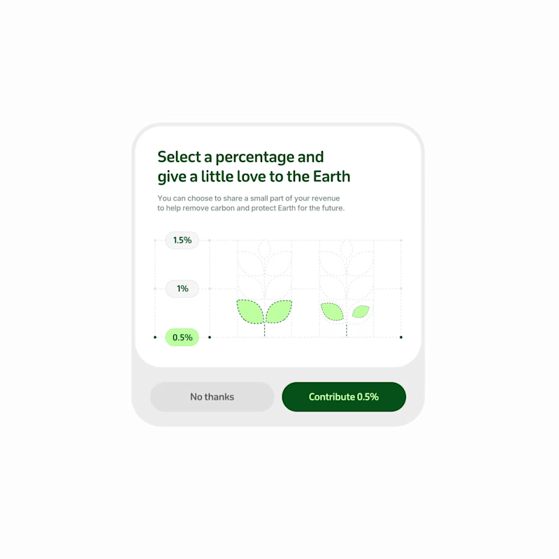
Sustainable contribution selector: percentage picker
40
455
Message
6
Kris Anfalova
Crafting a High-Conversion Wellness Landing Page I recently completed the design for Moola, a premium mindfulness application. The goal was to create a web presence that balances aesthetic storytelling with high-performance SaaS marketing principles. Focused on "Sensory Design," I used soft gradients and glass-like textures to reflect the app's core mission: mental clarity. By replacing traditional lists with a structured bento grid, I improved the information architecture, making it easier for potential users to digest the app’s benefits. Available for new design inquiries. Let’s build something meaningful together.
1
6
240
Message
8
Adrian Kuleszo
pro
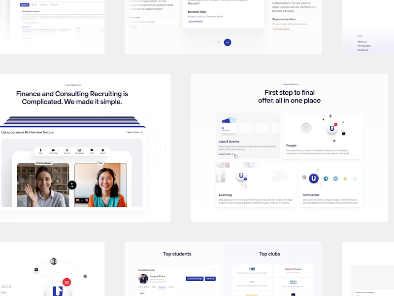
Road to $3.2M: RecruitU’s refreshed brand in 6 weeks
8
213
Message
8
Michał Kielar
pro
UI Design and Visual Direction for ShapeFactor
8
47
Message
2
Anastasiia Barbashyna
pro
Abyshcho - iOS Word Game done with Lovable
2
21
Message
1
Mykyta Kashcheiev
Frame - Webflow & AI development for intelligent work OS startup
1
11
Message
2
Kamil Bachanek
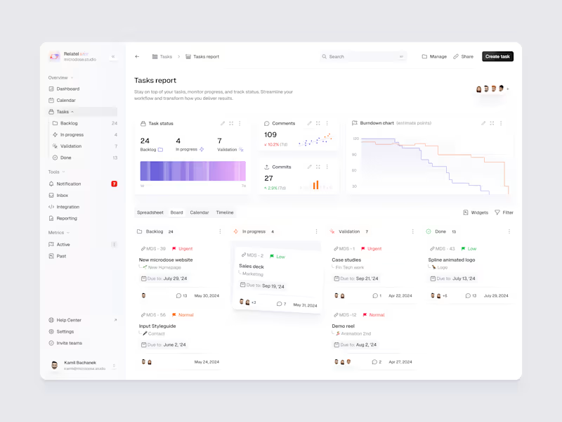
CRM Dashboard
2
10
Message
2
Blazej (Chris) Cieslar
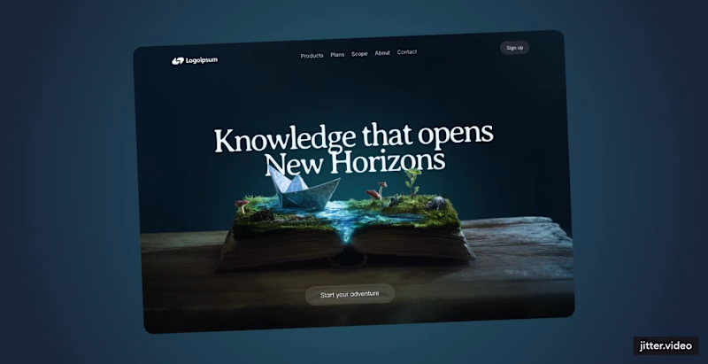
Dreamlike Hero Section for Horizon Reads
2
6
Message
2
Max Berdnikau
pro
Created up a polished symbol page for fintech product. Clean visual, strong grid, future-proof. What do you think?
2
116
Message
0
Borys Zbunskyi
pro
Thoughts
0
0
Message
1
Oksana Bryk
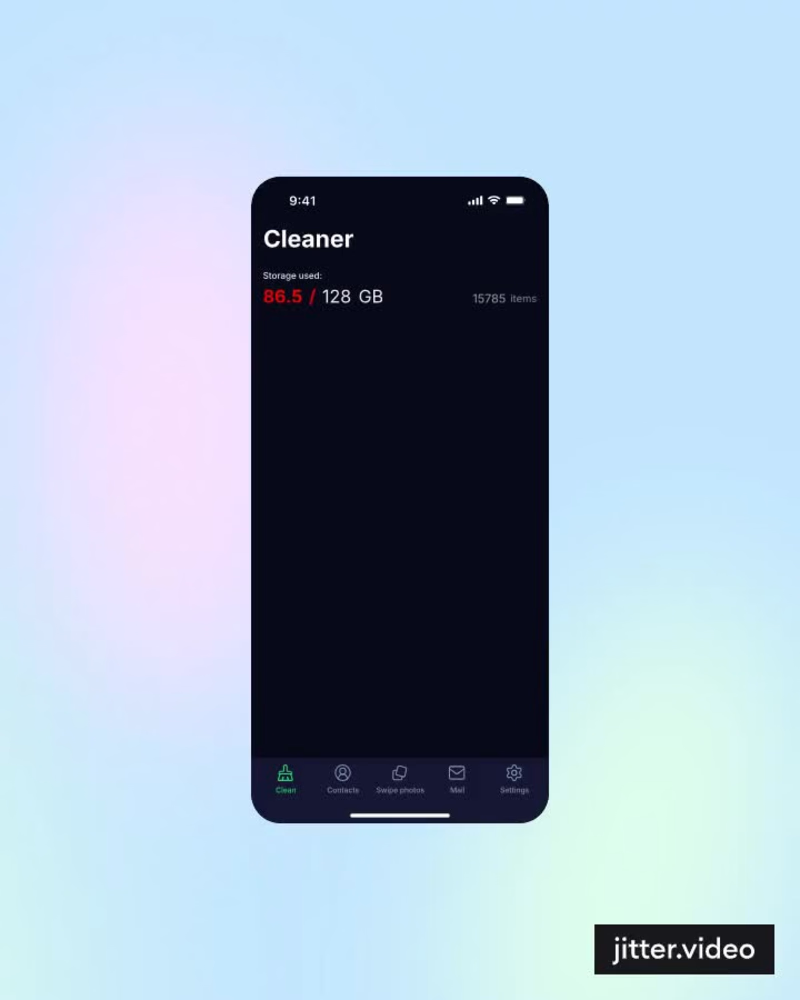
Design of IOS Cleaner Mobile app. Let me know whether you like this design☺️ I'm opened to new projects, if you have an idea for your project, let's connect!
1
58
Message
0
Ewa Mikusek
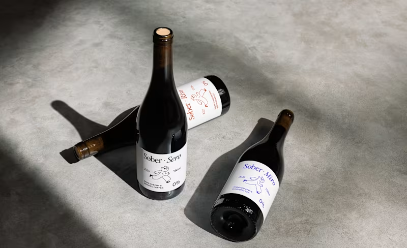
Sober Non-Alcoholic Wine Brand Identity
0
0
Message
17
Daniella
pro
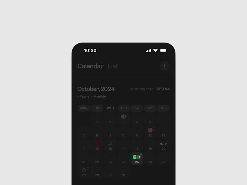
Subscription tracker: multiple subscriptions in one day
17
211
Message
2
Kris Anfalova
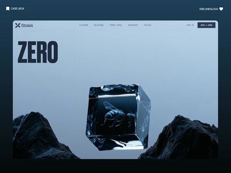
Most "cheap" UI looks messy because designers are afraid of empty space. Negative space isn't "missing content." It's the frame that makes your product look like a luxury brand. 🤌 I applied this exact philosophy to Axiom—a cloud observability platform. Usually, complex B2B SaaS looks like an airplane cockpit because teams try to cram data into every single pixel. But for Axiom, we gave the heavy tech room to breathe: a massive split-screen layout, confident typography, and zero clutter. The result? An enterprise tool that doesn't intimidate, but immediately sells premium, senior expertise.
3
2
332
Message
2
Anastasiia Barbashyna
pro
Squared Marketing: Rebrand and Evolve
2
7
Message
4
Adrian Kuleszo
pro
Zave.it’s record-breaking journey from concept to 300,000 Users
4
160
Explore projects