Beginner brand strategist + designer

Practicing instagram post carousel ideas 💥
I created an Instagram carousel for a mock caffeine supplement brand to practice visual storytelling and strengthen my Canva design skills.
0
167


Branding expert & Framer designer


Branding expert & Framer designer



Shopify Designer & Developer for Growing Brands
Shopify Designer & Developer for Growing Brands
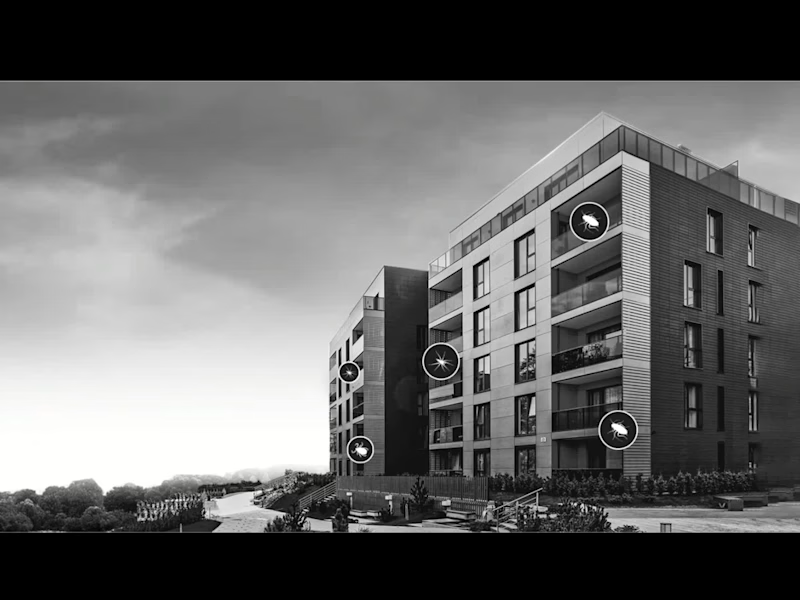
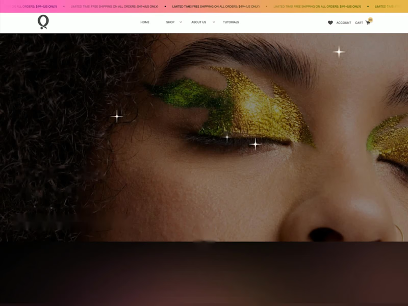
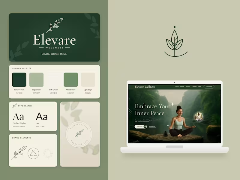
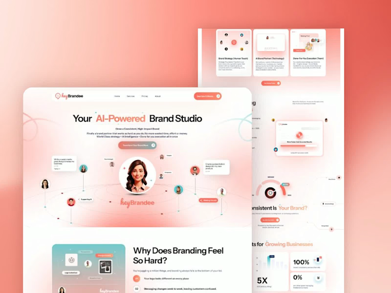


Web Design for Women



AI Creative Director - Campaigns, Content & Custom Builds


AI Creative Director - Campaigns, Content & Custom Builds

Built an Afro-Caribbean inspired AI recipe app 🍲 that you can type a prompt, get a beautiful recipe card with ingredients, tips, and culture. Still in progress, but I love where it’s going.
⚙️ Note: This version of the app is still in beta testing. I’ve been experimenting on the free tier, and I used up my initial free credits which honestly says a lot about how much I’ve been testing and refining it 😅.
This is an early build, but I wanted to share the progress, show what’s possible, and hear your thoughts.
💬 Let me know what you think so far what would you add, improve, or love to see next?
🔗 Try the demo: https://eb885ab8-0b65-43c1-b56f-a3ead8705fe5.web.createdevserver.com (https://eb885ab8-0b65-43c1-b56f-a3ead8705fe5.web.createdevserver.com/) #AnythingChallenge
30
635
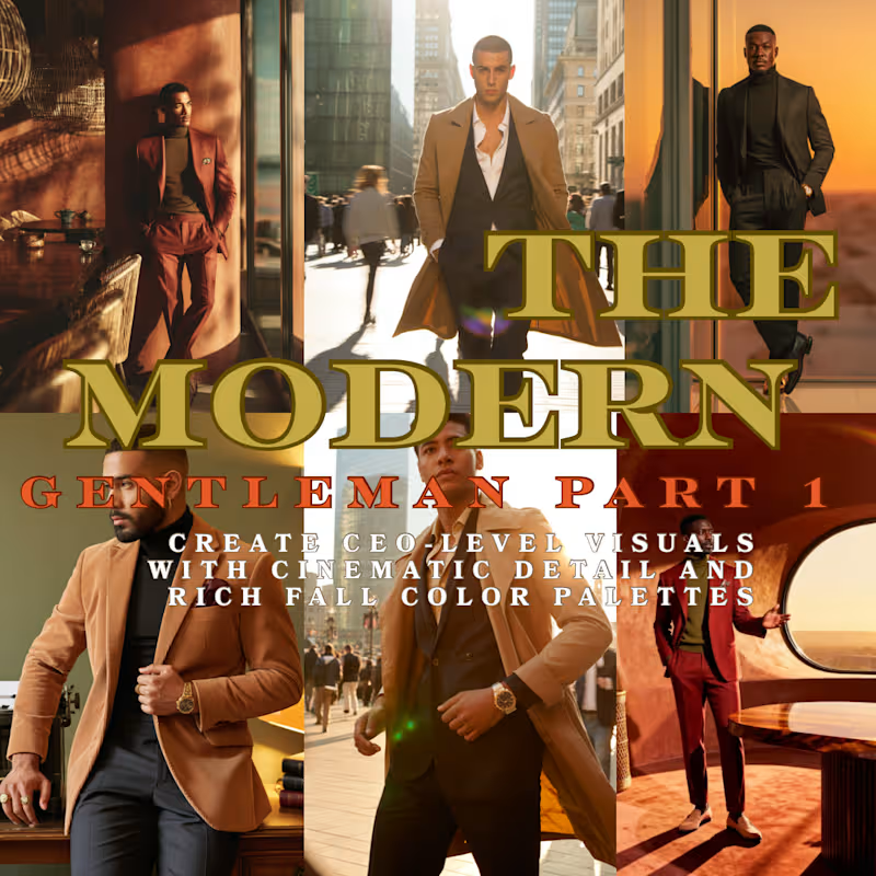
The Modern Gentleman: Building a Visual Identity with Cinematic AI Prompts
Overview
In this content drop, I created a cohesive AI prompt series using cinematic lighting, fall color theory, and fashion-forward storytelling. The goal: empower digital entrepreneurs and brand leaders to visually elevate their image using free, high-quality prompt-based tools like OpenArt.
What I Did:
Conceptualized and built a 3-part image carousel
Wrote long-form, narrative prompts tailored to brand messaging
Packaged it into an educational post format for Instagram Reels + Carousels
Designed it to scale as a downloadable asset or workshop content
Tools Used:
OpenArt AI and Ideogram
Canva for design/layout
Instagram Reels + Carousel posting
Notion (for prompt drafting + planning)
16
314

This brand styling series explores the intersection of cozy minimalism and visual storytelling. Using AI-enhanced visuals, I crafted a cohesive fashion editorial that pairs texture, tone, and lifestyle into a compelling brand aesthetic.
The look soft knits in blush gradients, gold accents, and sunlit environments reflects a brand identity that’s both approachable and elevated. Every element is intentional, from the curated set design to the editorial layout, reinforcing consistency in tone and voice.
20
378
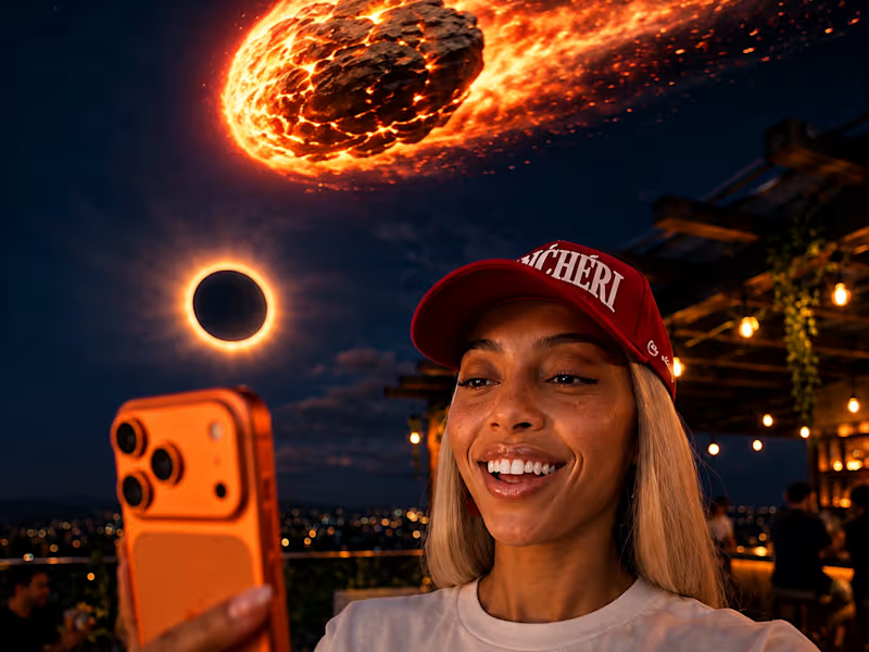
SEEDANCE 2.5 | 30-SECOND ONE-SHOT CINEMATIC TEST
So I wanted to see how far I could push Seedance 2.5 with one continuous 30-second camera movement.
The challenge was simple:
Take one complex storyline, keep the same heroine, maintain her wardrobe and appearance, move continuously through the environment, introduce a gravity anomaly, bring in the crater, transfer the power to the heroine, reveal the creature, and end with incoming meteors.
All inside one generation.
I pushed it.
The result was surprisingly cinematic.
The character consistency held throughout the sequence. Her outfit stayed intact. The continuous tracking movement worked. The gravity effect came through. The crater interaction worked. The power-transfer moment worked. The monster appeared. The incoming meteors created the final cliffhanger.
The biggest issue was pacing.
I gave the model too many major story beats for 30 seconds, so it compressed several actions together. The pool transition is where the sequence loses some continuity. Instead of giving that moment enough time to develop, the model rushed her into the pool and back toward the crater.
Still, I decided to keep the test.
Why?
Because this was never intended to be the final version.
I wanted to understand how Seedance 2.5 interprets a complex one-shot prompt, and this test gave me a clear answer.
The model followed the overall direction.
The next step is better scene planning.
Instead of forcing an entire story into one 30-second generation, I would break the major action beats into shorter sequences and give each moment enough room to breathe.
My biggest takeaway:
More story inside a single generation does not automatically create a better video.
Sometimes better AI video direction means giving the model less to execute at once.
This was a test.
This was the result.
And I’m keeping it because the experiment itself was worth documenting.
Tool tested: Seedance 2.5 @Renoise
Format: 30-second continuous one-shot
Goal: Character consistency + camera continuity + complex action
Result: Strong visual execution, rushed narrative pacing
Next experiment: Shorter controlled sequences with fewer major actions per generation
2
5
342


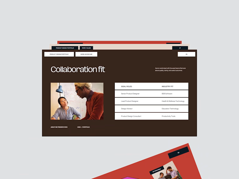
Premium Pitch Decks & Presentations Expert for Startups
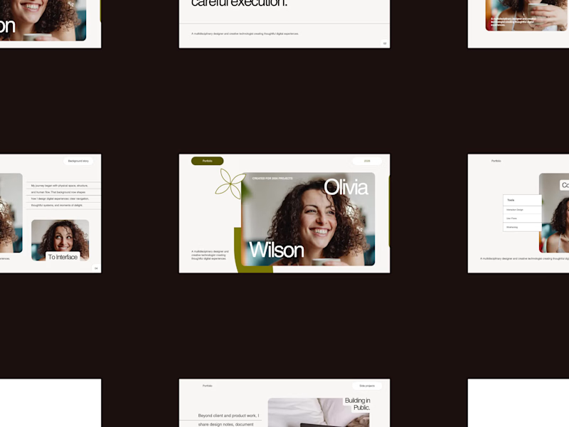
Premium Pitch Decks & Presentations Expert for Startups



Web Designer & Developer — Custom Sites, Booking & Web Apps
- $1k+
- Earned
- 6x
- Hired
- 5.0
- Rating
- 34
- Followers
Web Designer & Developer — Custom Sites, Booking & Web Apps

Anchored In Him Images is a faith-centered photographer specializing in families, seniors, and maternity & newborns. She needed a website that felt as warm and personal as her work — a place where clients could explore her sessions, feel her heart behind the camera, and easily reach out to book.
I designed and built her site on Zenfolio, customizing it well beyond the standard templates to match her brand: soft, earthy tones, a "Rooted in Faith" story, and a clean layout that lets her photography lead. I organized her work into clear session categories — Families, Seniors, and Maternity & Newborns — so visitors can quickly find what they're looking for, wove in her brand story and faith-centered messaging, and set up clear calls to action to plan a session.
The result is a warm, professional portfolio that reflects exactly who she is: her photography front and center, easy for clients to browse, and inviting them to reach out.
2
302

I created this mobile app concept for Northbound Hoops, a basketball development platform built to give players a simple place to track their progress, view workouts, stay on top of their schedule, and keep training goals in front of them.
The design uses a dark, high-energy basketball feel with bright green accents, clean dashboard cards, and an easy mobile layout. I designed the login experience and player dashboard screens to feel motivating, organized, and simple to use while still having a strong brand identity.
This project shows the kind of digital tools I enjoy building: functional app experiences that take a big idea and turn it into something clear, usable, and visually strong.
0
228


Content & Creative Strategist