Brand Identity Design
Farook Maya
Verified
VividSnap – Crafting a Bold Identity for a Visual Storytelling Brand
Client Overview
VividSnap is a dynamic creative brand specializing in visual storytelling, photography, and digital content creation. As a visual-first company, they needed more than just a logo—they needed an identity that felt alive, expressive, and unmistakably theirs. One that could speak to both creative collaborators and corporate clients alike.
The Challenge
Design a brand identity system that captures emotion through imagery, reflects modern creative energy, and delivers professional consistency across every touchpoint—from social feeds to pitch decks.
Scope of Work
Logo Design
Typography System
Color Palette Development
Visual Imagery Direction
Full Brand Guidelines
Creative Direction & Execution
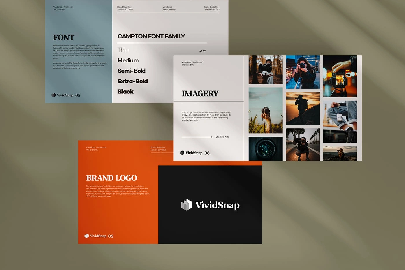
1. Brand Logo: Where Elegance Meets Expression
The logo is the heart of VividSnap’s identity. We crafted a unique wordmark using a modern serif font—timeless yet expressive. The accompanying icon, inspired by a folded photo or aperture, symbolizes the core of storytelling: framing a perspective.
Typeface: A refined serif that conveys editorial elegance and credibility.
Icon: Abstract lens/paper fold — an ode to both analog photography and digital creation.
Color Play: Used boldly on black or vibrant orange to spark visual drama and brand recall.
2. Font System: Versatility Meets Voice
We selected the Campton font family, a contemporary sans-serif with a range of weights that offer strong hierarchy and design flexibility. Whether used in hero headings or microcopy, it delivers clarity and confidence.
Tone: Clean, confident, and approachable
Weights Used: Thin to Black — for multi-platform flexibility
Use Cases: Website, social content, printed materials, and branded docs
3. Imagery Style: Emotion in Every Frame
VividSnap lives and breathes photography, so its imagery had to speak louder than words. The guidelines prioritize authenticity and motion—rich tones, real moments, and natural lighting that evoke a cinematic quality.
Visual Focus: Candid shots, on-location energy, human connection
Style: Editorial meets lifestyle, with a splash of spontaneity
Goal: Inspire and immerse, never just decorate
Brand Voice & Visual Highlights
🎨 Color Palette: Bold orange and grounding black, softened by neutral grays
✍️ Tone of Voice: Energetic but personal—like a seasoned creative with something to say
🔥 Visual Mood: Passionate, bold, and built for the scroll
The Result
VividSnap’s new identity is more than a look—it’s a storytelling system. It empowers the brand to show up consistently, connect deeply, and scale confidently. Whether in client decks, digital campaigns, or a scroll-stopping Instagram grid, the brand now speaks with clarity and creative force.
“The brand finally feels like us. It’s bold, emotional, and gets people to stop and look. We now have the visual language to back up what we’ve always believed in.”
Creative Director, VividSnap
Katerio Brand Guideline
Katerio – Crafting an Identity for Timeless, Empowered Fashion
Client Overview
Katerio is a modern fashion label redefining elegance for the confident, style-savvy woman. Blending timeless silhouettes with bold, contemporary details, the brand embodies quiet luxury, individuality, and effortless confidence. Katerio sought a distinctive identity that could elevate its growing presence—both digitally and on the runway.
The Challenge
To design a visually rich and emotionally resonant brand identity that feels high-end yet grounded. It needed to connect with an audience that values both substance and style—one that isn’t afraid to stand out, but always with grace.
Scope of Work
Logo & Wordmark Design
Typography System
Color Palette Development
Imagery Guidelines & Style
Brand Voice & Tone Alignment
Comprehensive Brand Guideline Document
Creative Direction & Design Execution
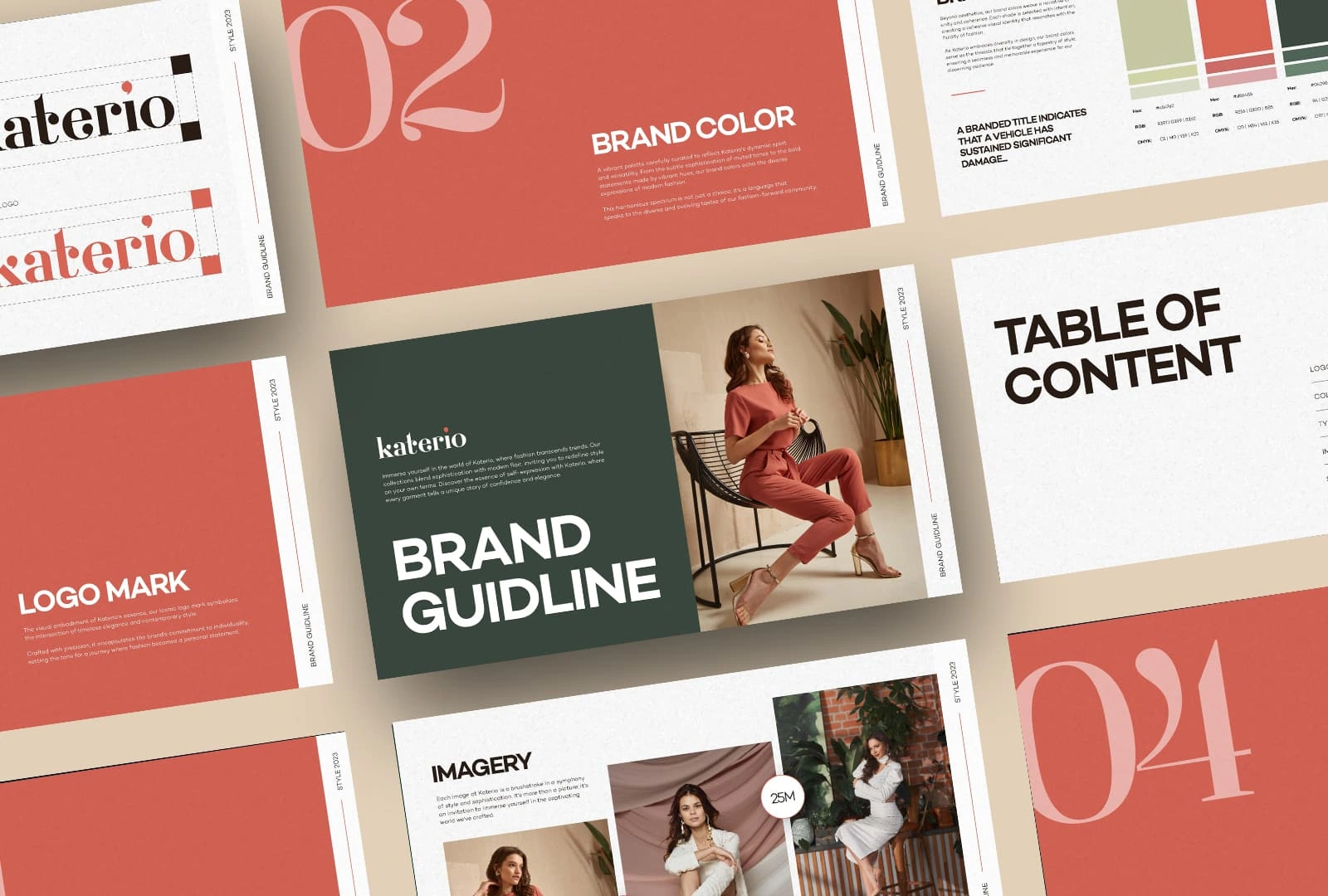
1. Brand Logo: Classic Meets Contemporary
At the heart of the identity is the Katerio logomark—a sophisticated typographic composition that merges tradition with a modern twist. The refined serif typeface, paired with unique typographic details (like the red dot above the “i”), creates a distinctive voice: poised, stylish, and instantly recognizable.
Design Intent: Clean, editorial, and deeply fashion-forward
Usage: Versatile across packaging, digital, and stitched labels
2. Color System: Warm, Bold, and Elevated
Katerio’s palette centers around a warm terracotta red, reflecting passion, earthiness, and elevated femininity. It’s paired with a deep, grounding forest green and soft neutrals—resulting in a luxurious yet approachable visual balance.
Primary Hue: Terracotta Red – expressive, warm, and confident
Supporting Tones: Forest Green & Soft Beige – elegant and grounding
Applications: Lookbooks, hangtags, web UI, seasonal campaigns
3. Typography: Bold Elegance with Editorial Flexibility
Typography plays a central role in shaping Katerio’s brand voice. A mix of serif and sans-serif fonts creates contrast and sophistication—perfect for both digital platforms and printed materials.
Headline Font: A classic serif with graceful curves and weight
Body Font: A clean sans-serif for legibility and balance
Overall Feel: Fashion magazine meets minimalist design
4. Imagery Direction: Stories of Style and Strength
Katerio’s visuals spotlight the modern woman in her element—confident, unapologetic, and effortlessly stylish. Natural lighting, soft textures, and curated scenes evoke a sense of quiet luxury and editorial drama.
Aesthetic: Clean compositions, empowering poses, muted tones
Mood: Feminine, intentional, and expressive
Usage: Campaigns, website, social media, e-commerce product visuals
Brand Personality at a Glance
🎨 Visual Feel: Warm, minimal, fashion-forward
✍️ Tone of Voice: Elegant, empowering, refined
👗 Audience Connection: Speaks directly to women who lead with style and substance
Outcome & Impact
The new Katerio identity is a comprehensive and cohesive brand system—ready to scale with the brand’s ambitions. With a distinct tone and timeless design, Katerio now confidently communicates who it is: a leader in sophisticated, contemporary fashion.
The brand guidelines empower internal teams and creative partners alike, ensuring every touchpoint—from a business card to a social campaign—embodies the Katerio essence.
"This identity feels like the woman we design for—bold, elegant, and unforgettable."
Creative Director, Katerio
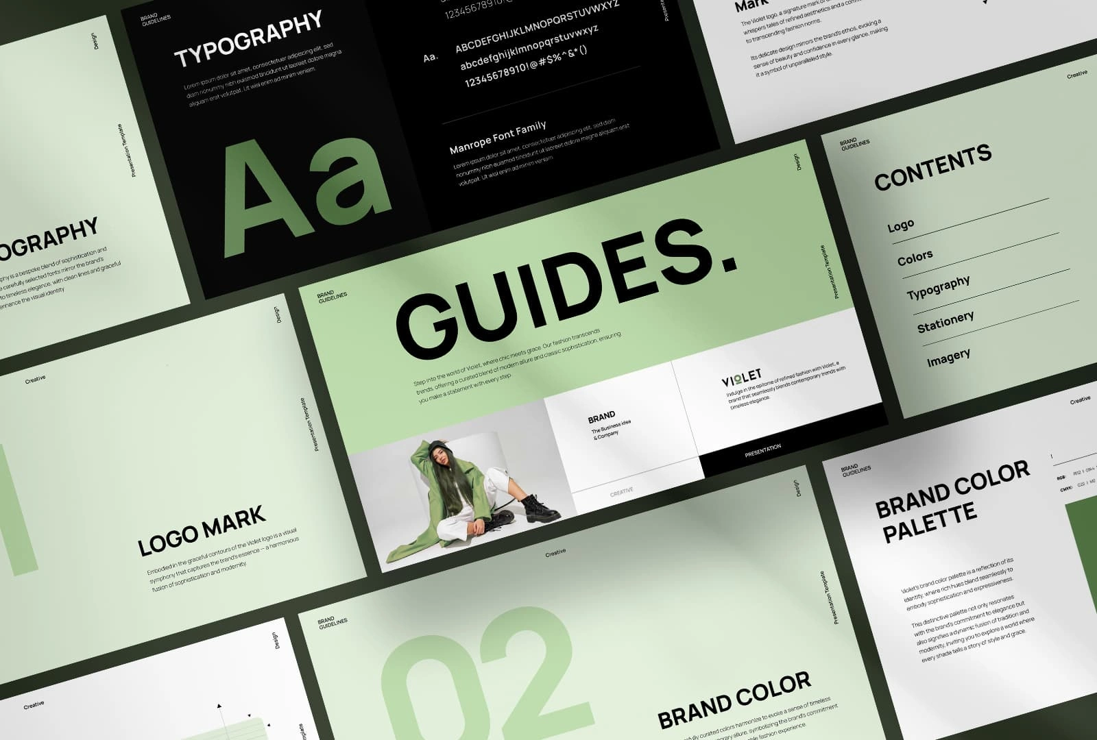
Violet Brand Guideline.
Violet – Redefining Minimalism in Modern Fashion
Client Overview
Violet is not just a fashion brand—it’s a statement. Built for the modern woman who moves with intention and dresses with edge, Violet merges clean minimalism with streetwise boldness. Sitting at the crossroads of editorial elegance and urban utility, the brand needed a refined visual identity that could match its fearless yet understated spirit.
The Challenge
To design a timeless yet trend-conscious identity system that felt as wearable as the pieces themselves. Violet required a brand presence that could transition smoothly between digital screens, printed campaigns, packaging, and retail—while staying unmistakably true to its tone: cool, confident, and uncomplicated.
Scope of Work
Brand Strategy & Identity System
Logo System Design
Typography & Font Hierarchy
Color Palette & Mood Development
Visual Imagery Direction
Stationery & Brand Touchpoints
Comprehensive Brand Guidelines
Creative Direction & Design Execution
1. The Logo: Understated Boldness
The Violet logotype was crafted as a minimal sans-serif wordmark that exudes modern luxury without any frills. Each character is structured, spacious, and strong—allowing the logo to carry weight even in the most stripped-down applications.
Look & Feel: Crisp. Clean. Sophisticated.
Application: From stitched labels and mobile headers to packaging and e-comm banners
Core Idea: A brand that lets the clothes (and the customer) speak louder than the logo
2. Color System: Calm Confidence in Every Shade
A muted mint green was chosen as the brand’s hero color—cool, breathable, and quietly confident. Paired with charcoal black, soft whites, and subtle grays, the palette allows the clothing—and the wearer—to shine through.
Primary Color: Mint Green – fresh and grounded, yet unexpected
Accent & Neutrals: Charcoal, warm white, mid-gray
Emotion & Strategy: Designed to evoke clarity, minimalism, and trust
3. Typography: Geometric Precision with a Soft Edge
The Manrope typeface was selected for its clarity and character. A geometric sans-serif with beautifully balanced curves, it adds structure to content without feeling cold. This system supports both strong editorial layouts and accessible digital use.
Display: Bold uppercase headings with ample spacing
Body: Lighter weights with generous line height for elegance and ease
Hierarchy: Clean, scalable, and unmistakably modern
4. Imagery Direction: Cool, Composed, and Confident
Photography for Violet reflects the brand’s belief in power through simplicity. Each frame embraces negative space, allowing styled subjects in monochrome or muted pastels to become focal points.
Visual Tone: Minimalist environments, high-contrast lighting, slow fashion storytelling
Styling Direction: Expressive but intentional—never overdone
Purpose: To create aspirational, scroll-stopping visuals that also feel real
Deliverables
✳️ Full Brand Guidelines Deck
✳️ Logo System (Horizontal, Stacked, Icon-only Variants)
✳️ Web & Print Color Codes
✳️ Typography Pairing & Usage Rules
✳️ Imagery Styleboard + Brand Mood Guide
✳️ Stationery Templates (Letterhead, Cards, Labels)
Result & Impact
The new identity system positions Violet as a premium fashion brand with minimalist authority. Every touchpoint—from a digital ad to a printed hangtag—now speaks in a unified, elevated tone. The brand feels ownable, editorial, and instantly recognizable, ready to scale with the bold ambition of its founders.
Client Feedback
“This brand system feels like our future—cool, confident, and effortless. It speaks to our customers and gives our team everything we need to move fast and stay consistent.”
Co-Founder, Violet
Final Thoughts
Violet’s transformation shows that less can truly be more—when every detail is done with intention. From color to kerning, every choice contributes to a story that’s clean, curated, and completely on-brand.
Like this project
Posted Jun 13, 2025
Crafted a cohesive brand identity for VividSnap, capturing its creative spirit and emotional storytelling through bold visuals and refined design.
Likes
3
Views
126
Timeline
Dec 4, 2025 - Dec 11, 2025
Clients
CreativeForge