


Designing elegant brands & high-end websites

Branding and packaging designer


Multidisciplinary Designer | Identity • Digital • Print
Multidisciplinary Designer | Identity • Digital • Print

Fleuraison — Organic Minimalist Floristry
Artisanal Storytelling: Fleuraison Floral Studio
Translating the organic soul of a boutique flower studio into a minimalist visual identity. This design focuses on "perceived value"—making the brand feel as premium as its arrangements.
Key features:
★ Organic Palette: Earthy sage-green tones that project freshness and high-end artisanal quality.
★ Botanical Artistry: Halftone floral illustrations that bridge the gap between vintage charm and modern clean layouts.
★ Strategic Minimalism: A layout designed to let the brand’s professional authority speak for itself.
Business Goal: Elevating the brand's aesthetic to justify premium pricing for bespoke event curation. High-quality, technically precise layouts ready for professional printing to help a local business stand out in a saturated market.
0
149


Most nightlife branding tries to scream for your attention.
Nocturne is designed to whisper.
I’m thrilled to share that the brand identity for Nocturne — The Art of Sound & Shadow is officially live on Behance!
Nocturne is a premium visual identity developed for an exclusive, private bar sanctuary. The concept centers on the intersection of sensory experience, high-fidelity sound, and intimate hospitality.
The Client’s Challenge:
The objective was to avoid traditional, loud bar tropes. The client sought a sophisticated direction that would balance a sense of heritage with modern minimalism — creating an environment where the brand doesn't dominate, but quietly reveals itself through details.
The Design Strategy:
★ Light & Shadow: The identity plays with deep shadows and warm contrasts, mimicking the physical lighting of the venue.
★ Refined Typography: High-contrast serif typography establishes a confident, mysterious, and premium character.
★ Tactile Textures: A deep burgundy and gold palette paired with a signature floral lace pattern to create a cohesive, sensory journey for the guest across physical artifacts.
The result is a visual ecosystem where every touchpoint feels deliberate, premium, and quietly confident.
👉 Explore the full case study on Behance:
https://www.behance.net/gallery/255251611/NOCTURNE?platform=direct
I would love to hear your thoughts and get your support on this project!
3
12
144


Multidisciplinary Creative in Graphic & 3D Design
Multidisciplinary Creative in Graphic & 3D Design


Graphic Designer | UI Specialist


Corporate Presentation Catalog Design
I designed a modern and professional corporate presentation catalog, ensuring full alignment with the brand’s identity and visual language.
The design process focused on preserving corporate colors, consistency, and brand integrity, while creating a clean and impactful layout that effectively communicates services and company vision.
Special attention was given to typography, spacing, and visual hierarchy to enhance readability and deliver a strong corporate impression. The result is a structured and visually engaging catalog that reflects professionalism and strengthens brand perception.
Key Highlights
Brand-consistent design approach
Effective use of corporate colors
Clean, modern, and professional layout
Strong visual hierarchy and readability
Structured presentation flow
0
184

This video represents how I transform ideas into real, client-ready projects by combining two powerful tools: Contra and Fuser Studio.
My goal is simple:
To show not just what I design, but how I think, create, and deliver value.
I also created this video to demonstrate what I’m قادر of producing with Fuser Studio — from interface design to interactive prototypes and visual experiences.
With Fuser Studio, I quickly turn concepts into functional and visually engaging designs.
With Contra, I present these works to a global audience and connect with potential clients.
This video highlights my workflow:
From idea → to design → to real opportunities.
It’s more than a showcase —
it’s a reflection of my process, creativity, and the way I approach every project.
2
6
548


Founder & Principal Designer | Studio Solvea
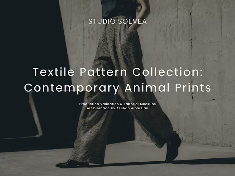
High-End Apparel Pattern Engineering & Strategy
Comprehensive pattern engineering and market strategy for AlicekClothing. This project focuses on calibrating print files for high-end apparel manufacturing, ensuring structural integrity across diverse fabric behaviors.
Key Deliverables & Process:
• Texture & Color Calibration: Designing organic ton-sur-ton transitions strictly engineered for matte and heavy fabric surfaces.
• Distortion Engineering: Ensuring high tolerance against pattern distortion across cylindrical, cinched, and flat forms (dresses, bags, footwear).
• Commercial Application: Optimizing print scales for both capsule collections and signature classic garments.
0
65
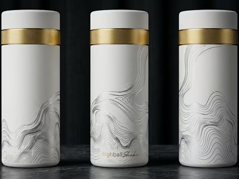
Custom surface design and technical pattern engineering for Highcamp. This case study demonstrates the execution of translating conceptual line art into precise, production-ready vector architectures for cylindrical product surfaces.
Key Deliverables & Process:
• Original Vector Engravings: Developing precise, scalable line art tailored specifically for physical product dimensions.
• Surface Mapping: Engineering the artwork to wrap seamlessly around cylindrical forms without scale distortion.
• Product Presentation: Rendering final high-end 3D mockups across multiple colorways and material finishes for commercial launch.
0
80
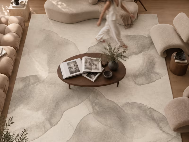
Comprehensive B2B collection development and pattern engineering for global marketplace rug brands. This showcase highlights the transition from aesthetic concept to strict industrial reality.
Key Deliverables & Process:
• Original Pattern Engineering: Translating concepts into mathematically precise vector architectures and border systems.
• Scale & Colorway Systems: Developing coordinated palettes and scale variations across varying rug dimensions for expansive product lines.
• Seamless Repeat Development: Ensuring structural integrity across all surface patterns.
• Flawless Manufacturing Handoffs: Delivering strict, print-ready digital architectures (300dpi LZW-compressed TIFFs and layered PSDs) to guarantee error-free production.
0
105
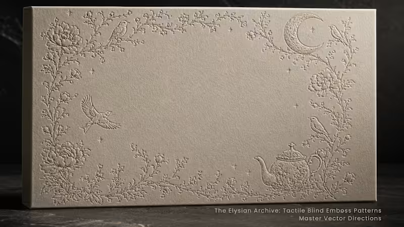

Graphic Designer specializing in corporate brand identity.
Graphic Designer specializing in corporate brand identity.


Imaginative NFT & Print Designer 🎨
Imaginative NFT & Print Designer 🎨


