
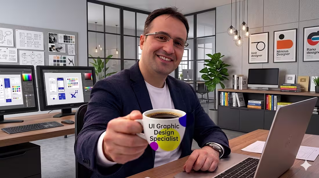
RECEP YILDIZ
Graphic Designer | UI Specialist
New to Contra
RECEP is ready for their next project!

This video represents how I transform ideas into real, client-ready projects by combining two powerful tools: Contra and Fuser Studio.
My goal is simple:
To show not just what I design, but how I think, create, and deliver value.
I also created this video to demonstrate what I’m قادر of producing with Fuser Studio — from interface design to interactive prototypes and visual experiences.
With Fuser Studio, I quickly turn concepts into functional and visually engaging designs.
With Contra, I present these works to a global audience and connect with potential clients.
This video highlights my workflow:
From idea → to design → to real opportunities.
It’s more than a showcase —
it’s a reflection of my process, creativity, and the way I approach every project.
2
6
451
Which web banner design looks better to you? Which one should I choose? Which of my designs would you recommend?
2
111
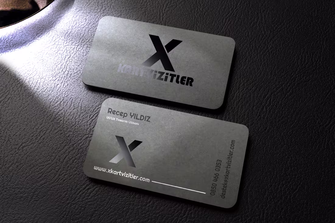
Premium Foil Business Card Design
0
8
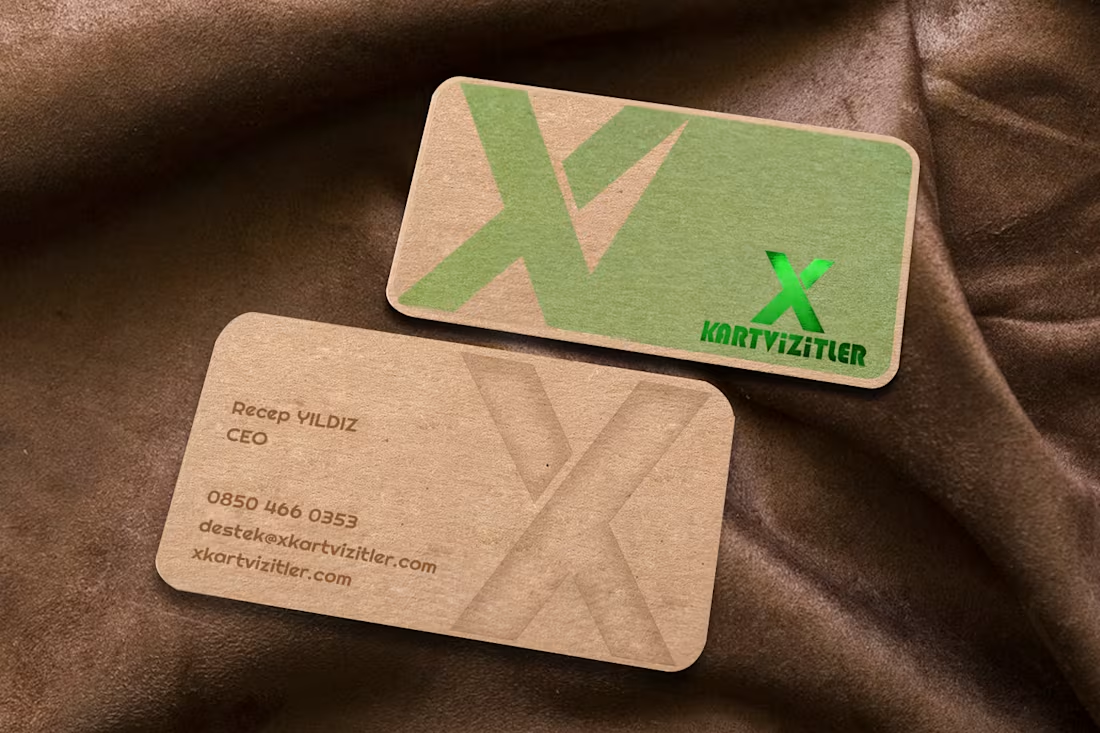
Premium Kraft & Foil Business Card Designs
0
1
Fantasy Business Card Design
0
4
Premium Transparent Business Card Design
0
2
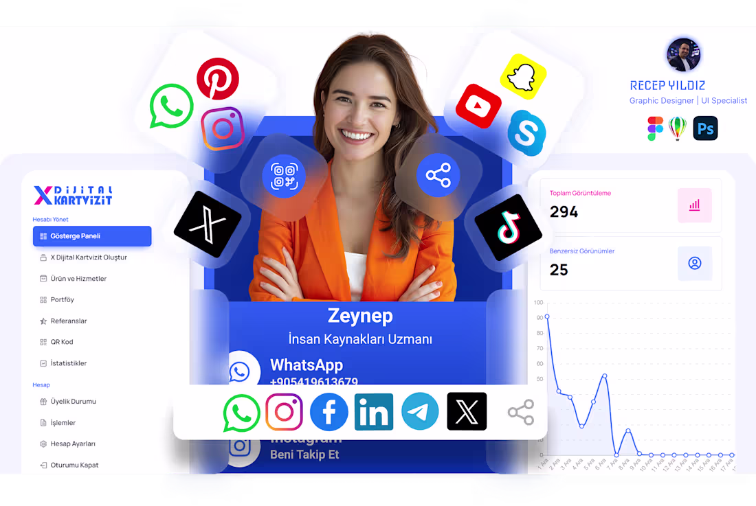
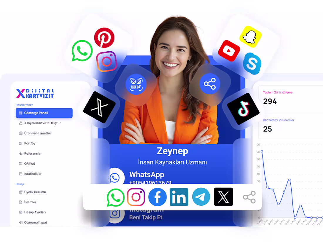
Digital Business Card Interface Design
0
6
Presentation Catalog Design
0
4
CRM Campaign Builder UI Design – Segmentation & Message Preview
This project focuses on designing a campaign creation interface within a CRM system, enabling users to easily manage audience targeting and message delivery.
The interface allows users to select target segments, define criteria, and customize message content through a structured and user-friendly workflow. A real-time mobile preview was integrated to provide instant feedback on how messages will appear to end users.
Special attention was given to usability, visual hierarchy, and workflow clarity. The design ensures that complex operations such as segmentation and campaign setup can be completed quickly and efficiently.
The project was designed using Figma and CorelDRAW, with a focus on creating a modern, intuitive, and conversion-oriented user experience.
1
102
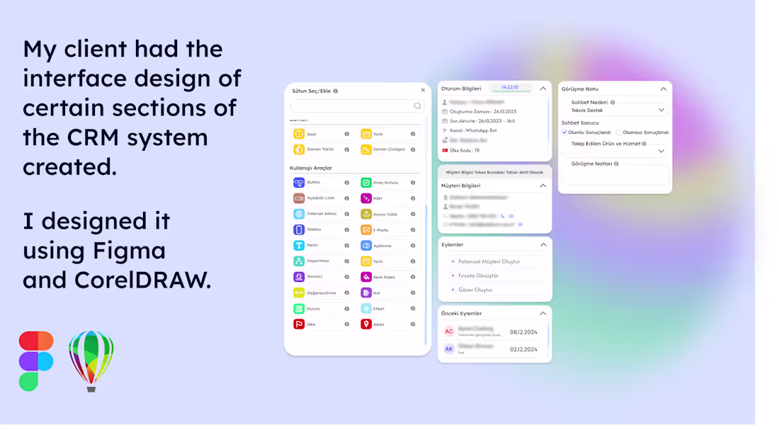
In this project, I redesigned the user interface of specific modules within a CRM system for a client. The goal was to improve user experience, simplify data access, and create a more modern and intuitive interface.
During the design process, a modular structure, clean visual hierarchy, and user-friendly interactions were prioritized. Dashboard components, form elements, and action panels were optimized to ensure a more efficient user experience.
Figma and CorelDRAW were used throughout the process for design, prototyping, and visual refinement.
1
127
In this project, I designed a mobile interface that guides users step by step through the identity verification process. The goal was to make the process more intuitive, clear, and trustworthy for users.
The design presents verification steps such as phone number verification, ID scanning, facial recognition, liveness detection, and contract signing in a simple and seamless flow. Each step includes visual status indicators to provide clear feedback throughout the process.
The interface was created with a focus on mobile usability, accessibility, and user experience, resulting in a modern, readable, and action-oriented design.
1
102
I design user-friendly (UI) interfaces tailored to the needs of brands and startups, primarily using Figma and other modern design tools. I deliver aesthetic, functional, and user-centered solutions for both web and mobile projects, helping businesses establish a strong digital presence.
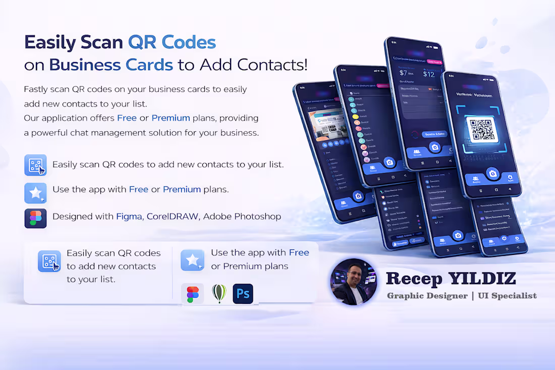
📱 QR Code Contact Management App – UI Design Project
This project featured in my portfolio is a mobile application UI design that allows users to quickly and easily add contacts to their phone by scanning QR codes on business cards.
Within the scope of the project:
A clean and user-friendly interface was designed
The QR code scanning experience was optimized
Contact management and listing screens were designed based on modern UI principles
User flows were created for both Free and Premium plan structures
During the design process, Figma, Adobe Photoshop, and CorelDRAW were actively used. With its modern color palette, readable typography, and smooth user experience, the project offers a well-balanced structure both visually and functionally.
2
101
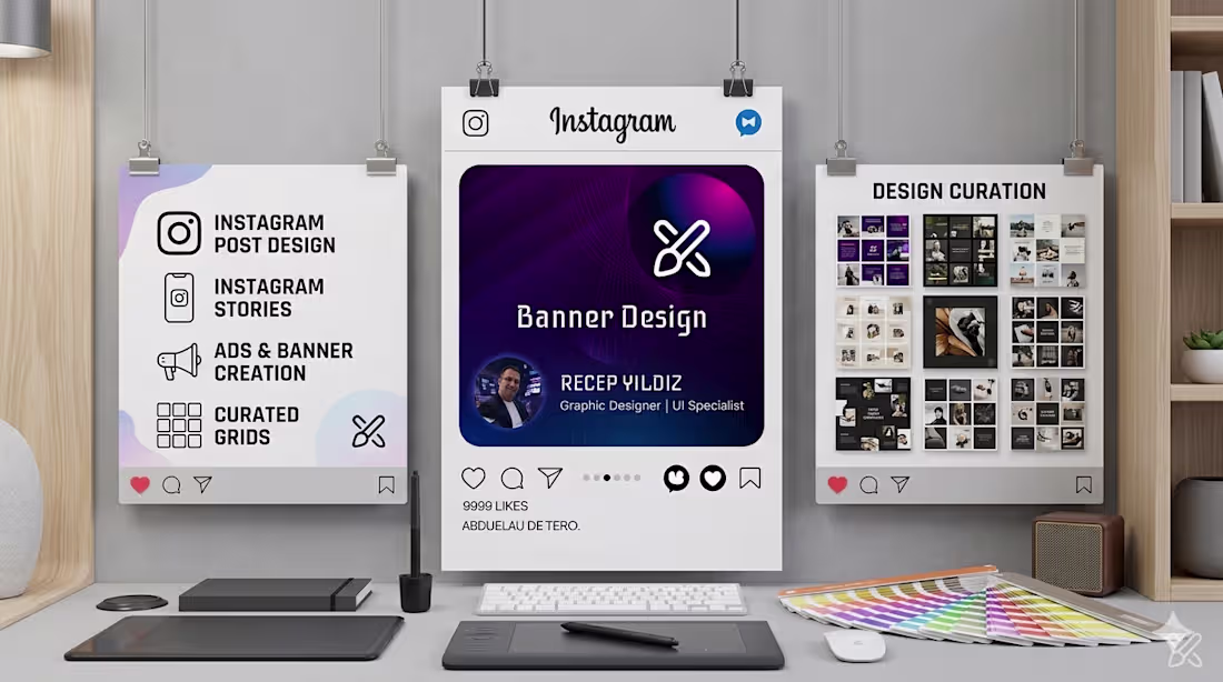
Social media banner designs are one of the most important elements that directly impact your brand’s presence in the digital world. A well-crafted design not only grabs attention but also reflects your brand’s professionalism, reliability, and character.
At this point, the key factor is originality and corporate consistency. Your brand’s colors, fonts, and visual language should be shaped around a clear concept, and this line should be consistently maintained across all designs. Every post should act as a piece that strengthens your brand identity—created not randomly, but as part of a strategic whole.
This is exactly where the role of a graphic designer comes into play. With a professional perspective, the designer analyzes your brand, builds the right concept, and applies it consistently across all designs to establish a strong visual identity. As a result, your brand doesn’t just exist on social media—it stands out and becomes memorable.
2
114
Which one would you choose?
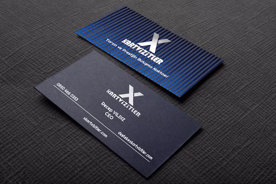
• Black foil premium business card – clean, strong, and prestigious
• Custom-cut silver foil business card – eye-catching, modern, and unique
First impressions matter… Your business card reflects your style.
So, are you more into classic elegance or bold creativity?
Let me know in the comments!
2
307
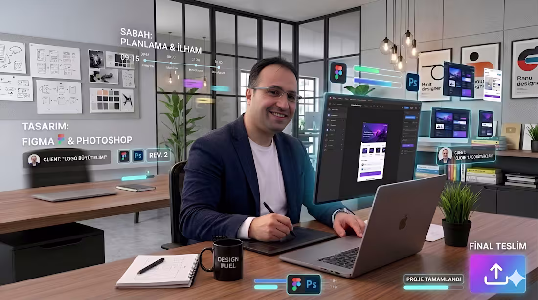
The daily workflow of a UI and Graphic Designer should be presented as a natural and sincere part of the creative process. The day begins with inspiration; coffee, music, and a clean, minimal workspace that nurtures productivity. Working with tools like Figma and Photoshop is not just a technical process, but a journey where ideas are transformed into visuals. Throughout the day, ideas emerge, sketches are created, revisions are made, and small details gradually shape the essence of the design.
The working environment plays a crucial role as one of the most important sources of inspiration; an organized desk, natural light, minimalist details, and a calm atmosphere directly enhance creativity. This environment helps ideas take clearer form, making the design process more focused and enjoyable. At the end of the day, what emerges is not just a design, but a reflection of the day’s creative journey and mood.
1
113
I wanted to explain this through Fuser because I was curious about how it works. The user experience is really good; it is simple, clear, and fast. It provides a strong environment especially for generating scenarios, testing ideas, and exploring different user flows.
Every point where your brand is positioned is a strong reflection of its stance and identity. A logo is not just a symbol; it is a living element that stands out in any environment, expresses itself, and conveys the character of the brand.
Whether on a digital screen or a physical surface, a well-designed logo stands out wherever it appears, builds a connection with the user, and tells the brand’s story at a single glance.
For this reason, no additional text, slogans, or unnecessary visual elements should be added to the logo.
A logo should be strong, legible, and impactful on its own.
A strong brand adapts to its environment while still managing to capture attention.
2
13
785
With extensive experience in digital design, I work on web banner design, social media content, and digital advertising visuals.
I actively contribute to developing visual concepts aligned with brand identity and creating a strong digital communication language.
Transitioning into UI design with Figma, I focus on creating clean, modern, and functional interfaces that prioritize user experience.
I continue to develop user-centered interface solutions by balancing design aesthetics and usability.
I am open to contributing to freelance and full-time projects, working remotely.
0
150
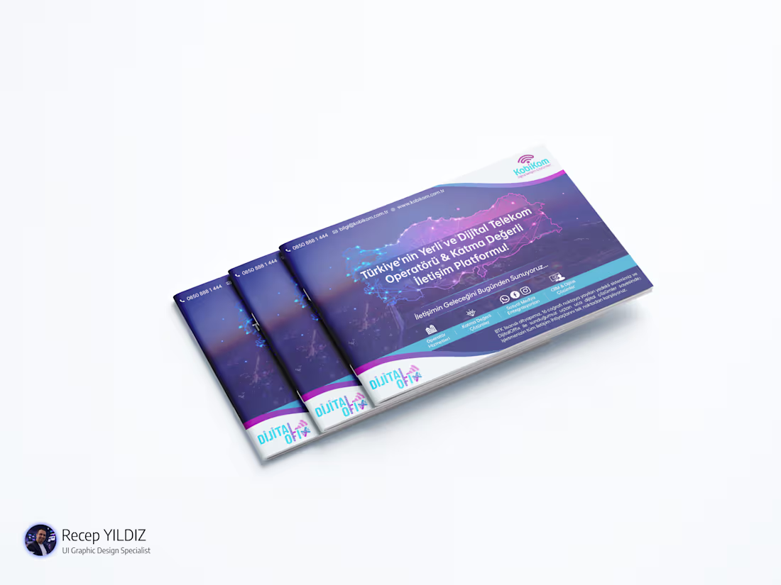
Corporate Presentation Catalog Design
I designed a modern and professional corporate presentation catalog, ensuring full alignment with the brand’s identity and visual language.
The design process focused on preserving corporate colors, consistency, and brand integrity, while creating a clean and impactful layout that effectively communicates services and company vision.
Special attention was given to typography, spacing, and visual hierarchy to enhance readability and deliver a strong corporate impression. The result is a structured and visually engaging catalog that reflects professionalism and strengthens brand perception.
Key Highlights
Brand-consistent design approach
Effective use of corporate colors
Clean, modern, and professional layout
Strong visual hierarchy and readability
Structured presentation flow
0
163
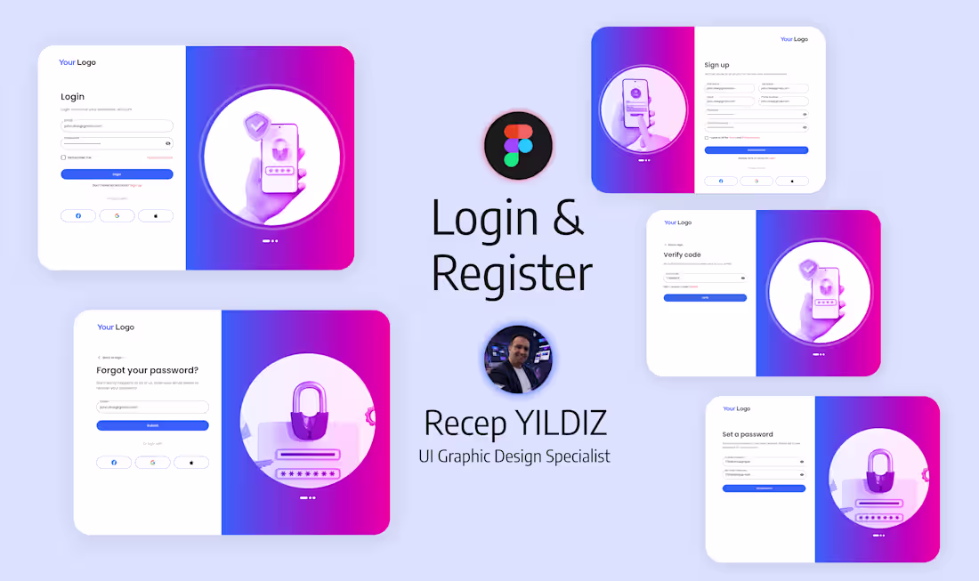
Modern Login & Register UI Design
I designed a clean, modern, and user-friendly Login & Register interface focused on simplicity and seamless user experience.
The goal of this project was to create an intuitive authentication flow that feels fast, minimal, and visually appealing across all devices. I focused on balancing usability with a modern aesthetic.
0
153
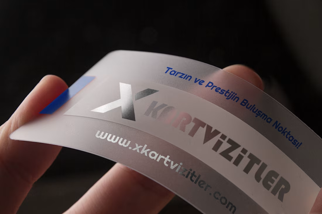
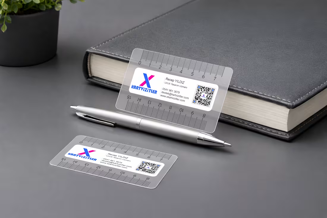
A transparent-based business card design featuring silver foil detailing combined with white and navy printing, finished with an oval cut shape, delivers a highly refined, modern, and premium visual presence. This design approach reflects a strong sense of minimalism merged with luxury aesthetics, making it an ideal representation for brands that aim to position themselves in a high-end and sophisticated segment.
The transparency of the material creates a sense of openness and lightness, allowing the design to feel contemporary and visually distinctive. The silver foil accents interact dynamically with light, giving the card a subtle yet powerful reflective character that immediately draws attention and enhances its premium perception. White typography introduces clarity, cleanliness, and balance within the composition, ensuring readability while maintaining a refined visual hierarchy. Meanwhile, the navy print reinforces trust, professionalism, and corporate elegance, grounding the overall design with a strong and stable identity.
The oval cut shape break:s away from traditional sharp-edged business card formats, introducing a softer, more fluid silhouette. This unique form enhances memorability and adds an artistic, design-driven touch that elevates the overall brand expression.
Overall, this business card design stands as a sophisticated piece of visual communication—meticulously crafted, detail-oriented, and highly effective in conveying exclusivity, professionalism, and strong brand perception.
0
197