
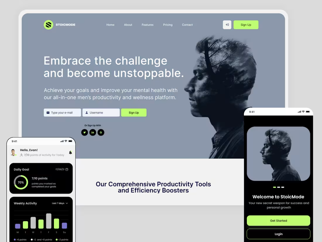


Here's my submission! Click to view
(https://youtu.be/yFsx4iv8QZ8?si=81X8Q31bUIO_TCqr)Hey guys! My name is Kayla and I'm going to walk you through my process on how I used Envato as a main toolkit to create a fake closed caption only movie theater from start to finish. You'll find I used the following from Envato:
Stock photos
Generated images
Web/UI templates.
All I started with was two things, an idea and a name. Envato helped me practically create a brand ecosystem complete with photography in less than a day and a half. The rest of the time was spent migrating everything to Figma for the sake of organizing everything in one place and made visible for this video. Yo brainstormers!! Envato is where the party's at!! Do your brain dump in the prompt, scavenger through the photos,videos, graphics, and all other tools to and give form to your passions. Play with it and make it tangible because once you have a solid base to go from, it's only up from there. You will NOT be sorry.
It's really so crazy how much Envato provided. It solidified direction for product and environmental branding, marketing mockups and pushed me to think outside the box on how I could humanize all the content by making the impact of the content land immersive. I used a consumer lens to focus on what angles, grading, and designs would reel me in as a consumer and not designer. Never have I had this much fun using a design platform for the first time. Thank you for watching and I hope you enjoy!
@envatotuts (https://www.youtube.com/@envatotuts) @envato (https://www.youtube.com/@envato) #envatochallenge (https://www.youtube.com/hashtag/envatochallenge)
2
4
283
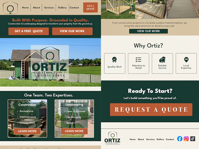


Redesign + Podia to Webflow Migration - Figma to Webflow
🔻Problem: The original Podia site buried critical information under endless vertical scrolling while failing to establish clear visual hierarchy or memorable brand identity, costing the client engagement and conversions.
🔹My Process: I conducted a heuristic evaluation and competitive analysis, then redesigned the site using UX best practices for information architecture.
🔹Outcome: A modern website that establishes credibility for the consultant immediately at the top, attracts qualified leads, strengthens the brand, and reduces excessive vertical scrolling.
▸BEFORE (The Original Website): https://www.loom.com/share/951faa26a6f9439c8bde96c1c3b49948
✦︎AFTER (My Redesign): https://www.iconoclaststrategy.com/
0
197
