Temple Brand Identity Development
Josh Waggoner

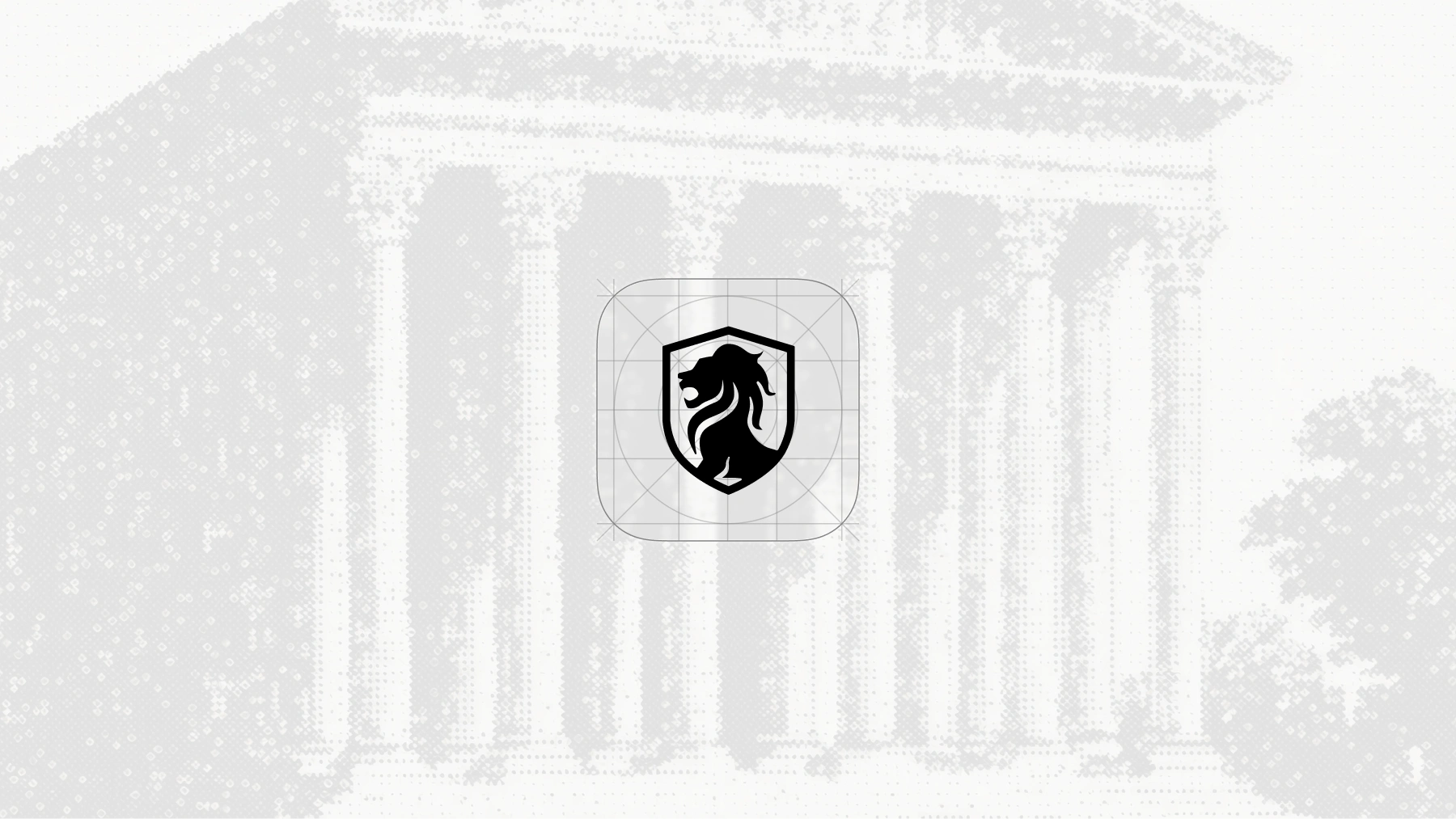
The Temple lion shield mark against a classical architectural backdrop with halftone texture, representing institutional strength
Summary
A comprehensive brand identity for a next-generation digital asset infrastructure company.
Temple needed a visual identity that communicated both technological sophistication and institutional trustworthiness. The brand had to work across trading interfaces, marketing materials, and regulatory documentation, a rare combination that required careful balance of boldness and restraint.

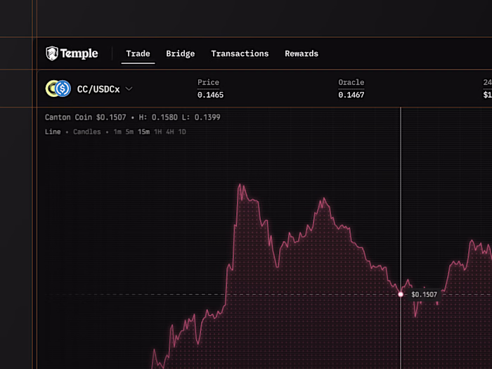
Trust Through Design
Financial brands live or die on trust signals. The Temple logo represents a shield of trust and stability. The supporting type system pairs this with a humanist serif for long-form content, creating warmth without sacrificing professionalism.

Brand mark in a dramatic, sculptural context emphasizing the lion motif with elegant monochromatic lighting
Visual Language
Temple's visual identity draws from classical architecture and institutional finance, rendered through a modern digital lens. The halftone dot pattern creates texture and depth while nodding to traditional print processes. The color palette balances warm bronze and copper tones with cool teals, grounding the brand in both heritage and innovation.
Colors & Typography
The Temple brand employs a refined palette anchored by deep blacks and warm neutrals, accented with institutional gold and bronze tones. Typography centers on a sophisticated serif for headlines and marketing ('Capital Markets Built on Canton'), paired with a clean geometric sans-serif for UI and body text. This combination signals both the gravitas of traditional finance and the precision of modern technology.
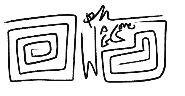
App icon design showing the mathematical grid system behind the lion shield mark

Brand messaging using the elegant serif typeface paired with the Temple mark
Application
The identity system extends across trading interfaces, marketing collateral, and regulatory documentation. From the app icon construction to full-page brand moments, every touchpoint reinforces Temple's position as the institutional-grade infrastructure for capital markets built on Canton.
Got a project in mind? I'd love to hear about it. Reach out on Contra or via email and let's build something worth shipping. hello@joshwags.com
— Josh Waggoner
Like this project
Posted Jun 8, 2026
Temple needed a brand and visual identity that communicated both technological sophistication and institutional trustworthiness.
Likes
0
Views
2
Clients
Temple