
Alicia Alexander
Webflow Designer & Developer | Product Design | 18 Yrs Exp.
- 5.00
- Rating
- 2
- Followers
Johns Hopkins University GovEx Works — End-to-End Product Design
UX Research · UI Design · Prototyping · Front-End Development
User Problems:
🔻Staff were avoiding the original internal dashboard entirely and working out of external spreadsheets instead.
🔻The interface was slow, cluttered, and forced users to zoom out in the browser to use the old dashboard interface.
Impact
🏢 Introduced UX research and Design Thinking practices to the organization.
🧠 Replaced spreadsheet workarounds with a centralized, modern system.
⭐ 4.7 / 5 user satisfaction at beta launch.
📈 Higher adoption, improved workflow efficiency, and better remote collaboration during the pandemic.
Result: I redesigned it end-to-end and turned it into a tool they actually rely on and could use during the COVID-19 pandemic.
0
25
Redesign + Podia to Webflow Migration - Figma to Webflow
🔻Problem: The original Podia site buried critical information under endless vertical scrolling while failing to establish clear visual hierarchy or memorable brand identity, costing the client engagement and conversions.
🔹My Process: I conducted a heuristic evaluation and competitive analysis, then redesigned the site using UX best practices for information architecture.
🔹Outcome: A modern website that establishes credibility for the consultant immediately at the top, attracts qualified leads, strengthens the brand, and reduces excessive vertical scrolling.
▸BEFORE (The Original Website): https://www.loom.com/share/951faa26a6f9439c8bde96c1c3b49948
✦︎AFTER (My Redesign): https://www.iconoclaststrategy.com/
0
112
I designed and built this "Coming Soon" landing page in Webflow for a solo wellness strategy consultant.
The subtle animation brings the brand to life in a memorable way so her business makes a strong first impression with visitors well before the website launch.
View the live page here: https://hod-wellness.webflow.io/
2
385
Redesign - Bloomberg Philanthropies: What Works Cities (WWC) Dashboard
Role: Lead Designer & Developer | Johns Hopkins University Stack: Django, Python, Bootstrap, jQuery, PostgreSQL
Overview: Transformed a legacy, data-heavy tool into a high-fidelity, modern dashboard for Bloomberg Philanthropies. I overhauled the information architecture and scannability, replacing fragmented navigation with a professional, cohesive UI.
Key Outcomes:
✦ UX Modernization: Converted raw data into intuitive visual cards and charts.
✦ Enterprise Branding: Aligned color and typography with global brand standards.
✦ Improved Efficiency: Replaced top-heavy tabs with a scalable sidebar.
0
117
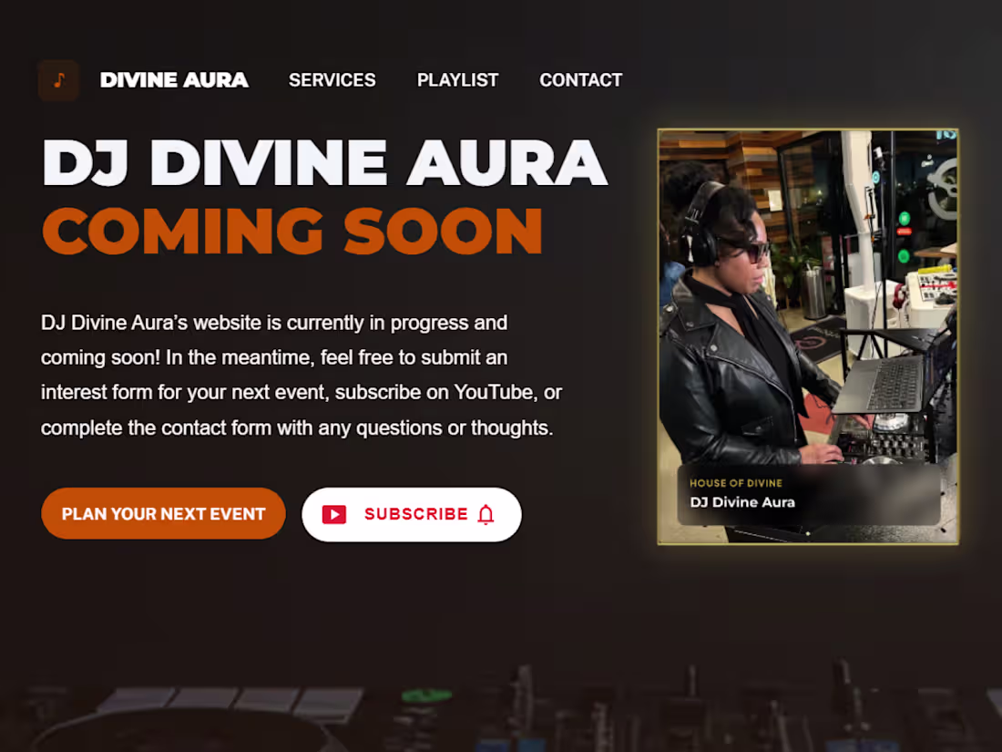
DJ Divine Aura - Coming Soon Webflow Landing Page
Designed and developed a branded "Coming Soon" Webflow landing page for DJ Divine Aura.
Delivered an end-to-end Figma-to-Webflow build featuring conversion-optimized CTAs for bookings and YouTube growth.
https://djdivineaura.com/
1
278