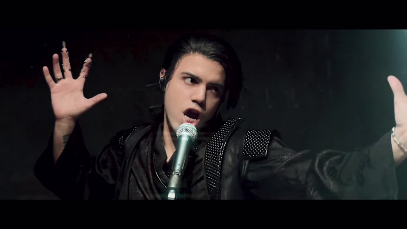
Projects in Teófilo OtoniProjects in Teófilo OtoniThis project started with a very fun question in my head:
What if I tried to create a cinematic pop opera with a blue screen, an automated slider, an iPhone, some 3D, some VFX, and a lot of curiosity?
I tested, failed, tried again, changed the scenes, rebuilt the stages, filmed myself more times than I can count, and slowly watched this little idea become its own visual world. It was dramatic, chaotic, intense, funny, and honestly very special to make.
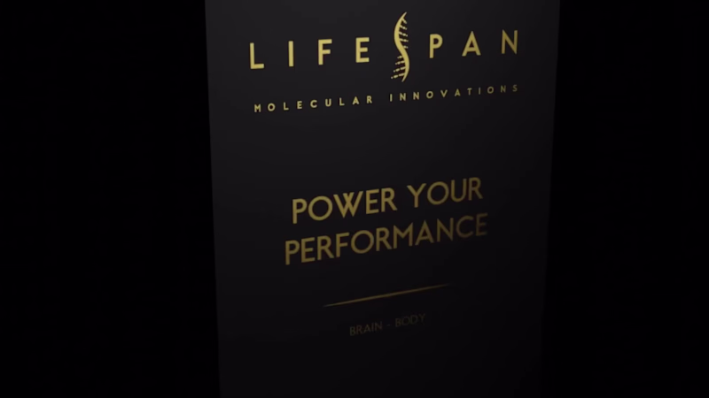
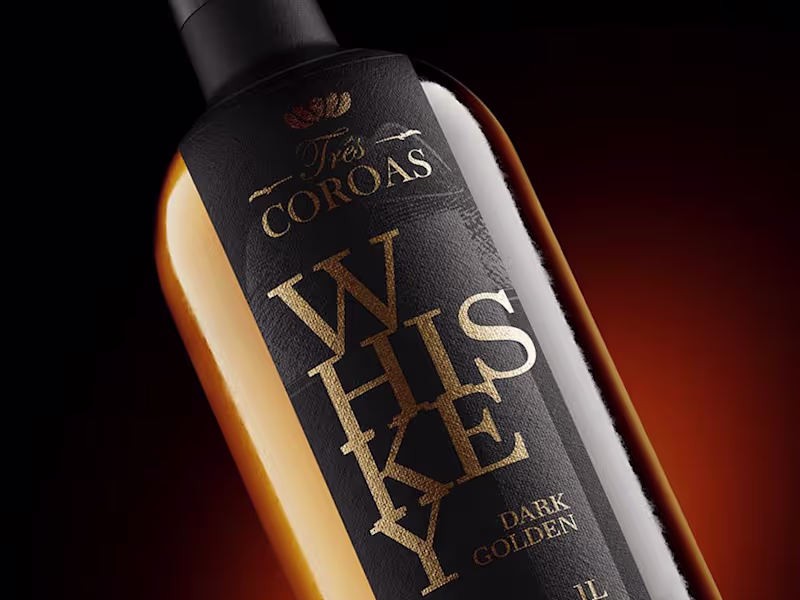
Here’s a little glimpse of the process behind Done Opera, from the messy tests to the final world. Watch the final result here (https://youtu.be/N9DPXjXnBDE). 🎬🎥 This project was developed as a 3D commercial for Lifespan, focused entirely on product animation and three-dimensional visual storytelling.
The work involved product modeling, lighting, texturing, and animation, with the goal of presenting the product in a clear, premium, and visually engaging way. The animation highlights form, materials, and functionality, using movement to enhance realism and perception.
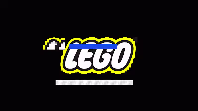
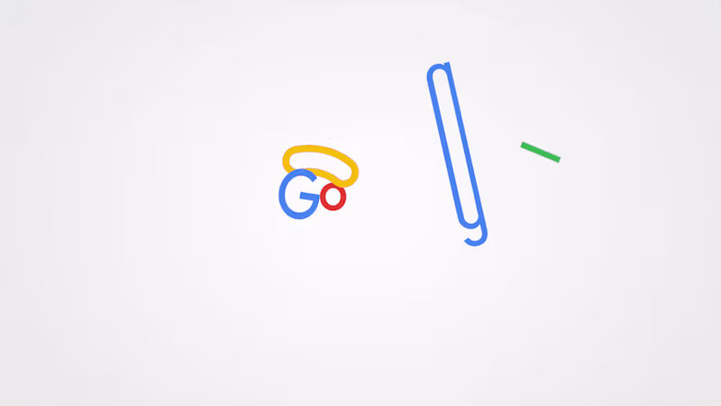
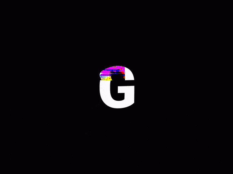
Art direction and branding principles guided the overall look of the piece, ensuring consistency in tone, composition, and visual language. The result is a product-driven 3D commercial where animation and lighting play a central role in communicating value and quality. This logo animation was built using classic animation principles inspired by traditional animation. Techniques such as squash and stretch, anticipation, timing, and easing were applied to give the “G” a sense of weight, elasticity, and rhythm.
The movement feels smooth and intentional, guiding the eye naturally as the logo appears. Instead of relying on effects, the animation focuses on motion fundamentals, creating a result that feels playful, and polished.
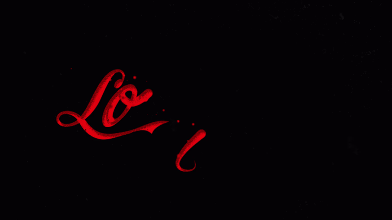
By applying traditional animation techniques to a modern logo, the animation feels expressive while remaining clean and easy to use across digital contexts. This animation explores fluid motion inspired by soda and carbonated drinks. Based on the curves and flow of classic beverage typography, the movement was designed to feel liquid, airy, and effervescent.
Fluid shapes, soft distortions, and bubble-like motion were used to suggest gas, pressure, and release. The animation aims to translate the physical sensation of a cold, fizzy drink into motion, where typography behaves almost like liquid.
The result is an expressive animation that connects type, motion, and sensory memory, bringing freshness, energy, and movement into the visual identity.