The network for creativity
Join 1.25M professional creatives like you
Connect with clients, get discovered, and run your business 100% commission-free
Creatives on Contra have earned over $150M and we are just getting started
Back to feedPost

This logo animation was built using classic animation principles inspired by traditional animation. Techniques such as squash and stretch, anticipation, timing, and easing were applied to give the “G” a sense of weight, elasticity, and rhythm.
The movement feels smooth and intentional, guiding the eye naturally as the logo appears. Instead of relying on effects, the animation focuses on motion fundamentals, creating a result that feels playful and polished.
By applying traditional animation techniques to a modern logo, the animation feels expressive while remaining clean and easy to use across digital contexts.


The network for creativity
Join 1.25M professional creatives like you
Connect with clients, get discovered, and run your business 100% commission-free
Creatives on Contra have earned over $150M and we are just getting started

Challenges
View all


Related posts

Wonder -- Visual Expressions

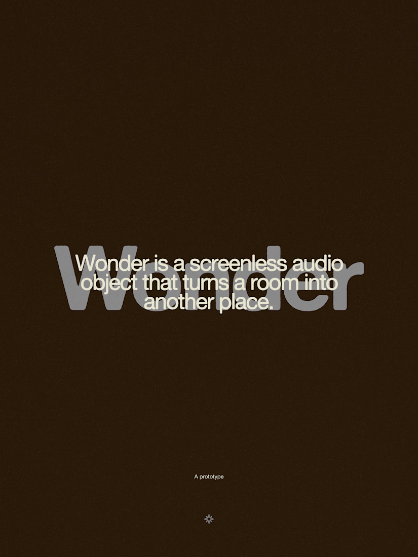
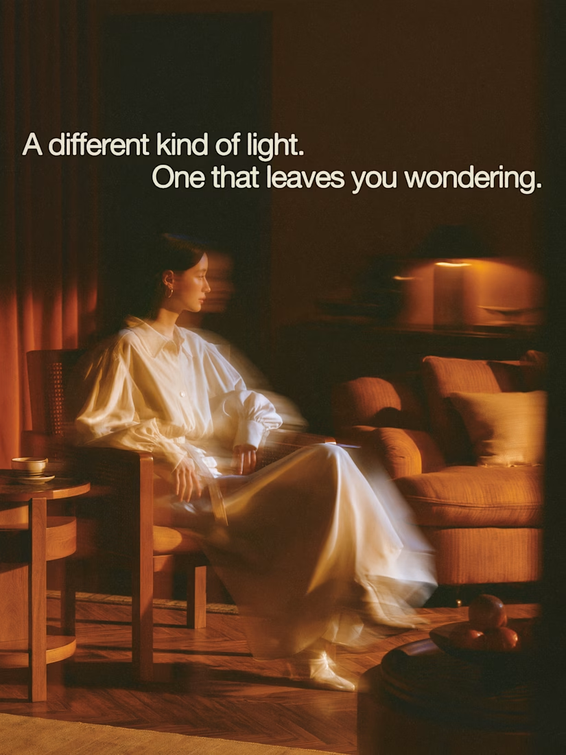

The restraint in the warm palette really lets the sound-object concept breathe—especially that shift from readable type to atmosphere.

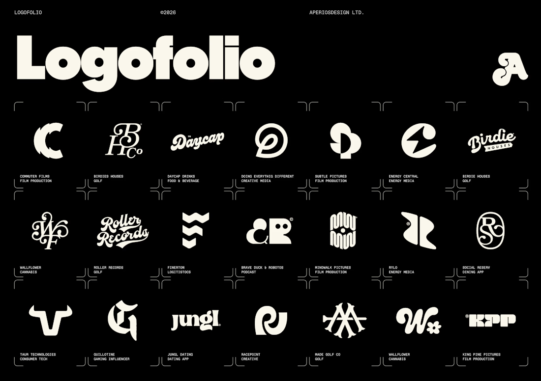
I’ve been slowly updating all of our project imagery across a new website update and and our internal decks.
Logos are only a small fraction of what we do for clients now, but I still love starting there. They often set the tone for the wider identity, the visual language, and the story we’re trying to tell.
Also, pretty satisfying seeing some of my favourites all together on one page.

Nice

Custom liquid interaction built in Framer.
Turning a static hero into a responsive visual surface through cursor-driven distortion.


How do you adapt the cursor-driven effect for touch screens?