The network for creativity
Join 1.25M professional creatives like you
Connect with clients, get discovered, and run your business 100% commission-free
Creatives on Contra have earned over $150M and we are just getting started
Back to feedPost

This animation explores fluid motion inspired by soda and carbonated drinks. Based on the curves and flow of classic beverage typography, the movement was designed to feel liquid, airy, and effervescent.
Fluid shapes, soft distortions, and bubble-like motion were used to suggest gas, pressure, and release. The animation aims to translate the physical sensation of a cold, fizzy drink into motion, where typography behaves almost like liquid.
The result is an expressive animation that connects type, motion, and sensory memory, bringing freshness, energy, and movement into the visual identity.


The network for creativity
Join 1.25M professional creatives like you
Connect with clients, get discovered, and run your business 100% commission-free
Creatives on Contra have earned over $150M and we are just getting started

Challenges
View all


Related posts

Custom liquid interaction built in Framer.
Turning a static hero into a responsive visual surface through cursor-driven distortion.


How do you adapt the cursor-driven effect for touch screens?

1M views in 3 days for OpusClip launch.
Obviously not just the video - it's the team, the timing, the distribution push. But I'm genuinely proud to be the part that moves that fast.
Delivered in 14 days.
Have a product launch coming up? Feel free to DM me.


The launch piece makes the product story feel tangible—the checkmark sequence and kinetic type build a clear sense of momentum without losing the human proof behind the result. Great example of motion carrying the narrative.

Wonder -- Visual Expressions

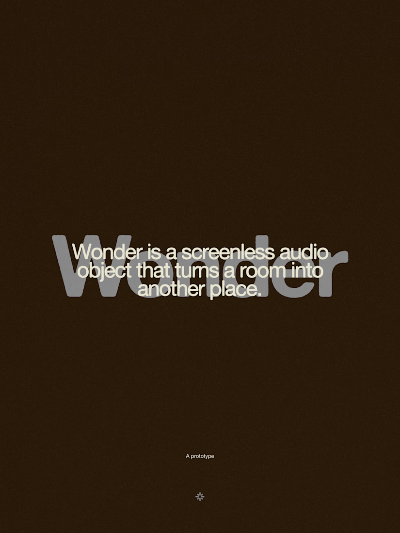
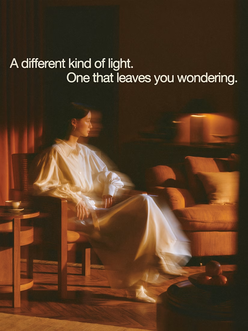

The restraint in the warm palette really lets the sound-object concept breathe—especially that shift from readable type to atmosphere.