Motion Design Projects in Teófilo OtoniMotion Design Projects in Teófilo OtoniIf there’s one thing I learned working in advertising agencies, it’s that design goes far beyond creating beautiful pieces.
The Meet Your New Art Director campaign comes from that mindset. It’s about bringing agency thinking, methods, and experience to founders, startups, and growing brands. Because often, the idea isn’t the problem — what’s missing is direction to make it real.
This project took two weeks of planning, production, filming, and editing. A reminder that strategy comes before visuals, and strong brands are never built by chance.
Today, this video is out in the world.
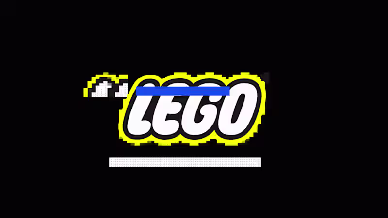
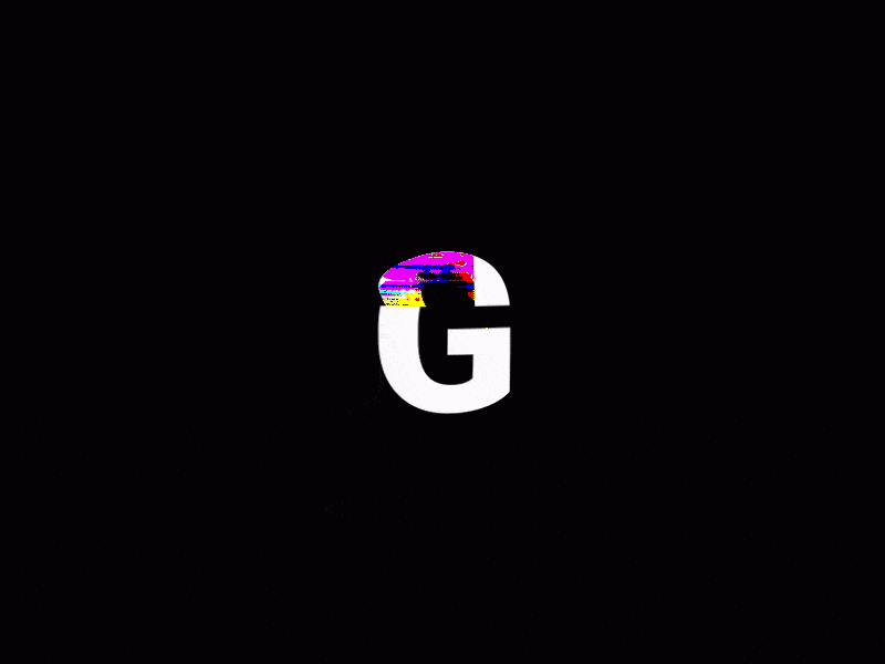
I hope it reaches you and inspires you to move your ideas forward. This logo animation was built using classic animation principles inspired by traditional animation. Techniques such as squash and stretch, anticipation, timing, and easing were applied to give the “G” a sense of weight, elasticity, and rhythm.
The movement feels smooth and intentional, guiding the eye naturally as the logo appears. Instead of relying on effects, the animation focuses on motion fundamentals, creating a result that feels playful, and polished.
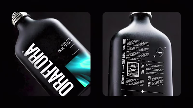
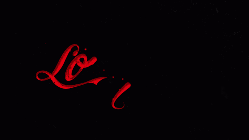
By applying traditional animation techniques to a modern logo, the animation feels expressive while remaining clean and easy to use across digital contexts. This animation explores fluid motion inspired by soda and carbonated drinks. Based on the curves and flow of classic beverage typography, the movement was designed to feel liquid, airy, and effervescent.
Fluid shapes, soft distortions, and bubble-like motion were used to suggest gas, pressure, and release. The animation aims to translate the physical sensation of a cold, fizzy drink into motion, where typography behaves almost like liquid.
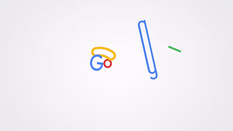
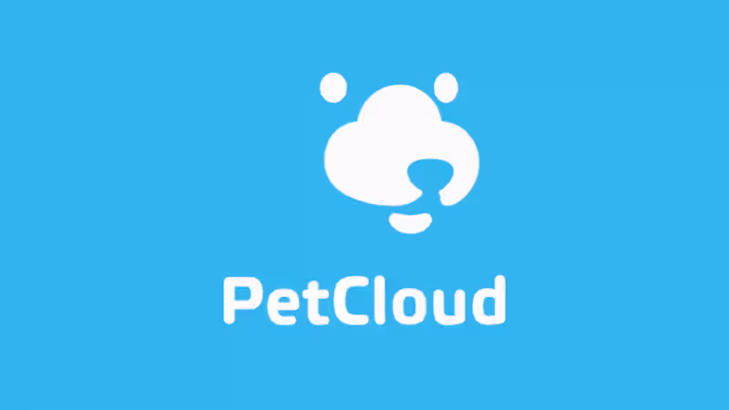
The result is an expressive animation that connects type, motion, and sensory memory, bringing freshness, energy, and movement into the visual identity. This logo animation focuses on clean motion design and technical precision. The animation explores timing, easing, scale, and opacity to create a smooth and controlled reveal of the logo.
Subtle motion principles such as anticipation, overlap, and rhythm are applied to give the animation flow without adding unnecessary effects. The movement is restrained and functional, designed to feel modern, lightweight, and consistent with digital platform branding.
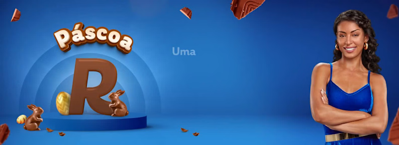
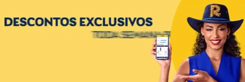
The result is a logo animation that prioritizes clarity and usability, working seamlessly across intros, transitions, and digital environments. These animated headers and footers were created for email marketing campaigns, using GIF animations to bring movement and attention to key messages inside the email layout.
The animations highlight benefits such as app features, promotions, discounts, and campaign messages, always aligned with seasonal themes. Motion is used in a subtle and strategic way, enhancing visibility without overwhelming the content or affecting readability.
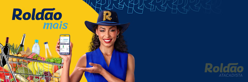
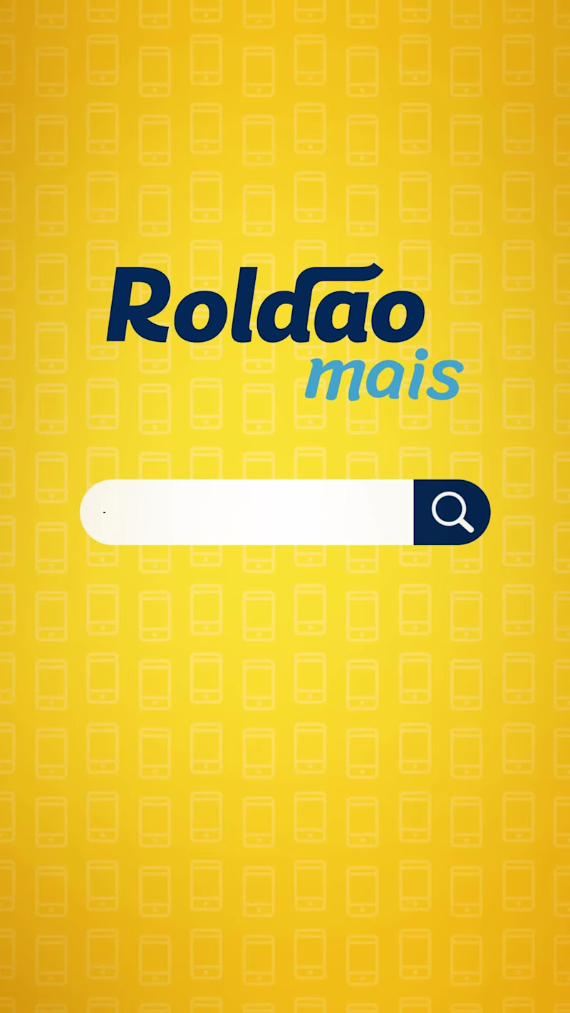
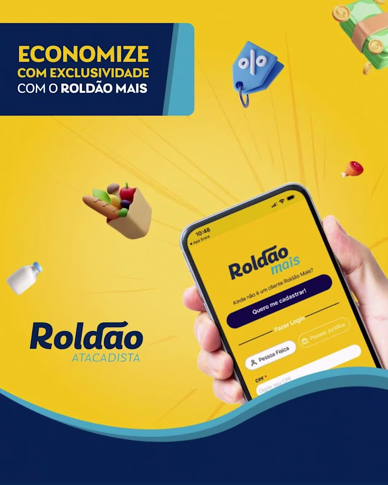
Designed specifically for email environments, the animations prioritize lightweight files, clear hierarchy, and compatibility across platforms, helping campaigns stand out in crowded inboxes while remaining functional and easy to load. This motion piece was developed to promote the Roldão Mais app on social media, encouraging users to download the app and activate exclusive offers.
The project covers the full motion workflow, including visual design, asset preparation, animation, and sound design. The visuals were designed to be clear, dynamic, and easy to understand, helping communicate the app’s benefits quickly in short-form content.
Motion, transitions, and visual hierarchy guide the viewer’s attention, while sound design reinforces key actions and moments, increasing clarity and engagement across social platforms.