Available For Next Project!
Cinematic Edits, Bold Designs & Logos
Cinematic Edits, Bold Designs & Logos
Social media designer
Logo Specialist & Brand Identity Designer
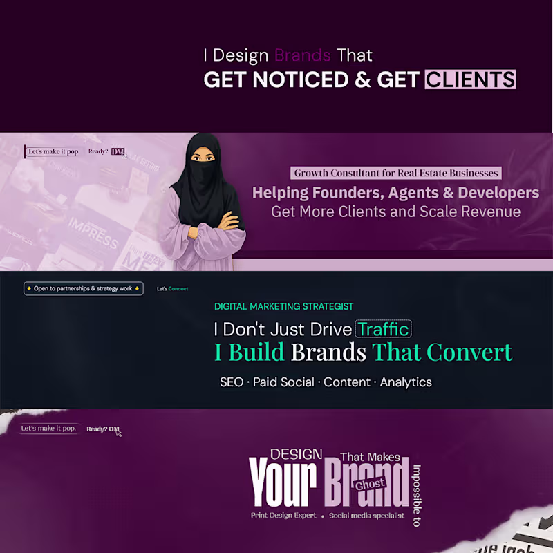
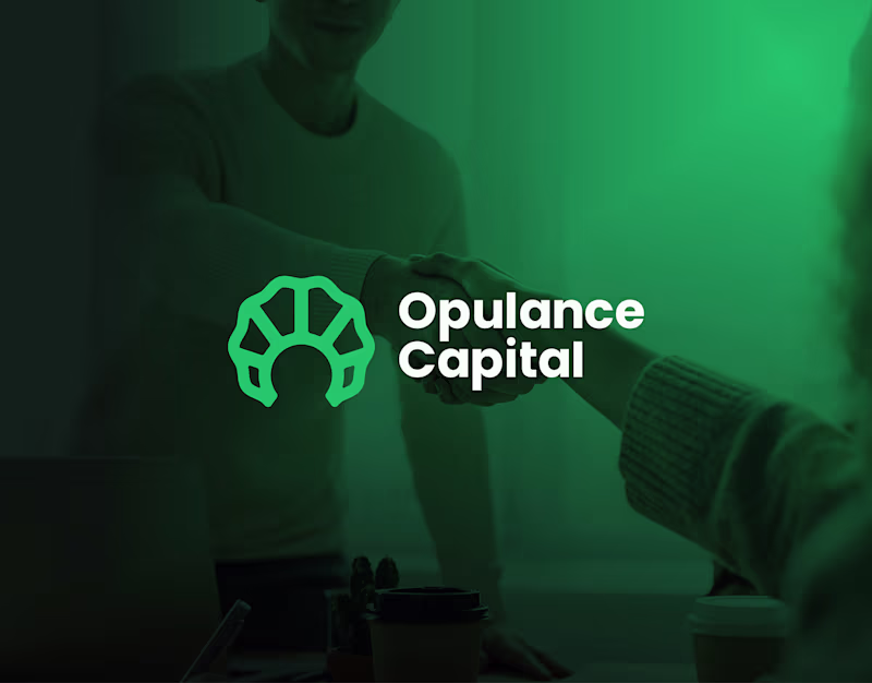
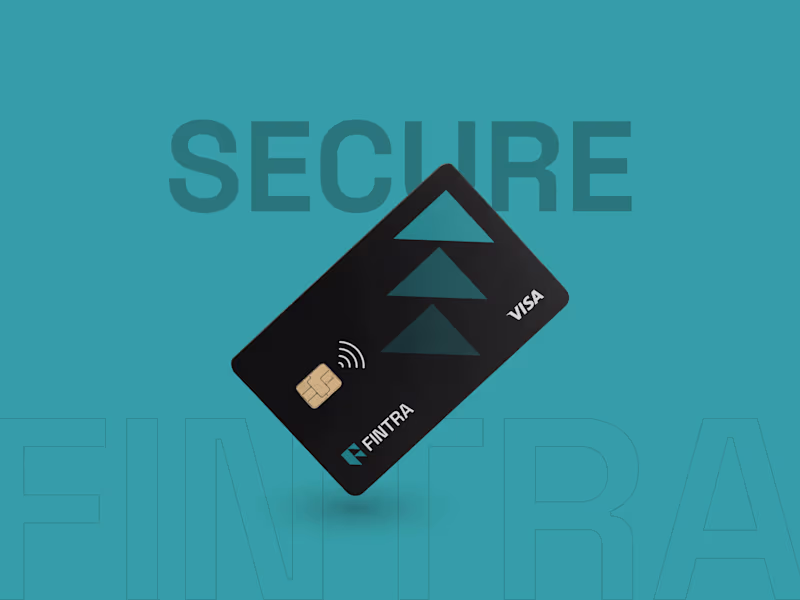
🤝Helping businesses to get Logo & Brand designs
New to Contra
🤝Helping businesses to get Logo & Brand designs
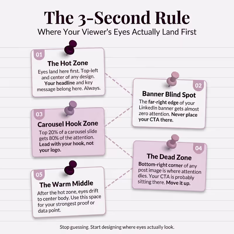
Creative Director & Brand Strategist
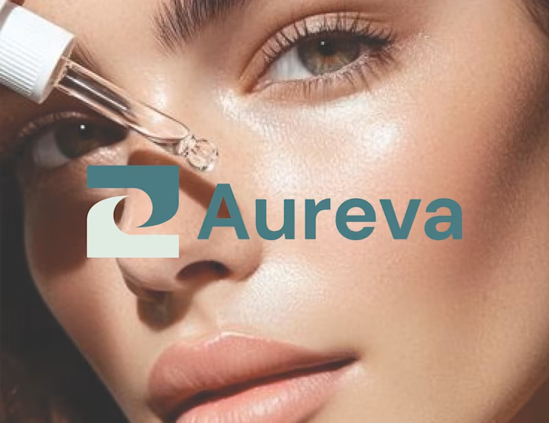
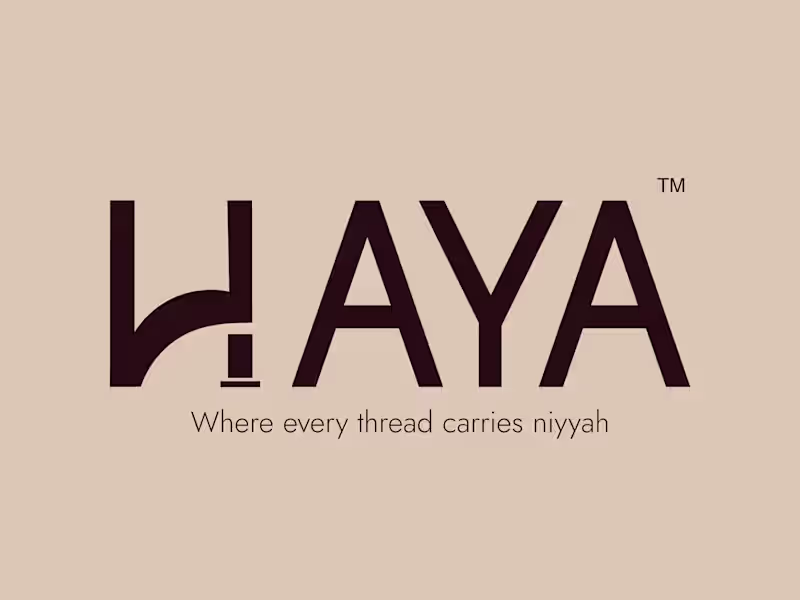
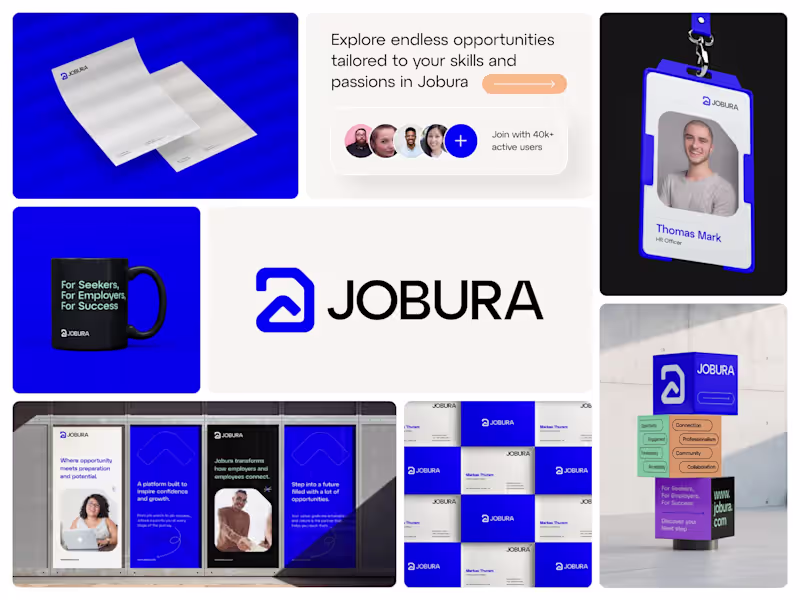
Logo & Brand Identity Designer ✦ Brand Strategist
Logo & Brand Identity Designer ✦ Brand Strategist
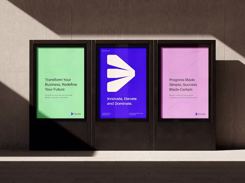
Innovating Brands
Innovating Brands
View more →