Tripova- Brand Identity & Visual Guidelines

Motiur R. Munna



Posted May 21, 2026
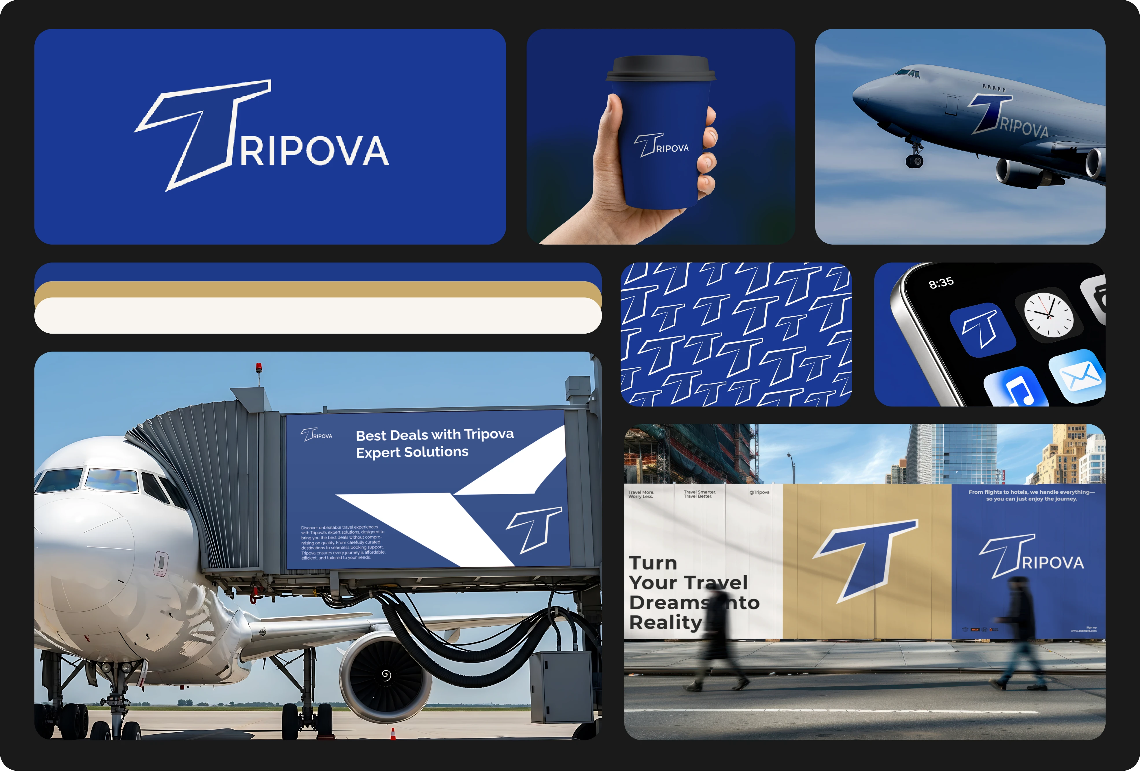
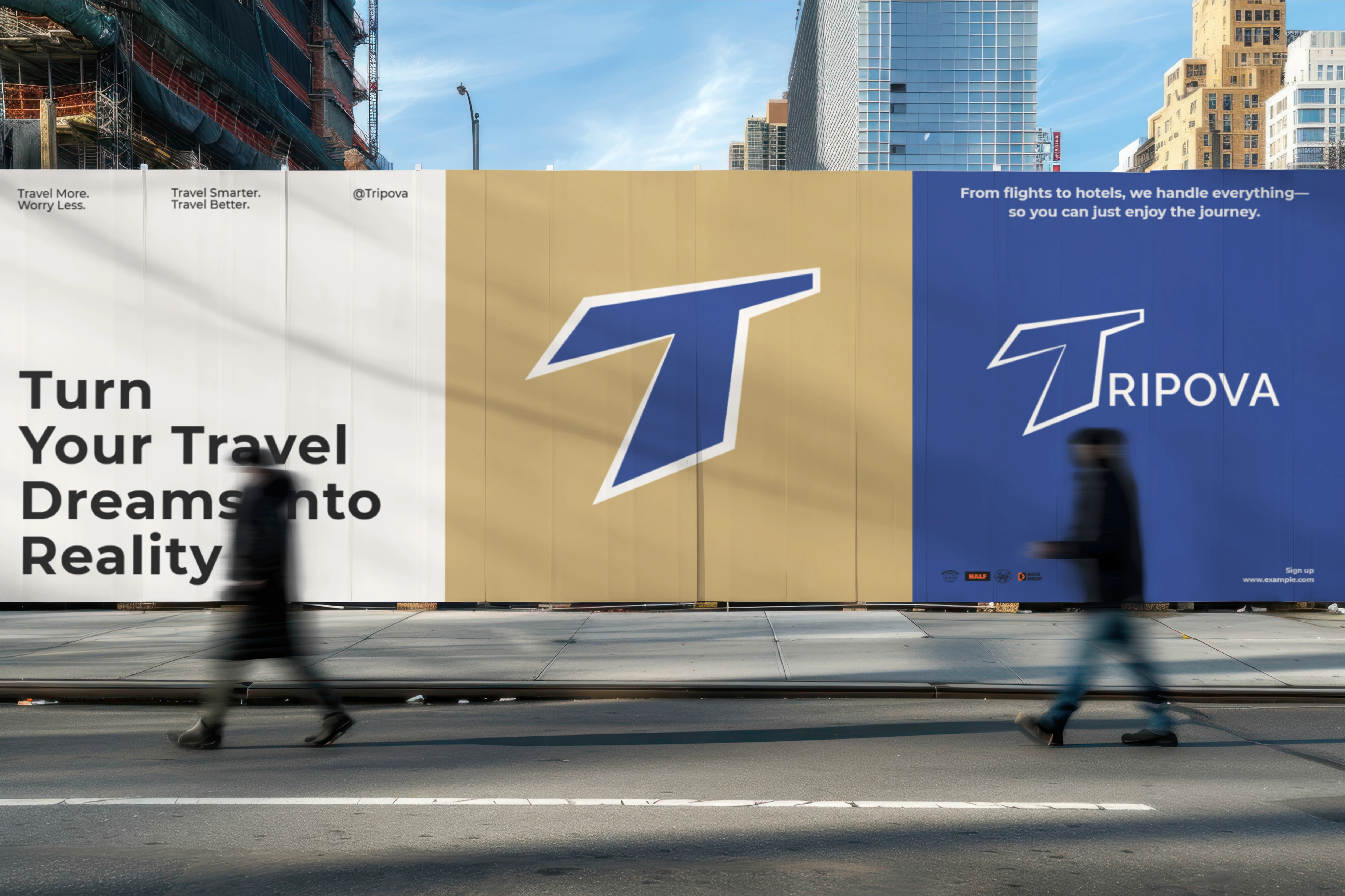
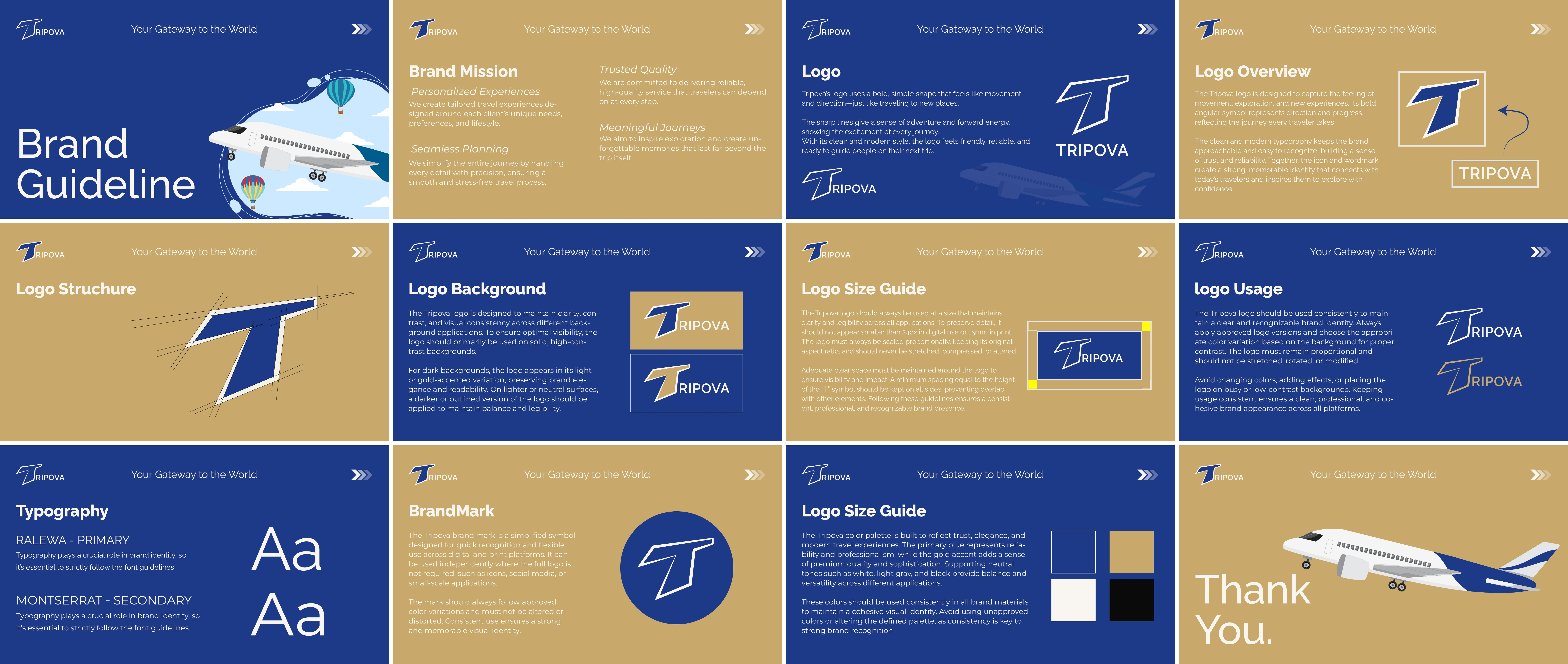
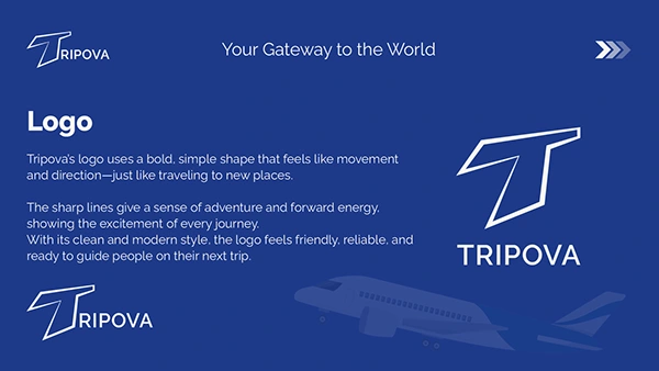
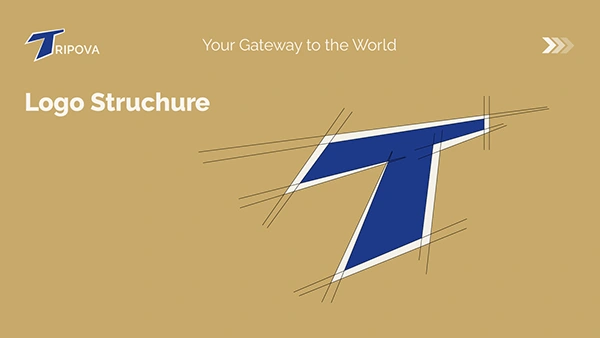
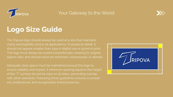
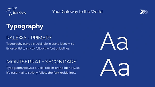
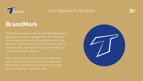
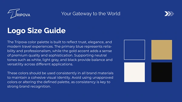
Tripova is a modern travel agency brand built around one idea — movement. The wordmark and its iconic angular "T" symbol draw inspiration from forward momentum, sharp direction, and the excitement of reaching new destinations. Bold yet approachable, the identity is designed to connect with travelers and inspire confidence from the very first glance. This project delivers a complete brand identity system: logo design and structural breakdown, light and dark background usage rules, size and clear space guidelines, a cohesive color palette, and a full typography pairing — all packaged into a ready-to-use brand guideline. The primary blue communicates trust and reliability — essential for a brand people hand their journeys to. The warm gold accent adds a sense of premium quality. Together they create a palette that feels confident, inviting, and distinctly travel-forward. Typography is led by Ralewa for display, supported by Montserrat for body text — a pairing that balances personality