Savisto – Minimalist Branding for a Food Distribution Company!
daud hasan
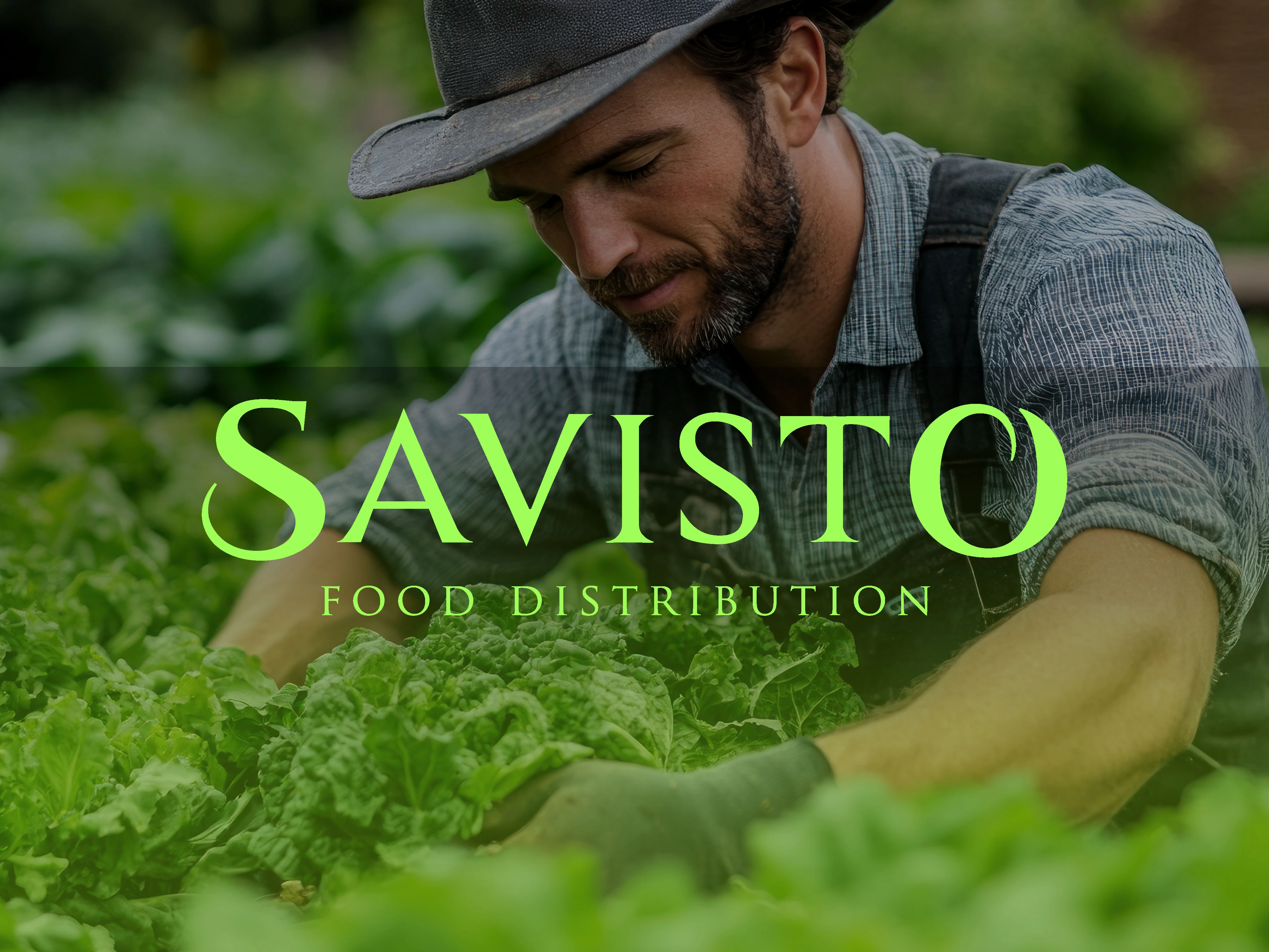
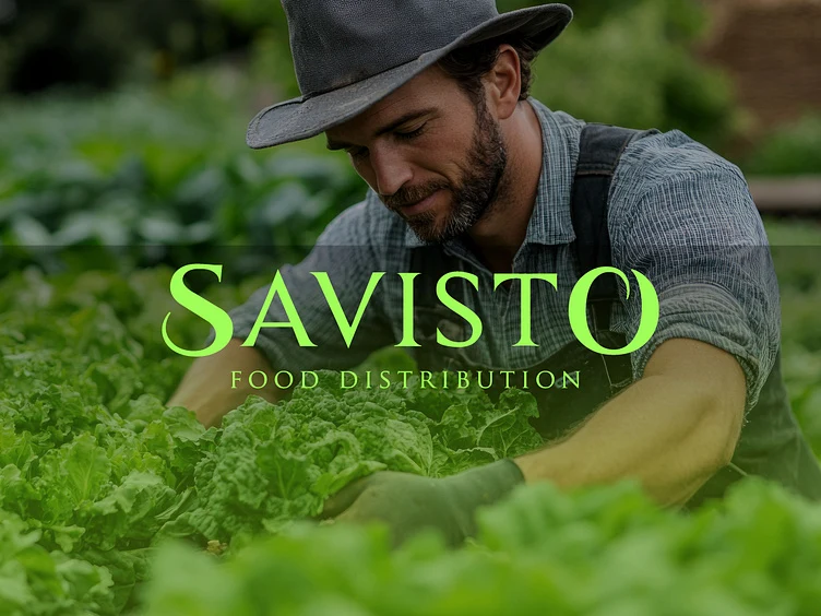
Savisto Food Distribution Logo & Branding – Professional Food Logistics Visual Identity
The Savisto logo and brand identity are expertly crafted for a modern food distribution company, combining elegance, clarity, and purpose. Designed with a minimalist aesthetic, this food logistics logo captures the essence of reliability, taste, and movement — key attributes in the food supply and logistics industry.
The brand name "Savisto" creatively merges "savor" and "logistics", symbolizing a company that delivers both flavor and efficiency. The sleek, serif typography adds a premium feel, while the unique curves in the "S" and "O" create a memorable and distinctive visual identity. This approach to food branding ensures that Savisto stands out in a competitive market.
From packaging and uniforms to delivery trucks and digital platforms, this visual identity for a food company is built to be versatile and scalable. The clean layout and balanced typography promote trust and professionalism—core values in the food logistics and distribution sector.
Whether you're launching a new food startup or rebranding an existing supply chain business, this identity is an ideal example of strategic and visually impactful food distribution branding. It reflects modern design standards while maintaining industry relevance, making it a powerful tool for brand recognition and growth in the food industry.
Your brand’s story starts with its logo!
Let’s make it
unforgettable!
DM me
your next iconic logo is just a message away!
Like this project
Posted Oct 12, 2025
Savisto Food Distribution Logo & Branding – Professional Food Logistics Visual Identity
Likes
1
Views
3
Timeline
Jul 12, 2025 - Ongoing