
UX & Product Designer | Framer Developer

UX & Product Designer | Framer Developer
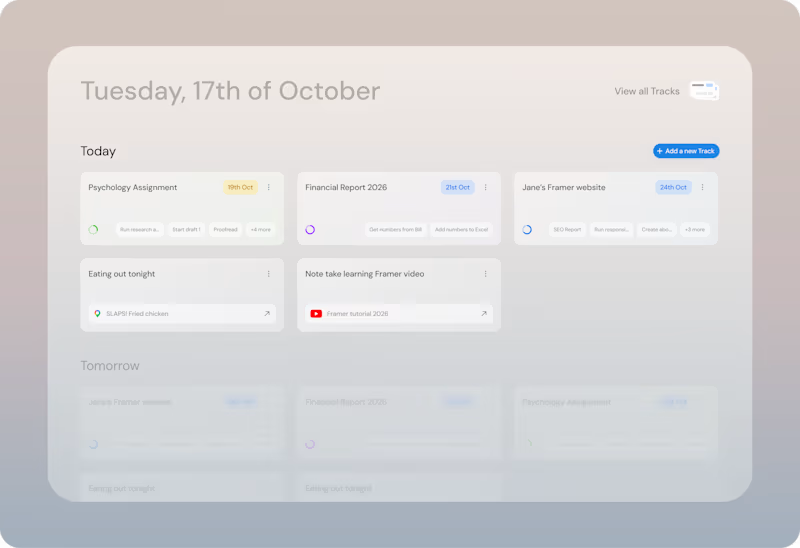
My thought process for Ontrack was to build a task app that made sense for how people keep track of the work they do.
Unfortunately, too many times most task apps forced you into a pattern of spending time micromanaging them over a seamless experience of keeping track of your goals and the work that needed to be done in a fashion that felt fluid and intuitive.
I designed Ontrack around that hypothesis yet I still ran into bottlenecks that blocked the aimed fluidity of a productivity app that felt truly useful.
To address the issues, I've been experimenting new approaches that push the limits of creating a frictionless experience, and a productivity app that actually helps you be productive without the overhead.
You can read about some of my research around Ontrack here: https://dilanomer.com/projects/ontrack-treating-task-paralysis
(https://dilanomer.com/projects/ontrack-treating-task-paralysis)Below, Ontrack as it currently stands, and a proposed version of addressing the current bottlenecks
4
1
86
I've used a number of task apps for almost a decade.
Yet, I still struggle with task paralysis on the daily regardless of the app or system I use.
I spent some time designing a theoretical, better approach to how we approach task management design which you can read about below:
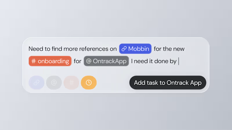
I'm working on the thinking behind the task capture by designing an interface for inline natural language processing to organise tasks.
Read more here: https://dilanomer.com/case-studies/treating-task-paralysis-with-fluid-task-entry-and-list-structure::
1
2
199

Web design and branding for startups & small businesses.
- 5.0
- Rating
- 20
- Followers
Web design and branding for startups & small businesses.
Day 13/30
For thirteen days I've been designing hero sections for companies that don't exist.
Today I'm sharing one for a company that does. Mine.
Studio Meva. Web design and branding for startups, small businesses, and everything in between.
The challenge was always pointed at this. Every brief taught me something I used here:
→ The carousel is the portfolio.
→ Big type, white space, nothing else. After weeks of lush photography I wanted the studio's own page to be the quiet one. If the work is colorful, the frame should be plain.
If you're building something and need a site that doesn't look like a template, my inbox is open.
Landing page pre-loader by Alireza Sinaei
1
1
86

Day 10/30 of my hero section challenge.
Today: Ofelia, a spa in Bali.
→ The wordmark sits at eye level, spanning the full width, cutting across the middle of the space. Here the type claims the room, and because the interior is symmetrical and calm, it can take the weight.
→ A high-contrast serif against soft plaster. The architecture is all curves and matte texture, so the type brings the only sharp edges in the frame. Contrast without adding a single element.
10 down, 20 to go. A third of the way.
Template by Hariom, adapted and customized by me. Interior imagery generated with AI.
10
28
1.4K
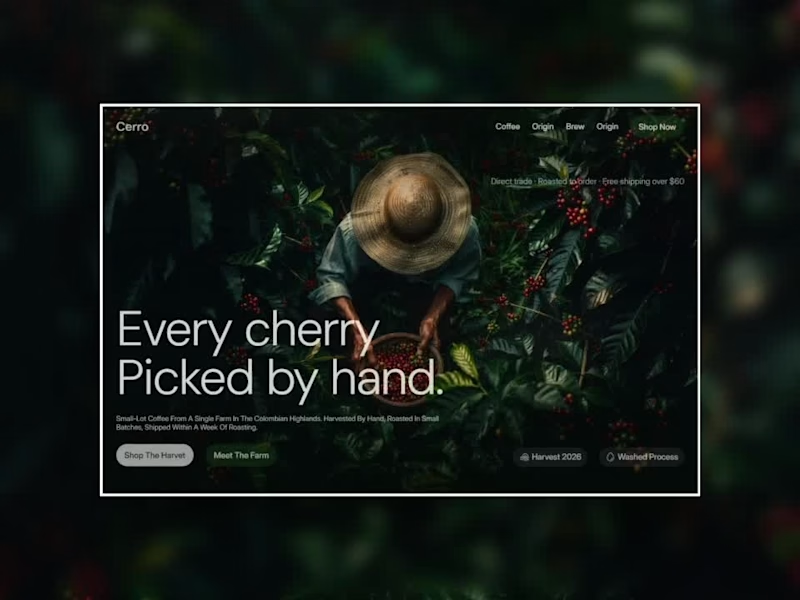
Day 8/30 of designing one hero section every day.
Today: Cerro, a single-origin coffee brand. And after three days of building reveal mechanics, this one has almost no interaction at all.
→ The photograph is the design. An overhead shot of a picker at work, dark glossy foliage, red cherries. My only job was to not get in its way.
→ The light does the layout for me. The image funnels attention to the center, so the type sits in the shadowed edges where it doesn't compete. No scrims, no overlays needed.
→ The only motion is an entrance: the wordmark alone on empty plants, then the picker fades in.
Credits: Arbi Khan for the template
Image: Google Nano Banana
Built in Framer
8 down, 22 to go.
10
34
1.1K
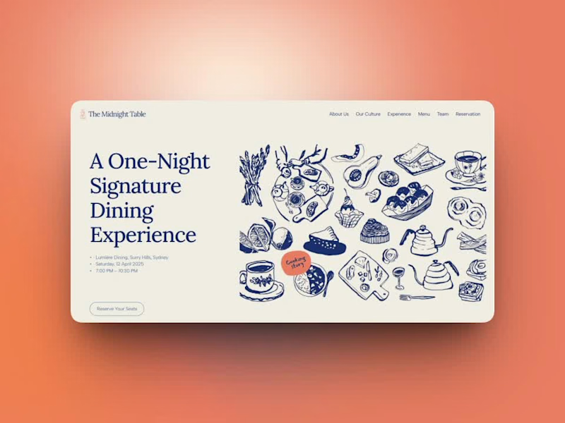
Day 7/30 of designing one hero section every day.
First, some honesty: "every day" hasn't happened. I started this challenge 13 days ago, and this is post 7, real life kept turning it into every other day. I'd rather say that plainly than quietly hope nobody counts. From tomorrow, I'm aiming for daily again.
But here's what I've learned already: showing up on an imperfect schedule beats abandoning a perfect one. Each of these seven has taught me something a tutorial couldn't.
Today: The Midnight Table — a one-night-only signature dining experience.
→ My first hero with zero photography. Everything is hand-drawn ink illustration on cream — plates, kettles, pastries, a whole tabletop of them. (Credits: magnific) When every restaurant site reaches for moody food photos, illustration instantly reads as "this event is different."
→ Ink blue and cream, one coral accent.
7 down, 23 to go- at whatever honest pace it takes😊
#webdesign #uidesign #herosection #30daychallenge #illustration #typography #designchallenge
4
19
331

Award-winning agency specializing in design and development.
- 5.0
- Rating
- 39
- Followers
Award-winning agency specializing in design and development.
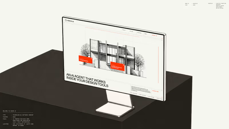
Heron AI is an agent that reviews architectural models and flags building code problems. The hardest part of the brief was making that legible in the first few seconds.
We built the hero as a small interaction instead of a statement. The visitor drags across a black and white building sketch and violations surface where they drag, annotated with real IBC clauses. It puts the person in the agent's position for a moment.
Everything after that section can then talk in normal product language, because the core idea has already landed without needing to be described.
4
4
558
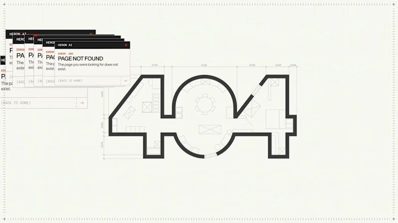
The 404 was treated as a proper page rather than a fallback state.
The number is constructed as an architectural drawing. The 4 and the 0 are formed from walls at true thickness, with furniture laid out inside the resulting rooms and dimension strings running along both edges. It sits inside the same drafting system as the rest of the site rather than borrowing a display typeface.
The error message then repeats. Instead of a single dialog, identical windows cascade back across the canvas, each one carrying the same 404 notice. It reads as a system throwing an unresolved warning over and over, which is the exact behaviour Heron is built to prevent inside a model.
Error pages are never in the brief. They're a good measure of whether a team understood the product or just styled it.
11
11
1K

United Carriers serve sectors with genuinely different requirements, from pharmaceuticals to automotive to retail. The industries hero establishes that range before the page goes into specifics.
The hero uses a wide, cinematic frame to signal breadth, then hands off into a structured layout where each sector gets its own handling detail. The intent is to make a broad capability feel specific rather than generic, which is the usual failure mode of an industries page.
3
178

Logistics is usually sold on scale: fleet numbers, port coverage, capacity. We wanted the team section to argue the opposite point, that the service is delivered by people making judgement calls.
The layout gives each person real presence rather than compressing the team into a thumbnail grid. Portraits are treated at a size that holds attention, with hover states revealing role detail. It's a small section that does a lot of work for trust, especially for a business where clients hand over cargo worth a great deal of money.
1
3
177

✨ Creative Minds, Seamless Solutions—Let’s Build Together
✨ Creative Minds, Seamless Solutions—Let’s Build Together




Creating efficient, impactful systems and designs.
Creating efficient, impactful systems and designs.



Brand & Web design that makes your product unforgettable


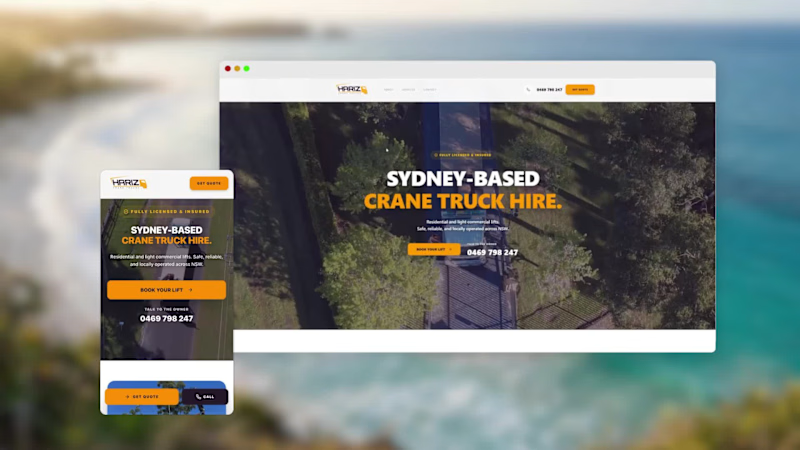
Recent Web design and branding work for a client with a crane truck business. I was lucky enough to be a part of the strategy process and have seen this business grow massively over the last 6 months.
To be a part of the growth and having contributed parts of the brand like the logo and website has been a really rewarding experience and I look forward to doing similar projects in the future!
https://hariz-crane-trucks.vercel.app/
0
89


Conversion-Focused Web & Product Designer


View more →

Fast & Flawless UI Design with Wix Studio
Fast & Flawless UI Design with Wix Studio


View more →