




Meet yuzu, a luxury women’s perfume built around warmth and light. The identity starts with a honey glass logo that looks poured, then carries the same golden glow through the bottle, the model and every frame.
The campaign pairs a framed portrait with a close up of hands cradling the bottle. A round glass sphere, golden liquid, a faceted black cap and soft amber light give the whole project a feeling of liquid sunshine.
Yuzu is a concept project for a fictional brand. I’m Manav, a 3D and AI creative director making CGI, fashion and product films for brands. If you have a launch in mind, message me.
2
3
245





SPEAKER — A Study in Quiet Luxury
I wanted to explore a different side of speaker branding, moving away from the usual loud, tech-heavy look and creating something calm, refined, and timeless. Inspired by minimalist editorial identities like MORROW, I developed a visual direction built around warm cream tones, subtle champagne-gold accents, elegant typography, and sculptural speaker forms.
The SP monogram connects the identity to the product itself, while the packaging and material details bring the entire concept together. My goal was to make a speaker brand feel less like consumer electronics and more like a considered piece of luxury design.
Designed to be heard. Created to be felt.
1
68
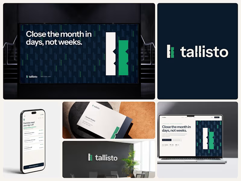
Tallisto: brand identity for an AI accounting SaaS that closes the monthly books. A concept project.
The mark comes from a medieval tally stick. In 12th-century England a debt was recorded by cutting notches into a stick, then splitting it in two. Each side kept a half, and if the halves matched, the books agreed.
That is what Tallisto's agent does. It matches every bank line to the ledger, and a person signs it off. So the logo is two sticks, the stock and the foil, carrying the same two cuts.
One rule holds the system together: Lamp Green only appears where a person has approved the agent's work. It's never used on buttons or as decoration.
The rest is calm on purpose. Ink and Paper as the base, Instrument Sans for words, JetBrains Mono for figures, and a "ledger of tallies" pattern that never sits behind text. You can see it here on the website, the close dashboard, a mobile sign-off screen, business cards, an office wall and an Underground poster.
Would a finance team trust a tool more if its logo had a reason behind it, or do they only care about the numbers?
I design brand identities and build them into Webflow sites. Open to SaaS and fintech projects.
4
1
284