

Product & Motion Designer | Rive Expert

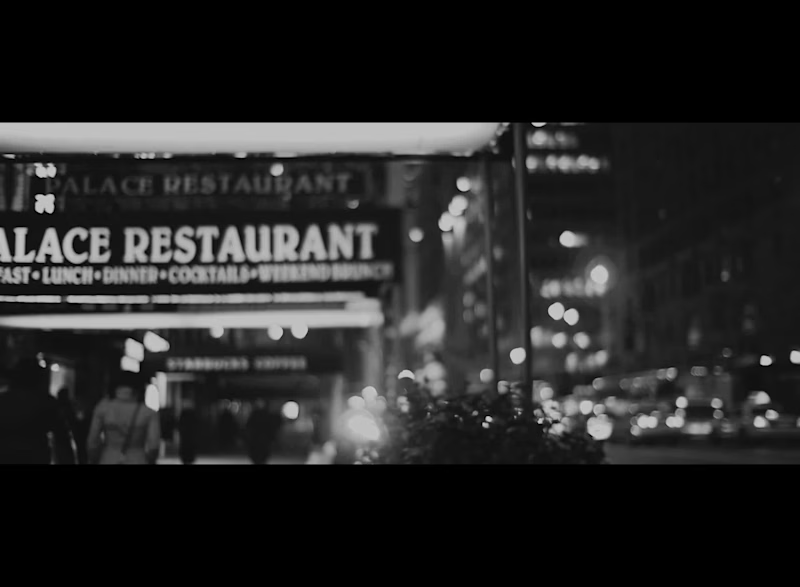
Velvet Revolution is a platform where independent musicians sell directly to the people who actually listen — releases, tickets, merch, memberships — and keep almost all of it. The name comes from the 1989 uprising that toppled a government without a shot fired, pushed along by underground bands and a playwright. Same idea here: an artist doesn't need a million passive listeners, she needs 800 people who show up.
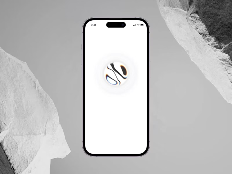
The branding and the product are one system. The black circle holds still while the city moves behind it — in the UI it becomes the container for everything. All imagery is desaturated on upload, and colour appears in exactly one place: money. The artist side is a dense workspace for pricing releases and reaching buyers directly. The fan side is deliberately bare — no likes, no follower counts, no infinite scroll.
I'm currently designing the UI/UX of the product. The platform is still in development, so for now I'm only sharing the title opening — a short teaser built around the name.
2
304

Websites & Landing Pages for B2B & B2C companies.
- 5.0
- Rating
- 1
- Followers
Websites & Landing Pages for B2B & B2C companies.

Web and Product Designer | 10 years exp.
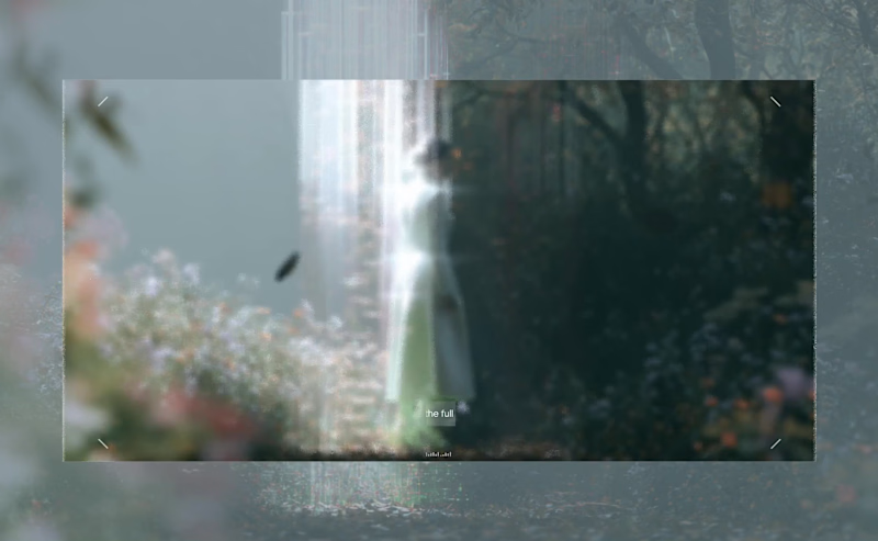
Three souls. One fractured world. A crack in the Veil that should never have opened. Some stories don't begin with a hero. They begin with a mistake.
Veilborn FUI exploration
1
2
124


I build visual identities and websites for SaaS and fintech
- 14
- Followers
I build visual identities and websites for SaaS and fintech

Excited to share something cool for a verification project in the Web3/Crypto world, we are also working on a dapp for this.
The design is based on the idea that the watchdog is known for security, alert, resilience, trust (you can basically trust your life with a well-trained dog), and the elements of the mark will be strongly used around for backgrounds, patterns, sub-graphic collections, and more. So excited.
Wait until Q1 ends; more are coming out soon.
1
129

Progress thinking is the new UI design.
You know how sometimes you build something fast to get moving?
That was us with Real’s first UI components (you know the cards, blocks, etc.)
It looked clean, it worked, and honestly, it was perfect for v1.
They blended too much into the background. No depth. No hierarchy. No sense of what matters more.
So we rebuilt the whole thing.
We added light, subtle gradients, a bit of glow, and brought in the 3D sphere that’s part of Real’s identity.
And the funny part?
Same content… totally different experience.
Now the cards lift off the page. They feel intentional. You immediately know where to look. It’s like giving the interface a bit of personality.
Developers usually bring logic.
Designers add feeling to that logic.
We at 2x22 studio call it the sweet spot.
2
17
167


Website & app design, development, and brand identity.
Texim Holding is a Bulgarian family business with a remarkable history stretching back to the 1960s, connected to one of the country’s most influential business stories.
My goal with the website was to transform that history into a modern, immersive digital experience rather than a traditional corporate website.
The design combines strong typography, archival photography, editorial layouts and a long-form interactive timeline to guide users through Texim’s story — from its early years and international expansion to the company it is today.
A major focus was balancing heritage with a contemporary investment identity, giving the historical content enough space and character while keeping the overall experience clean, premium and forward-looking.
The result is a website that works both as a company presentation and as a digital archive of the Texim story, connecting its past, present and future through one consistent visual experience.
2
183
NEWMA is a Swiss fintech and private wealth company built around a young, ambitious founding team and a vision to rethink how technology, trading and wealth management come together.
I worked on the project during my time at Studio Rubik, where our team helped shape NEWMA from its early stages into a complete and recognizable brand.
My involvement focused on the brand identity, visual direction and digital experience, helping translate the company’s vision into a contemporary identity that could work across its website, platform, communication and wider brand ecosystem.
The project later reached an international audience, with NEWMA showcased in Davos during the World Economic Forum 2025, alongside its growing presence across Switzerland and other international markets.
It was a great opportunity to work on a fintech brand from an early stage and help build a visual identity capable of growing alongside an ambitious young company.
2
251
Hi there, Here is another one of my projects - Brain Trust Real Estate. Brain Trust (https://www.braintrust.bg/) is a real estate company with more than 15 years of experience in the market, with listings in all major continets and this project started with one clear goal - to completely refresh the brand and bring its digital presence up to the same level as the business itself.
The project included a full rebrand, visual identity, website design, and app design and development, creating one consistent experience across every touchpoint.
My role was to shape the new visual direction of the brand and translate it into a modern digital system - from the identity and graphic language to the website, property platform, and mobile app.
The result is a cleaner, more premium and contemporary real estate brand, designed to feel trustworthy, established, and easy to use across both desktop and mobile.
Website
(https://www.braintrust.bg/)Google play
(https://play.google.com/store/apps/details?id=bg.braintrust.app)App Store
(https://apps.apple.com/bg/app/brain-trust/id6783337753)
1
267

I move pixels for a living


Cinema 4D / Unreal Engine / After Effects / Motion Design


UX/UI Designer & Design Director


