Bling: a new era for your wellbeing | Landing page
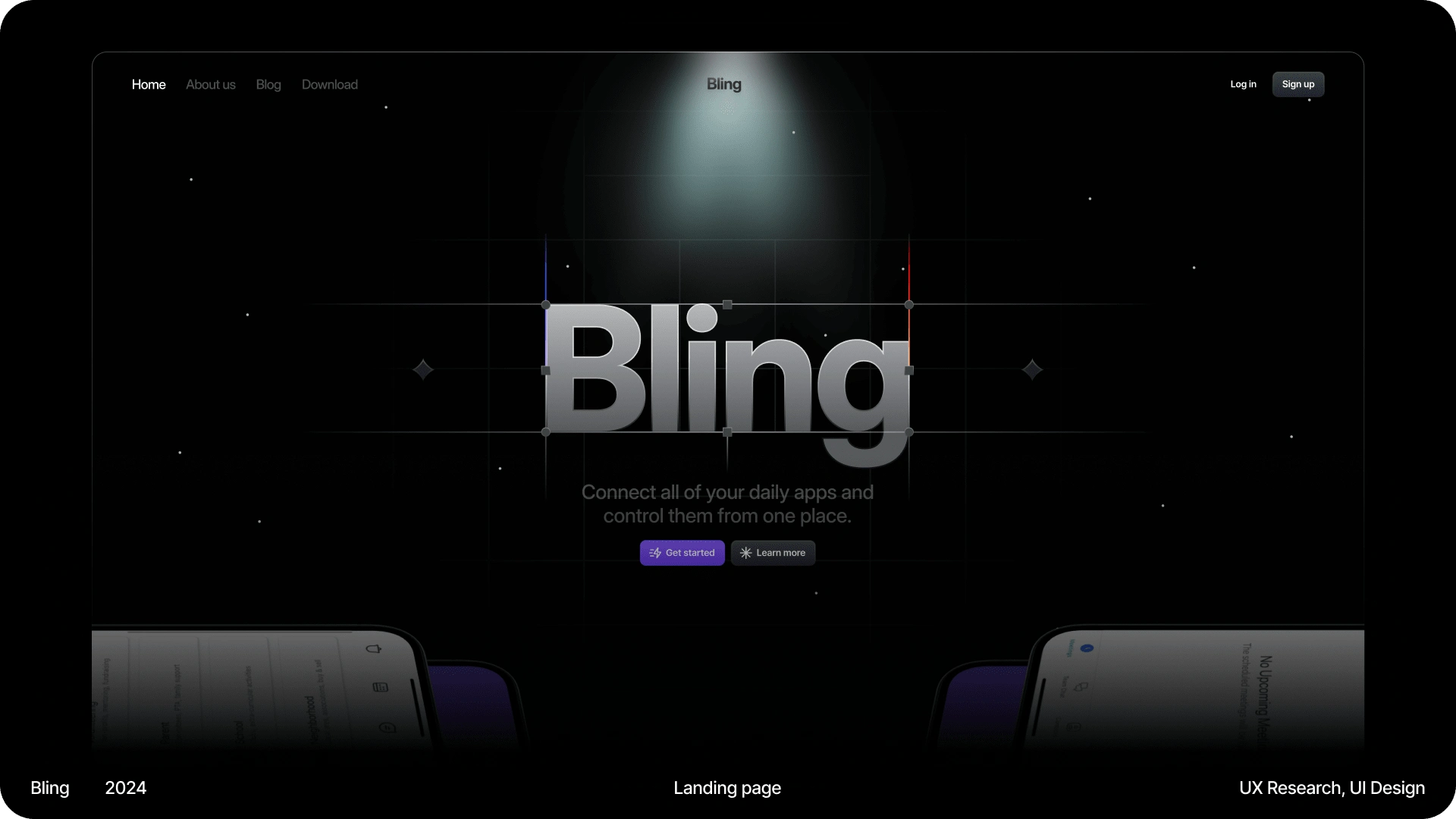
Case study cover
⁉️ What is this all about?
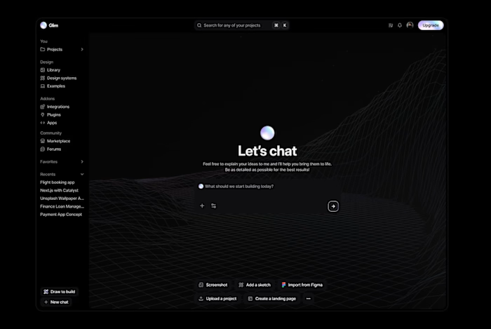
As was mentioned in the previous project, Bling is the passion project that I've always came back to, whenever I had the free time. For the longest time I never managed to quite finish it, but I finally did. And then I had the urge to create a landing page for it to showcase what it can do, and, well, I'm still working on materializing this one too.
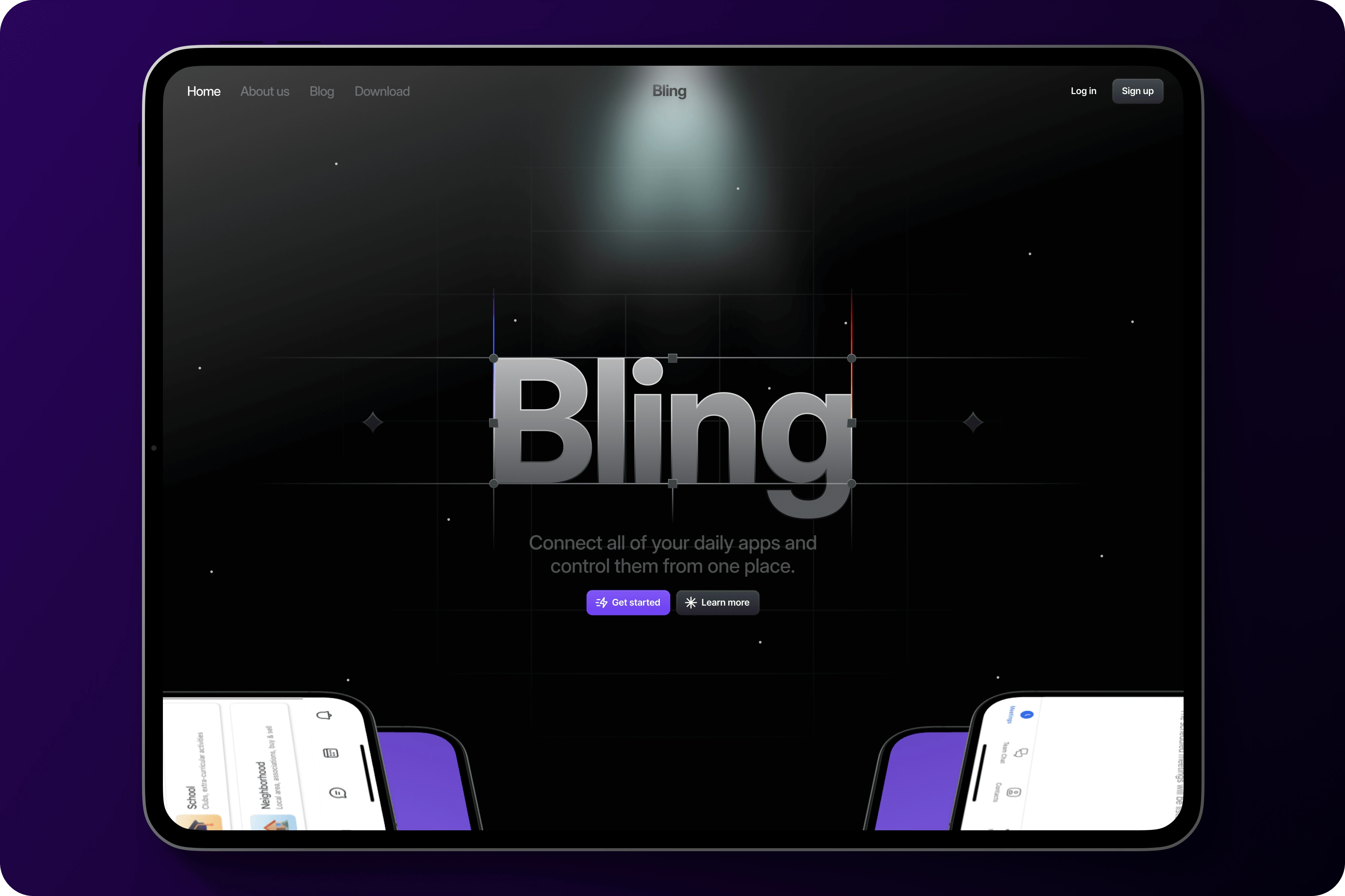
Landing page on iPad Pro
💠 How it started
Our journey began by realizing that our current digital experiences often overwhelm us with a multitude of disjointed apps, slowing down our productivity and causing us frustration. Wanting to address this challenge, our team came up with a solution that would integrate daily digital tools into a unified platform. With a keen focus on the landing page, we set out to create an immersive experience that would effectively showcase the app's innovative features while captivating users from the moment they arrive.
🎯 Goals
The primary objective for our landing page was to provide users with a compelling introduction to the app's functionalities in a concise and engaging manner. Through interactive elements, illustrations, and mockups, we aimed to offer a hands-on preview of how the app seamlessly integrates various daily tools into a single dashboard. Additionally, we sought to establish a strong brand identity through a space-themed design language, setting the tone for the futuristic and user-centric experience that awaits within the app.
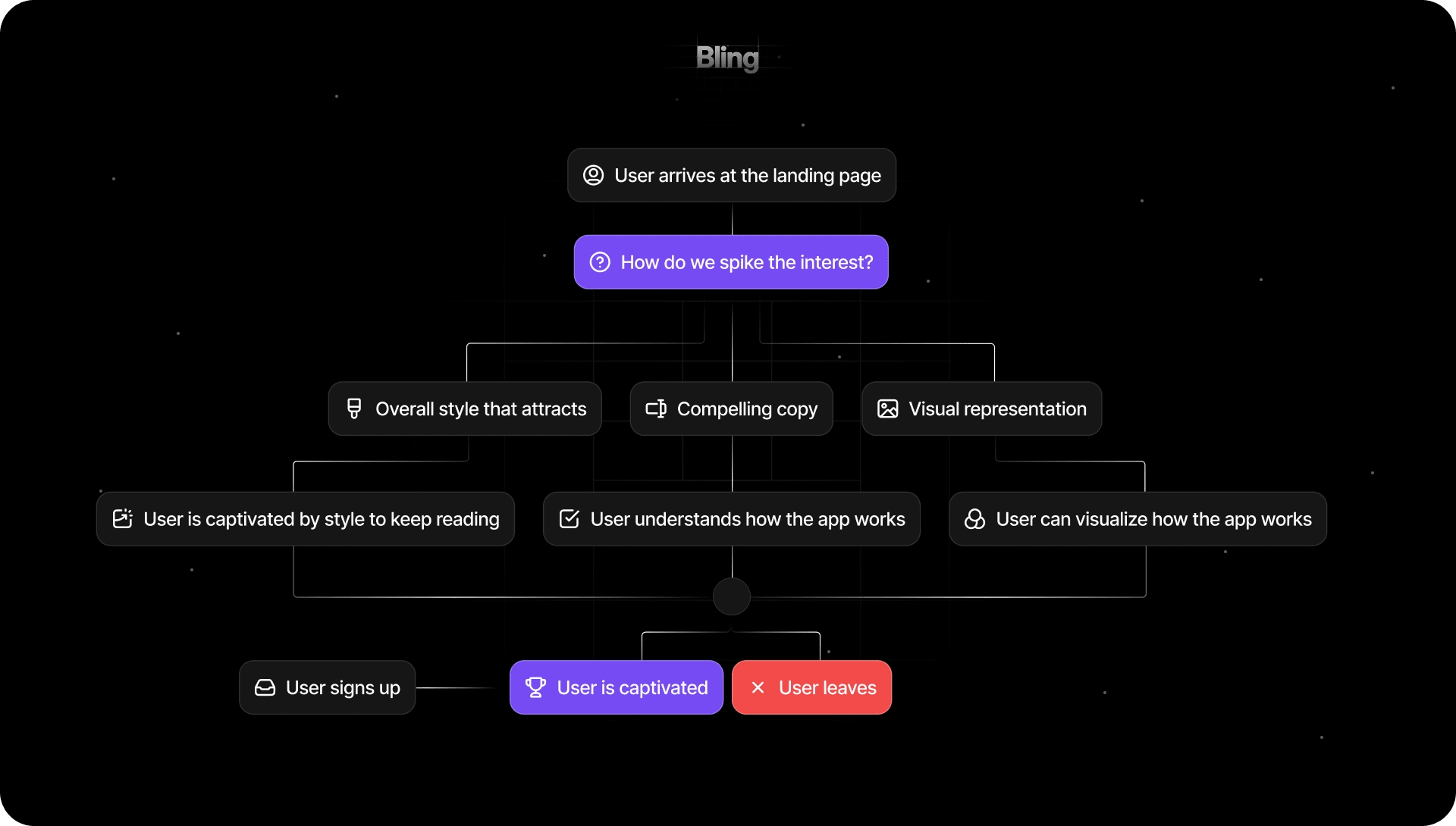
Map on how the user might perceive the landing page
🪫 Challenges
Crafting a landing page that effectively communicated the app's features in an interactive and visually appealing way presented several challenges. We grappled with the task of distilling complex functionalities into easily digestible snippets that would resonate with users at first glance. Additionally, ensuring seamless integration between the landing page and the app itself required careful attention to detail and coordination between design and development teams. Balancing creativity with usability posed another challenge, as we aimed to strike the perfect balance between captivating visuals and intuitive navigation.
🏹 Strategy
Our strategy for the landing page centered around creating an immersive and interactive experience that would captivate users from the moment they arrived. We employed a combination of illustrative elements, animations, and mockups to guide users through the app's key features in a hands-on manner. By providing users with a glimpse of the app's functionality through engaging visuals, we aimed to pique their curiosity and encourage further exploration. Iterative design and user testing played a crucial role in refining the landing page, ensuring that it effectively communicated the app's value proposition while delighting users with its futuristic aesthetic. Through a collaborative and iterative approach, we successfully created a landing page that serves as a compelling gateway to our innovative app, inviting users to embark on a journey towards a more streamlined and efficient digital experience.
📈 Trends
🤔 How do users feel about the landing page?
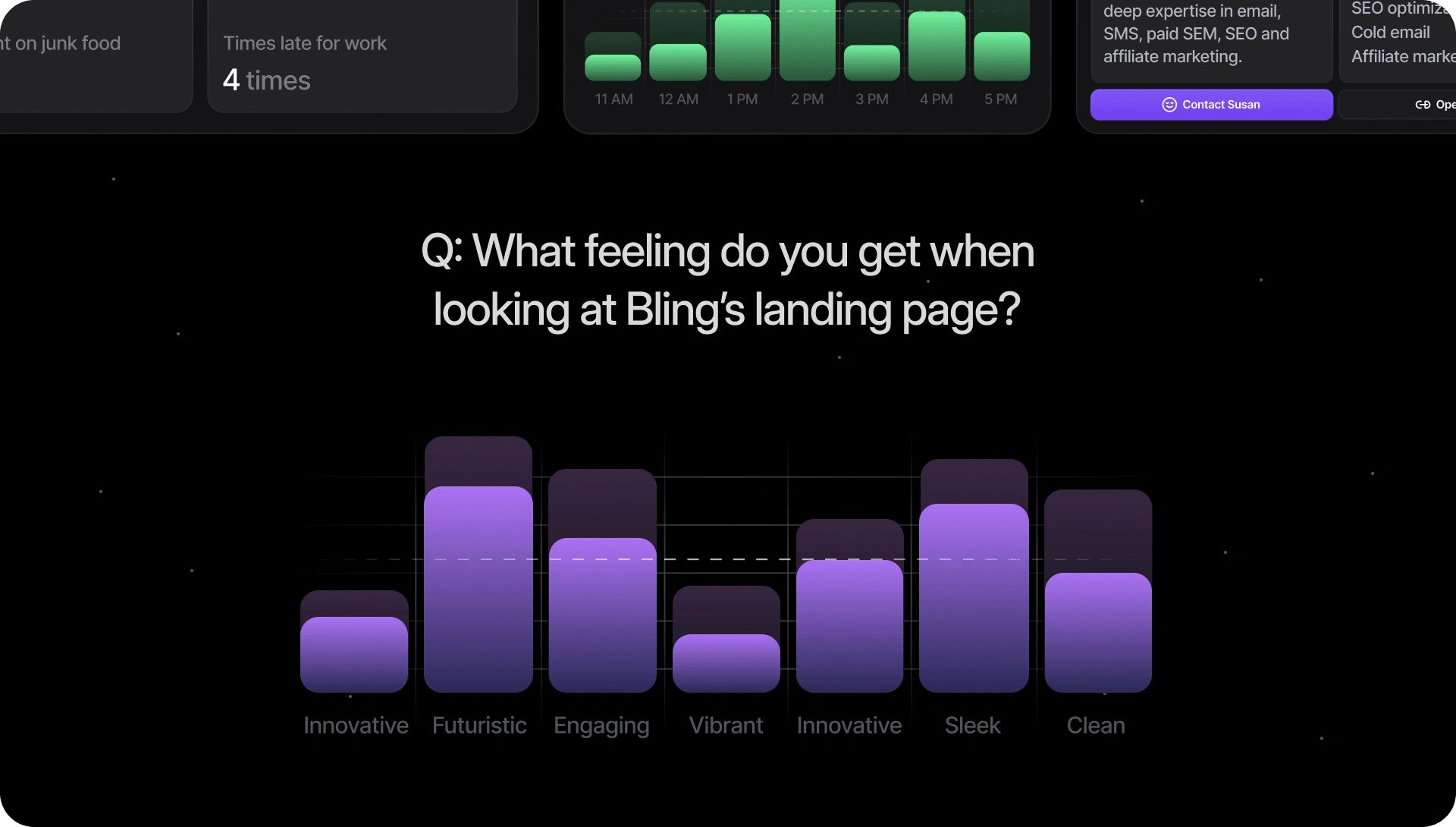
Survey in relation to the feel that users get upon seeing Bling's landing page
The user study on Bling's landing page revealed that respondents overwhelmingly perceived it as futuristic and sleek, embodying a cutting-edge aesthetic that resonated strongly. Furthermore, users described the page as engaging, suggesting that its design successfully captured their attention and encouraged further exploration. The repeated mentions of innovation indicate that users perceived Bling as a forward-thinking and novel solution within the digital landscape. Additionally, descriptors such as clean and vibrant suggest that the landing page conveyed a sense of clarity and dynamism, further enhancing its appeal to users. Overall, these findings highlight the effectiveness of Bling's landing page in evoking positive emotions and conveying its innovative value proposition to users.
🖤 What did they like best?
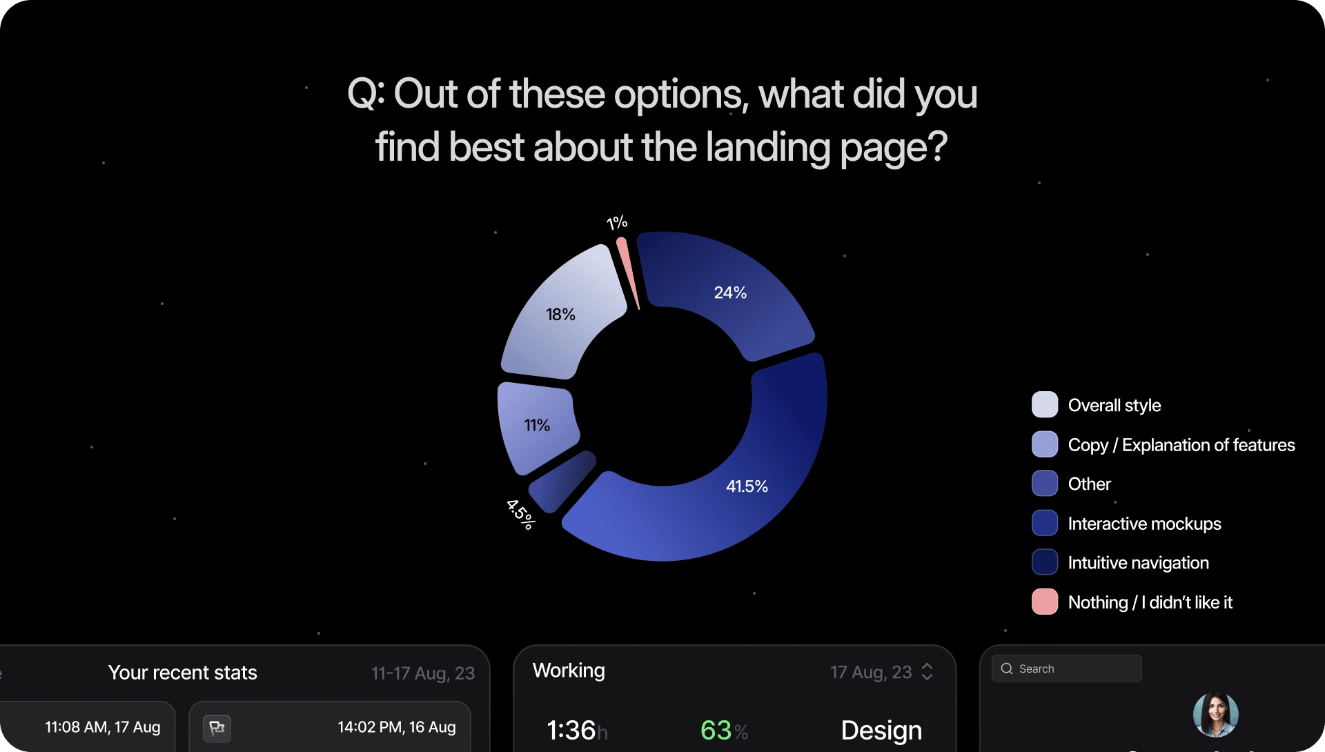
Survey in relation to what users liked the most in the page
The study on user preferences regarding Bling's landing page revealed that a significant majority, 41.5%, found interactive mockups to be the standout feature, indicating that users highly valued hands-on demonstrations of the app's functionality. Intuitive navigation followed closely behind at 24%, highlighting the importance of seamless user experience in driving engagement. Additionally, 18% of respondents appreciated the overall style of the landing page, suggesting that the visually captivating design played a crucial role in attracting and retaining user interest. While a smaller percentage found value in the explanatory copy detailing features, it's evident that the combination of interactive elements, intuitive navigation, and visually appealing design contributed to the landing page's effectiveness in engaging users.
📷 Shots
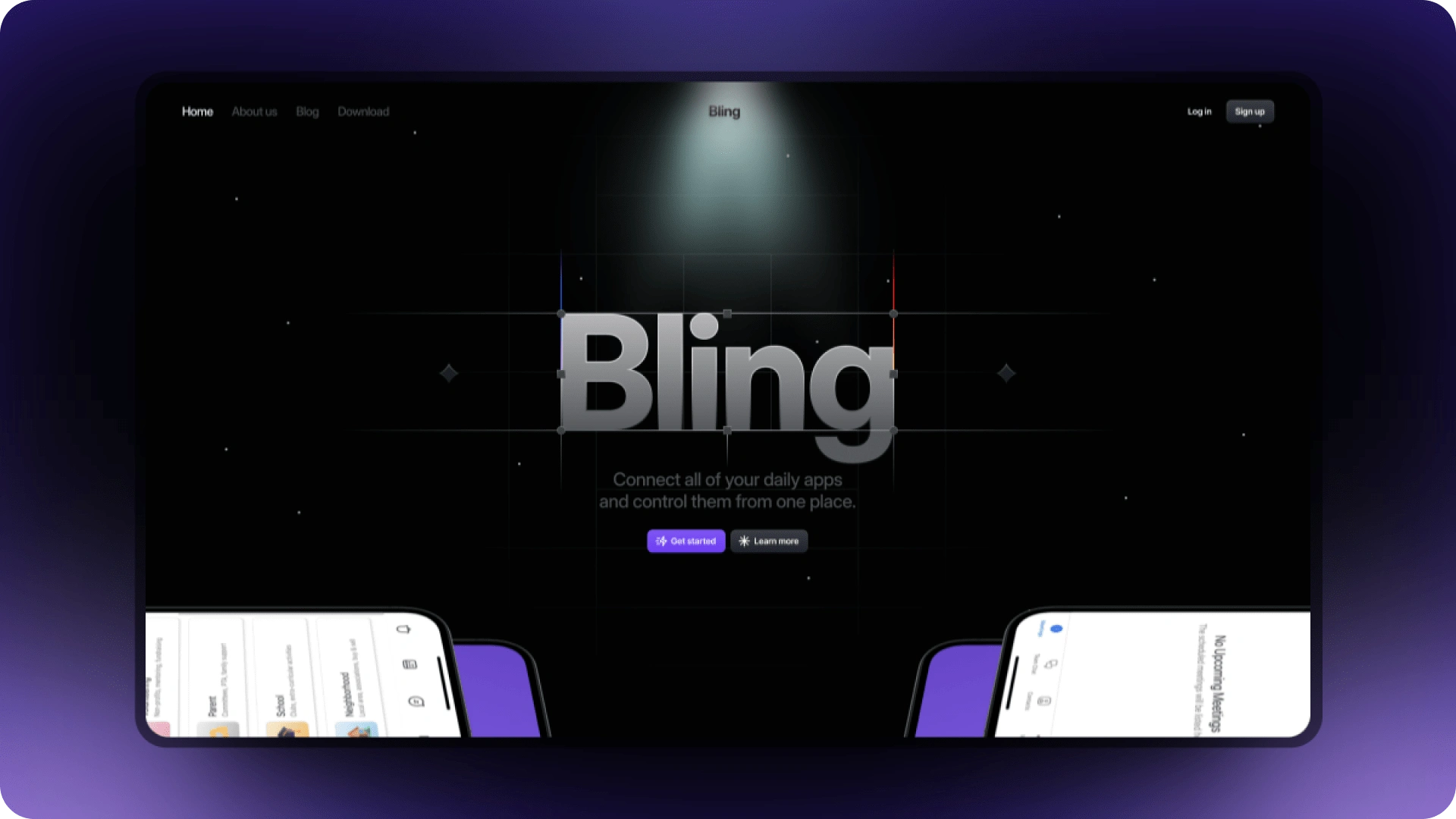
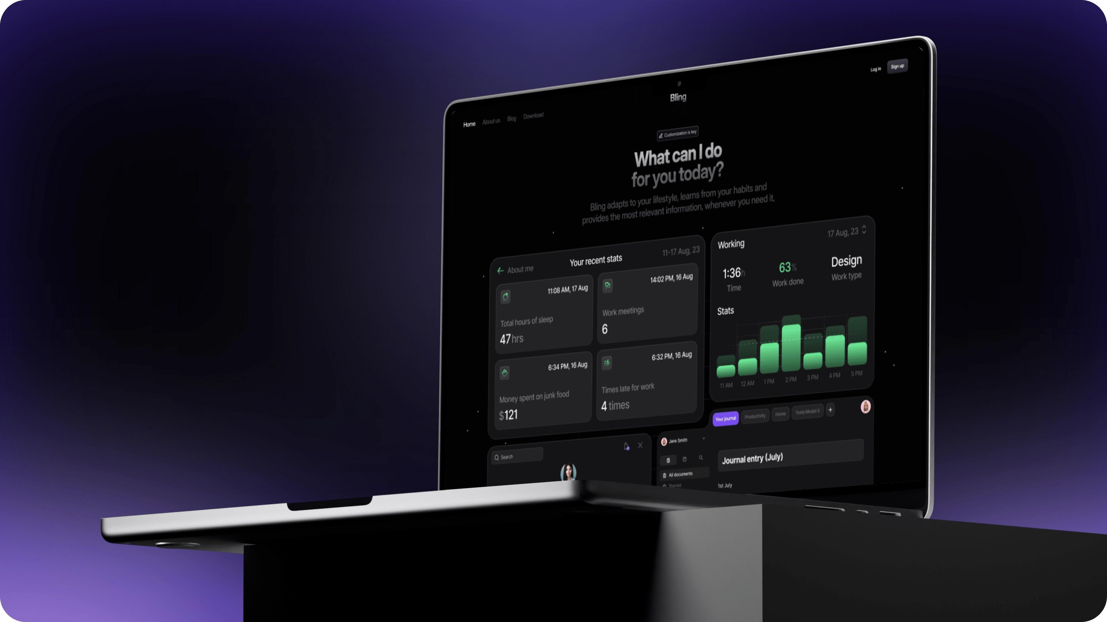
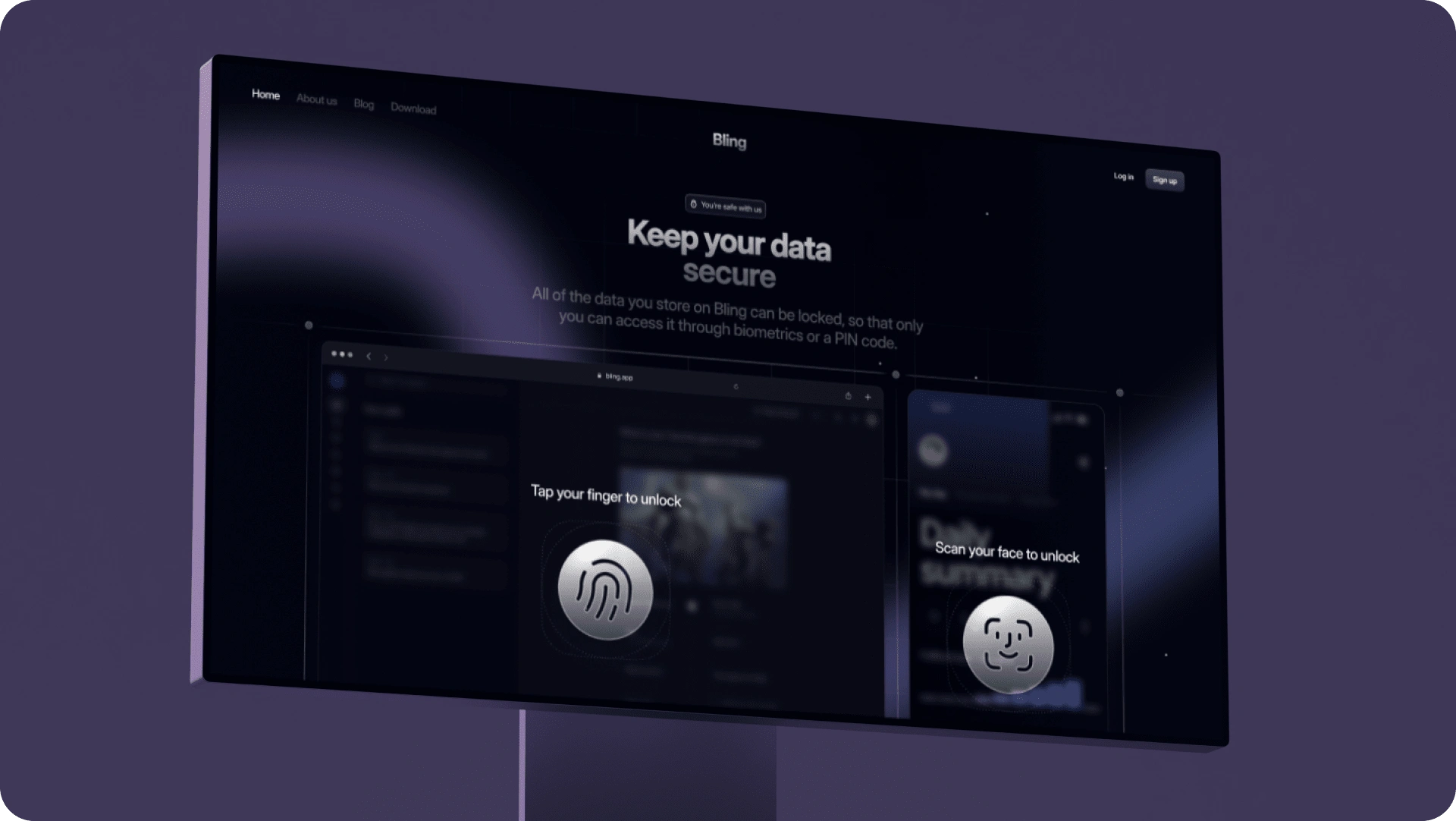
🎨 Final design

The full Bling landing page
🎊 The end!
Like this project
Posted Feb 12, 2024
The realization that our current digital experiences often overwhelm us with many disjointed apps motivated us to come up with a solution - meet Bling.

