Ad Creatives Designer and CAPI specialist
Ad Creatives Designer and CAPI specialist

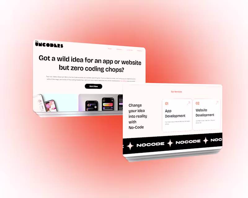
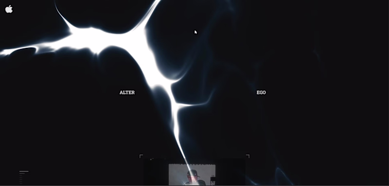
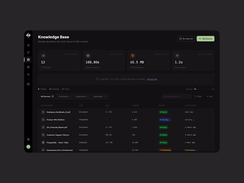
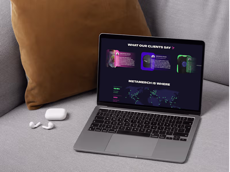
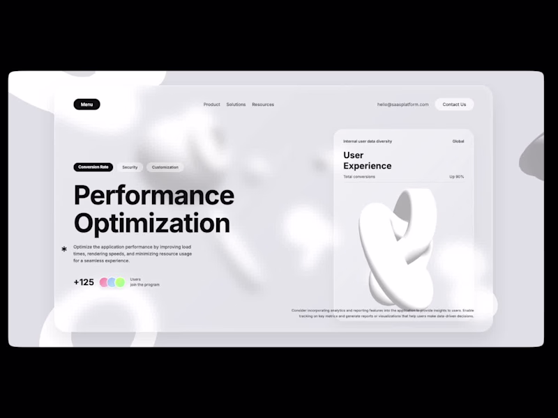
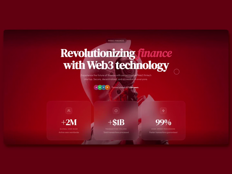
NoCode Pioneer: Stunning UI/UX Apps & Websites
- $50k+
- Earned
- 38x
- Hired
- 5.0
- Rating
- 62
- Followers
NoCode Pioneer: Stunning UI/UX Apps & Websites
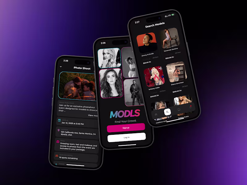
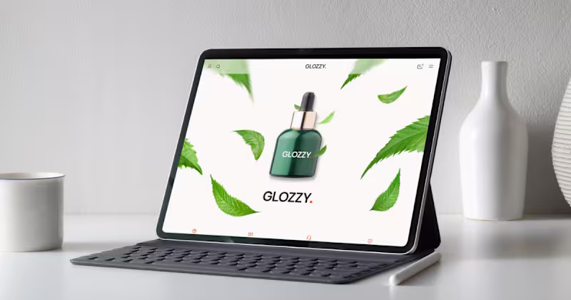
Framer Designer • React Web & Mobile Developer
Framer Designer • React Web & Mobile Developer

Designing and developing apps, websites and dashboards.
- $5k+
- Earned
- 1x
- Hired
- 5.0
- Rating
- 11
- Followers
Designing and developing apps, websites and dashboards.

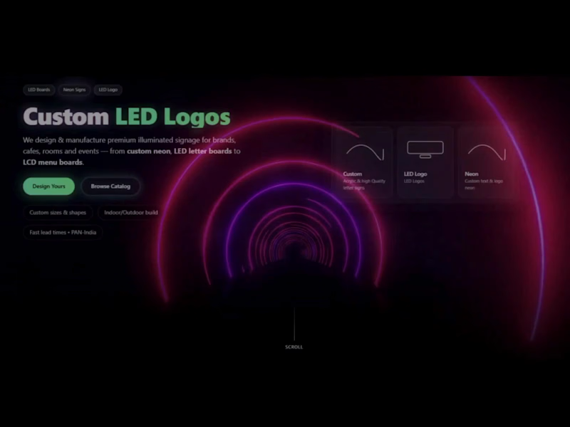
Designing sleek websites that wow-powered by Figma & Framer
Designing sleek websites that wow-powered by Figma & Framer


I build fast Framer sites that convert 2–3× more
I build fast Framer sites that convert 2–3× more

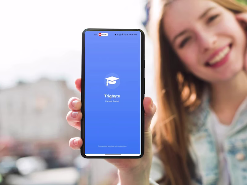
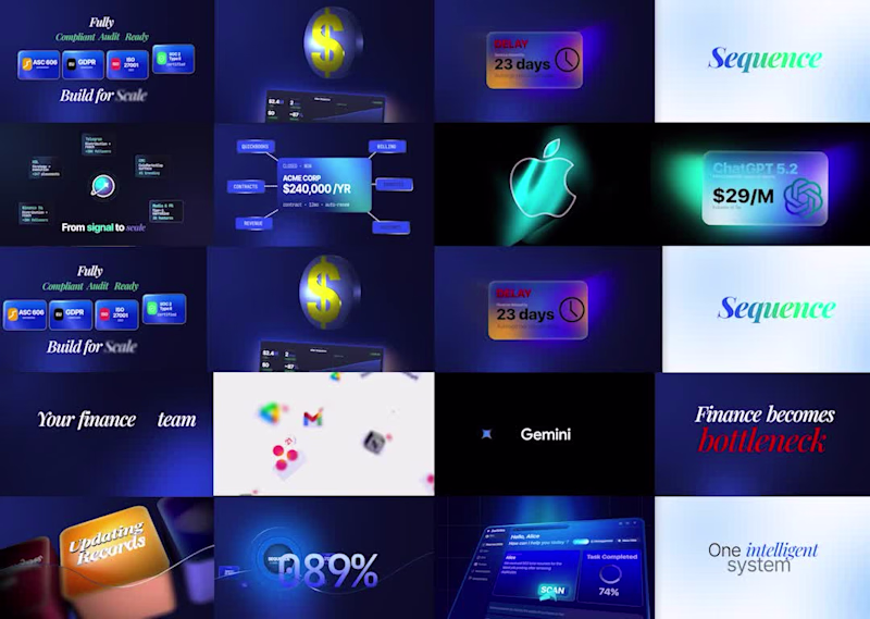
I create SaaS videos that drive clarity, action and growth
- 1x
- Hired
- 5.0
- Rating
- 18
- Followers
I create SaaS videos that drive clarity, action and growth
Video Editing & Thumbnail design for social media
Video Editing & Thumbnail design for social media