
Product & Brand Designer | UX/UI, Websites & Identity


20 years experience in sites lowcode UX, UI, and branding
- 14
- Followers
20 years experience in sites lowcode UX, UI, and branding


When century-old tradition meets Japanese precision 🇧🇷🇯🇵
Cachaça Nara was born from an extraordinary challenge: to create a brand that would honor deep Brazilian roots while incorporating the sophistication and rigor of Japanese processes.
A farm from 1886. The only Nara oak plantation in Brazil. A spirit that needed to transcend categories and create its own narrative of excellence.
We built from concept to packaging an identity that translates omotenashi, the Japanese hospitality that values every detail, every stage, every tasting moment.
The result is a brand that doesn't compete on shelves, but creates its own territory of sophistication and authenticity.
See the full case at www.yuza.com.br (http://www.yuza.com.br) 🥃
10
94


Creating a brand for a law firm is already challenging. With strict legal limitations, the challenge multiplies. ⚖️
For Davián & Sestini, we developed a monogram that unites the partners' initials while simultaneously referencing digital and fashion, the firm's areas of specialization.
The result is a sophisticated identity that navigates the legal sector's restrictions without sacrificing personality and contemporaneity.
See the full case at www.yuza.com.br (http://www.yuza.com.br) 🏛️✨
13
113

Brand designer | Visual identity, social media & websites
Brand designer | Visual identity, social media & websites
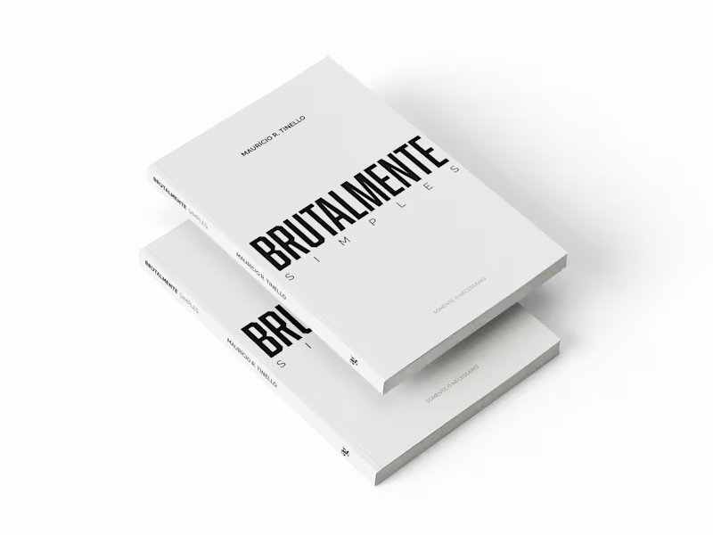
Book Cover Design | "Brutalmente Simples" (Brutally Simple)
Book cover design for a Brazilian business consultant with 40+ years of experience. The book, "Brutalmente Simples," teaches entrepreneurs how to simplify their operations for better results.
The concept was built around contrast: bold, clean typography that reflects the book's core message. If the method is about cutting complexity, the cover had to feel that way too. No clutter. No decoration. Just clarity.
Scope: concept development, typography, layout, print-ready file.
0
99
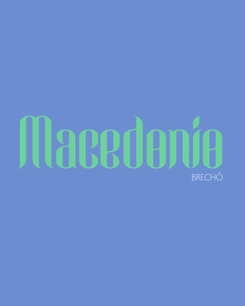
New brand, new energy 🌿
Macedônio Brechó came to me needing an identity that felt as intentional as the clothes on their racks — something warm, a little vintage, unmistakably theirs.
We built it from the ground up: logo, pattern, color palette, and every physical touchpoint that makes a brand feel real — bags, pins, badges, apparel.
Full case study on my profile.
0
89


Strategic Branding for Design-Driven Brands ✨
Strategic Branding for Design-Driven Brands ✨


Brand Strategist


View more →

Brand identity & websites for startups


Designer of unique brands.
Designer of unique brands.


Ready to bring your dream brand to life? Let’s do it! 🪩
Ready to bring your dream brand to life? Let’s do it! 🪩


