Free Hands | Brand Design
Rafaela Giani
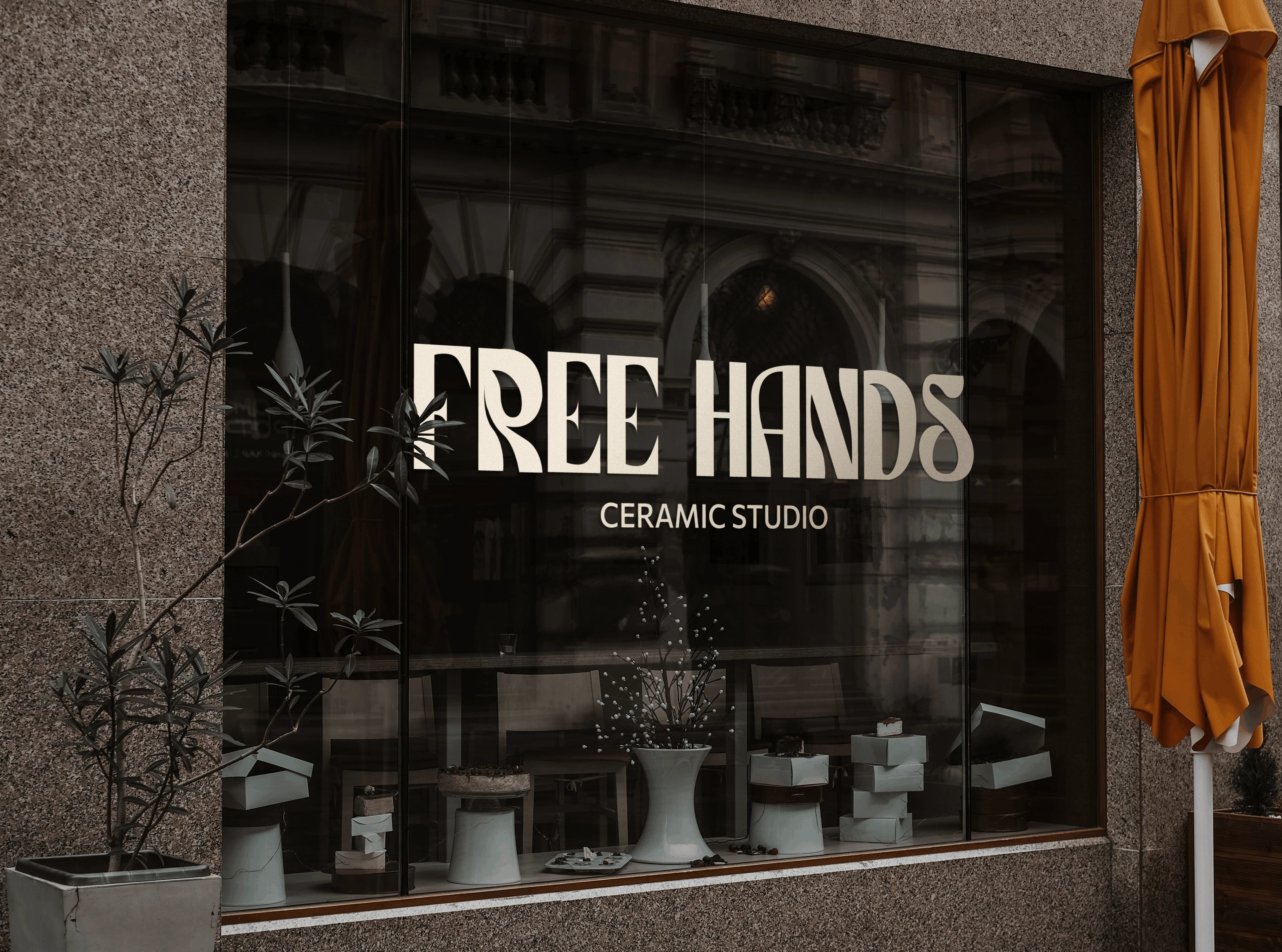
Free Hands – Shape the moment.
Free Hands is more than a ceramic studio—it’s a sanctuary for self-expression. A space where time slows down, and your hands become the storytellers. Here, creativity is about feeling, experimenting, and embracing imperfection. The colors, the textures, the rhythm of your movements—all come together in a process that is uniquely yours. No rush, no pressure—just you, the clay, and the art of being present.
[PT]
No meio da rotina corrida, o Free Hands Ceramic Studio é aquele respiro. Um espaço para quem busca desacelerar, colocar a mão na massa (literalmente) e se reconectar.
Aqui, cada peça é única, como você. Não tem certo ou errado, é sobre experimentar, criar livremente e se divertir no processo. O importante não é o vaso perfeito – é o que você descobre enquanto modela.
Mais do que um estúdio de cerâmica, somos um ponto de encontro para mulheres criativas, que querem transformar a correria do dia a dia em momentos só delas. Nada de pressa, só você, a argila e muita inspiração.
[EN]
In the midst of a busy routine, Free Hands Ceramic Studio is that breath of fresh air. A space for those who want to slow down, get their hands dirty (literally), and reconnect with themselves.
Here, every piece is unique—just like you. There’s no right or wrong, it’s all about experimenting, creating freely, and having fun along the way. The goal isn’t the perfect vase; it’s what you discover while shaping it.
More than a ceramic studio, we’re a meeting place for creative women who want to turn the rush of everyday life into a moment just for them. No hurry—just you, the clay, and lots of inspiration.
[PT]
A identidade do Free Hands traz essa ideia de liberdade e fluidez.
As cores escolhidas – laranja terra, rosa suave, creme, azul e verde clarinhos – evocam conforto e inspiração. Elas remetem ao natural e ao criativo, um equilíbrio entre energia e tranqu//ilidade. O degradê simboliza transformação e movimento constante, refletindo o processo artesanal de criação: tudo muda, tudo evolui.
A tipografia principal é orgânica, cheia de movimento, como se fosse moldada à mão, o que traduz o toque humano e artesanal da marca. Já a tipografia secundária, mais simples e reta, garante equilíbrio e deixa tudo fácil de ler, sem perder a leveza.
[EN]
The Free Hands identity embodies the idea of freedom and fluidity.
The chosen colors—earthy orange, soft pink, cream, light blue, and soft green—evoke comfort and inspiration. They reflect a balance between energy and tranquility, connecting the natural with the creative. The gradient represents transformation and constant movement, mirroring the handmade process of creation—everything changes, everything evolves.
The primary typography is organic and full of movement, as if shaped by hand, capturing the human and artisanal essence of the brand. The secondary typography, simpler and more structured, brings balance and ensures readability while maintaining a light, effortless feel.
Color palette and typography
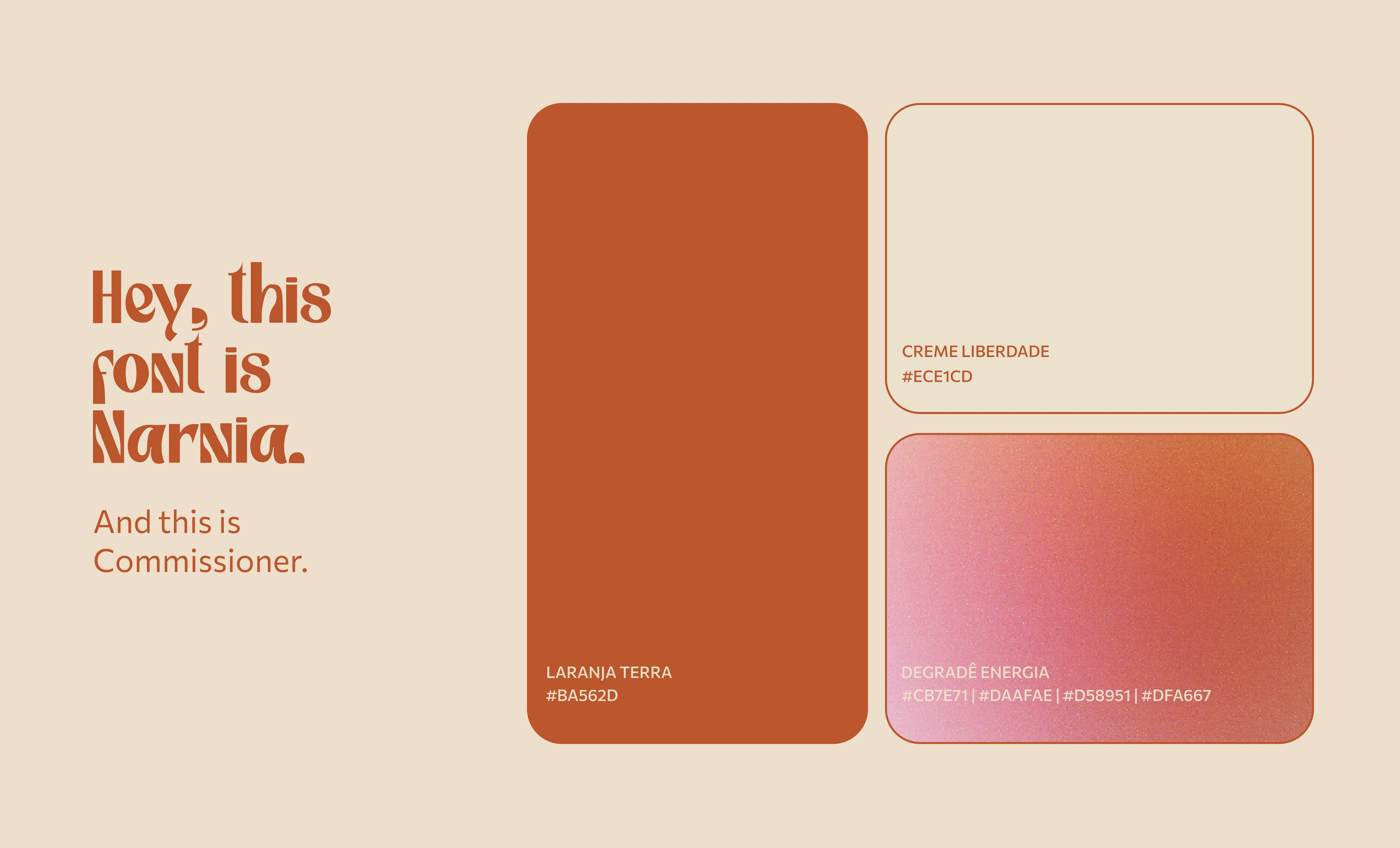
Color palette and typography
Visual identity in action
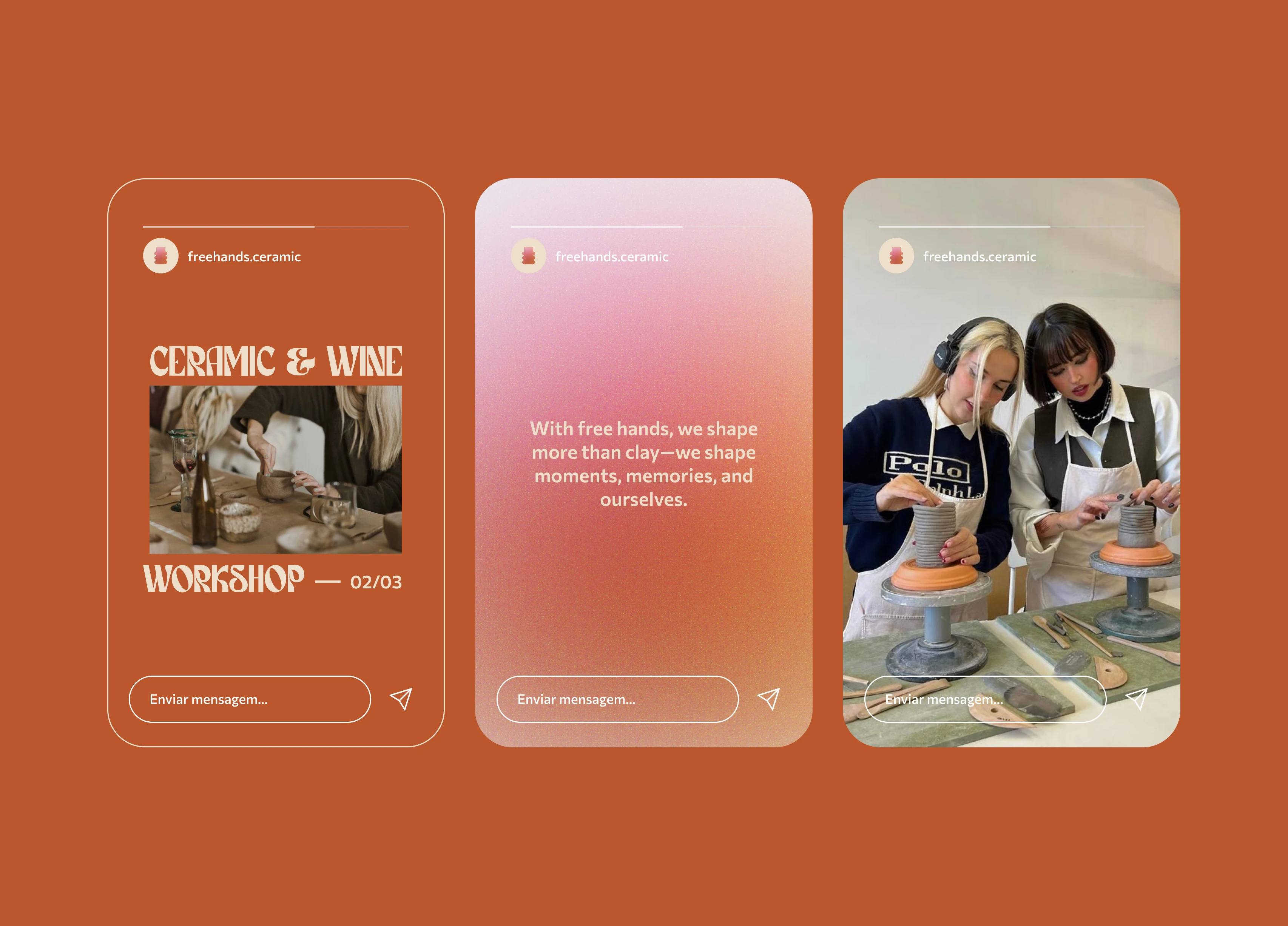
Stories for Instagram
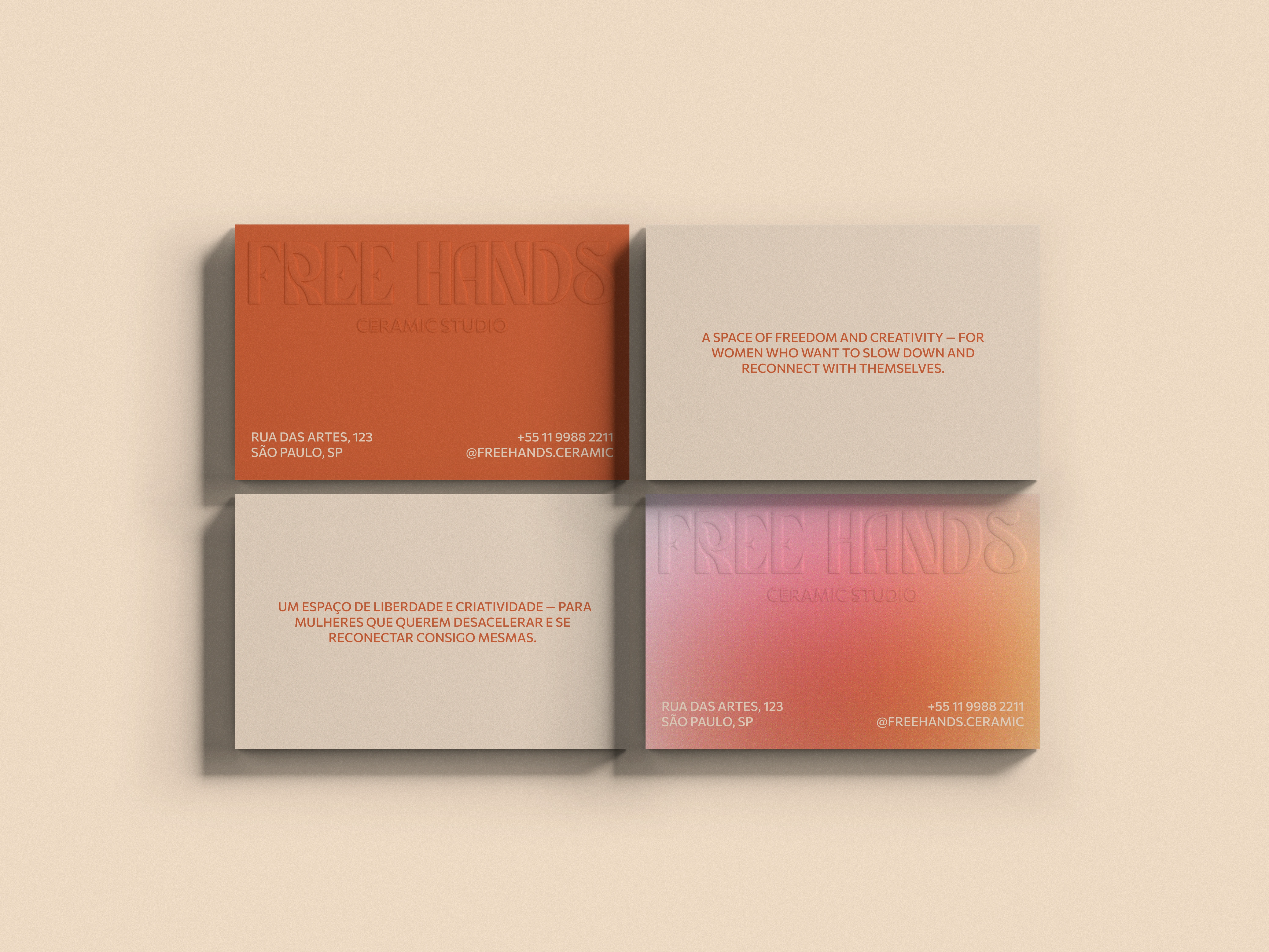
Business card
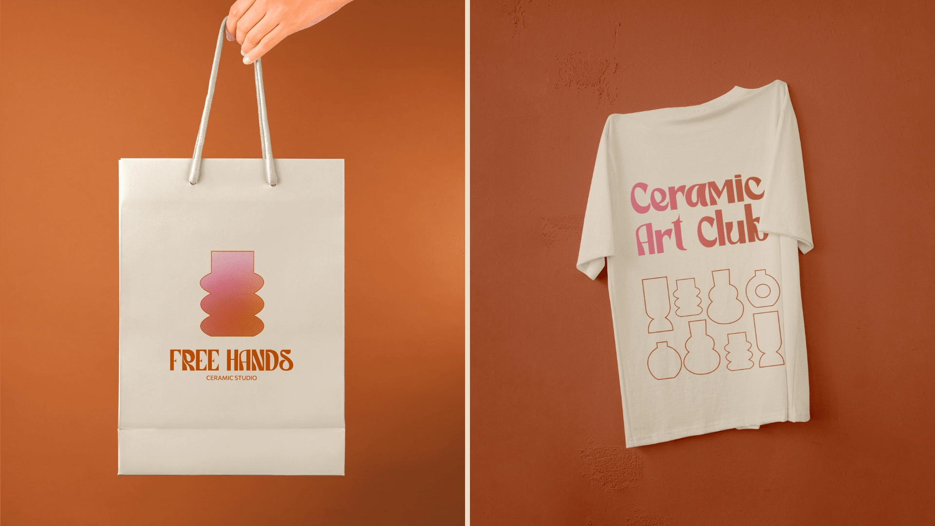
Paper bag e T-shirt
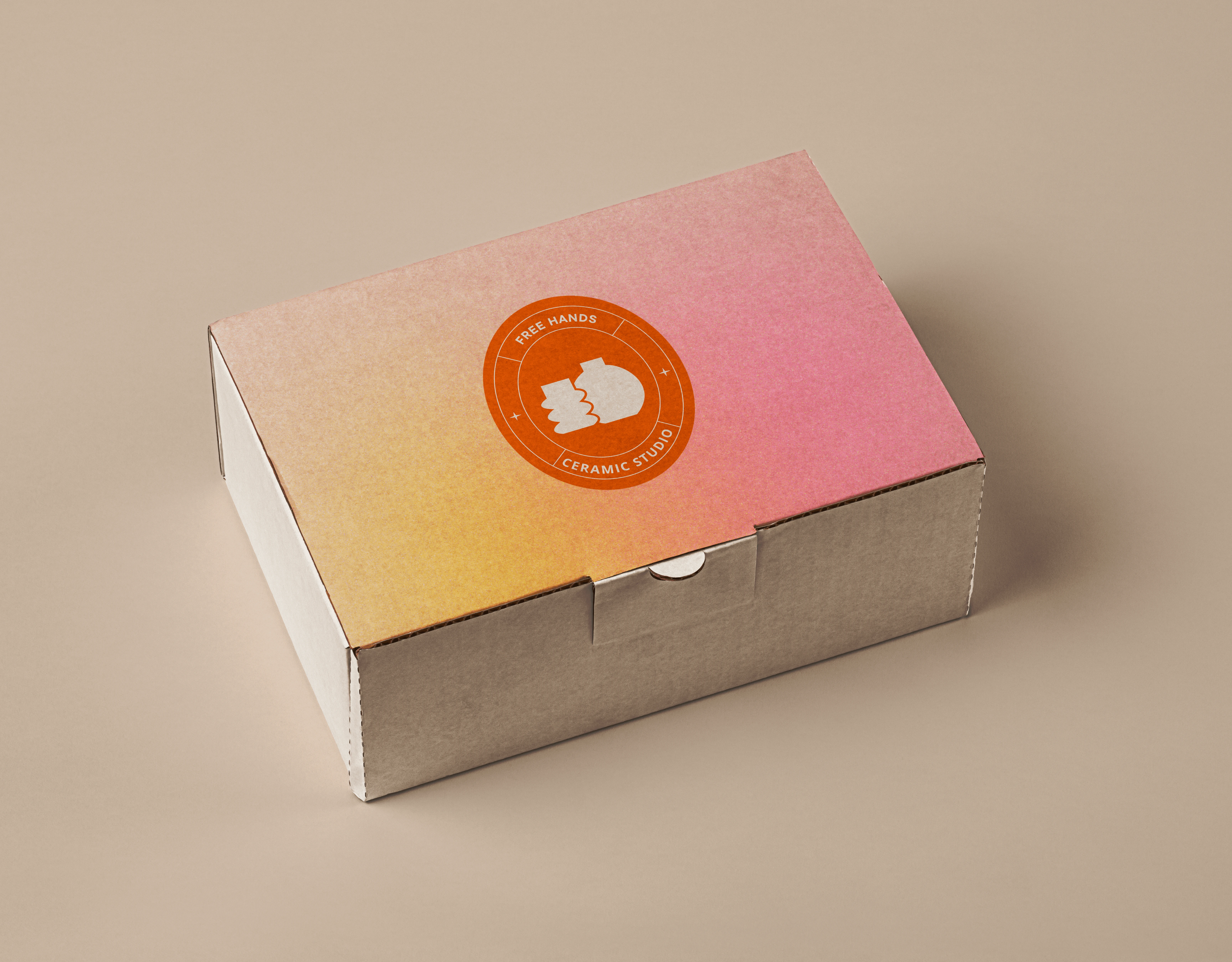
Box and Stick
Like this project
Posted Feb 20, 2025
A place where time slows down, and creativity takes over. Free Hands invites you to shape, explore, and connect with yourself through ceramics.
Likes
0
Views
2