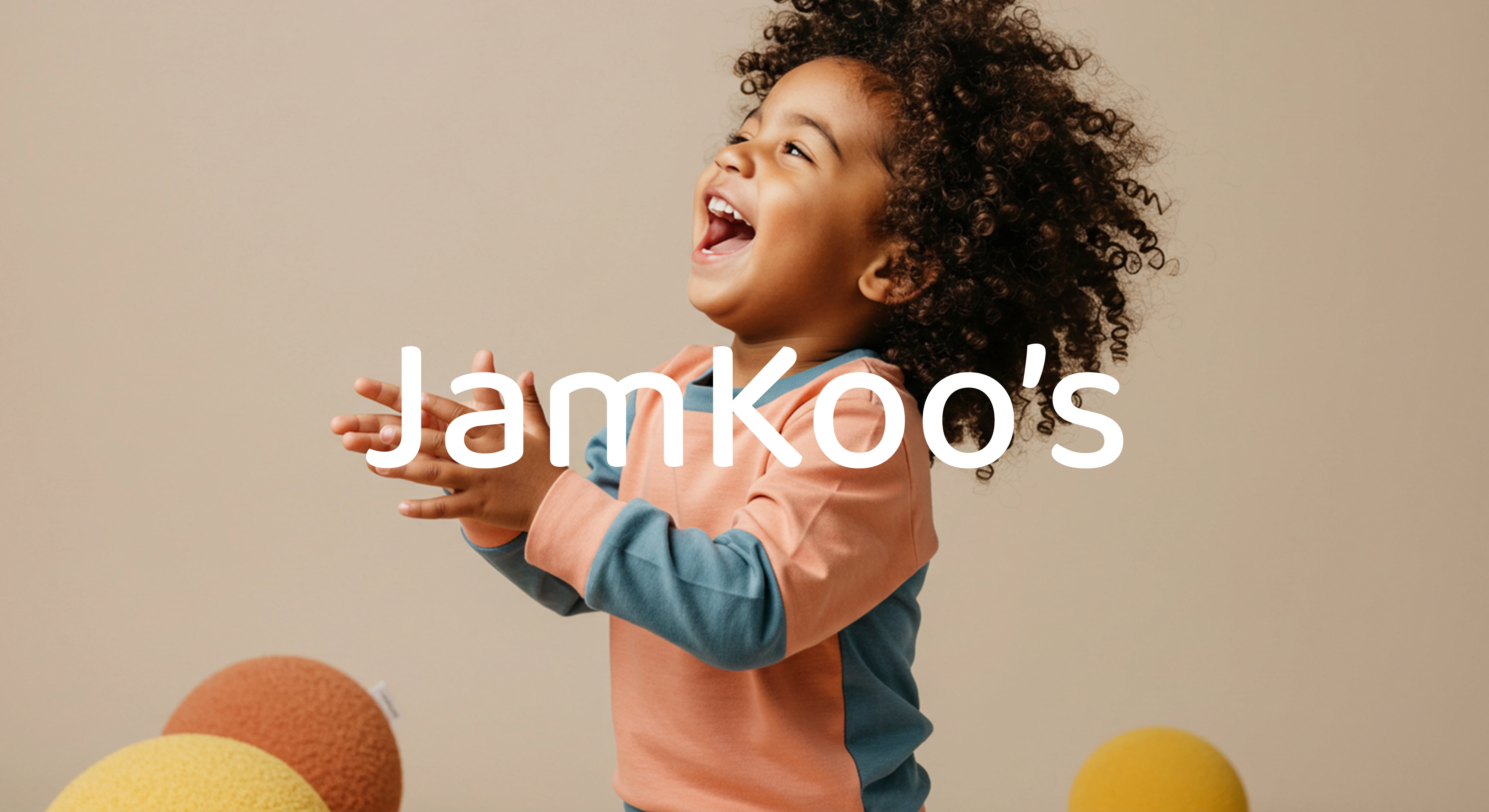
Jamkoo’s — Visual Identity Redesign
Adriana Lima
In what way can a visual identity embrace the tenderness and authenticity of early childhood?
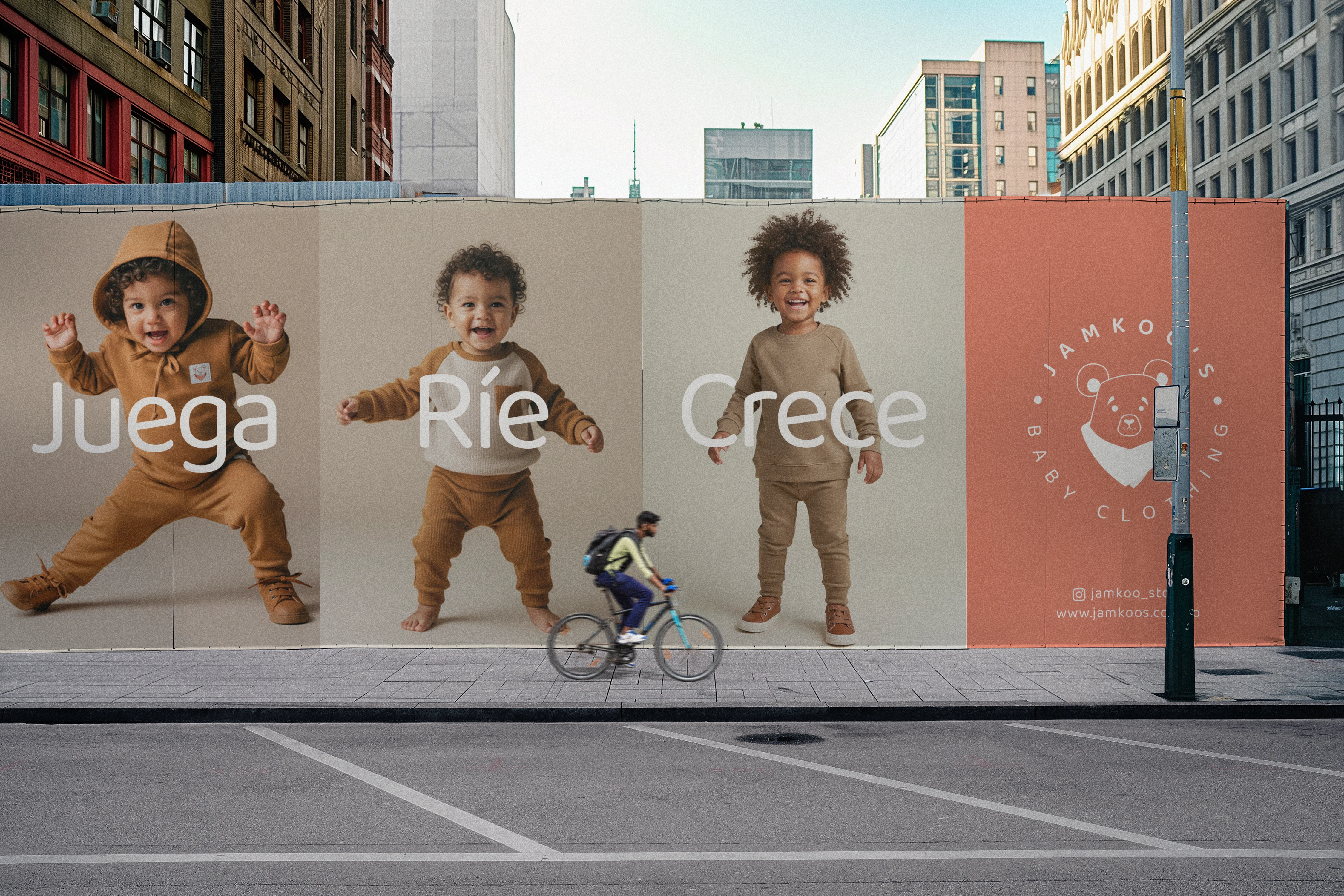
Born in Bogotá, Jamkoo’s carries the mission of dressing childhood with warmth, closeness, and joy. Its essence reflects a universe where every garment accompanies children’s first discoveries, games, and laughter.
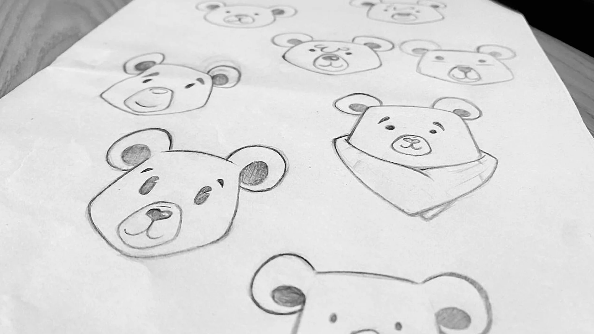
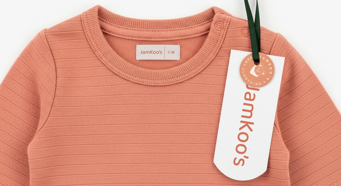
The visual identity redesign sought to bring a fresh perspective to the brand, reinforcing its unique character within the children’s clothing market. The bear, more than a universal symbol of tenderness, becomes here an emblem deeply connected to the founders — infused with affection and personal meaning. This way, Jamkoo’s is no longer “just another brand with a bear logo,” but a truly authentic, heartfelt, and purposeful proposal.
The new identity is built on a warm and natural palette that conveys softness, trust, and approachability, accompanied by a flexible visual system that communicates the joy of childhood with a clear, contemporary voice.
This redesign not only strengthens Jamkoo’s presence in a competitive market but also allows the brand to continue growing alongside those who inspire it most: children and their families.
Client: Jamkoo’s
Type of Project: Visual Identity Redesign and Packaging
Studio: Essenza Case Co.
Country: Colombia
Year: 2025
Packaging
Every identity is more than colors and symbols — it’s a way of nurturing meaning and presence.
Thank you for exploring Jamkoo’s story. If you feel it’s time to dress your own brand with soul, tenderness, and strategy, let’s bring it to life together.
Like this project
Posted Aug 23, 2025
The project consisted of redesigning the visual identity and packaging design for Jamkoo's, a children's brand based in Bogotá and dedicated to early childhood.