
AI Web Designer | Webflow & Astro + Sanity


AI Web Designer | Webflow & Astro + Sanity


AI & Full-Stack Engineer | Product Design & Development
- $10k+
- Earned
- 5x
- Hired
- 5.0
- Rating
- 35
- Followers
AI & Full-Stack Engineer | Product Design & Development



Webflow, Bubble, Retool Developer | Ai Automation Specialist
- $1k+
- Earned
- 2x
- Hired
- 5.0
- Rating
- 15
- Followers
Webflow, Bubble, Retool Developer | Ai Automation Specialist


Expert Custom Website Developer

Studio Helpers · WebGL, 3D Motion, Brand & Web Engineering
New to Contra
Studio Helpers · WebGL, 3D Motion, Brand & Web Engineering
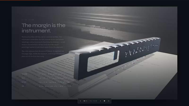

Shopify & WordPress | 540+ Stores | Avg. 20% Conversion Lift
- 52
- Followers
Shopify & WordPress | 540+ Stores | Avg. 20% Conversion Lift


Web Developer | UI/UX| 3D Product Animation |
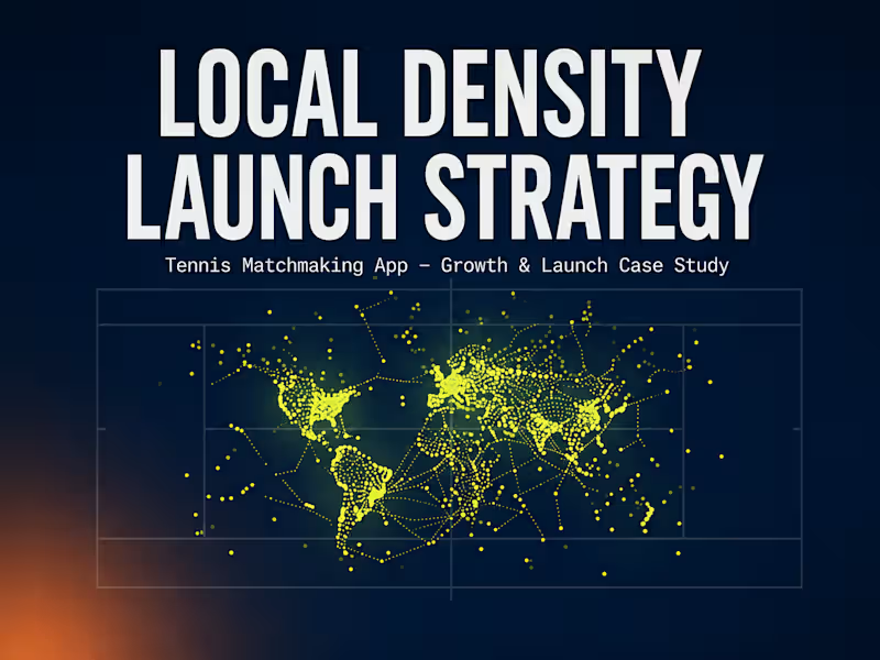
Project title: Local Density Launch Strategy — Tennis Matchmaking App
Category tags: Growth Marketing, Digital Marketing, User Acquisition, Web Design
Description:
A live launch-strategy case study built for a tennis matchmaking app, designed to solve the real problem behind local matchmaking products: density, not just downloads. Instead of a generic acquisition plan, this project sequences growth around one core insight — a matchmaking app only works when enough real players exist close enough to actually play each other.
What's included: a 90-day sequenced launch plan (seeding acquisition through existing community touchpoints, local creator/influencer partnerships over broad-reach influencers, a paired referral mechanic for online + offline growth, and a neighborhood-by-neighborhood density rollout for matchmaking), plus a sample referral flow mockup and projected KPI framework — all built and deployed independently as a working site (HTML/CSS/JS, hosted on Netlify).
Live site: https://saifullah-tennis-launch.netlify.app
0
129
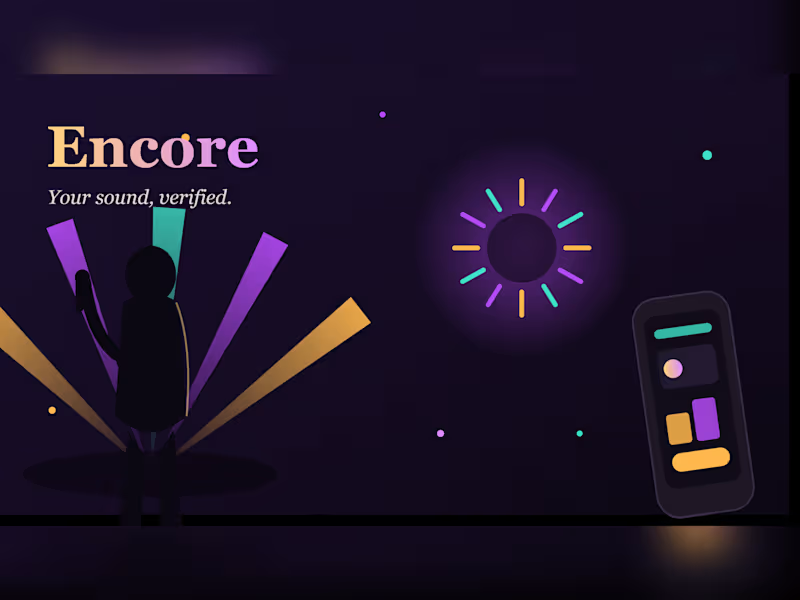
🎤 Encore — Your Sound, Verified
A concept demo built for the artist/fan/venue platform brief
📌 What This Is
Encore is a front-end concept demo — a single-page, mobile-first web experience designed to show how the platform described in the brief could feel to use. It's not just a mockup of screens; it's a working, interactive build: real animation, real 3D motion, real responsive layout, all in the browser.
The goal wasn't to illustrate "a music app." It was to design around the actual problem stated in the brief: AI and infinite streaming have flooded the market, and the one thing that can't be faked is a room full of real people who showed up for one specific artist. Every design decision traces back to that idea.
🎯 The Core Idea (Signature Concept)
The centerpiece of the whole design is a simple visual metaphor:
Noise → Signature
On page load, the hero section shows a waveform made of random, chaotic bars — representing the flood of AI-generated tracks. Over about 2 seconds, it smoothly resolves into a clean, deliberate waveform shape — representing a real artist's identity emerging from the noise. This one animation is the pitch: your sound survives the flood because it's yours.
That same idea — human signal standing out against synthetic noise — is echoed quietly throughout: in the copy, in the "verified" badges, and in the rotating light-ray silhouette behind the hero text.
🎨 Design System
Color palette (named, not generic defaults):
#0E0B12 Stage — near-black background, like a dim venue
#161019 Stage 2 — slightly lifted panel background
#1F1826 Card — surface color for cards/passes
#FFB84D Amber — warm spotlight accent
#B24BF3 Violet — electric stage-light accent
#F5F0EB Paper — main text color
#6EE7A8 Green — small "verified/confirmed" indicator only
Typography (three roles, chosen for character, not defaults):
Fraunces (serif) → headlines. Warm, a little vintage, feels human rather than corporate
Inter (sans) → body copy. Clean, highly readable at small sizes
IBM Plex Mono → tags, roles, timestamps, eyebrows. Gives a "verified/technical" feel to labels like CONFIRMED · MOBILE
Layout logic: every section either shows the brief's real content (roles, event lifecycle) or reinforces the noise→signature theme. Nothing decorative was added just to fill space.
🧩 Section-by-Section Breakdown
🧭 Nav — sticky, blurred glass background, quick links + waitlist CTA
🎙️ Hero — the noise→signature waveform animation, headline built directly from the brief's own stat (750k tracks/day, 400k AI-made), rotating light-ray performer silhouette as ambient background
📉 The Problem — three animated counting stats (53%, 750k, ~1%) pulled straight from the brief's numbers, plus one closing line of copy
🎫 Who's In (Roles) — three "backstage pass" style cards for Fan (guest → registered → confirmed), Artist (approved, Stripe-connected — marked as the core role), and Local Business (approved, Stripe-connected). Each tilts in 3D toward the cursor
🕒 Before / During / After — the real event lifecycle from the brief, shown as a genuine numbered sequence (this is the one place numbering is justified, since order actually matters here)
🌟 Real People, Real Rooms — a horizontally scrollable roster of fictional artist cards (unique gradient avatars, genre, city) — social proof without using anyone's real photo or name
📱 The App — a tilting phone mockup showing what a confirmed fan actually sees: artist card, live "audio bars," setlist voting, check-in button
🖋️ Footer — simple sign-off
🛠️ What's Actually Used (Tech Stack)
HTML5 — semantic structure, no frameworks
CSS3 — custom properties (CSS variables) for the whole color system, Flexbox layout, clamp() for fluid type scaling, CSS mask-image for the fading carousel edges, keyframe animations
Vanilla JavaScript — no libraries, no build step:
<canvas> + requestAnimationFrame for the waveform animation
IntersectionObserver for scroll-triggered stat counters and section reveals
Mouse-position math for the 3D tilt effect on cards and the phone
Inline SVG — the hero performer silhouette and light rays, hand-built, no external image files
Google Fonts — Fraunces, Inter, IBM Plex Mono
No dependencies, no npm install, no server required — it's three files (index.html, style.css, script.js) that run with a static file server like VS Code's Live Server.
✨ Motion & Interaction Details
🌊 Hero waveform: chaos → order animation on load, then idles with a gentle breathing motion
🔢 Stats count up from 0 the moment they scroll into view
🃏 Role cards & artist cards tilt in 3D toward the cursor, and lift slightly on hover
📲 Phone mockup tilts in full 3D based on cursor position — sells the "real device" feeling
🎇 Background light rays rotate slowly and continuously — ambient, not distracting
🪄 Sections fade/slide in as you scroll, instead of appearing all at once
You can check out my project live here: https://encore-demo-saifullah.netlify.app (https://encore-demo-saifullah.netlify.app/)
It is mobile and web-based.
0
116
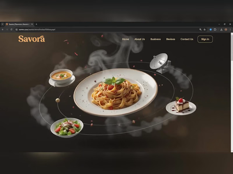
Savora — Food Delivery Landing Page
Designed and developed "Savora," a modern food-delivery landing page concept, built with HTML, CSS, and JavaScript, using GSAP for scroll-triggered and interactive animations.
Key features:
Animated hero section — a 3D-style orbiting animation where signature dishes (pasta, soup, salad, dessert) circle a central hero plate, complete with layered steam/smoke effects and floating particles for a premium, cinematic feel
Scroll-triggered reveal animations throughout the page using GSAP, giving each section a smooth fade/slide-in effect as the user scrolls
Interactive Sign In / Sign Up modal with tabbed switching between forms, styled input fields (name, email, password with show/hide toggle, address, phone), a consent checkbox, and smooth open/close transitions
Horizontal Menu Grid carousel — food item cards with images, titles, descriptions, and cart icons, complete with hover states and pagination dots
Promotional "Stats & Download" section with a call-to-action button, styled to match the overall dark/gold brand palette
Fully responsive layout with a cohesive dark-brown and gold color scheme designed to feel premium and appetite-appealing
Got a project in mind? Let's build it — message me anytime.
0
140
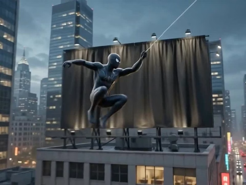
🚨 Big reveal on the skyline! 🚨
I build custom, animated, and fully responsive portfolio websites — no templates, no shortcuts, 100% built from scratch.
✅ Custom design tailored to you
✅ Fully responsive (Mobile / Tablet / PC)
✅ Modern UI/UX with smooth animations
Ready to unveil your own standout portfolio? Let's work together 👇
https://fiverr.com/createdbysaif
0
89

Webflow Developer | Custom Code Specialist | Figma to Webflo
- 2x
- Hired
- 5.0
- Rating
- 3
- Followers
Webflow Developer | Custom Code Specialist | Figma to Webflo


