Hinova Design - Brand Identity Motion Showcase
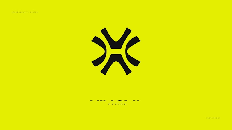
Hinova is a design studio, and the name already carries the idea: hi + nova, a star that suddenly gets brighter. So the mark doesn’t need a metaphor bolted on - it’s a capital H pulled open along eight axes until the counters break and the letter reads as a star.
https://hinovadesign.com/
Leave your feedbacks.
1
2
61

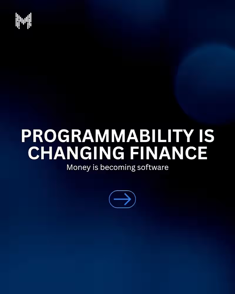
For decades, finance has relied on paperwork, intermediaries, and manual processes.
Today, programmable finance is changing the equation.
Through smart contracts and blockchain technology, financial products can execute automatically, enforce rules transparently, and interact with other systems in real time.
The future of finance isn't just digital.
It's programmable.
#ProgrammableFinance #Blockchain #Web3 #DeFi #SmartContracts #Fintech #DigitalAssets #BlockchainTechnology #FutureOfFinance #MkaitsTechnologies
3
447

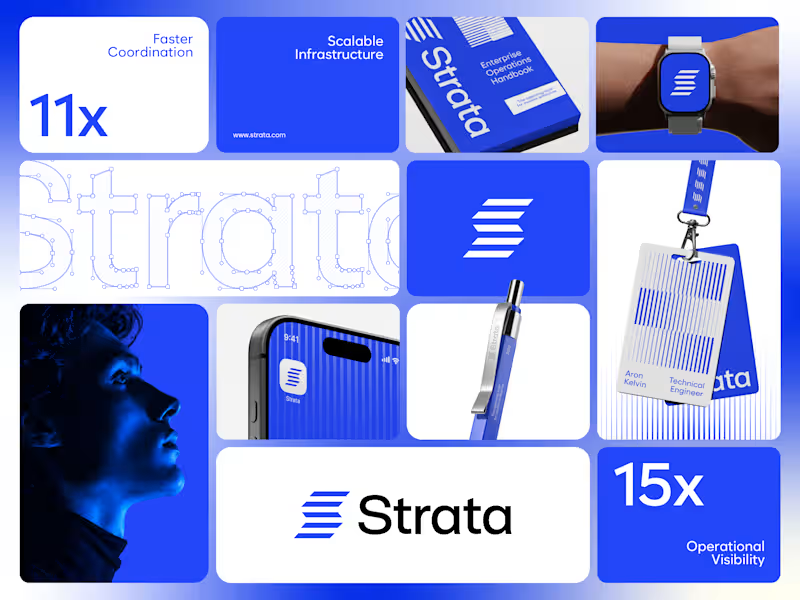
Strata’s brand runs on one colour, one shape and one rule. Restraint was the strategy.
I designed the brand identity for Strata, an enterprise SaaS platform that connects fragmented systems, data, workflows and teams. A product that removes chaos can’t have a chaotic brand, so every element earns its place: “Every layer, working as one.”
One shape: Five horizontal layers forming a subtle S. It works as the logo, a pattern and a rhythm for layouts.
One colour: Strata Blue #2447F9, carried by near-black and white. Solid only, never a gradient.
One rule: Complexity, organized into movement. If a layout feels busy, it’s wrong.
Structure: Modular grids, strong alignment and architectural spacing across every surface.
Imagery: Single-colour portraits in Strata Blue, so even the photography follows the system.
Fewer elements, used with discipline, scale further than more elements used loosely.
If your enterprise SaaS company needs a brand that stays consistent as it grows, let’s talk.
#VisualIdentity #SaaSBranding #B2BBranding #BrandDesign
1
109
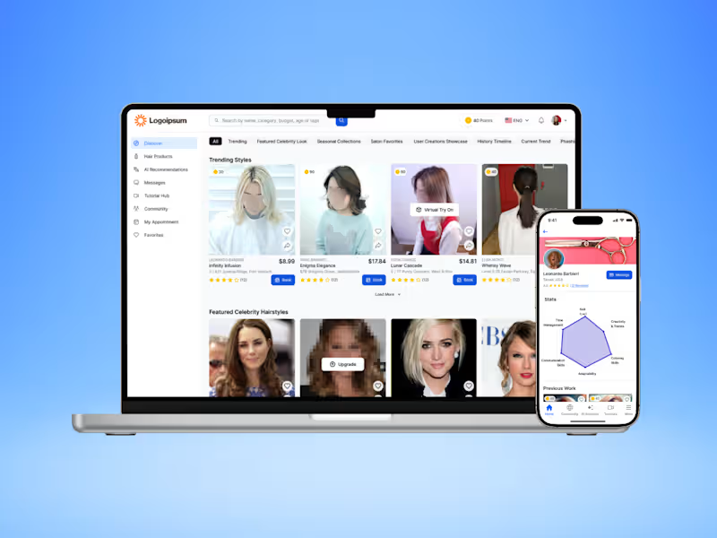

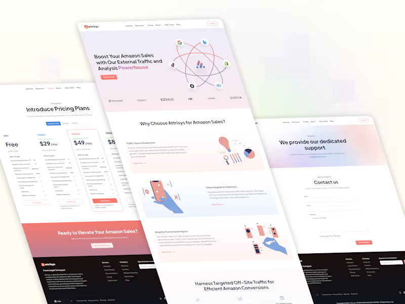
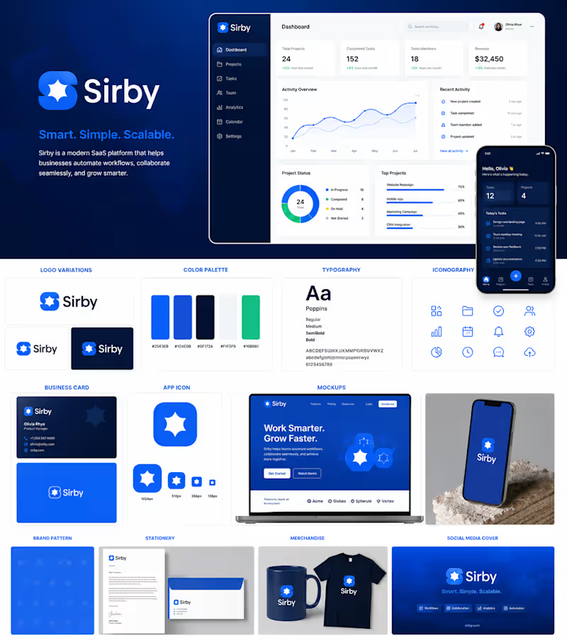
Sirby | Modern Logo & Visual Identity
A recent branding project focused on creating a distinctive and modern identity for Sirby.
The visual direction combines a bold blue color palette, a memorable custom symbol, and clean typography to create an identity that feels contemporary, professional, and adaptable across digital applications.
My Approach:
I focused on creating an identity that would be:
Memorable — a recognizable symbol with a simple visual structure.
Modern — clean typography and a contemporary color direction.
Versatile — designed to work across digital and brand touchpoints.
Consistent — establishing a visual foundation that can grow with the brand.
Deliverables
Logo Design • Visual Identity • Typography • Color Direction • Brand Presentation
The result is a clean and confident identity designed to give Sirby a recognizable visual presence.
Project Type: Brand Identity / Logo Design
Role: Graphic Designer & Brand Identity Designer
2
4
217