Freelancers using Adobe Illustrator in Rajshahi Division
Sign Up
Post a job
Sign Up
Log In
Filters
2
Projects
People
Humaun Atelier
pro
Natore, Bangladesh
Brand & UI/UX Designer — Design + Web Development
New to Contra
Follow
Message
Brand & UI/UX Designer — Design + Web Development
1
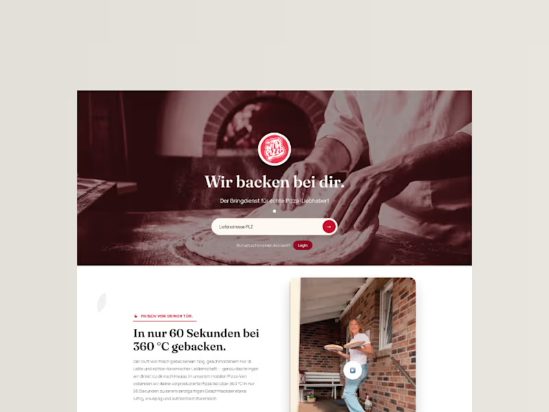
InLoveWithPizza Premium Landing Page Redesign
1
4
0
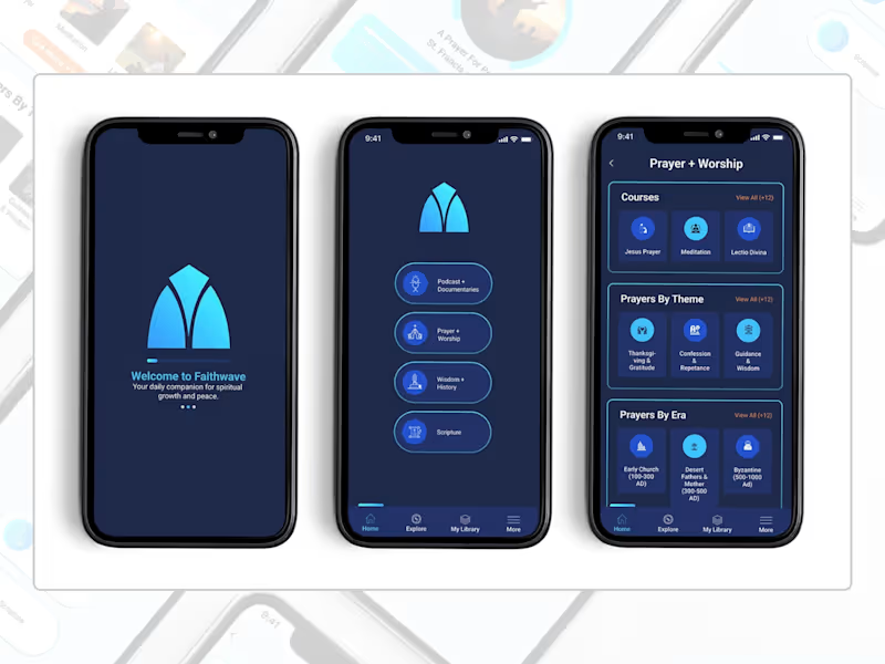
A full UI concept for FaithWave, a faith-based app designed to help users explore and deepen their Christian faith through meaningful learning, prayer, and customizable worship experiences. I designed three key screens—Home, Prayer & Worship, and a Customizable Item Page—that together demonstrate the app's core user journey. The Home screen features four main content sections (Podcasts, Prayer & Worship, Wisdom & History, Scripture) with a clean, intuitive bottom navigation. The Prayer & Worship page organizes a rich library of prayers by theme, era, courses, and meditations, making spiritual content easily discoverable. The Customizable Item page allows users to personalize their prayer experience by selecting narrator voices, background sounds, and volume controls—creating a deeply personal and immersive devotional experience. The design uses a calming blue gradient inspired by the brand's logo (cyan to deep blue), with thoughtful typography and ample whitespace to create a serene, focused atmosphere for prayer and reflection.
0
141
1
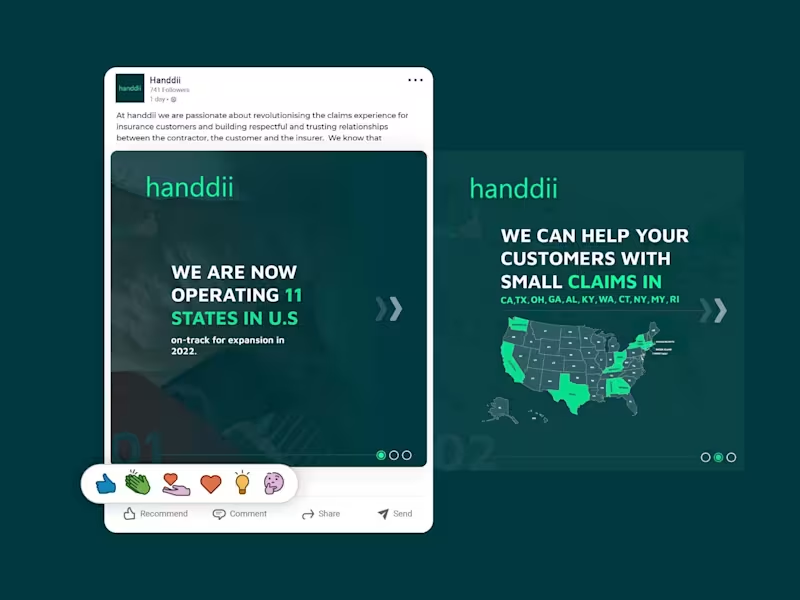
A LinkedIn carousel post designed for handdii, a company expanding across 11 U.S. states. The goal was to visually communicate their growth and service areas while maintaining their brand identity—using their signature green (#00FF99), supporting colors, and a clean, modern layout. I incorporated the 2-letter state abbreviations (CA, TX, OH, GA, etc.) into the design, creating a map-like visual that immediately conveys the company's reach. The carousel structure allowed me to present the key message—operating in 11 states with more expansion coming—across multiple slides, keeping each one clean, scannable, and on-brand. The design uses bold typography, consistent spacing, and a professional tone suitable for LinkedIn's audience, without relying on the logo since the post was published from the company page.
1
153
1
A trade-show flyer designed for Builder Backup Mortgage, a brokerage that provides financing solutions when a builder's in-house lender can't close the deal. The goal was to create an eye-catching, professional 8.5" x 11" flyer that communicates a clear, powerful message: "We help builders sell more homes." The design focuses on credibility and urgency—featuring a client list, key selling points, and clear contact information—while maintaining a clean, structured layout suitable for both print and PDF distribution. I used bold typography, a refined color palette, and strategic visual hierarchy to direct attention to the builder's core benefit: increasing sales and closings. The refreshed design incorporates the client's new logo and retains the required disclaimer and contact details, ensuring compliance while elevating the overall brand presence.
1
142
Adobe Illustrator
(14)
Follow
Message
Md Zahid Hasan Khan
Rajshahi Division, Bangladesh
I am a professional Brand Designer, I do all kind of Design
15
Followers
Follow
Message
I am a professional Brand Designer, I do all kind of Design
2
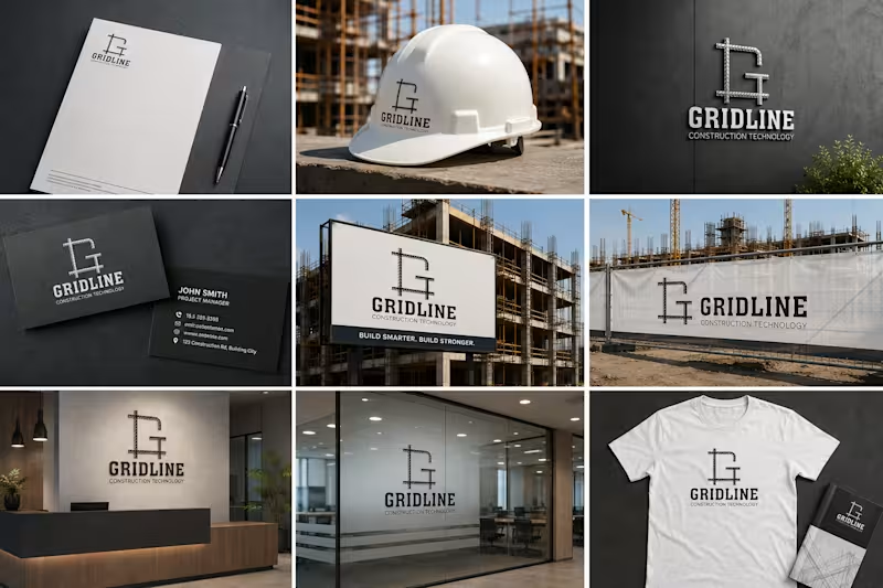
Project Overview: Gridline is a concept project tailored for a modern construction technology firm. The objective was to design an impactful lettermark logo that instantly communicates durability, engineering precision, and modern construction practices. Design Strategy: Iconography: Integrated the letter 'G' with steel reinforcement bars (rebar) to represent structural integrity and modern building frameworks. Typography: Paired with a bold, modern serif/slab typeface for the primary brand name to emphasize strength and reliability. Color Palette: Monochrome/dark grey tone to keep the feel industrial, professional, and clean. Deliverables: Logo Mark & Wordmark Brand Identity Assets Are you looking for an impactful visual identity for your business? Let's work together! Feel free to reach out via Contra.
2
15
4
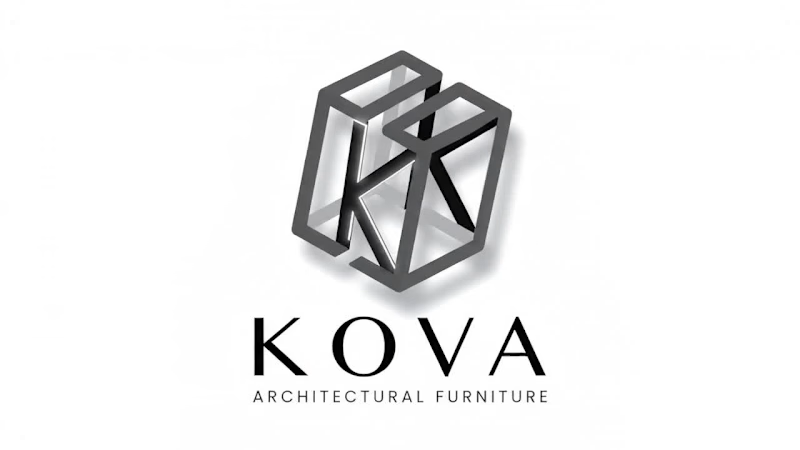
Discover the modern 3D geometric logo design for KOVA Architectural Furniture. Featuring an interlocking 'K' lettermark built on an isometric cube structure, this logo represents precision, architectural design, and luxury furniture branding. Ideal inspiration for architectural firms, interior designers, and luxury furniture brands. Designed by Designer Jahid.
4
4
166
1
KOVA Architectural Furniture — 3D Geometric Logo & Brand Identity Design Discover the modern 3D geometric logo design for KOVA Architectural Furniture. Featuring an interlocking 'K' lettermark built on an isometric cube structure, this logo represents precision, architectural design, and luxury furniture branding. Ideal inspiration for architectural firms, interior designers, and luxury furniture brands. Designed by Designer Jahid.
1
80
2
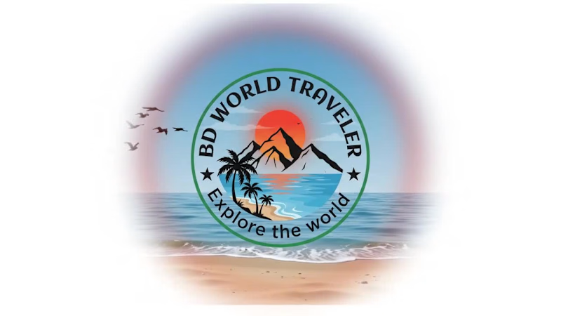
Excited to share this badge logo design created for BD World Traveler, a travel and adventure YouTube channel! The concept revolves around the essence of exploration—combining rugged mountain peaks, vibrant coastal views, towering palm trees, and a lone hiker reaching new heights under a bold sun. Designed with clean vector lines and an energetic color palette to represent both land and ocean adventures.
2
2
140
Adobe Illustrator
(39)
Follow
Message
Md. Abdur Rahman
Pabna, Bangladesh
The designer that you can trust.
6
Followers
Follow
Message
The designer that you can trust.
4
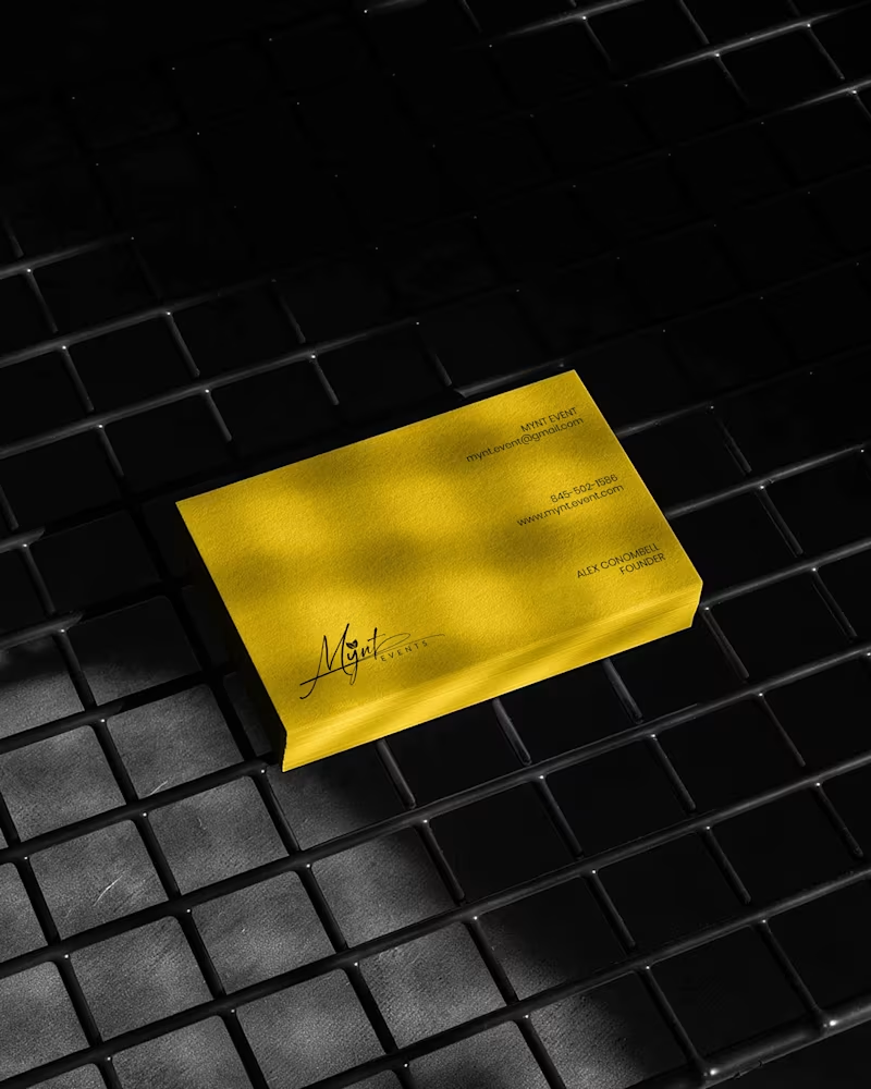
Luxury Brand Identity System for a Premium Event Planning Business PROJECT DESCRIPTION: Mynt Events is a premium event planning business built around moments that matter — proposals, curated celebrations, and experiences where every detail is considered and nothing is left to chance. The founder came to me with a business that had already outgrown its brand. The work was operating at a premium level. The identity wasn't communicating that yet. The brief was clear: build a complete brand identity system that positions Mynt Events as the obvious choice for clients who already know what they want and are deciding who to trust with it. The Strategic Starting Point Every decision in this project started with a single question: what does a client need to feel the moment they encounter this brand for the first time? For Mynt Events, that feeling needed to be confidence. Trust. The quiet certainty that this is a business that handles things properly — that the moment they're planning will be in the right hands. That emotional target shaped every mark, every color choice, and every surface application that followed. The Logo The primary mark is a signature script logo with a leaf detail structurally embedded within the letterforms. The script was chosen deliberately — in the events industry, clients are trusting you with moments that cannot be redone. A signature communicates personal commitment. It feels authored, not assembled. The leaf element does secondary brand work quietly. It signals organic intention, care, and attention to detail without requiring explanation or a separate icon. The underline sweep grounds the composition and gives it the horizontal confidence it needs to hold across wide-format surfaces — packaging lids, signage panels, and environmental applications where a floating mark would lose presence. A monogram M was developed as a secondary mark for applications where the full signature loses legibility at small scale — product labels, cap patches, and interior packaging details. The Palette Gold and black. Not chosen for trend. Chosen for emotional function. Gold carries warmth, occasion, and perceived value — the feeling of something worth celebrating. Black carries authority, precision, and restraint — the feeling of a business that delivers without drama. Together they position Mynt Events exactly where it needs to sit: celebratory but controlled, personal but professional. The palette was tested across matte, gloss, foil, backlit, and fabric applications to confirm it held integrity across every surface in the system without compensation or adjustment. The Full Identity System Every deliverable was designed as part of a single coherent brand expression — not a collection of individual design tasks, but a system where every piece reinforces every other piece: — Primary signature logo and monogram secondary mark — Full brand palette and typography hierarchy — Premium gold foil business card — Luxury magnetic gift box with full interior branding — Ring box and product packaging application — Branded tote bag — Apparel — t-shirt and structured cap with patch application — Backlit environmental signage panel — Digital UI and mobile wallpaper application The Result A brand identity system that closes the gap between what Mynt Events delivers and what a client sees before they ever make contact. The brand now works at a proposal ring box and a storefront signage panel simultaneously — with the same presence, the same authority, and the same unmistakable identity at every scale. That's not styling. That's positioning. And positioning is what turns a great business into the obvious choice. SERVICES INCLUDED IN THIS PROJECT: Brand Strategy, Logo Design, Visual Identity System, Monogram Design, Business Card Design, Luxury Packaging Design, Gift Box Design, Apparel Design, Environmental Signage Design, Digital UI Application, Brand Collateral Design, Full Brand System KEYWORDS: Luxury Event Brand Identity, Signature Logo Design, Event Planner Branding, Gold Brand Identity, Script Logo Design, Visual Identity System, Custom Logo Design, Brand Identity Designer, Luxury Logo Design, Event Brand Design, Handcrafted Logo Design, Premium Brand Identity, Calligraphy Logo Design, Brand Mockup Design, Logo Design Concept, Black And Gold Branding, Event Planner Logo, Signature Brand Identity, Full Brand System, Brand Strategy Design
2
4
101
2
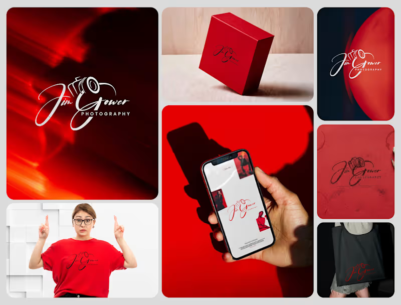
Signature Brand Identity System for a Photography Business PROJECT DESCRIPTION: Jim Gower is a professional photographer who needed more than a logo. He needed a complete brand identity that could represent his work at every level — from a business card handed to a client after a shoot to a lightbox sign above a studio entrance. The brief was clear: build something that feels personal, premium, and immediately recognizable as belonging to one person and one vision. The Approach Every decision in this project started with strategy before it touched aesthetics. Who is Jim Gower to his ideal client? What feeling should someone walk away with after their first encounter with his brand? What does premium mean in the photography space right now — and how do you stand apart from it without alienating it? The answers shaped everything that followed. The Work The primary logo is a signature script with the camera body structurally integrated into the letterforms — the "G" in Gower becomes the lens housing, making the mark read as both a name and a profession without requiring a separate icon. The script carries energy and movement, referencing the intuitive, fast-moving nature of working photographers. The crimson brand palette was selected for emotional weight — confident, warm, and saturated enough to hold presence across both physical and digital surfaces without compromise. The full system was then applied and stress-tested across every client touchpoint: — Primary and secondary logo variations — Brand color palette and typography system — Business card design — Premium gift box packaging — Tote bag and apparel — Digital UI mockup for web and mobile — Environmental signage and lightbox application The Result A brand identity system that positions Jim Gower not as a photographer with a logo, but as a brand with a presence — one that commands attention, communicates quality instantly, and scales from a phone screen to a storefront without losing a single point of its power. SERVICES INCLUDED IN THIS PROJECT: Brand Strategy, Logo Design, Visual Identity System, Brand Collateral Design, Packaging Design, Apparel Mockup, Digital UI Application, Environmental Signage Mockup Photography Logo Design, Signature Logo Design, Brand Identity System, Photographer Branding, Script Logo Design, Visual Identity Design, Custom Logo Design, Brand Identity Designer, Logo Design Process, Creative Brand Design, Handcrafted Logo Design, Photography Brand Kit, Premium Brand Identity, Calligraphy Logo Design, Brand Mockup Design, Logo Design Concept, Red Brand Identity, Photographer Visual Identity, Brand Strategy Design, Full Brand System
2
71
1
Julian Böttger — Full Brand Identity for a Wedding & Portrait Photographer A photographer's work lives and dies by first impressions. Julian's images were exceptional. His brand wasn't keeping up. We built a complete visual identity from the ground up — designed to feel personal, timeless, and scalable across every surface it would ever touch. What was delivered: → Custom hand-lettered signature logotype (primary mark) → Monogram seal (JB) for watermarks, merch, and secondary use → Business card system — black and white versions → Studio signage mockup → Apparel (t-shirt + tote bag) → Stationery and print collateral → Film-strip and overlay assets for video content The brief was clear: no templates, no stock fonts, nothing generic. Every element was drawn or crafted specifically for this brand. The identity now works at every scale — from a coffee mug to a 6-foot sign — and across every context, from dark editorial photography to bright lifestyle imagery. Available for similar projects. Inquire to discuss scope and timeline. Brand Identity, Logo Design, Visual Identity, Graphic Design, Photography, Creative Services, Wedding Industry, Brand Guidelines, Print Design, Merch Design
1
35
5
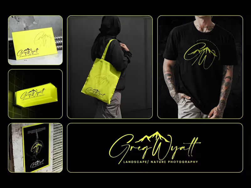
Greg Wyatt — Landscape & Nature Photography | Full Brand Identity System Project Summary: A complete brand identity built for a landscape and nature photographer who needed more than a logo — he needed a visual world that matched the scale of what he shoots. The Brief: Greg Wyatt captures landscapes the way most people only dream of seeing them. The work is cinematic, emotional, and deeply personal. But his brand wasn't reflecting any of that. The goal was to build a cohesive identity system from the ground up — one that could hold its own across every surface it touched. The Approach: Every decision in this project started with one question: does this feel like standing at the edge of something vast? The signature wordmark was hand-lettered in style to feel personal and authorial — because the best landscape photography is never accidental. It carries the photographer's fingerprint. The mountain mark was integrated directly into the initials rather than placed beside them, making the connection between artist and subject inseparable. Color was the most strategic call in this project. Neon yellow on deep black creates the kind of contrast that stops a scroll, but it wasn't chosen for that reason alone. It references the exact quality of light that makes a great outdoor photograph — that electric moment just before or after darkness. The brand lives in that moment. The system was then pressure-tested across real-world applications: a neon illuminated storefront sign, business cards, tote bags, apparel, and a brand pattern — because a logo that only works on a white background isn't a brand system. It's a starting point. What Was Delivered: — Primary signature wordmark — Mountain monogram mark — Circular badge logo — Submark and watermark variations — Brand color and typography system — Business card design — Tote bag design — T-shirt / apparel design — Illuminated signage mockup — Brand pattern / texture — Full brand presentation The Result: A brand identity that works as hard as the photographer behind it. Cohesive across every format. Instantly recognizable. Built to grow with the brand rather than date it. Services Provided: Brand Identity Design · Logo Design · Visual Identity · Brand Strategy · Print Design · Merch Design · Brand Presentation Keywords: Brand Identity, Logo Design, Photography Brand, Signature Logo, Handwritten Logo, Mountain Logo, Nature Photography Branding, Outdoor Brand Identity, Monogram Logo, Visual Identity System, Photographer Branding, Custom Logo Design, Dark Brand Aesthetic, Neon Branding, Apparel Design, Print Collateral, Brand Strategy, Creative Direction, Full Brand System, Freelance Brand Designer
6
5
69
Adobe Illustrator
(19)
Follow
Message
Md Suman Ali
Rajshahi, Bangladesh
Brand Strategist & Identity Designer for Property Developers
New to Contra
Follow
Message
Brand Strategist & Identity Designer for Property Developers
2
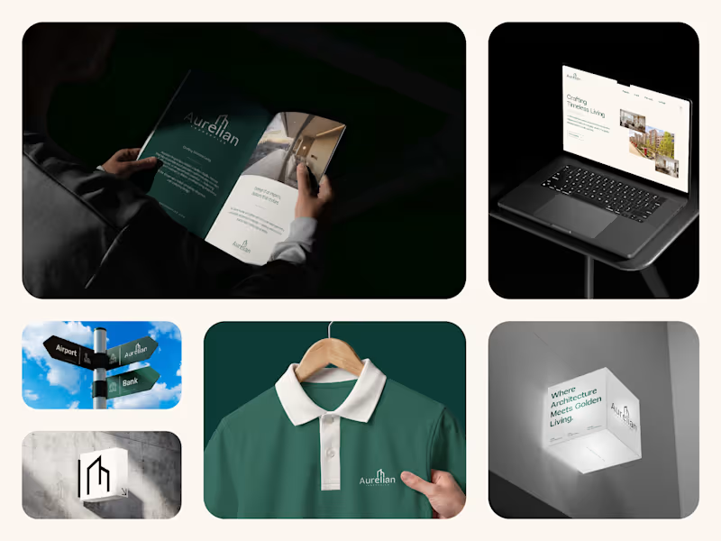
Aurelian Properties, Brand Identity Design Aurelian Properties is a luxury residential concept designed for Canary Wharf, London. The goal was to create a refined brand identity that reflects modern architecture, timeless design, and the confidence of an asset-grade property. Inspired by clean architectural forms, the identity combines a minimalist logo, elegant typography, and a premium visual system that carries seamlessly across print, digital, and environmental applications. Every element was designed to position Aurelian as more than a residence—it's a brand built around quality, precision, and long-term value. Services: Brand Strategy, Brand Identity, Logo Design, Visual Identity, Brand Guidelines, Marketing Collateral, UI/UX Design, Website Design
2
2
103
2
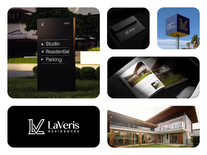
LaVeris Residences, Brand Design LaVeris Residences is a luxury residential concept created for Canary Wharf, London. The objective was to build a premium brand that feels refined, timeless, and trustworthy while speaking to buyers who value architectural quality and long-term investment. The identity is built around a custom LV monogram inspired by modern architecture, combining clean geometry with understated elegance. Alongside the visual identity, I developed a complete branding system across print, digital, and marketing materials to create a consistent experience at every touchpoint. Services: Brand Strategy, Brand Identity, Logo Design, Visual Identity, Marketing Collateral, UI/UX Design, Website Design, Brand Guidelines.
2
2
97
1
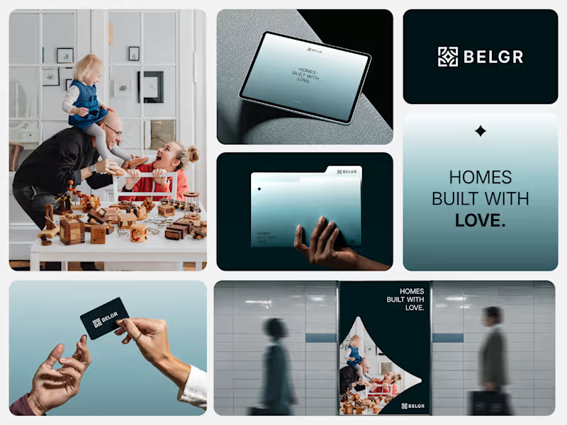
BELGR, Brand Identity for a Modern Property Developer! BELGR is a modern property brand built around a simple idea: Homes built with love. The goal was to create a premium identity that balances contemporary design with a genuine sense of community, trust, and belonging. The Challenge BELGR needed a distinctive identity that would stand out in a competitive property market while feeling warm, approachable, and premium. The brand had to appeal to homebuyers by communicating quality, connection, and long-term value instead of focusing solely on construction. The Solution We developed a complete brand identity centered around a custom symbol created from four abstract B letterforms. Together, they represent connection and community, while the star-shaped negative space at the center symbolizes quality, excellence, and premium living. The visual system combines clean typography, refined colors, and thoughtful applications to create a brand that feels modern, memorable, and built to grow. My Role I led the project from strategy to final delivery, creating a cohesive visual identity that reflects BELGR's values while ensuring consistency across both print and digital applications. Brand Highlights → Custom logo inspired by four interconnected B letterforms → Symbol representing community, connection, and premium living → Modern and timeless visual identity → Consistent branding across stationery, signage, social media, and marketing materials → Built to support long-term brand recognition Outcome BELGR now has a distinctive and scalable brand identity that reflects its vision of creating homes people are proud to live in. Every touchpoint works together to present a premium, trustworthy, and memorable property brand. Brand Strategy | Brand Identity | Logo Design | Creative Direction | Brand Guidelines | Visual Identity | Typography
1
72
1
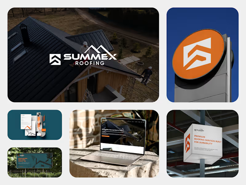
Summex Roofing, Brand Identity, Website & Digital Experience! Summex Roofing is a Texas-based roofing company built on quality, trust, and craftsmanship. I partnered with the team to create a complete brand experience, from strategy and visual identity to UI/UX design and WordPress development, ensuring every customer touchpoint feels consistent and professional. Summex needed more than a new logo. They wanted a brand that would inspire confidence, stand out in a competitive roofing market, and provide a seamless experience both online and offline. The challenge was to create a consistent identity that reflected the company's values across every customer touchpoint. Starting with brand strategy, I developed a complete visual identity that communicates trust, durability, and professionalism. I then translated that identity into a clean, user-focused website, designing the interface and developing it in WordPress to ensure a consistent experience from first impression to customer inquiry. I led the project from concept to launch, creating a cohesive brand system and transforming it into a fully functional WordPress website. This ensured that every interaction with the brand, whether online or offline, reflected the same level of quality and professionalism. The final outcome is a cohesive brand ecosystem that positions Summex Roofing as a modern, trustworthy roofing company. From the logo and printed materials to the website and digital experience, every element works together to build credibility and create a strong first impression.
1
123
Adobe Illustrator
(4)
Follow
Message
Rifat Mehedi
Naogaon, Bangladesh
Product Designer (UX/UI) improving usability for SaaS
23
Followers
Follow
Message
Product Designer (UX/UI) improving usability for SaaS
1
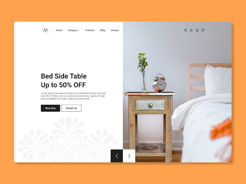
Vintage Mango – Premium Furniture Landing Page Designed for a luxury furniture brand specializing in royal-era inspired pieces. This project delivers a high-impact landing page that blends elegance and modern web usability. I used warm tones, textured backgrounds, and minimalist typography to convey heritage and craftsmanship, while structuring the layout to highlight products, brand story, and trust signals — all fully responsive for mobile. Available for freelance opportunities. Schedule a call at rifatuxd@gmail.com (mailto:rifatuxd@gmail.com)
1
67
1
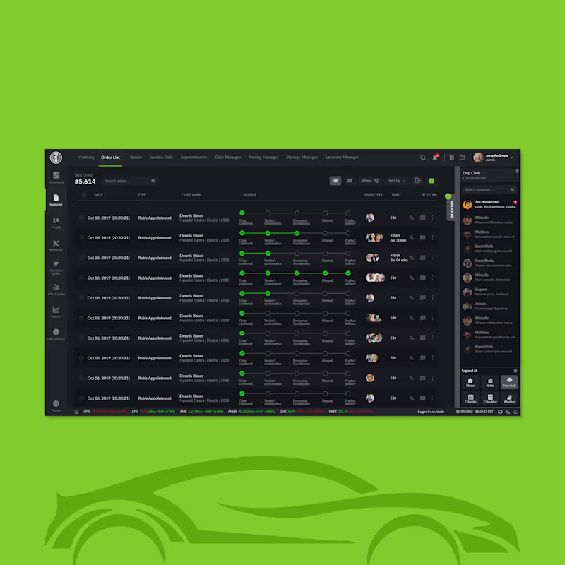
Automotive Inventory Platform – B2B SaaS for Tire & Auto Service Businesses Designed for an automotive service enterprise. This platform lets teams manage inventory, billing, purchases, and reports — all in one clean, enterprise-grade web app. I created a sidebar-driven UX with intuitive navigation, role-based modules (Dashboard, Invoicing, Inventory, PO, Bills, Check-in), and filterable tables to streamline complex workflows and reduce cognitive load. A modern dark interface, clear visual hierarchy, and strong spacing support users who aren’t tech specialists while boosting operational efficiency and decision-making. Available for freelance opportunities. Schedule a call at rifatuxd@gmail.com (mailto:rifatuxd@gmail.com)
1
70
1
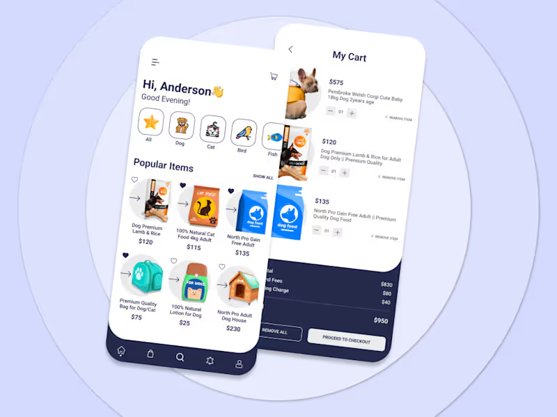
Designed for pet shop businesses selling pets, food, toys, and accessories, this project features 20+ high-quality screens with organized layers built in Figma—also compatible with Adobe XD. I focused on a clean, user-friendly interface that supports easy browsing, product discovery, and checkout. Available for freelance opportunities. Schedule a call at rifatuxd@gmail.com (mailto:rifatuxd@gmail.com)
1
68
1
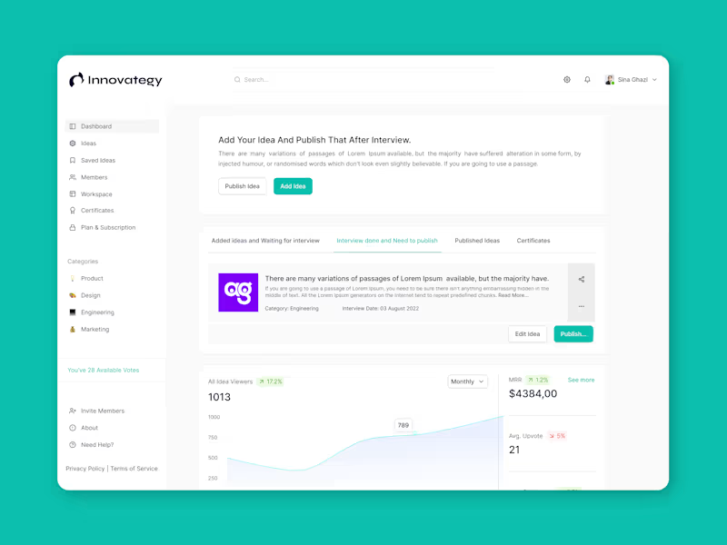
Ideation Tool Design (Web App) — SaaS Platform for Innovation Teams For a startup tackling the ideation gap, I designed the SaaS web app that allows users to validate ideas via uniqueness scoring, collaborate with teams, publish workflows, and earn innovation certificates. I mapped the user journey from discovery to certificate, built a clear sidebar structure for features like Ideas, Workspace, and Certifications, and implemented a card-based layout that makes complex data accessible and inviting. The final outcome: a scalable, user-friendly platform that blends productivity and creativity seamlessly. Available for freelance opportunities. Schedule a call at rifatuxd@gmail.com (mailto:rifatuxd@gmail.com)
1
65
Adobe Illustrator
(4)
Follow
Message
Md.Shamim Ahamed
Muhammadpur, Bangladesh
Graphics and logo designer
Follow
Message
Graphics and logo designer
0
Bold Logo Design for Trucking & Transport Services
0
9
0
Modern Pizza Logo Design for a Trendy Restaurant
0
5
0
logo design Clear Casa
0
3
View more →
Adobe Illustrator
(3)
Follow
Message
Md Ashraful Islam
Pabna, Bangladesh
Brand Identity and Logo Design Expert

Follow
Message
Brand Identity and Logo Design Expert
0
Splendor Comporta - Logo Project
0
9
0
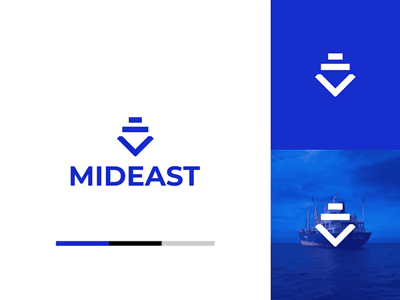
MIDEAST SHIPPING - Brand Identity
0
3
0
Logo Designs
0
5
0
Hotel Harrison - Brand Identity
0
6
Adobe Illustrator
(4)
Follow
Message
Mohammad Ali
Bogura, Bangladesh
Professional Vector Illustrator And Silhouette Designer
Follow
Message
Professional Vector Illustrator And Silhouette Designer
0
MLIT Logo Design For IT Institute
0
4
0
Tech Logo Design Project - Real Project
0
7
0
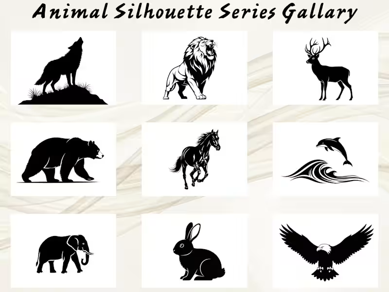
15 Premium Animal Silhouette Vector Collection
0
4
0
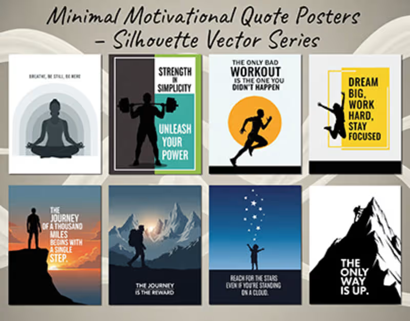
Minimal Motivational Quote Posters – Silhouette based
0
6
Adobe Illustrator
(6)
Follow
Message
Explore people