The network for creativity
Join 1.25M professional creatives like you
Connect with clients, get discovered, and run your business 100% commission-free
Creatives on Contra have earned over $150M and we are just getting started
Back to feedPost

SWAN SONNET | Brand Identity & Visual Design
A refined brand identity concept combining a swan-inspired logo, minimalist typography, muted natural tones, and cohesive brand applications.
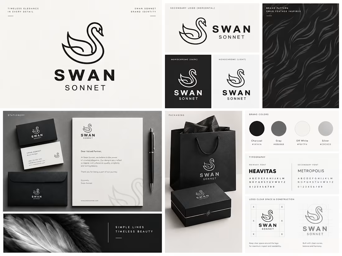
SWAN SONNET is a conceptual visual identity project centered on elegance, simplicity, and timeless design.
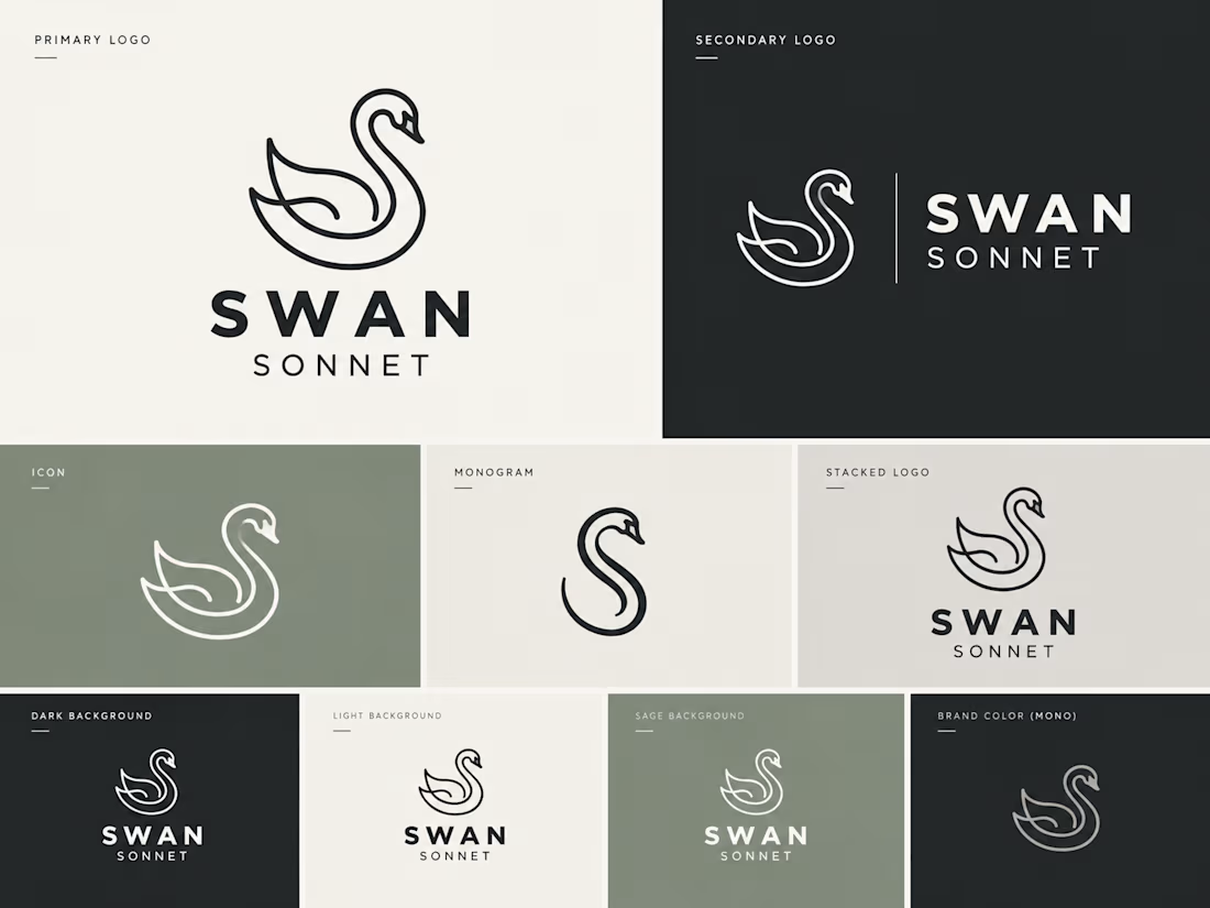
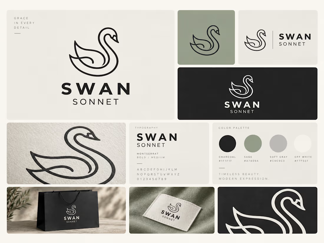
The creative direction brings together a distinctive swan symbol, modern typography, and a carefully curated palette of charcoal, sage green, soft gray, and warm off-white.
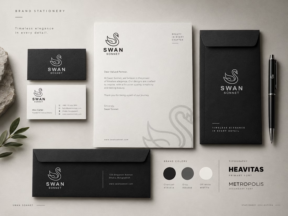
The project explores how a consistent identity can translate across different visual touchpoints, from logo variations and brand guidelines to stationery and packaging.
Project Deliverables:
Primary and secondary logo system
Icon and monogram variations
Typography and color palette
Brand pattern and graphic elements
Stationery and packaging concepts
Brand presentation and mockups
Design Focus:
Brand Identity · Logo Design · Visual Systems · Packaging Design · Art Direction
Creative Statement:
Grace in every detail.
Brand Identity, Logo Design, Branding, Graphic Design, Visual Identity, Packaging Design, Typography, Art Direction, Brand Guidelines, Creative Direction

The network for creativity
Join 1.25M professional creatives like you
Connect with clients, get discovered, and run your business 100% commission-free
Creatives on Contra have earned over $150M and we are just getting started
Related posts

🍔 BITE BOX — Where Every Bite Brings a Smile! 🧡
A fun, fresh, and memorable logo concept designed for a modern fast-food brand. The smile icon represents happiness, while the bold typography creates a friendly and recognizable identity. 🍟✨
#LogoDesign #FoodBranding #GraphicDesign #BrandIdentity #LogoDesigner


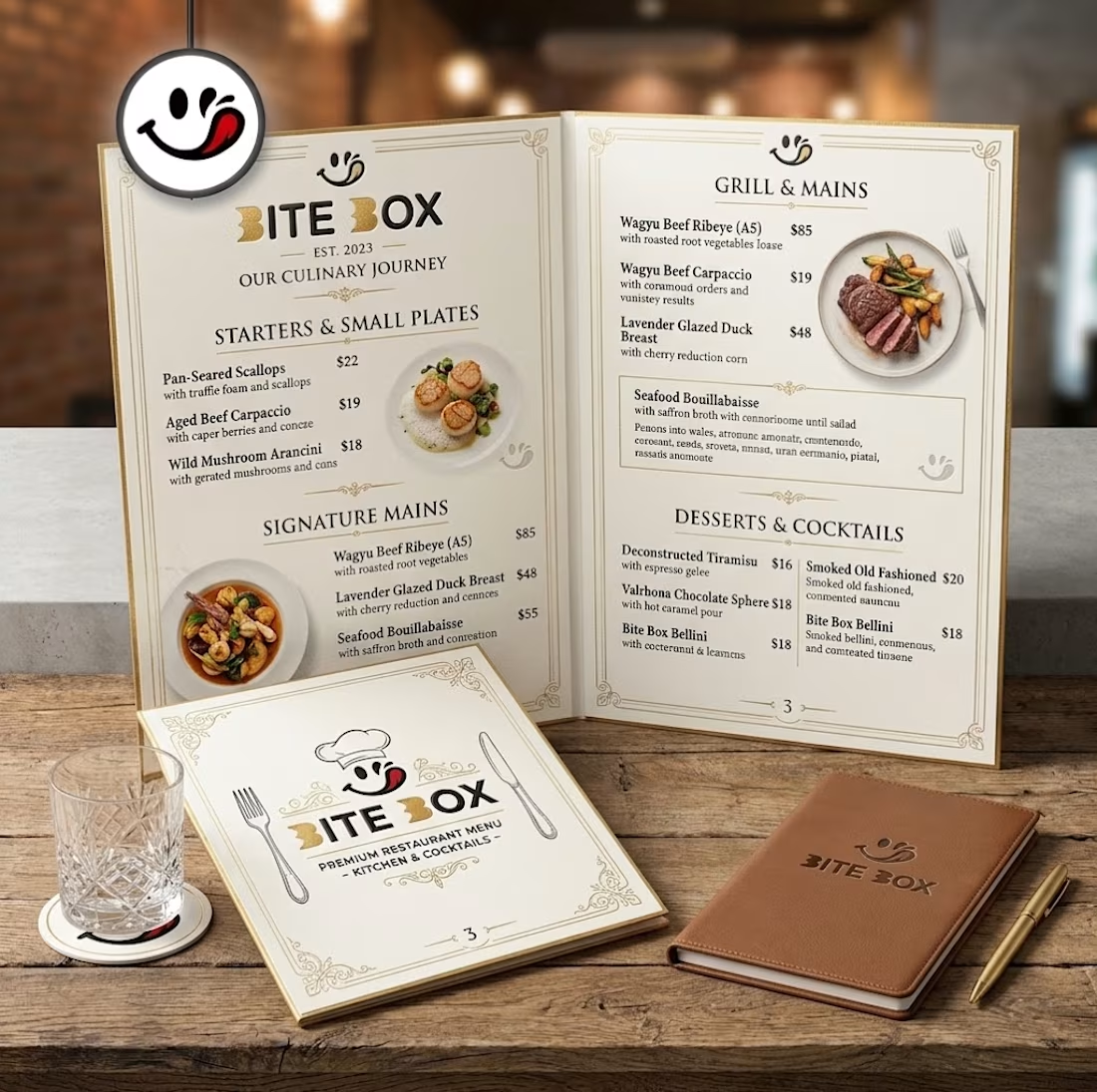
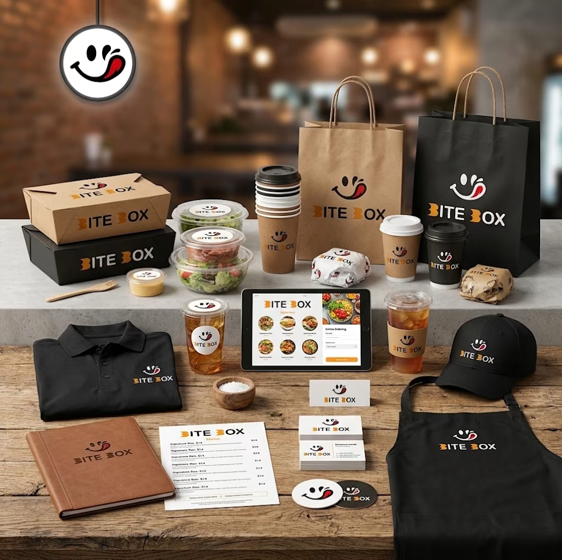
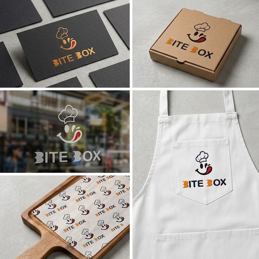


the little chef smile on the box is doing a lot of the work here


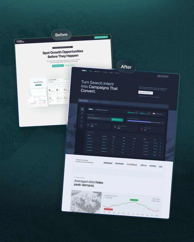
We redesigned ‘My Next Campaign’s website recently.
Clarity and a modern design were the entire plan behind this project.
The old website wasn’t up to date and didn’t match the app.
We wanted consistency throughout the brand so the product's easy to understand and navigate, and users know what to do next.
• A focused headline, supporting copy, and primary CTA.
• Kept features in a scannable module.
• Kept visual hierarchy to make the site less cluttered.
• Comparison with other tools to make the decision faster.
• Client testimonials, pricing plan, FAQ, and final CTA placed strategically.
We simplified the ‘My Next Campaign’ logo into the more distinctive ‘MNC’ mark.
The original wordmark is visually long.
It could be difficult to read at smaller sizes, and was challenging to place consistently in headers, navigation, and other branded sections.
This structure connects visuals with business goals.
Are you thinking about a redesign?
DM or comment here. Let’s work together.


Comparison with other tools placed before the pricing is a bold choice. Did you see it help people decide faster, or was it mostly a clarity move?

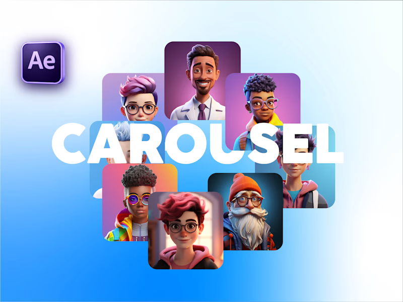
Carousel Animation vs Thumbnail
Description: A quick test to see how the animation and thumbnail work together. What do you think?


5 voted
71%
2 voted
29%
7 votes
Closed

Seamless