The network for creativity
Join 1.25M professional creatives like you
Connect with clients, get discovered, and run your business 100% commission-free
Creatives on Contra have earned over $150M and we are just getting started
Back to feedPost
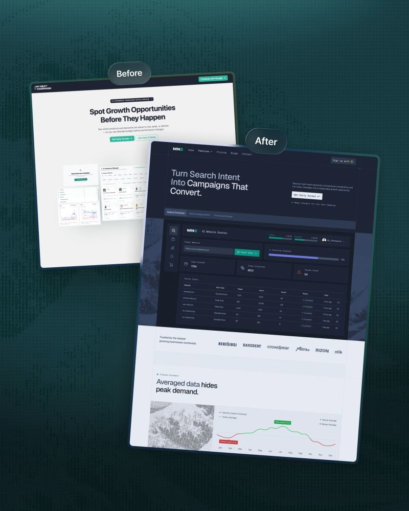
We redesigned ‘My Next Campaign’s website recently.
Clarity and a modern design were the entire plan behind this project.
The old website wasn’t up to date and didn’t match the app.
We wanted consistency throughout the brand so the product's easy to understand and navigate, and users know what to do next.
• A focused headline, supporting copy, and primary CTA.
• Kept features in a scannable module.
• Kept visual hierarchy to make the site less cluttered.
• Comparison with other tools to make the decision faster.
• Client testimonials, pricing plan, FAQ, and final CTA placed strategically.
We simplified the ‘My Next Campaign’ logo into the more distinctive ‘MNC’ mark.
The original wordmark is visually long.
It could be difficult to read at smaller sizes, and was challenging to place consistently in headers, navigation, and other branded sections.
This structure connects visuals with business goals.
Are you thinking about a redesign?
DM or comment here. Let’s work together.


Comparison with other tools placed before the pricing is a bold choice. Did you see it help people decide faster, or was it mostly a clarity move?


Mostly a clarity move. It gives people enough context before pricing, so the plans feel easier to compare.

Matching the website to the app is so often missed, nice to see consistency was the main goal. A focused headline with one primary CTA keeps it really clear for new users.
The network for creativity
Join 1.25M professional creatives like you
Connect with clients, get discovered, and run your business 100% commission-free
Creatives on Contra have earned over $150M and we are just getting started





Related posts



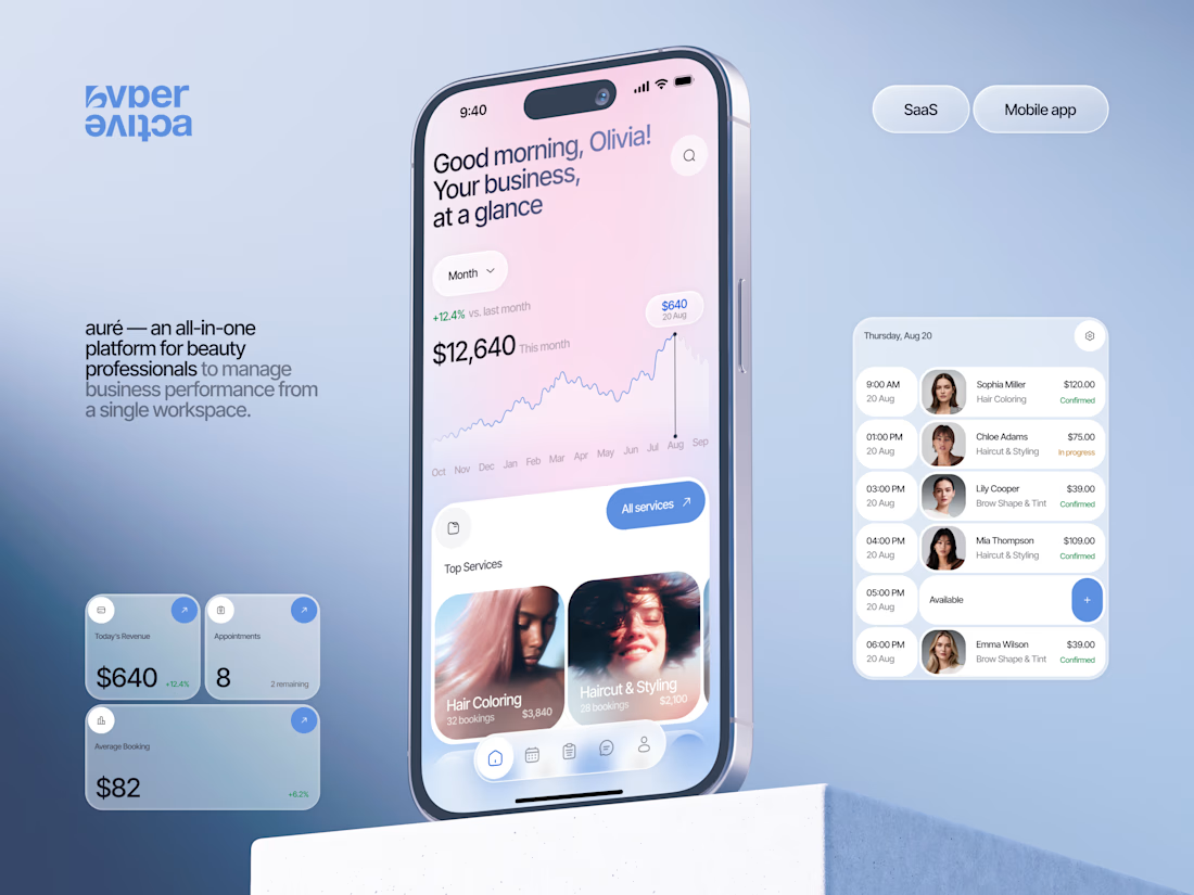
Finally wrapped up this project, and I’m excited to share the case study! 💅 A fresh product design concept for a beauty dashboard. Would love to hear your thoughts! ✨


A beauty dashboard is such a fun product design challenge, Oleksandra. The Good morning, Olivia! greeting in the header makes business metrics feel personal instead of clinical, which is exactly what a beauty professional would want.


A logo reveal created in Blender, where simple geometric shapes come together to form the Geisleris Studio identity.


Nice