💅 Product design for beauty dashboard | Hyperactive

Oleksandra Marchenko


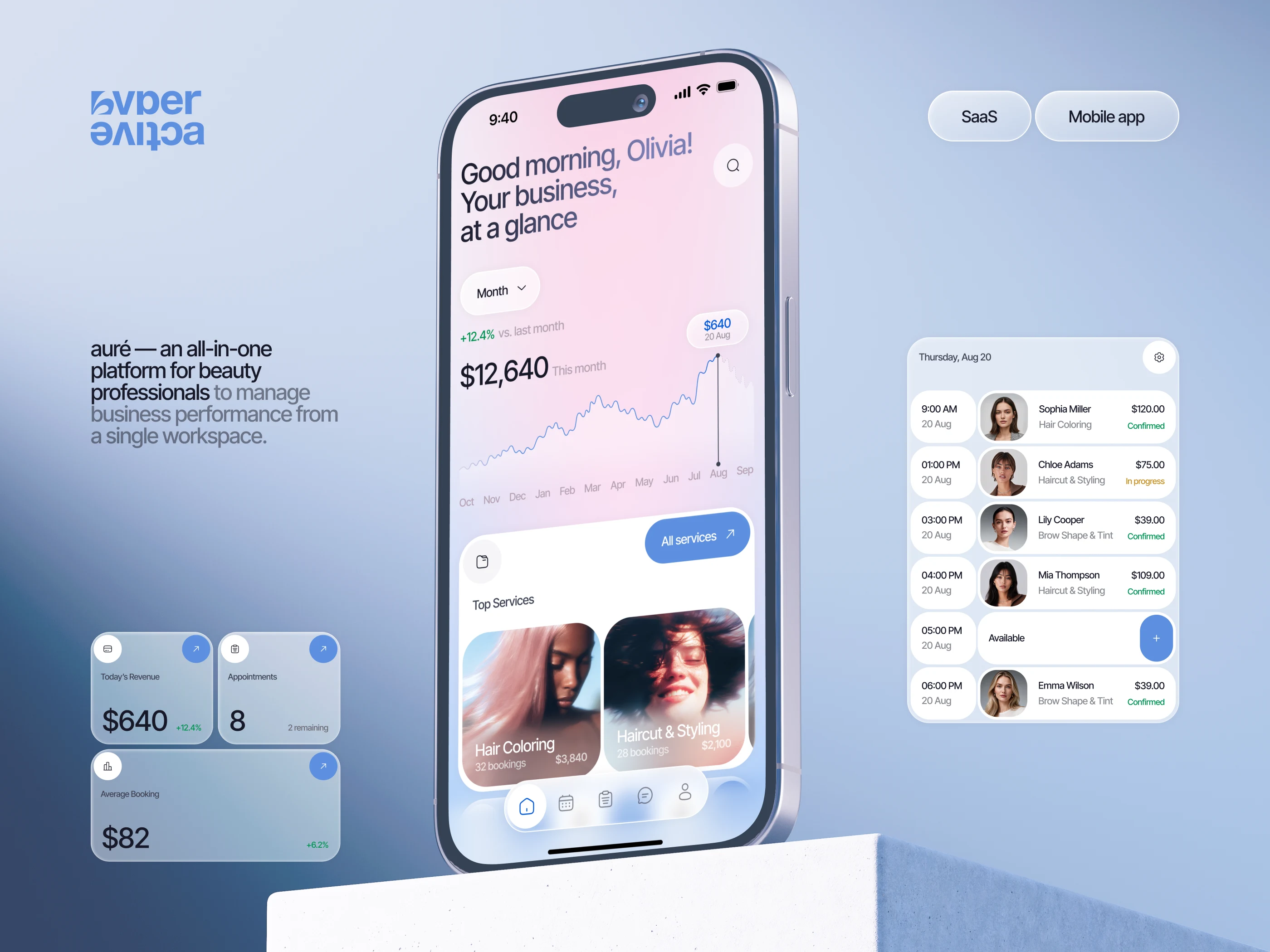
💎 Auré — Beauty Business Management SaaS Mobile App is a modern all-in-one platform designed to help beauty professionals manage appointments, track revenue, and grow their businesses from a single workspace. The concept combines Mobile App Design, SaaS Platform Design, User Interface Design, User Experience (UX) Design, iPhone iOS App Design, Dashboard Design, Product Design, Visual Design, Creative Design, and User-Centered Design. A sophisticated pastel color palette, soft gradients, and minimalist layouts create a premium digital experience for beauty salons, hairstylists, and independent beauty professionals.
Auré is an all-in-one SaaS platform designed for beauty professionals to manage their business from a single workspace. The experience combines performance analytics, appointments, services, and daily operations in a clear and visually refined mobile interface.
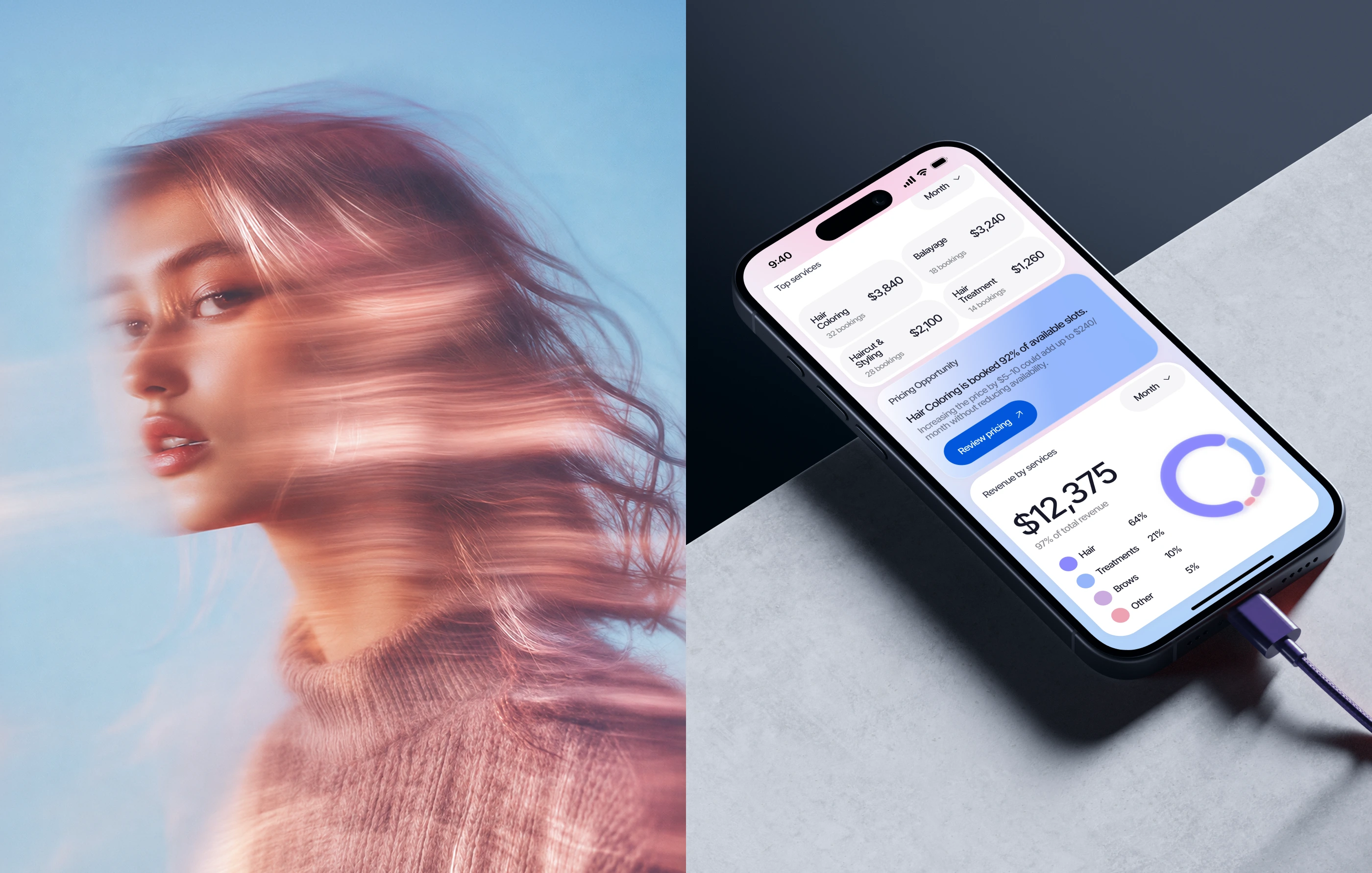
The visual direction brings together beauty imagery and digital product design. Soft blue and pink tones, expressive photography, and clean UI elements create a modern aesthetic that feels both professional and emotionally connected to the beauty industry.
We created a cohesive desktop and mobile experience for Auré, combining clear UX structure, intuitive workflows, and a refined visual system. The project covered SaaS product design, mobile interfaces, a scalable design system, and interactive prototypes.
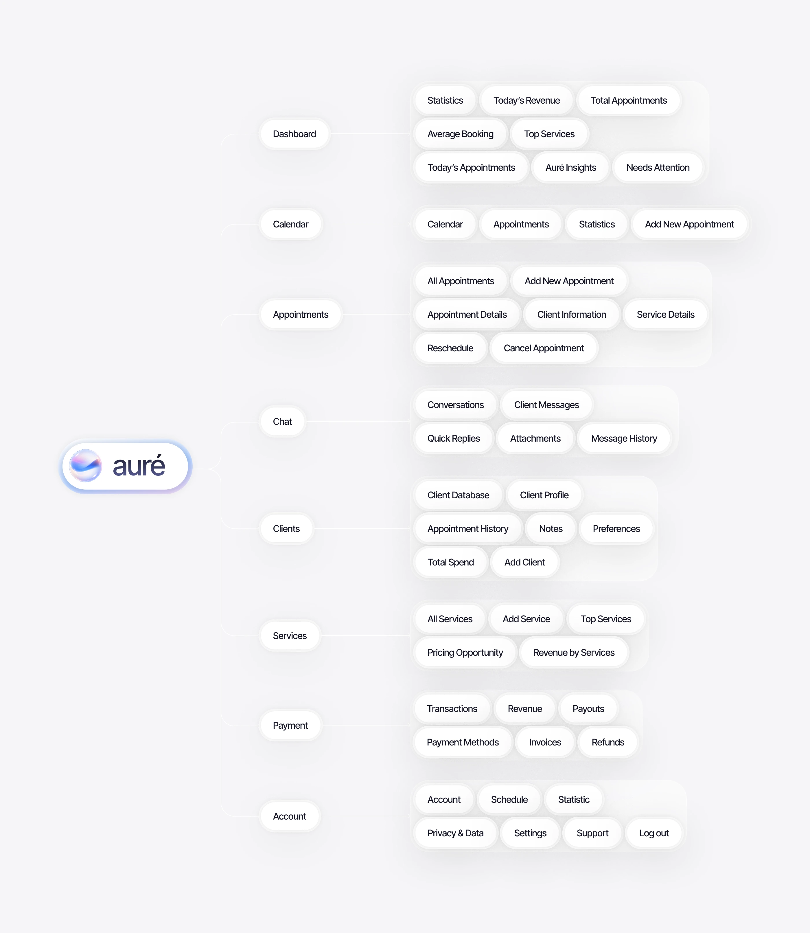
The product architecture was structured around the key workflows of beauty professionals. Dashboard, calendar, appointments, clients, services, payments, chat, and account management were organized into a clear hierarchy to make navigation simple and everyday tasks easier to complete.
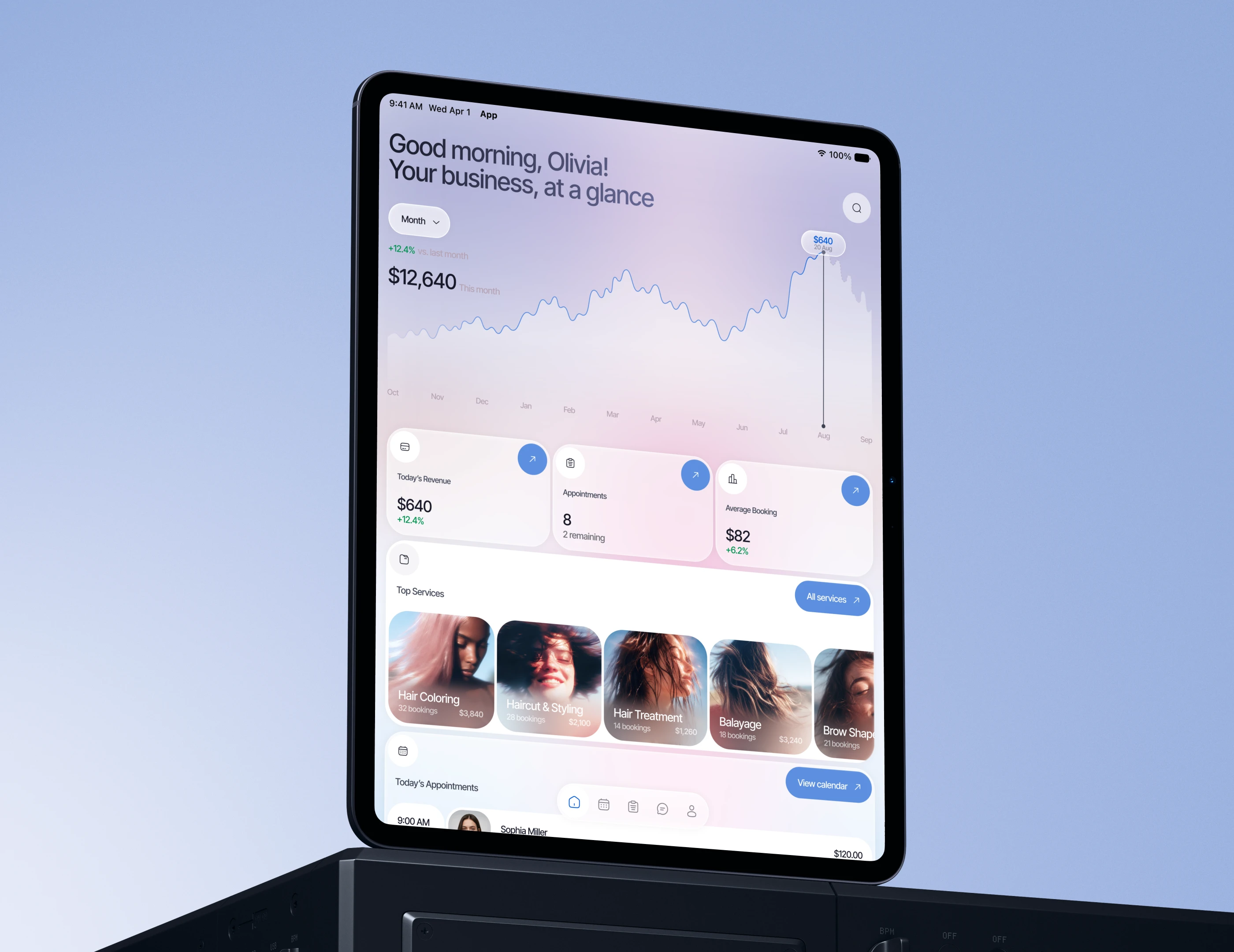
Auré was designed to work consistently across different devices. The tablet dashboard preserves the same visual language and functionality as the mobile and desktop versions, giving users quick access to revenue insights, appointments, services, and daily performance data.
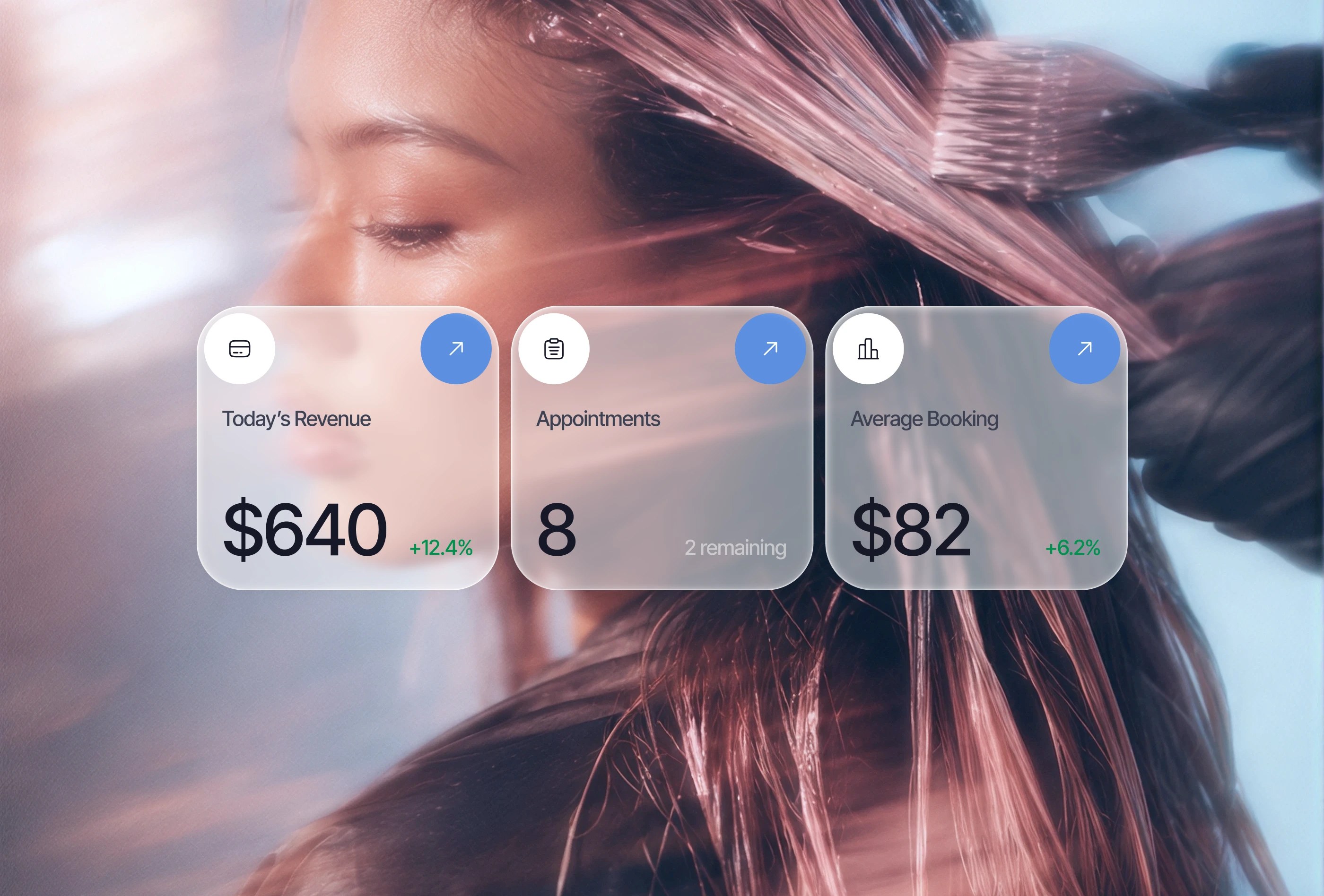
Key business metrics are surfaced through simple, easy-to-scan cards. Revenue, upcoming appointments, and average booking value give users an immediate overview of performance, helping them understand what is happening in their business without navigating through complex reports.
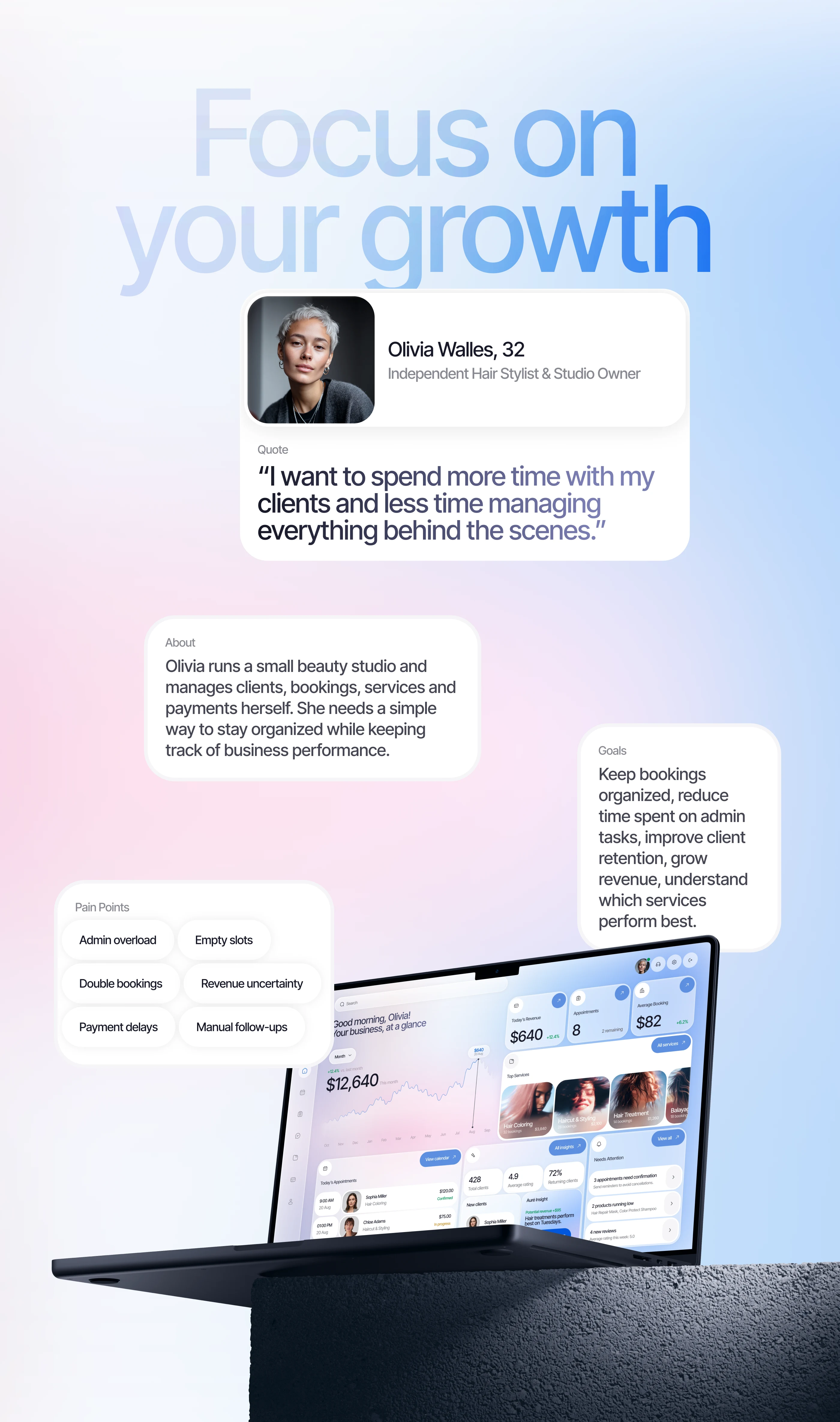
The experience was shaped around independent beauty professionals like Olivia, who manage clients, bookings, services, and payments themselves. The main goal was to reduce administrative overload, keep daily operations organized, improve client retention, and give users more time to focus on their clients and business growth.
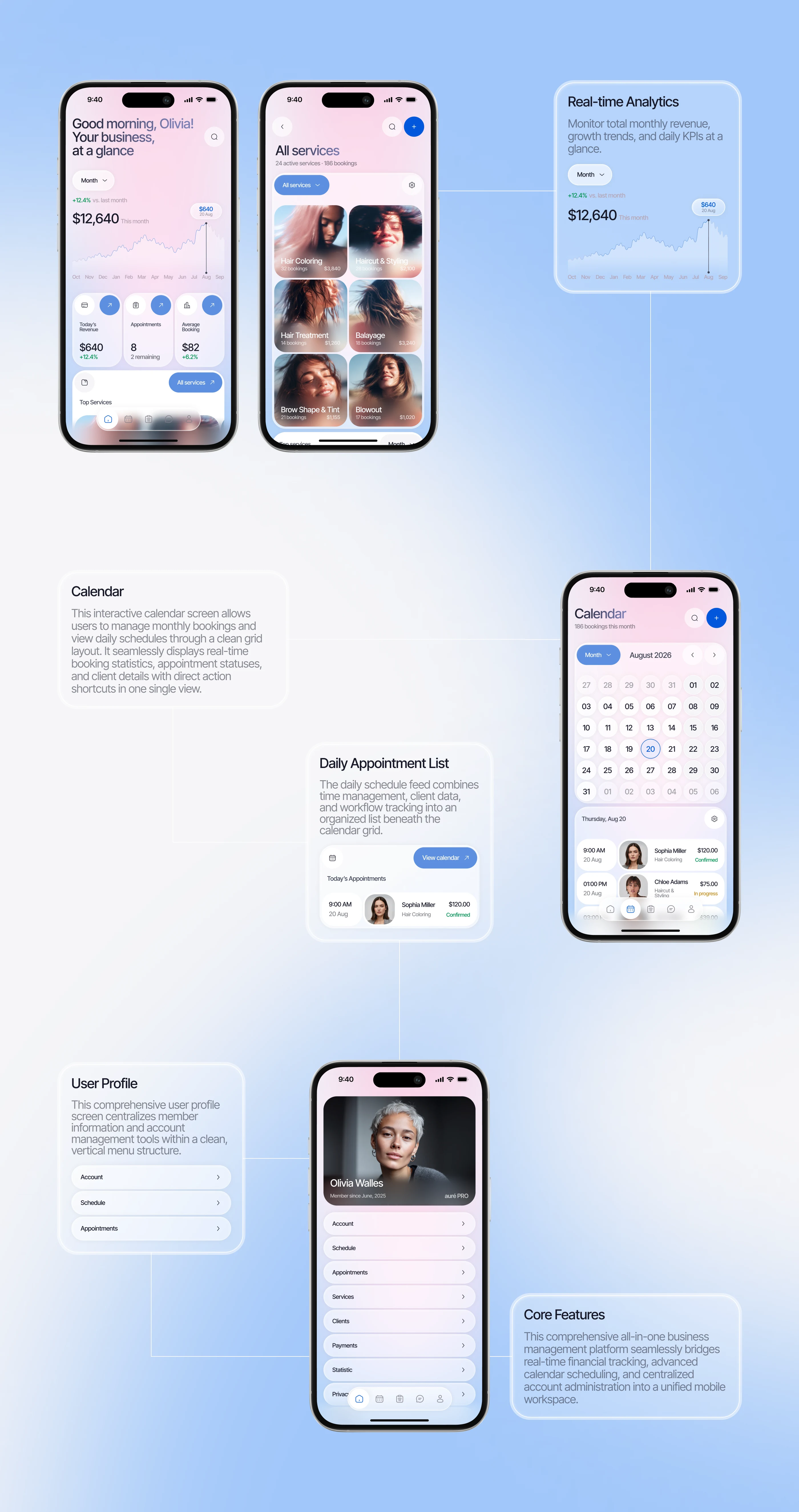
The mobile experience brings the most important business tools into one connected workflow. Users can monitor real-time analytics, manage bookings through the calendar, review daily appointments, access their profile, and handle core business operations directly from their phone.
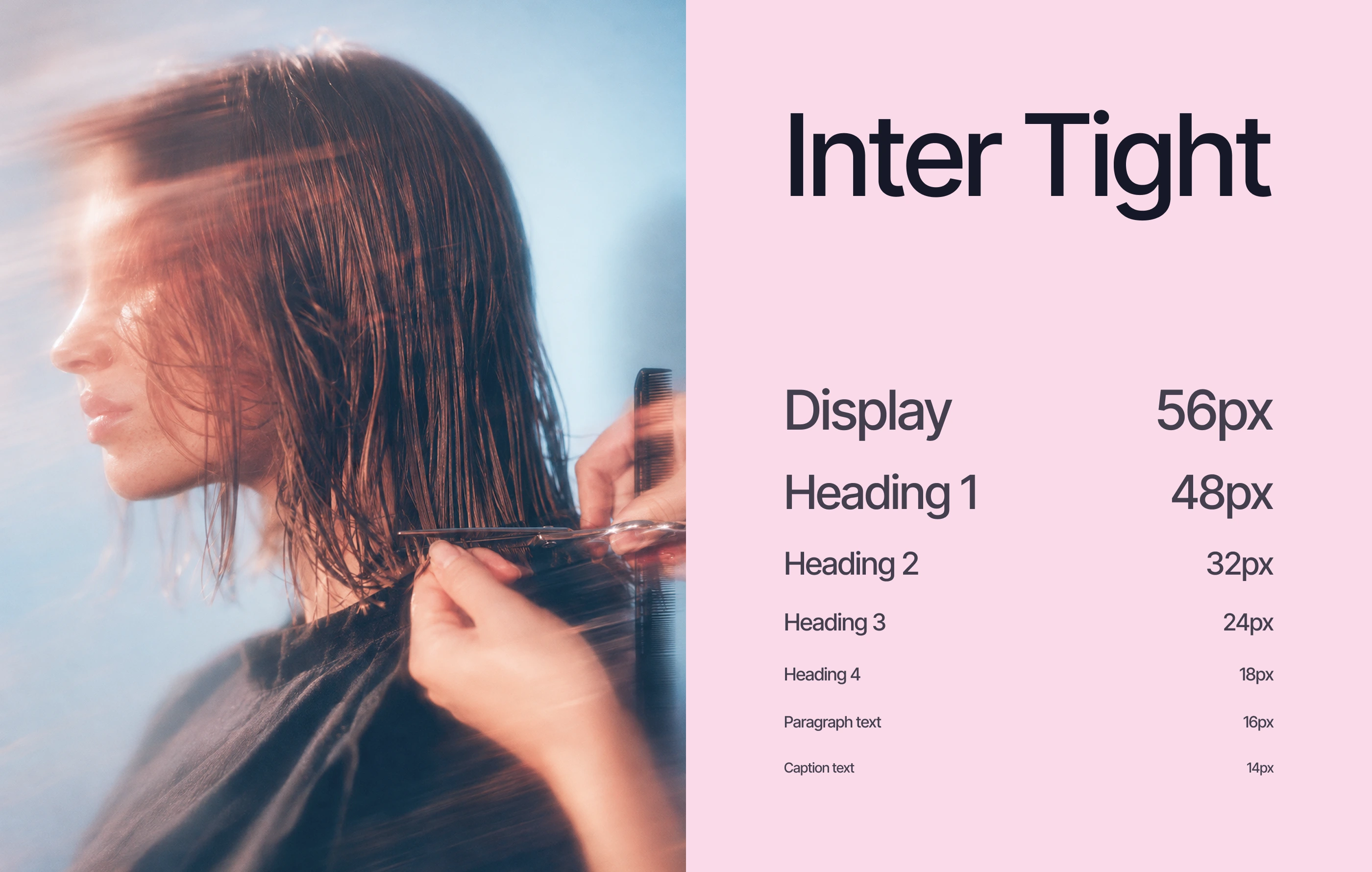
Inter Tight was selected as the primary typeface for its modern character, strong readability, and flexible hierarchy. A clear typography scale supports everything from large display statements to interface labels and captions, helping maintain consistency across both product screens and brand communication.
The Auré color palette combines soft blue, blush pink, lavender, and clean neutral tones to create a calm, premium, and approachable visual identity. Light gradients add depth without overwhelming the interface, while brighter blue accents highlight key actions, active states, and important data. White and soft gray surfaces keep content easy to scan and allow photography and analytics to remain visually dominant. The palette was designed to feel closely connected to the beauty industry while still supporting a professional SaaS product. Across mobile and desktop, color helps maintain consistency, hierarchy, and a recognizable brand experience.
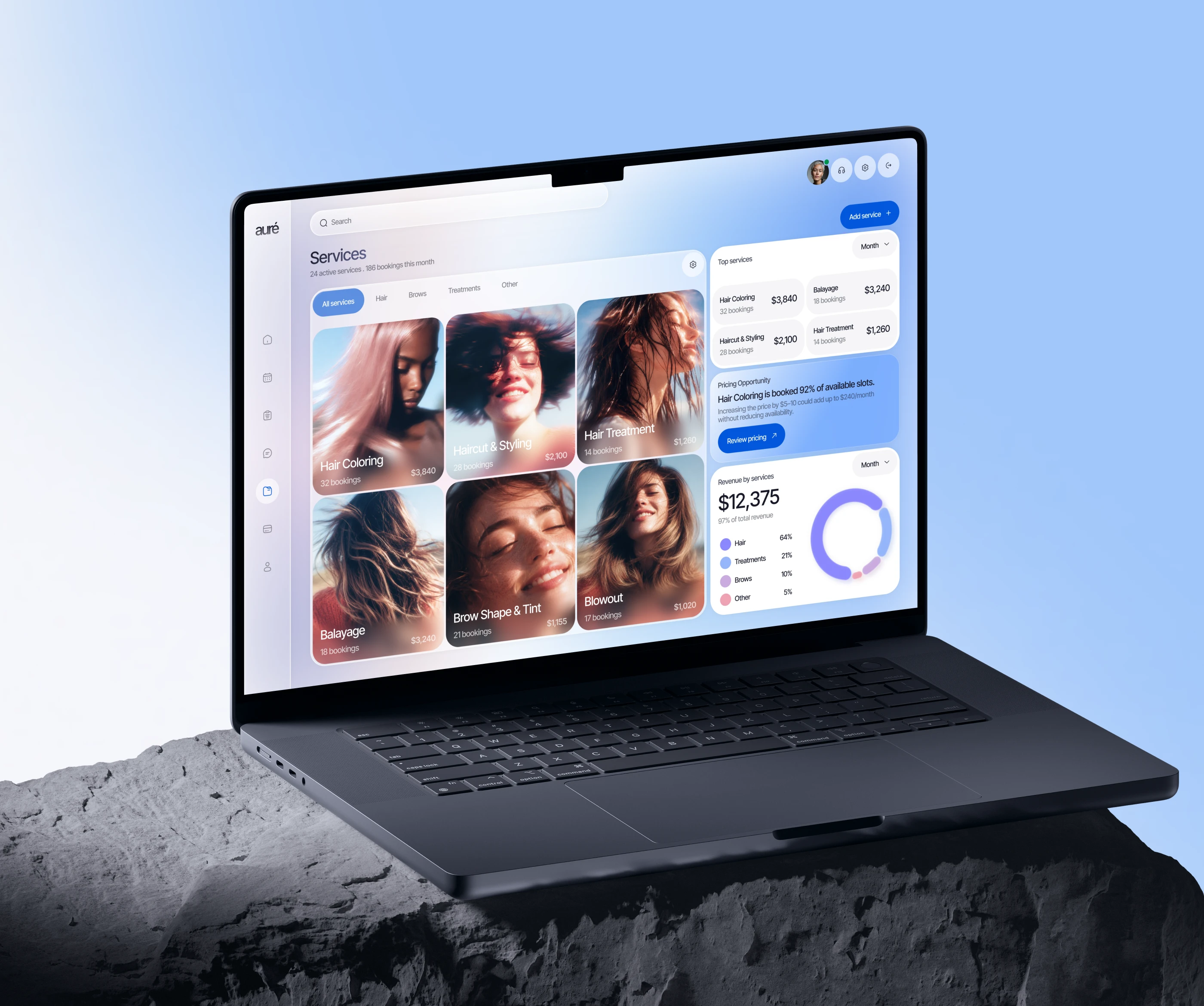
The desktop experience gives professionals more space to manage services and analyze performance. Service cards, booking data, pricing opportunities, and revenue breakdowns are presented together in one workspace, making business insights easier to understand and act on.
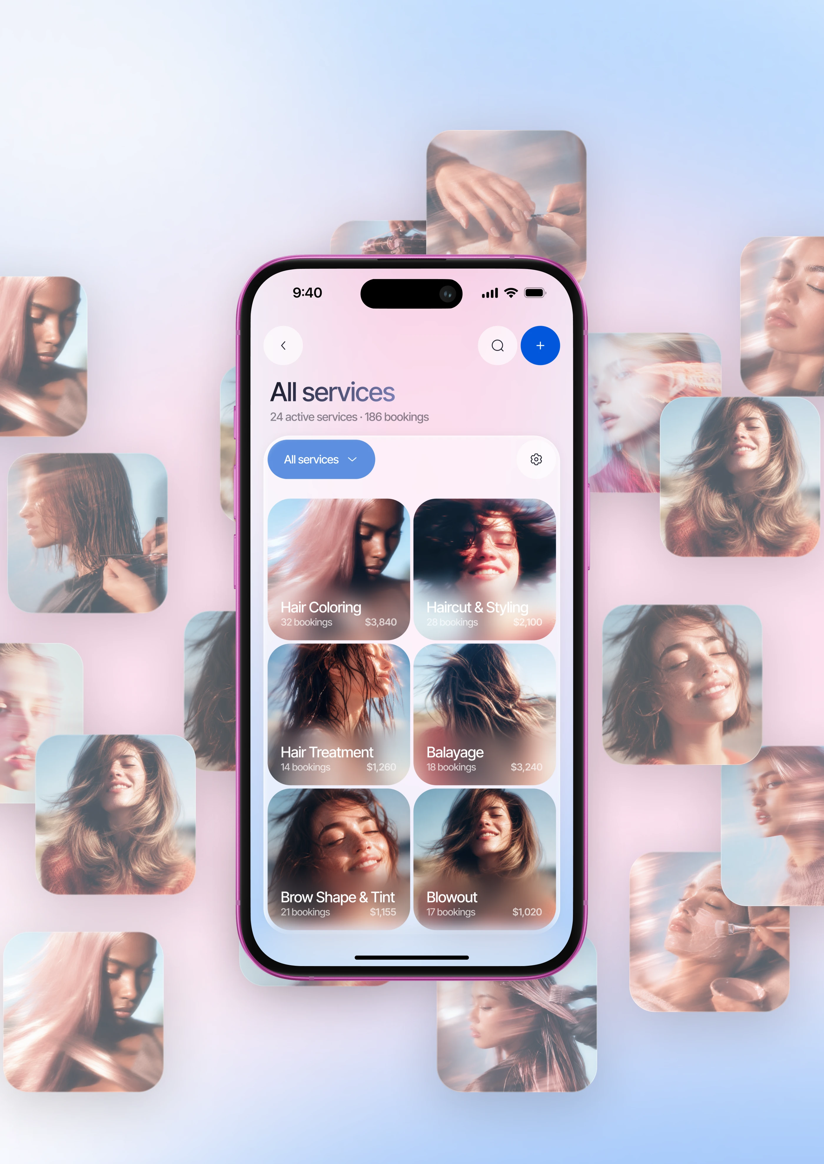
The services screen combines strong visual content with practical business information. Users can browse active services, view booking numbers and revenue, and quickly understand which treatments perform best. Photography makes the interface feel more relevant to the beauty industry while keeping the experience functional and easy to scan.
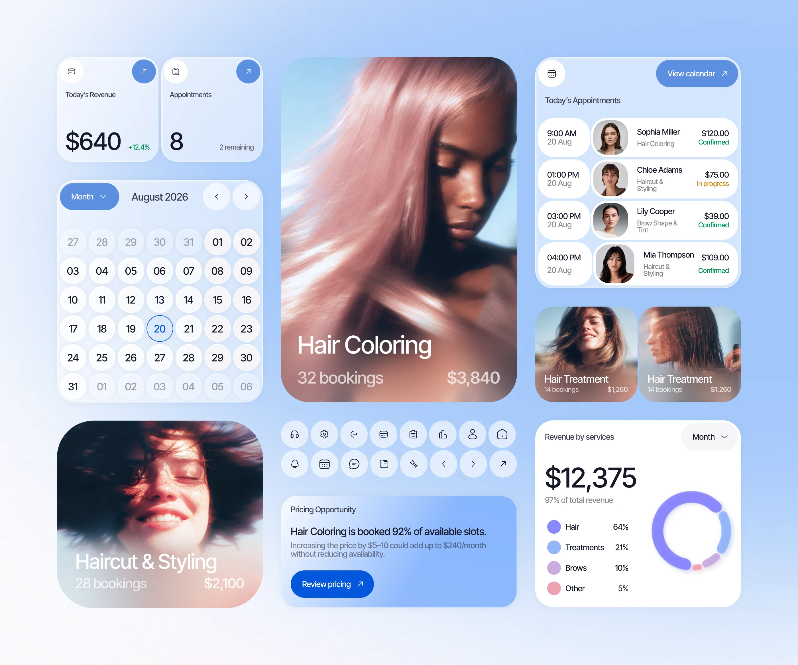
A modular UI system was created to keep the experience consistent across mobile and desktop. Cards, calendars, appointment lists, icons, analytics modules, service tiles, and action buttons share the same rounded geometry, spacing principles, and soft color palette.
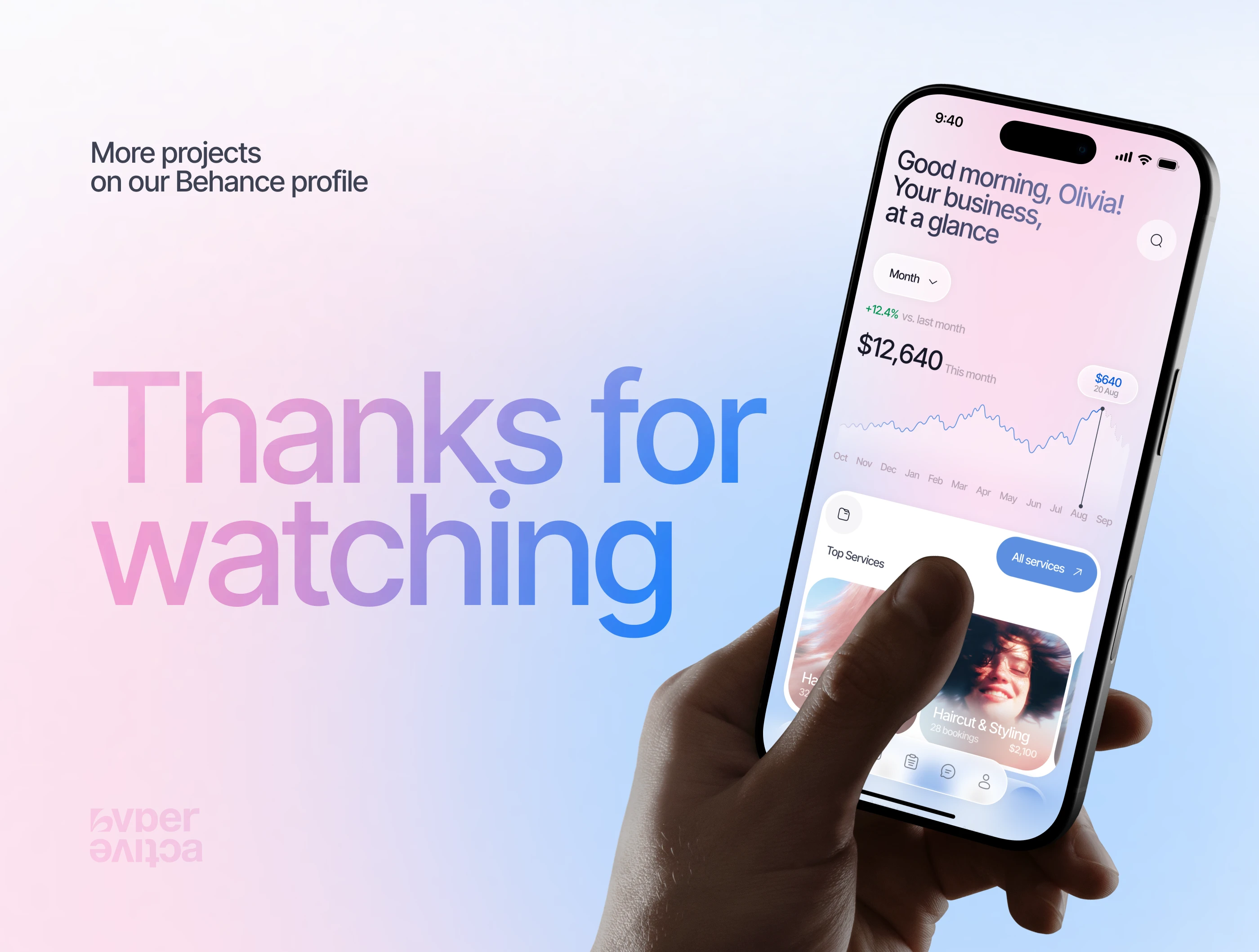
Auré brings business management and beauty-focused visual design into one cohesive digital experience. The final product balances clarity, functionality, and emotion across mobile and desktop, creating a flexible platform designed to support beauty professionals as their businesses grow.

Like this project
Posted Oct 20, 2026
Auré is a beauty business SaaS mobile & desktop app for managing appointments, tracking revenue, analyzing performance, and simplifying daily salon operations.