Freelance Brand Designers in Rajshahi Division
Sign Up
Post a job
Sign Up
Log In
Filters
2
Projects
People
Md Zahid Hasan Khan
Rajshahi Division, Bangladesh
I am a professional Brand Designer, I do all kind of Design
14
Followers
Follow
Message
I am a professional Brand Designer, I do all kind of Design
2
Indian Client Work Vitamin C 10% Face Serum Package Design. Here I have designed several packages of Vitamin C 10% Face Serum for my Indian client. From here, the client has finalized a design and is selling their product by printing that package. From here you can get your design ideas if you want and those who want to package such products can contact me. I am here for you. You (http://you.you/) can design labels for your products, and if you want, you can get your company's full branding done by me. If you want to get ideas about my designs, you can check out my entire portfolio, so if you need this service, be sure to contact me.
2
73
4
This logo for Zentro is built around calm, balance, and centered living. The symbol is a circular form, representing wholeness, unity, and completeness. It reflects the idea of being centered, both mentally and emotionally, which aligns perfectly with a meditation or mindfulness-focused brand. Inside the circle, the flowing shapes create a soft, continuous movement. These curves feel natural and organic, almost like a gentle path or breath flow. They subtly guide the eye through the mark, reinforcing a sense of calm and balance rather than tension or sharp direction. There’s also a quiet suggestion of a path or journey within the form. It hints at self-discovery and inner alignment without being literal, keeping the design minimal but meaningful. The color palette plays a big role here. The muted greens and earthy beige tones bring a grounded, natural feeling. Green connects to growth and harmony, while the warm neutrals add softness and stability. Together, they create a peaceful and reassuring visual tone. The typography is clean and modern, providing contrast to the organic symbol. It keeps the identity clear and professional while letting the icon carry the emotional and conceptual weight. Overall, the logo communicates a simple idea: Zentro is about finding balance, staying centered, and moving through life with calm and clarity.
4
136
1
This logo for Fluxa – AI Automation Tools is built around the idea of continuous flow, adaptability, and intelligent systems. The symbol is the core of the identity. It takes on an infinity-like form, representing endless processes, automation loops, and systems that keep running without interruption. At the same time, the shape subtly hints at an “F,” tying it directly back to the brand name. The smooth, flowing curves communicate flexibility and evolution. Nothing feels rigid. This reflects how AI systems adapt, learn, and optimize over time rather than staying fixed. The gradient blend of blue and violet adds depth and a sense of movement. Blue brings trust and technology, while the shift into violet introduces innovation and forward-thinking. Together, they create a modern, intelligent feel. The typography is clean and minimal, allowing the symbol to carry the concept. It keeps the brand grounded and professional, making it suitable for tech platforms and scalable across different use cases. The spacing and simplicity also reinforce clarity, which is key for a brand focused on automation and efficiency. Overall, the logo communicates a clear message: Fluxa is about seamless, continuous systems that evolve, adapt, and work effortlessly in the background.
1
111
2
This logo for Echo Root Podcast is built around a strong, meaningful dual concept—sound and origin. At the top, the waveform represents audio, voice, and storytelling. It instantly connects to the idea of a podcast, where conversations, ideas, and messages are constantly flowing. The waveform is clean and controlled, suggesting clarity and well-structured content. As the line moves downward, it transforms seamlessly into roots. This transition is the core idea of the logo. It visually communicates that every voice, every story, and every idea has a deeper origin. The roots symbolize depth, foundation, and connection to something real and meaningful. The vertical flow from waveform to roots creates a sense of direction. It feels grounded, as if the content isn’t just surface-level noise but something that goes deeper and resonates. The green color reinforces this idea. It represents growth, authenticity, and natural connection, aligning with the concept of rooted stories and organic conversations. The typography is simple and stable, allowing the symbol to carry the concept. The spacing in “PODCAST” adds a bit of air and rhythm, subtly echoing the idea of sound waves. Overall, the logo communicates a clear message: this is a platform where voices don’t just speak, they connect back to something deeper.
2
104
Brand Designer
(24)
Follow
Message
Md. Abdur Rahman
Pabna, Bangladesh
The designer that you can trust.
New to Contra
Follow
Message
The designer that you can trust.
2
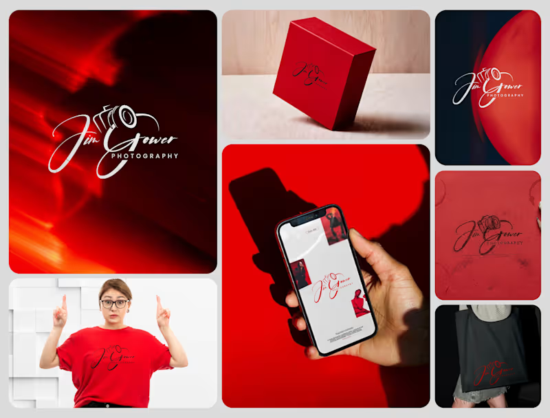
Signature Brand Identity System for a Photography Business PROJECT DESCRIPTION: Jim Gower is a professional photographer who needed more than a logo. He needed a complete brand identity that could represent his work at every level — from a business card handed to a client after a shoot to a lightbox sign above a studio entrance. The brief was clear: build something that feels personal, premium, and immediately recognizable as belonging to one person and one vision. The Approach Every decision in this project started with strategy before it touched aesthetics. Who is Jim Gower to his ideal client? What feeling should someone walk away with after their first encounter with his brand? What does premium mean in the photography space right now — and how do you stand apart from it without alienating it? The answers shaped everything that followed. The Work The primary logo is a signature script with the camera body structurally integrated into the letterforms — the "G" in Gower becomes the lens housing, making the mark read as both a name and a profession without requiring a separate icon. The script carries energy and movement, referencing the intuitive, fast-moving nature of working photographers. The crimson brand palette was selected for emotional weight — confident, warm, and saturated enough to hold presence across both physical and digital surfaces without compromise. The full system was then applied and stress-tested across every client touchpoint: — Primary and secondary logo variations — Brand color palette and typography system — Business card design — Premium gift box packaging — Tote bag and apparel — Digital UI mockup for web and mobile — Environmental signage and lightbox application The Result A brand identity system that positions Jim Gower not as a photographer with a logo, but as a brand with a presence — one that commands attention, communicates quality instantly, and scales from a phone screen to a storefront without losing a single point of its power. SERVICES INCLUDED IN THIS PROJECT: Brand Strategy, Logo Design, Visual Identity System, Brand Collateral Design, Packaging Design, Apparel Mockup, Digital UI Application, Environmental Signage Mockup Photography Logo Design, Signature Logo Design, Brand Identity System, Photographer Branding, Script Logo Design, Visual Identity Design, Custom Logo Design, Brand Identity Designer, Logo Design Process, Creative Brand Design, Handcrafted Logo Design, Photography Brand Kit, Premium Brand Identity, Calligraphy Logo Design, Brand Mockup Design, Logo Design Concept, Red Brand Identity, Photographer Visual Identity, Brand Strategy Design, Full Brand System
2
54
1
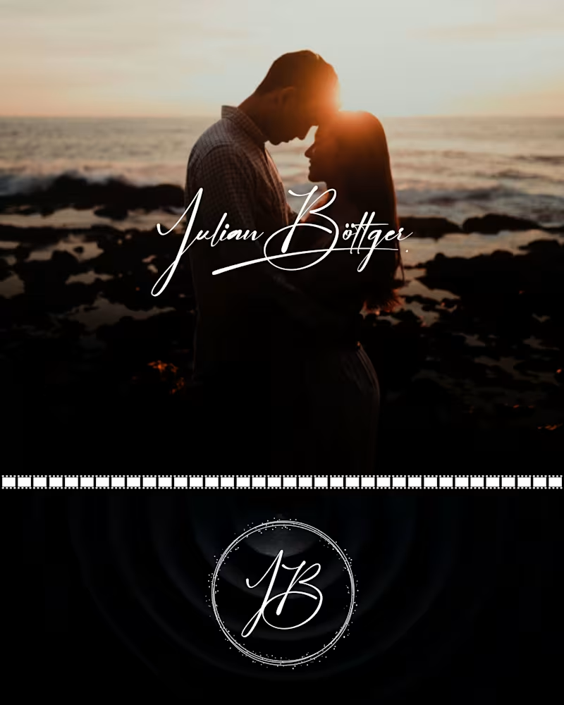
Julian Böttger — Full Brand Identity for a Wedding & Portrait Photographer A photographer's work lives and dies by first impressions. Julian's images were exceptional. His brand wasn't keeping up. We built a complete visual identity from the ground up — designed to feel personal, timeless, and scalable across every surface it would ever touch. What was delivered: → Custom hand-lettered signature logotype (primary mark) → Monogram seal (JB) for watermarks, merch, and secondary use → Business card system — black and white versions → Studio signage mockup → Apparel (t-shirt + tote bag) → Stationery and print collateral → Film-strip and overlay assets for video content The brief was clear: no templates, no stock fonts, nothing generic. Every element was drawn or crafted specifically for this brand. The identity now works at every scale — from a coffee mug to a 6-foot sign — and across every context, from dark editorial photography to bright lifestyle imagery. Available for similar projects. Inquire to discuss scope and timeline. Brand Identity, Logo Design, Visual Identity, Graphic Design, Photography, Creative Services, Wedding Industry, Brand Guidelines, Print Design, Merch Design
1
38
5
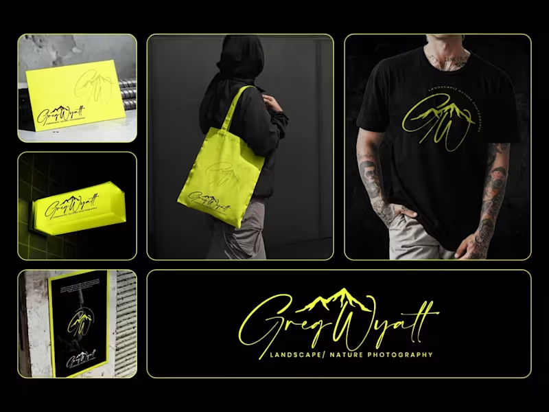
Greg Wyatt — Landscape & Nature Photography | Full Brand Identity System Project Summary: A complete brand identity built for a landscape and nature photographer who needed more than a logo — he needed a visual world that matched the scale of what he shoots. The Brief: Greg Wyatt captures landscapes the way most people only dream of seeing them. The work is cinematic, emotional, and deeply personal. But his brand wasn't reflecting any of that. The goal was to build a cohesive identity system from the ground up — one that could hold its own across every surface it touched. The Approach: Every decision in this project started with one question: does this feel like standing at the edge of something vast? The signature wordmark was hand-lettered in style to feel personal and authorial — because the best landscape photography is never accidental. It carries the photographer's fingerprint. The mountain mark was integrated directly into the initials rather than placed beside them, making the connection between artist and subject inseparable. Color was the most strategic call in this project. Neon yellow on deep black creates the kind of contrast that stops a scroll, but it wasn't chosen for that reason alone. It references the exact quality of light that makes a great outdoor photograph — that electric moment just before or after darkness. The brand lives in that moment. The system was then pressure-tested across real-world applications: a neon illuminated storefront sign, business cards, tote bags, apparel, and a brand pattern — because a logo that only works on a white background isn't a brand system. It's a starting point. What Was Delivered: — Primary signature wordmark — Mountain monogram mark — Circular badge logo — Submark and watermark variations — Brand color and typography system — Business card design — Tote bag design — T-shirt / apparel design — Illuminated signage mockup — Brand pattern / texture — Full brand presentation The Result: A brand identity that works as hard as the photographer behind it. Cohesive across every format. Instantly recognizable. Built to grow with the brand rather than date it. Services Provided: Brand Identity Design · Logo Design · Visual Identity · Brand Strategy · Print Design · Merch Design · Brand Presentation Keywords: Brand Identity, Logo Design, Photography Brand, Signature Logo, Handwritten Logo, Mountain Logo, Nature Photography Branding, Outdoor Brand Identity, Monogram Logo, Visual Identity System, Photographer Branding, Custom Logo Design, Dark Brand Aesthetic, Neon Branding, Apparel Design, Print Collateral, Brand Strategy, Creative Direction, Full Brand System, Freelance Brand Designer
6
5
69
2
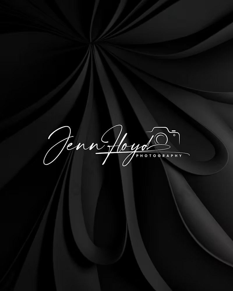
Project Title: Jenn Floyd Photography — Premium Visual Identity System Role: Brand Designer & Strategist Services: Brand Identity, Custom Lettering, Visual Strategy The Overview Many independent creatives compete on price because their visual identity relies on standard, off-the-shelf fonts. For the Jenn Floyd identity system, the objective was clear: skip the generic templates and build a bespoke, signature-driven brand that instantly positions the photography studio in the premium market. The Strategic Process True brand strategy lives in scalability. A premium identity must transition seamlessly across vastly different mediums without losing its core DNA or visual impact. Phase 1: Raw Sketching: Developed using graphite to map out organic weight, authentic line thickness, and typographic rhythm. Phase 2: Digital Optimization: Refined into a high-contrast digital vector optimized as an editorial watermark for low-light photography and high-res mobile interfaces. Phase 3: Physical Touchpoints: Engineered with precise line weights to translate flawlessly from luxury blind-embossed packaging to backlit storefront signage. By focusing on custom craftsmanship rather than fleeting design trends, we created a cohesive visual system that intentionally drives up perceived market value and consumer trust. Project Deliverables Custom Signature Wordmark & Secondary Sub-marks Comprehensive Brand Identity & Typography System Multi-Medium Asset Optimization (Digital Watermarking, Print, & Signage) Production-Ready Packaging Assets (Blind Embossing Specifications) Tools Used Adobe Illustrator, Adobe Photoshop, Procreate Tags & Skills brand identity, logo design, visual identity, custom lettering, typography, packaging design, creative direction, brand strategy, vector illustration, art direction, luxury branding
2
47
Brand Designer
(17)
Follow
Message
Md.Shamim Ahamed
Muhammadpur, Bangladesh
Graphics and logo designer
Follow
Message
Graphics and logo designer
0
Bold Logo Design for Trucking & Transport Services
0
5
0
Modern Pizza Logo Design for a Trendy Restaurant
0
1
0
logo design Clear Casa
0
1
View more →
Brand Designer
(3)
Follow
Message
Md Ashraful Islam
Pabna, Bangladesh
Brand Identity and Logo Design Expert

Follow
Message
Brand Identity and Logo Design Expert
0
Splendor Comporta - Logo Project
0
8
0
MIDEAST SHIPPING - Brand Identity
0
3
0
Logo Designs
0
5
0
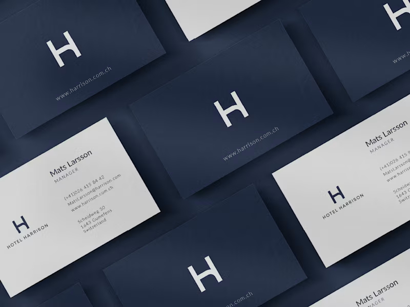
Hotel Harrison - Brand Identity
0
6
Brand Designer
(4)
Follow
Message
Mohammad Ali
Bogura, Bangladesh
Professional Vector Illustrator And Silhouette Designer
Follow
Message
Professional Vector Illustrator And Silhouette Designer
0
MLIT Logo Design For IT Institute
0
2
0
Tech Logo Design Project - Real Project
0
4
0
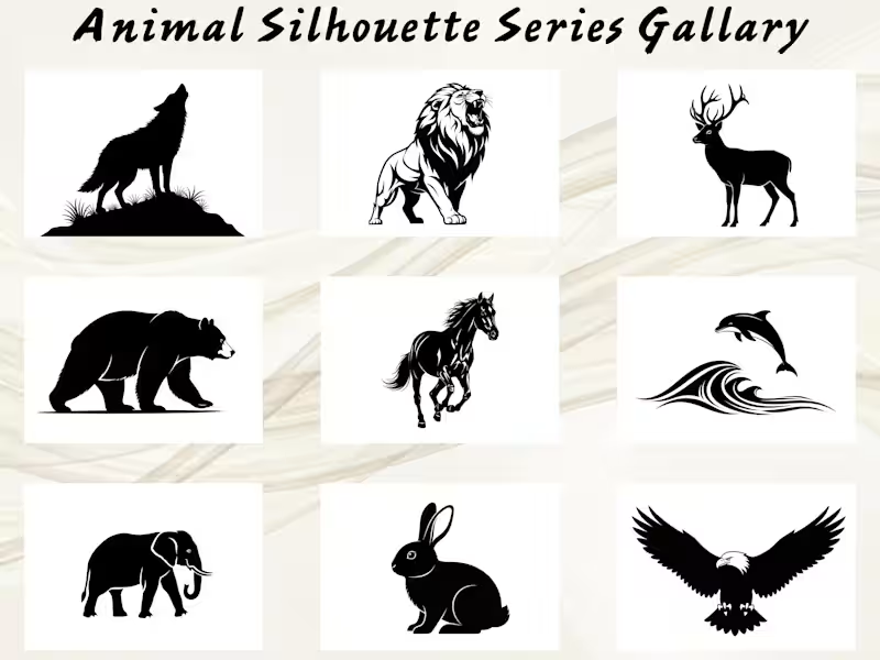
15 Premium Animal Silhouette Vector Collection
0
2
0
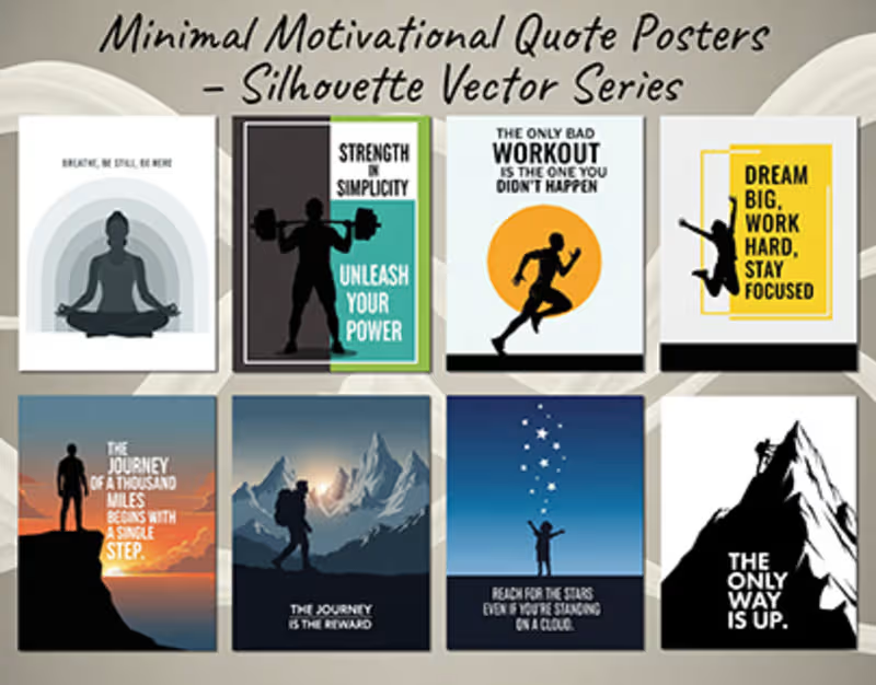
Minimal Motivational Quote Posters – Silhouette based
0
5
Brand Designer
(2)
Follow
Message
Abu Jaeed Khan
Pabna, Bangladesh
Visual/Graphic Designer
Follow
Message
Visual/Graphic Designer
0
Poster of Tamim Iqbal
0
19
0
Gym Social Media Post
0
17
0
Logo for Women Luxury Brand
0
9
0
Logo for Skopeai
0
12
Brand Designer
(13)
Follow
Message
Iqbal Hssain
Rajshahi, Bangladesh
Graphic Designer
Follow
Message
Graphic Designer
0
Packaging Design
0
1
0
Social Media Post Design
0
1
0
Amazon A+ Content Design
0
1
View more →
Brand Designer
(3)
Follow
Message
Humaun Atelier
Pabna, Bangladesh
Brand & UI Designer | Print, Packaging & Sticker Specialist
New to Contra
Follow
Message
Brand & UI Designer | Print, Packaging & Sticker Specialist
0
I designed a Facebook cover for LOVE FIT™ Emotional Toolkit – a brand focused on emotional well-being for families. The design features bold, confident typography with the powerful message: "BIG FEELINGS LIVE HERE. REAL-LIFE TOOLS FOR REAL-LIFE MELTDOWNS." This captures the brand’s mission to provide practical, real-world support for parents and children. The cover includes: A warm, inviting color palette that feels supportive and trustworthy Clear, easy-to-read typography that works well on both desktop and mobile A central call-to-action: "DOWNLOAD LINK IN PINNED POST" to encourage engagement A clean layout that keeps the focus on the message The design was optimized for Facebook’s cover dimensions and aligns with the brand’s tone — practical, caring, and empowering. Delivered as a high-resolution JPG file, ready for immediate use on social media.
0
110
0
This landing page was designed for Budget Branders, a manufacturer of custom disposable cups and bags for the food & beverage industry. The primary goal was to overhaul their plain, corporate website into a visually bold and fluid experience that drives lead generation. To capture the energy of the F&B sector, I incorporated dynamic elements like floating coffee beans and liquid splashes, moving away from static white sections. I maintained their brand identity using the signature lime green, grey, and white palette, while introducing bold typography and a clear conversion path—updating the primary call-to-action to 'Request Free Quote' to maximize client inquiries.
0
55
0
I designed a complete 3-ring Superhero-themed Feelings Wheel for children aged 5–12, created for Bella Coaching. The wheel is a practical tool that helps children: Identify what they are feeling Learn feeling vocabulary Choose a positive action (Superhero Move) to help them manage emotions The design is structured in three rings: 🔴 Inner Ring – 5 Main Feelings: Angry, Worried, Sad, Happy, Overwhelmed — each with a custom icon: lightning, cloud, raindrop, star, and swirl. 🟣 Middle Ring – 30+ Feeling Words: Expanded vocabulary for each emotion, carefully chosen for children. 🟢 Outer Ring – 25 "Superhero Moves": Instead of traditional coping skills, this ring uses fun, empowering action-based phrases like "Belly Breath", "Push the Wall", "Memory Mission", and "Victory Dance". The center features a superhero shield with the message: "Feel It. Name It. Choose Your Move." Delivered in multiple formats: Printable high-res PDF (3000×3000 px) Facebook and Instagram versions (square + portrait) Color and monocolor superhero style options The design is bright, fun, gender-neutral, easy to read, and created to be a supportive resource for coaches, parents, and educators.
0
110
0
I designed a complete 5×7 inch postcard insert for the Road Trip Adventure product line – a travel activity kit designed for families. The front side features: A bold title: "Road Trip Adventure Activity Collection" A warm welcome message 5 different game modes: Classic Bingo, Blackout Challenge, Family Teamwork, Who Saw It First, and 10-Minute Challenge A bonus section with a QR code linking to a free Feelings Wheel resource A friendly footer message The back side integrates a QR code with clear call-to-action text: "Scan to access your FREE Feelings Wheel & Superhero Moves." The design includes custom vector illustrations (car, hills, trees, sun, clouds, road) and maintains a clean, modern, and cheerful aesthetic — perfect for retail packaging. All files were delivered in print-ready formats: Print-ready PDF with 0.125" bleed, safe zone, and CMYK color profile High-resolution JPG preview PNG with transparent background SVG vector file Adobe Illustrator source file (AI) This project required careful typography, layout planning, and print preparation to ensure the final product meets professional printing standards.
0
116
Brand Designer
(1)
Follow
Message
Explore people