Project Title: Jenn Floyd Photography
Md. Abdur Rahman
Project Title: Jenn Floyd Photography — Premium Visual Identity System
Role: Brand Designer & Strategist
Services: Brand Identity, Custom Lettering, Visual Strategy
The Overview
Many independent creatives compete on price because their visual identity relies on standard, off-the-shelf fonts. For the Jenn Floyd identity system, the objective was clear: skip the generic templates and build a bespoke, signature-driven brand that instantly positions the photography studio in the premium market.
The Strategic Process
True brand strategy lives in scalability. A premium identity must transition seamlessly across vastly different mediums without losing its core DNA or visual impact.
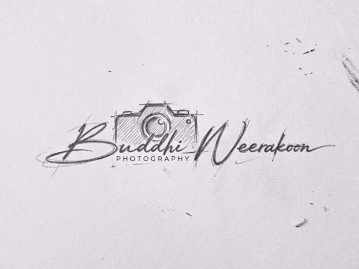
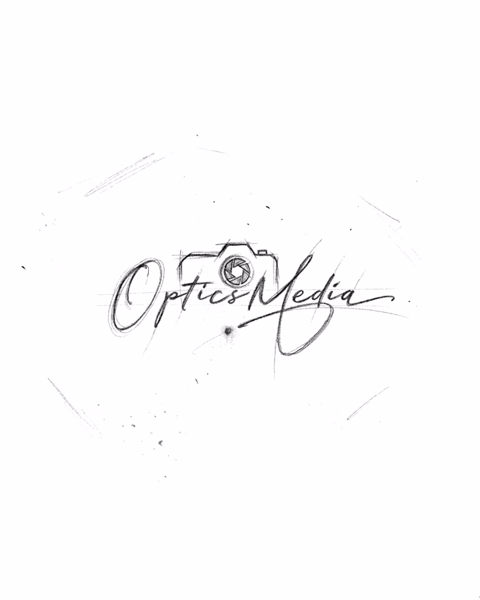
Phase 1: Raw Sketching: Developed using graphite to map out organic weight, authentic line thickness, and typographic rhythm.
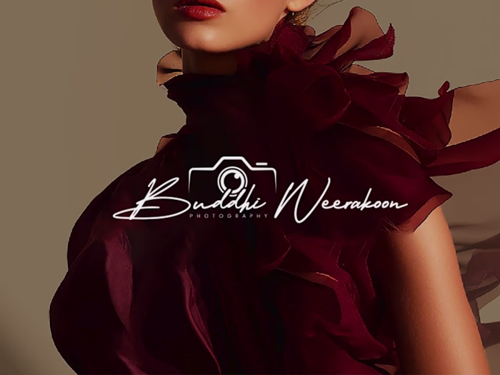
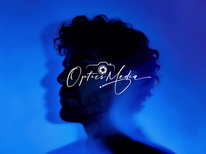
Phase 2: Digital Optimization: Refined into a high-contrast digital vector optimized as an editorial watermark for low-light photography and high-res mobile interfaces.
Phase 3: Physical Touchpoints: Engineered with precise line weights to translate flawlessly from luxury blind-embossed packaging to backlit storefront signage.
By focusing on custom craftsmanship rather than fleeting design trends, we created a cohesive visual system that intentionally drives up perceived market value and consumer trust.
Project Deliverables
Custom Signature Wordmark & Secondary Sub-marks
Comprehensive Brand Identity & Typography System
Multi-Medium Asset Optimization (Digital Watermarking, Print, & Signage)
Production-Ready Packaging Assets (Blind Embossing Specifications)
Tools Used
Adobe Illustrator, Adobe Photoshop, Procreate
Tags & Skills
brand identity, logo design, visual identity, custom lettering, typography, packaging design, creative direction, brand strategy, vector illustration, art direction, luxury branding
Like this project
Posted May 27, 2026
Project Title: Jenn Floyd Photography — Premium Visual Identity System Role: Brand Designer & Strategist Services: Brand Identity, Custom Lettering, Visual S...