Most logos get designed. Few
Md. Abdur Rahman
Most logos get designed. Few get built from the ground up with this much intention.
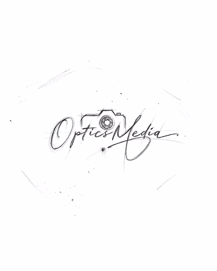
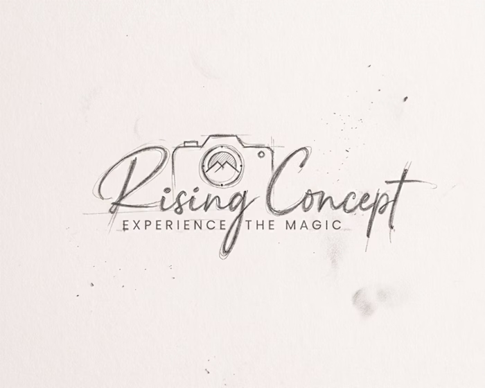
The brief was straightforward: create a photography identity that feels personal, professional, and impossible to forget. The answer started exactly where it should — pencil on paper, no shortcuts.
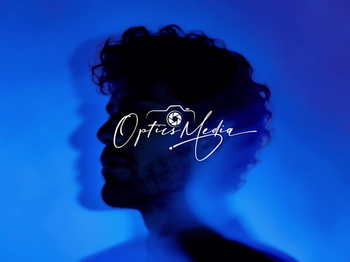
The camera illustration was hand-rendered first, with crosshatch shading and all. It needed to feel crafted, not downloaded. Around it, a fluid signature script carries the photographer's name with the kind of natural weight that tells a client this brand belongs to a real person — not a template.
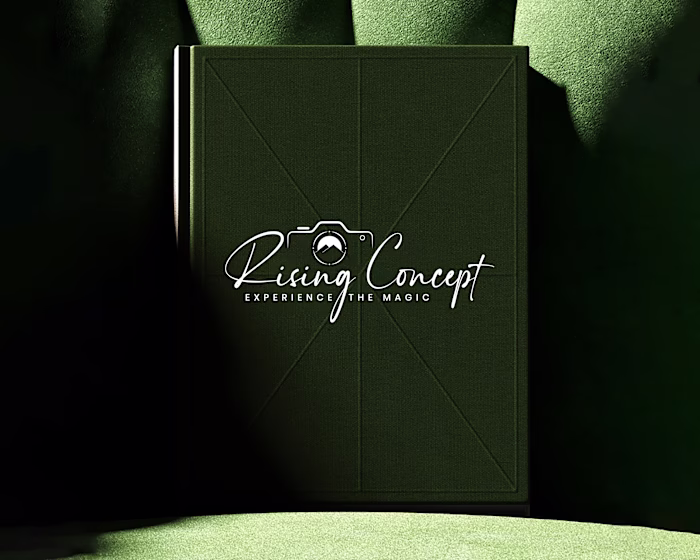
The small-cap "Photography" wordmark sits underneath as the anchor. Quiet. Confident. Doing exactly what the supporting type should do.
Three elements. One direction. Zero compromise.
This is what strategic branding looks like before it goes to final render — and honestly, the sketch sometimes says more than the polished version ever could.
If your photography business is still running on a generic mark, this is what you're leaving on the table.
Logo Design, Brand Identity, Photography Logo, Hand Drawn Logo, Script Logo, Logo Sketch, Visual Identity, Photography Branding, Creative Direction, Identity Design
Like this project
Posted May 24, 2026
Most logos get designed. Few get built from the ground up with this much intention. The brief was straightforward: create a photography identity that feels p...