

A creative design studio founder building brands

A creative design studio founder building brands




Product Design | Mobile apps | Web apps
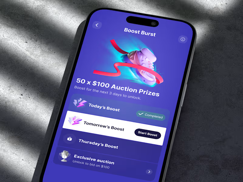
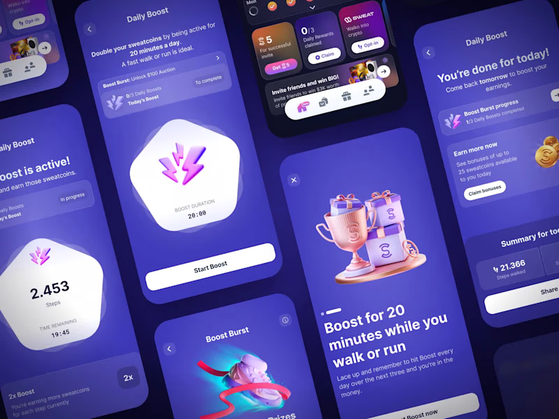
Sweatcoin LiveOps: the Boost Burst screen
Last time I showed the whole flow. This is the screen it all leads to. There was no onboarding modal for this campaign, so the list itself does the explaining: what you've done, what's next, and what you unlock at the end. The only white row is tomorrow's boost, because the next step should be the easiest thing to find.
1
113
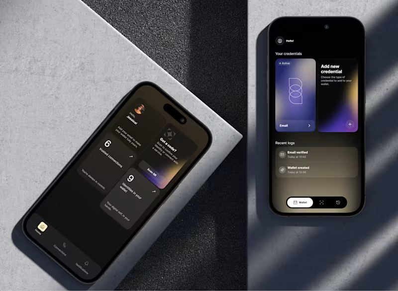
The wallet vote closed. 8% picked counts up front, 92% picked cards.
I promised the reasoning either way, so here it is.
The old home screen showed your credentials directly. You saw the card, you tapped it, done, plus a log of what just happened. A few people made that case in the comments, and they are right that taking it away costs a step.
The reason I took it anyway: the card row only works while the wallet is small. At twenty or thirty documents a horizontal swipe stops being access and turns into a search problem, and the card you need is never the one on screen. So the home screen stopped trying to be the wallet. It became a summary, with the real list one tap down where it can be sorted and filtered, and Scan QR moved to the top because scanning a code is what people open this app to do.
The outside signal we had was weak, and I want to be straight about that. The product sits in a regulated space under NDA, so no open user testing. We ran internal sessions and demoed both versions at industry events, where 88% of partners and investors picked the counts version and kept using the word premium. That tells me it reads as credible to the buying side. It does not tell me how it feels on the tenth open of the month. Different questions.
What would change my mind: if people turn out to open a specific credential often, pinning one or two to the home screen is the cheap fix. I would rather add that later than start from a layout that breaks at scale.
Thanks to everyone who argued with me. That was the point.
cc. @Agadon Creative @Maty Sandoval @Mark Barliet @Leena | Product Design, UX/UI & Web
2
275
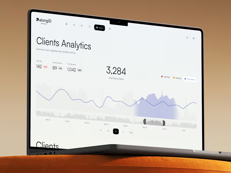
A few days ago I posted the wallet. That is the part a person holds.
This is the part that makes it work.
An identity wallet on its own is a folder of documents that nobody asks for. For the thing to function as a product, someone has to issue those credentials, someone has to request them, and someone has to decide what a given organisation is allowed to ask for in the first place. Without that half, the consumer app is a demo.
So this is the self-service console. A regulated organisation builds its own verification flows, sets what it needs to see and what it has no business seeing, and watches its client portfolio from one screen: who is active, who is sitting in review, what got flagged, how request volume is moving.
One decision I would defend. Only one number on this screen is allowed to be coloured. Rising high-risk clients is the one thing that needs somebody to act today, so it is the one thing that is red. The other two state their direction and stay quiet. The obvious version colours every change green going up and red going down, which is wrong twice here: more clients pending review is not good news, and once you have twenty metrics, a dashboard where everything is coloured is a dashboard where nothing is.
And one I would defend harder. The wallet is black. This is white. Two design systems, not one, both built from the same brand identity. A compliance manager reads dense tabular data on this screen for hours, and at that density a black surface is exhausting and hard to scan. Keeping the brand meant keeping its structure, its type and its behaviour, not its background colour. The person carrying one identity and the person auditing three thousand of them are not the same user, and forcing one system across both would have served neither.
0
235

Product Design Partner For Founders


Your Design and Dev partner for top quality projects


Distinctive Brands & Seamless Websites


Websites, Video & Graphics | Creating Digital Identity
- 25
- Followers
Websites, Video & Graphics | Creating Digital Identity

🚀 Project Finalized: New Landing Page is Live!
After 18 hours of work and sharing my progress, it’s finally done
Visuals: All custom graphics were crafted in Figma for a modern brand identity.
Development: Built entirely on Instant.so (http://Instant.so), focusing on performance and responsiveness.
Thanks for following my journey! Every detail is now polished and ready.
👉 Check out the full project on my profile!
6
29
378


Headline: Visuals meets Web Design: Graphics for Instant Landing Page 🚀
Creating a high-converting website isn’t just about the layout—it’s about the details. I recently designed a set of custom visuals specifically for a project built on Instant.
The goal? To ensure a seamless blend between the branding and the user interface.
What I focused on:
Visual Consistency: Using Figma and Canva to match the brand's aesthetic.
Web Optimization: Designing with the final Instant layout in mind for perfect alignment and fast loading.
Purpose-Driven Design: Every graphic was crafted to guide the user toward the CTA.
Let me know which one is the best!!
2
27
318


Web Designer & Webflow Expert


Your Framer Expert & Digital Designer


