Freelancers using Claude in Portugal
Sign Up
Post a job
Sign Up
Log In
Filters
2
Projects
People
Miguel Queirós
max
Portugal
Web Designer • Framer expert • Full-stack Design Partner
$50k+
Earned
21x
Hired
5.0
Rating
1.3K
Followers
Top
expert
+4
Follow
Message
Web Designer • Framer expert • Full-stack Design Partner
46
Clean about section for Ledgerfy What do you think about this style?
1
6
46
1.2K
86
Look how clean it is
1
27
86
4.6K
37
A large set of components will be dropping soon on the framer marketplace. We go all in on templates and components Stay tuned
1
6
37
5.5K
113
Hero section from my recent framer template
34
113
3.5K
Claude
(21)
Follow
Message
Tiago Rosado
pro
Portugal
Branding & Web Designer | Framer PRO Expert
$10k+
Earned
8x
Hired
4.9
Rating
182
Followers
expert
Club
Follow
Message
Branding & Web Designer | Framer PRO Expert

90
Mostly Sunny | Framer Development
90
3.7K
5
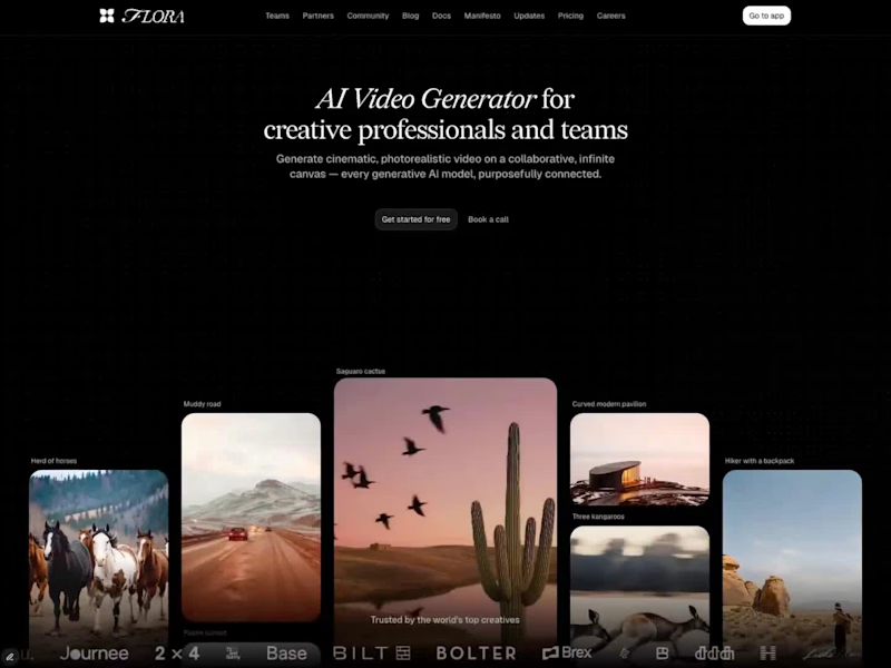
Flora | Framer development & improvements
5
105
2
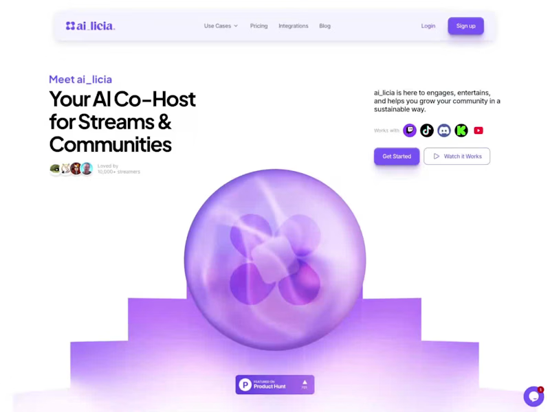
AI LICIA | Website Design & Development
2
67
2
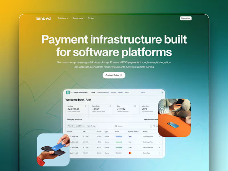
Embed | Framer Development
2
82
Claude
(1)
Follow
Message
Denys Dod
pro
Lisbon, Portugal
Design Partner that Ships SaaS Growth - Framer · 3D · Motion
$5k+
Earned
5x
Hired
5.0
Rating
96
Followers
Follow
Message
Design Partner that Ships SaaS Growth - Framer · 3D · Motion
4
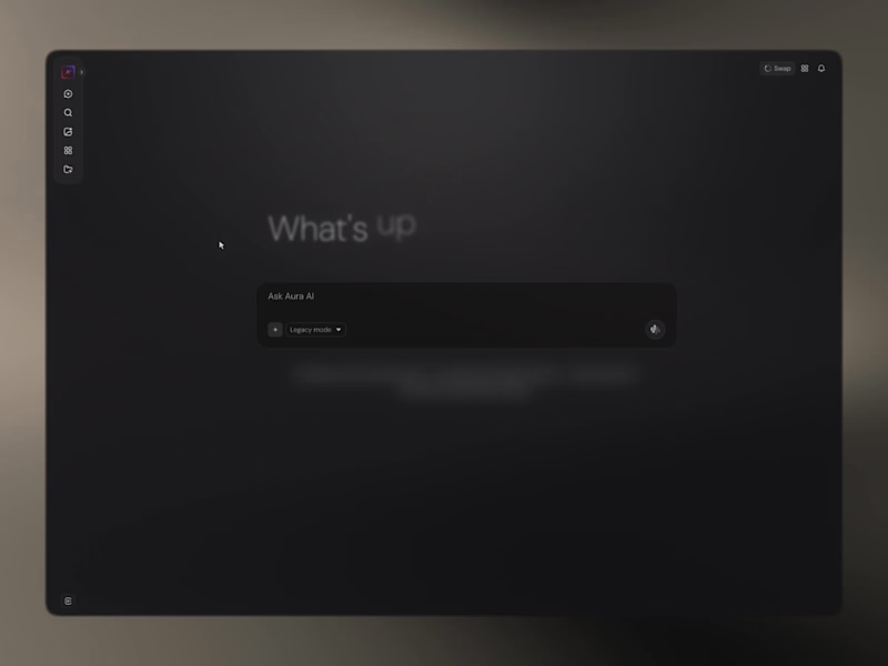
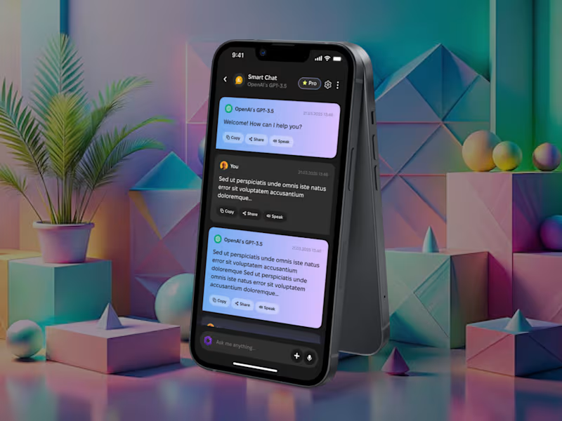
AI chat Integration for High-Stakes Interfaces
4
20
3
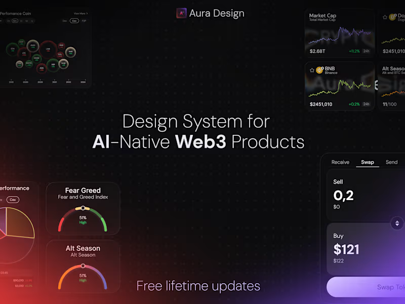
Aura Design System and UI Kit Dev
3
21
3
Nodus — Brand System and Framer Dev for a Global Edge Network
1
3
14
6
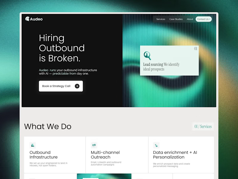
Audeo Framer Website Design and Development
6
69
Claude
(2)
Follow
Message
Alice D.
pro
Coimbra, Portugal
Branding & Framer sites for founders who stand out.
$10k+
Earned
96
Followers
Follow
Message
Branding & Framer sites for founders who stand out.
1
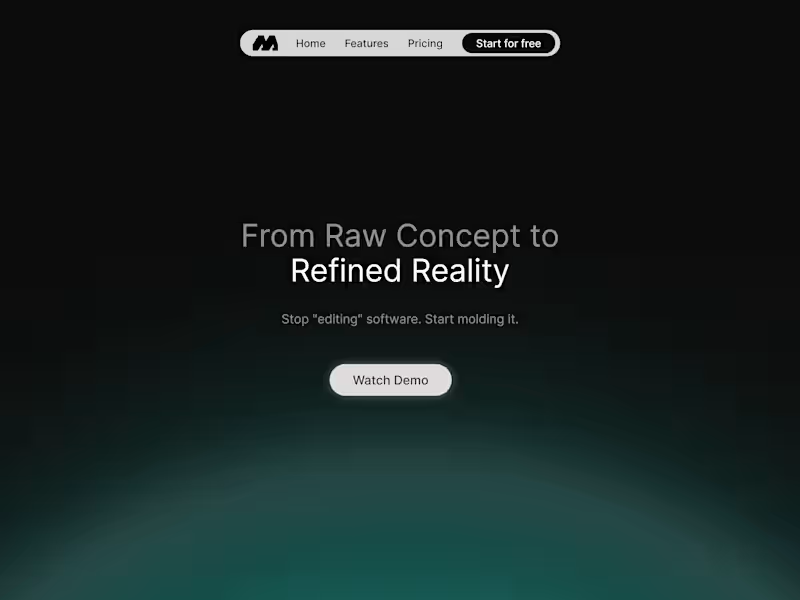
Swift Molding Stack
1
13
81
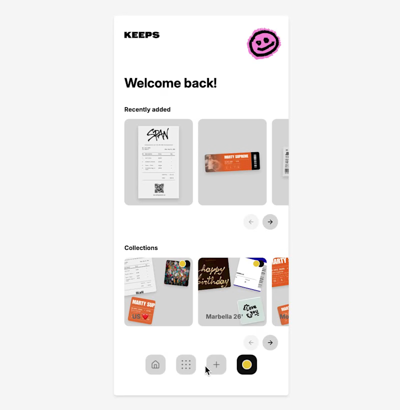
Introducing KEEPS: A Digital Home for Physical Memories KEEPS is a mobile app designed to preserve the physical objects that carry our memories. While most memory apps are built around photos, KEEPS is built around everything else. Concert tickets, boarding passes, receipts, handwritten notes, invitations, conference badges, and other small objects that people often keep long after their practical purpose has ended. The idea came from a simple observation: many of us keep these items because they represent experiences, relationships, milestones, and moments we don’t want to forget. Over time, they become scattered across drawers, wallets, books, and boxes, making them difficult to revisit and easy to lose. KEEPS transforms these physical keepsakes into digital artifacts. Users can scan real objects, remove backgrounds, add contextual information such as location, date, people, and personal notes, and organize them into custom collections. Artifacts can also be created from templates, allowing users to recreate memories that no longer exist physically. The prototype includes onboarding, collections, artifact detail pages, discovery flows, creation flows, profile experiences, and a connected navigation system that allows users to move through their archive naturally. Rather than generating the entire product in a single prompt, I used Flowstep as a design engineering tool. I started with a visual direction created in Figma, including custom illustrations, typography, layout systems, and the overall structure. From there, I rebuilt the product inside Flowstep screen by screen, using detailed prompts to define hierarchy, spacing, interactions, navigation patterns, and user flows. Each screen became the foundation for the next. Existing components were reused, refined, and expanded to create a cohesive design system across the entire application. The process was highly iterative: generating, reviewing, refining, and rebuilding until the product felt consistent both visually and functionally. The result is not simply a collection of screens, but a connected prototype with clear user journeys, interaction logic, and product intent. KEEPS is built around a simple belief: The smallest objects often carry the biggest memories. Flowstep file link: https://app.flowstep.ai/file?activeFileId=cb23715a-64af-4fb6-822a-c789fb99b461 X Post: https://x.com/webdesign_alice/status/2081713836613050543?s=46&t=1ZFswUtJzT6BPLQaoOweGw The walkthrough, screen recording of the prototype working in Flowstep, my custom illustrations, and the screens designed in Flowstep are included below.
38
81
2.4K
12
For the Squarespace Challenge, I built DAWN. DAWN is a conceptual portfolio for photographer Christopher Dawn built around a simple idea: photography should speak for itself. Website: https://maroon-sepia-dl3n.squarespace.com/ Password: DAWN Today, many creative portfolios compete for attention through excessive copy, interactions, and visual complexity. DAWN explores the opposite approach: a photography-first experience designed to remove friction between the viewer and the work. Rather than overwhelming visitors with information, the website focuses on what matters most when choosing a photographer: the images and the creative vision behind them. As part of the challenge, I joined Squarespace Circle to continue exploring how thoughtful, professional-grade design tools can help bring creative ideas to life. The project was designed around three principles: restraint, intentionality, and curation. Photography occupies the majority of the experience, supported by generous whitespace, minimalist typography, and editorial-inspired compositions. Every element was intentionally reduced to allow the work itself to become the primary storytelling medium. Inspired by contemporary editorial design and luxury fashion websites, DAWN feels closer to visiting a curated gallery than browsing a traditional portfolio. Using Finish Layer Finish Layer’s scroll animations became the foundation of the experience. Rather than using animation as decoration, they were used as tools for pacing, storytelling, and curation. One of the core ideas behind DAWN was that design decisions should always serve a purpose: including the tools used to build it. Finish Layer was never used simply for the sake of using it. Instead of incorporating every available feature, I intentionally chose the ones that best supported the concept and user experience of the project. Throughout the portfolio, photographs progressively reveal themselves and transition from isolated moments into carefully curated editorial compositions. Images begin small and gradually expand into editorial-inspired layouts as the user scrolls, creating visual rhythm, establishing hierarchy, and encouraging visitors to engage with each image before experiencing the collection as a whole. At the end of the website, Finish Layer is used to create a playful scroll-driven interaction that acts as Christopher’s introduction. As visitors continue scrolling, a series of hand-drawn elements are progressively revealed: a speech bubble, a camera, a camera flash, and finally a simple “Gotcha!” message. The sequence serves as Christopher’s personal introduction, presented in an unconventional and playful way. What appears to be a simple interaction is, in reality, a carefully choreographed scroll-driven experience designed to reveal personality through restraint. Animation is deliberately subtle and purposeful. Every transition was designed to support the photography rather than compete with it, demonstrating how Finish Layer can be used to create immersive storytelling through restraint rather than complexity. Every interaction throughout DAWN was designed to feel effortless. By embracing restraint and using Finish Layer intentionally, the project demonstrates that immersive and memorable digital experiences do not need to rely on complexity. Sometimes, thoughtful pacing, generous whitespace, and meaningful interactions are all that’s needed to let great work speak for itself. DAWN explores the idea that thoughtful design isn’t always about adding more: it is equally about knowing what to leave out. By combining editorial-inspired layouts, generous whitespace, and purposeful scroll-driven storytelling, the project demonstrates how a photography portfolio can feel immersive, playful, and highly curated while remaining remarkably simple.
12
619
3
Design.ID: Creative ID Card Generator for Designers
3
37
Claude
(1)
Follow
Message
Pedro Costa
pro
Coimbra, Portugal
Digital consultant and AI-driven MVP developer.
1x
Hired
5.0
Rating
9
Followers
Follow
Message
Digital consultant and AI-driven MVP developer.
1
Animated Hero
1
1
2
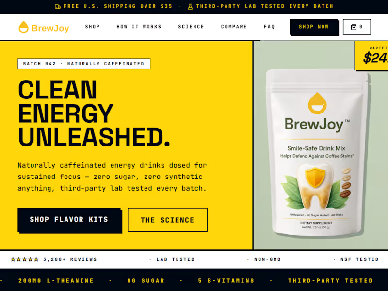
BrewJoy — Brand Landing Page (Mookup Website) What it is A single-page marketing/landing site for BrewJoy, a clean-energy instant coffee brand. The site is a brand-forward "storefront in progress" — built to communicate product credibility, science-backed benefits, and a distinctive visual identity before a full e-commerce build-out. Current state A live, responsive landing page is already built and deployed.
2
22
1
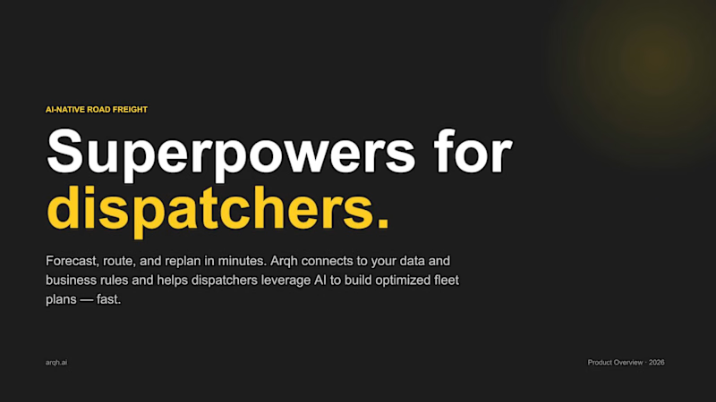
Arqh — Pitch Deck Design AI-native road freight platform · Brand-driven sales deck I designed an 11-slide sales pitch deck for Arqh, an AI-native logistics startup, translating their brand into a presentation system built to close deals with enterprise freight operators. Built a cohesive visual system from the brand's core elements — a warm-yellow accent, near-black ink, and off-white grounds — balancing high-contrast confidence with the restraint an enterprise B2B audience expects. Established a clear typographic hierarchy pairing a bold, wide geometric sans for headlines with a clean modern sans for body copy, giving the deck a technical, precise voice consistent with an "AI-native" brand. Designed a modular layout system with a consistent grid, section markers, and rhythm — alternating dark and light slides to pace the narrative and signal transitions between problem, solution, and proof. Structured the story arc from problem → solution → product → differentiation → close, shaping raw product messaging into a persuasive, presentation-ready flow. Created reusable content patterns — comparison layouts, stepped process diagrams, metric callouts, and card grids — so the deck stays visually consistent while handling very different content types. Integrated the brand wordmark and built the deck for real-world use: presenter-ready, with speaker notes and a placeholder system for live product imagery.
1
39
2
Vilamoura Property — Multilingual Property Platform
2
1
Claude
(3)
Follow
Message
Linnea. Studios
Porto, Portugal
Digital product design & no-code studio
5.0
Rating
8
Followers
expert
Follow
Message
Digital product design & no-code studio
0
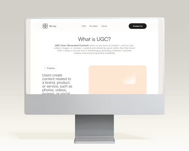
UGC Portfolio Creator: Your Professional Digital Showcase
0
14
0
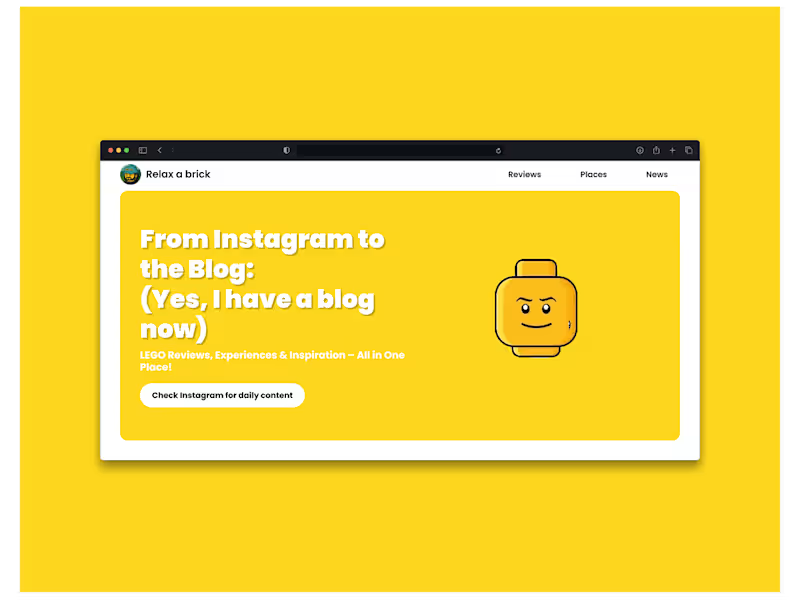
Relax a brick
0
20
0
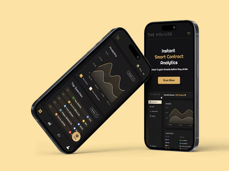
Blockchain Guardian: Smart Contract & Token Security Scanner
0
19
0
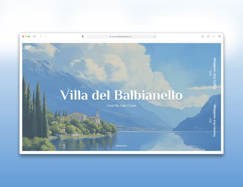
Villa Del Balbianello
0
21
Claude
(1)
Follow
Message
Florence Blackadder
Lisbon, Portugal
Kajabi Expert | Courses, Automations, Systems & Funnel
2x
Hired
8
Followers
Expert
Follow
Message
Kajabi Expert | Courses, Automations, Systems & Funnel
0
The Full-Stack Build: Launching an Acting Training Brand from Zero to $34K The Client: An acting training brand needed more than a course. They needed an entire business built around it, something that could launch, sell, and run itself. The Approach: I came in on the strategy side first: positioning the offer, shaping the course structure into a clear curriculum, and mapping out the launch approach, before any build work started. From there, I built out the full platform: 1) A complete course platform to deliver the training 2) A community space for members to share work and get feedback 3) Lead magnets to bring in new students on an ongoing basis 4) Automations handling onboarding, engagement, and follow-up, no manual work required The Result $34.43K in revenue within the first 90 days of launch. Roles: Strategy, Platform Build, Automation #OnlineCourse #CommunityBuilding #CourseCreation #EdTech #Automation #LaunchStrategy #CreatorEconomy #DigitalProduct
0
4
0
Most course creators think a great sales page needs a big design budget or a team of copywriters. It doesn't. It needs the right workflow. I paired Claude Code with Kajabi to go from idea to live sales page fast. Claude handled the build (layout, copy structure, interactive elements like the countdown banner), Kajabi handled the business side (checkout, course delivery, sales tracking). That combo let me focus on the part that actually moves the needle: messaging. The whole page leaned into one idea, "DaVinci Resolve is complicated, let's make it simple," backed by a video preview, clear course stats, and a money-back guarantee to kill hesitation. Result: $21,319 in sales in 30 days. This is becoming my go-to stack for course creators: Claude to build and iterate quickly, Kajabi to run the backend. No dev team required, no months-long timeline. If you've got a course that needs a landing page, let's chat!
0
16
0
We partnered with Velocity Mentorship, a business coaching program for personal trainers, to design and launch a structured online course and community experience using Kajabi. We built an integrated ecosystem combining course delivery, community engagement, and automated email systems to support monthly challenges, live coaching calls, and ongoing member interaction. The result is a seamless member journey with clear pathways, consistent engagement, and scalable systems that support long-term growth.
0
68
0
We partnered with Lane Sebring, a creator, speaker, and business coach, to increase course sales by designing a structured, high-converting funnel. We built two lead generation funnels, a tripwire offer, and an automated email nurture sequence integrated with Deadline Funnel - guiding people from initial opt-in to purchase through strategic follow-up and urgency. The result is a streamlined funnel that consistently converts new leads into paying students with fully automated systems.
0
67
Claude
(2)
Follow
Message
Teresa Correia
Funchal, Portugal
Senior Product Designer for SaaS, B2B, e-commerce & payments
Follow
Message
Senior Product Designer for SaaS, B2B, e-commerce & payments
4
Open to freelance opportunities through my studio. Product design, Web design from figma to lovable to live. Heptagramdigital.com
2
4
95
1
Verdio, a working MVP for Alojamento Local hosts in Portugal Portuguese Alojamento Local hosts manage their properties across too many tools. They sync bookings on Airbnb and Booking.com (http://Booking.com), file SIBA reports for guest registration, track tourist tax in a spreadsheet, message cleaners on WhatsApp, and prepare monthly reports for the accountant by hand. Hosts running more than one property end up spending around 4 hours every week on admin that does not generate revenue. I designed and built Verdio in two weeks to flatten all of that into one place. The product pulls reservations from Booking.com and Airbnb automatically, files SIBA, tracks tourist tax, coordinates the cleaning team over WhatsApp the moment a guest checks out, and exports clean monthly reports ready for the accountant. The host stops doing data entry. My role: Solo designer and builder. Research, UX, full UI, frontend build, and deployment. Stack: Lovable, Framer. Timeline: Two focused weeks from concept to working frontend. Key features: Multi property dashboard with revenue, expenses, and upcoming check ins on one screen Automatic booking sync from Booking.com (http://Booking.com) and Airbnb SIBA filing with deadline alerts before fines hit Tourist tax tracking by city and property Automatic WhatsApp message to the cleaning team the moment a guest checks out One click monthly export ready for the contabilista Portuguese first interface that bakes local rules in instead of forcing workarounds What this shows: Verdio is a self initiated project. No client paid for it. I built it because I saw a market underserved by international SaaS and wanted to test whether I could spec, design, and ship something useful in two weeks. If you are a founder reading this, that is the speed and care I bring to your project, even when it is mine. Live at verdioapp.com (http://verdioapp.com).
1
53
0
Appointly, AI-powered appointment management for solo psychologists Solo psychologists in Portugal lose meaningful revenue every week to no-shows. They have no receptionist, no admin team, and no time to chase patients the night before each session. Most rely on paper agendas because the alternatives feel overbuilt and clinical. I designed and built Appointly end-to-end in 60 days to fit the workflow they already trust, not replace it. The product reads handwritten agendas through AI vision, syncs with Google Calendar and Outlook, lets psychologists book directly in the app, and sends automatic WhatsApp reminders to patients before each session. The paper agenda stays. Everything else gets handled. My role: Solo designer, builder, and founder. Research, UX, full UI, frontend build, integrations, and deployment. Stack: Lovable, Stripe, Twilio, Claude API, Supabase. Timeline: 60 days from concept to working web app. Key features: AI agenda scanning that handles Portuguese handwriting, dates, and names Google Calendar and Outlook integration Manual appointment booking inside the app Patient management with contact details Automatic WhatsApp reminders at 48h, 24h, and 2h before each session A calm, mobile first interface designed for between session use What this shows: the kind of work I do for clients, except built without one. From research to working web app in 60 days, solo. Custom UI, real integrations, AI used where it earns its place. If this is what gets built when nobody is paying, the proof for what gets built with a client is clear. https://appointlyapp.lovable.app
0
44
20
Most exciting project of 2025 🚀 I worked on Native AI, a pilot project focused on bringing clarity and transparency to AI driven workflows across Legal, Finance, Support, and Technical teams. The goal was to solve scattered tasks and poor visibility. The result is a unified dashboard with specialized AI agents, clear task states like Completed, In Progress, and Needs Attention, plus integrated chat so users always know what is happening and where their input is needed. A strong reminder that good UX is what makes AI feel calm, useful, and trustworthy.
20
201
Claude
(3)
Follow
Message
Explore people