
Brand & Webflow Sites for Health Practitioners
- $•••••
- Earned
- 13x
- Hired
- 5.0
- Rating
- 310
- Followers
Brand & Webflow Sites for Health Practitioners
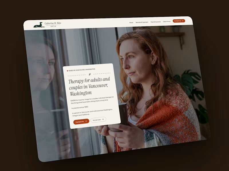
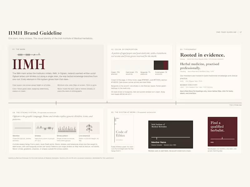


ICTIM Brand Refresh — From Generic to Clinical
The Irish College of Traditional and Integrative Medicine needed its visual identity to match the institution it actually is. Academically rigorous, clinically grounded, and accredited. The original palette of navy and amber gold read as informal and inconsistent with the repositioning the brand needed.
The new palette centres on Ultramarine as the primary brand colour, with Dark Cyan as a secondary accent. Both colours signal precision and credibility to a healthcare professional audience, replacing the warmer, more casual tones of the original site. Inter was selected as the sole typeface across the site, PDFs, and all brand materials for its legibility and clinical neutrality.
A brand guide should be documented covering colour usage, typography, voice and tone, and UI components, giving the institution a single reference point for every future decision.
6
786

Visual Content Creator | AI Engineer

Presentation & Visual Designer

Excited to share this mockup brochure design for Summit Vista Marketing, a fictional full-stack marketing agency based in Boulder, CO.
The goal was to create a bold, professional, and engaging conference piece that captures the brand’s energy while keeping the layout clean and easy to navigate. The brochure highlights the company’s core services, key differentiators, and conference event details — all tied together with a consistent color palette, modern typography, and balanced white space.
32
376


Transforming Vision to Identity


Course Developer, Web, Logo and Brand Strategist, Life Coach

Course Developer, Web, Logo and Brand Strategist, Life Coach


Pitch deck expert: over $2.1 billion raised by clients


Crafting Dynamic Videos and Designs for Brands & Businesses
- 5.0
- Rating
- 14
- Followers
Crafting Dynamic Videos and Designs for Brands & Businesses

Designed this poster for the 2026 Fallout Fringe Festival, an art festival located in Las Vegas. When talking with the client, we discussed utilizing some sort of atomic bomb/nuclear imagery on the poster, whether it be a mushroom cloud from a nuclear explosion or some sort of rocket. I had the idea to create an atomic core, cracking and emitting a green glow, capturing the message that ideas are about to detonate at the festival.
I referenced a lot of historical images of cores that were used for atomic bombs, including the Oppenheimer atom bomb core. I also referenced a lot of 80s horror film posters to see what color schemes were used and how they were textured.
14
234


Sharing 10+ years of CEO experience to help others succeed
Sharing 10+ years of CEO experience to help others succeed

The BZ Life – Lifestyle Brand and Icon Design
The BZ Life is my personal lifestyle brand built around the idea that everyone has their own version of the hustle. The name comes from my nickname BZ and represents the energy of being driven, focused, and purposefully busy in pursuit of your goals. The brand stands for unity among creators, entrepreneurs, and everyday hustlers who live life with intention.
The bold distressed typography and signature bunny icon serve as a unisex power symbol that blends strength, attitude, and identity. The design was created to translate across apparel, accessories, and digital branding while inspiring individuality and community at the same time. The BZ Life represents more than a brand. It is a movement for those who live unapologetically and keep going no matter what their hustle looks like.
19
170

This project was developed for a client seeking a clean and credible brand identity for their research peptide company, ForLife Peptides. I led the full brand development process from concept to completion, creating the brand name, logo, color palette, typography, and visual layout to reflect scientific precision and trust. I designed all product mockups, labels, and packaging visuals to ensure consistency and a modern pharmaceutical aesthetic. Alongside creative direction, I also completed the company’s full business plan to establish structure, brand positioning, and growth strategy.
20
191

Monk Ball – Personal Brand and Logo Design
This project was created for a client who wanted a unique brand identity for her son, an aspiring NBA player and online influencer. Drawing inspiration from his childhood nickname “Monkey,” I developed the brand name Monk Ball and designed a bold, character-driven logo that captures his energy, confidence, and love for the game.
The logo’s expressive mascot and basketball integration were created to be instantly recognizable across apparel, business cards, and promotional stickers. The design balances youthful personality with professional branding, giving the client a memorable visual identity that can grow alongside his athletic and influencer career.
22
188

PuraEarth, meaning “Pure Earth” in Spanish, began as a small startup dedicated to crafting clean and consistent cannabis oil products during a time when the industry was still finding its identity. I joined as one of the first brand ambassadors and grew into the role of CEO, leading its transformation into one of Arizona’s most recognized craft cannabis brands. The name PURA reflected everything we stood for....purity, authenticity, and trust. Under my leadership, the brand evolved from minimal white and gold packaging into a refined, premium aesthetic and expanded from cartridges to disposables, rosin vapes, and roll-ons. Guiding PuraEarth from startup to statewide recognition shaped my foundation as a leader and brand strategist.
14
145