
Brand & Logo Design | Graphic Design | UI/UX Design
Brand & Logo Design | Graphic Design | UI/UX Design

Brand Identity and Social Media Post
I developed a full branding suite and social media post design system for Mauriz Home, a luxury real estate advisory firm. The project focused on creating a refined, elegant brand identity that communicates trust, calm, and professionalism. This included logo design, a custom color palette with psychological intent, and multiple post templates that blend aesthetics with clear messaging. Each element aligns with the client's premium market positioning in the real estate sector.
Highlights of the project:
Sophisticated monogram logo (letter “R”) with minimalist circular geometry
Soft, elegant color palette reflecting trust, luxury, and calmness
Template variations for Instagram content (Q&A, informative posts, brand awareness)
Consistency in typography, spacing, and content hierarchy
3
4
150
Graphic Designer | Logo | Brand Identity | Web Design | Branding
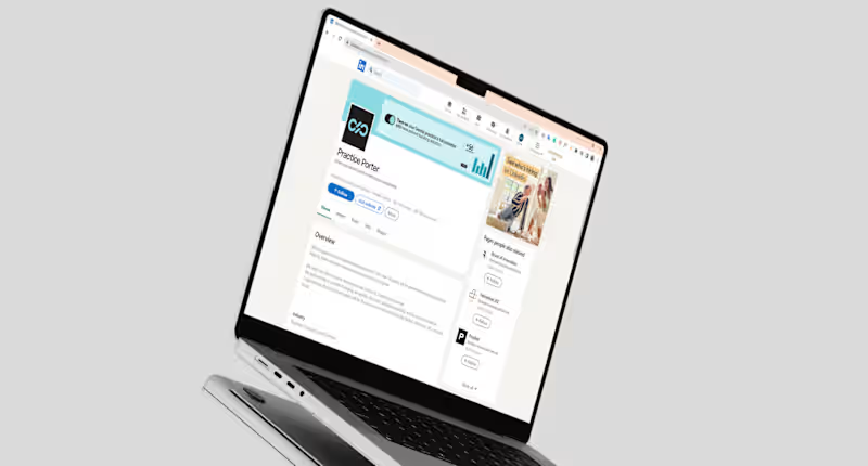
PracticePorter is a Canada-based software platform that supports health professionals in managing client care, communication, and documentation - all in one secure place. The brand needed a visual identity that would feel professional, approachable, and trustworthy, aligning with its mission to simplify healthcare operations while maintaining a human touch.
I developed the full visual identity system, including a clean and
modern logotype, color palette, and typography designed for clarity and digital-first use. In addition, I created marketing materials and a consistent LinkedIn visual presence to support their outreach and brand recognition across platforms.
0
123
La Mămuca | Logo Brand Identity
LaMămuca is street-food pastry / pretzel, which offers fresh and tasty products for passers-by. Located in heart of the city, La Mămuca is loved and well recognised by every Chisinau citizen.
0
141
Vonayo CPaaS Logo and Brand Identity Design
Vonayo is a CPaaS startup (Communication Platform as a Service) which provides messaging options and communication options to softwares as an external resource
The 'V' represents Vonayo and the two lines besides the V represent a 'quote' or a 'comment' as most people would interpret. The project kickstarted with a brainstorming session for the logo with the client and we came up with a bunch of ideas of how to present the logo, this phase took a lot of iterations and a lot of different ideas. Through that chain of thoughts came this logo design.
For the typography, the font chosen for this is 'Cabinet Grotesk' and for the secondary font, we have 'Manrope'. Overall, this project was quite fun because I have never worked with a CPaaS before and it is a game changer for sure.
0
94

Digital marketing executive with a nack for everything tech
New to Contra
Digital marketing executive with a nack for everything tech

Calm & Class: Mobile Interface Design & Orchestration
Designed from the ground up to bring a serene, premium wellness experience directly to the palm of the hand, the mobile interface for CalmandClass.com (http://CalmandClass.com) blends minimalist aesthetics with high-performance e-commerce functionality.
As the digital architect behind this project, I spearheaded and orchestrated the entire mobile transformation—from structural wireframing to final asset execution. The goal wasn't just to make a beautiful website, but to design a frictionless, intuitive ecosystem optimized for the modern mobile shopper.
Key Pillars of the Orchestration
Mobile-First UX/UI: Built entirely for the mobile screen, prioritizing effortless navigation, thumb-friendly touch targets, and a clean layout that eliminates clunky multi-step friction.
Creative Direction & Asset Design: Personally crafted the visual language, including bespoke digital gift card designs and immersive layouts on Shopify, keeping the interface deeply aligned with a premium wellness aesthetic.
Conversion-Engineered Framework: Balanced high-end design with conversion optimization, streamlining the path from discovery to cart to checkout to maximize retention and revenue.
The Outcome: A cohesive, immersive mobile flagship that proves a wellness platform can be breathtakingly calming while operating as a high-velocity conversion engine.
2
114

Led the creative direction for a premium culinary event promotional asset for Samantha’s Bistro, Lagos. The goal was to build a high-impact, sensory visual that drives exclusive ticket sales.
My Role: Creative Direction & Strategy
Concept & Vision: Developed the "sun, smoke, and spice" theme, pairing rich, fiery food styling with elegant, upscale typography.
Design Management: Guided the graphic designer on layout execution, prioritizing visual balance and brand alignment.
Conversion Focus: Structured the asset so that critical transactional details—date, pricing (₦20,000), inclusions, and location—are instantly scannable in a high-contrast bottom banner, as shown
1
3
147
Project Overview
As the E-commerce Growth & Performance Manager for Class and Calm Lifestyle,
I directed the content design and messaging architecture for a premium digital gift card collection on our wellness Shopify platform. The goal was to build high-converting, visually striking digital assets that align with premium wellness branding and drive direct gift purchases through the storefront.
The Creative & Copy Strategy
To maximize emotional resonance while maintaining strict brand consistency, I established a clear visual hierarchy across all asset variants
Editorial Typography & Tone: I paired an elegant, high-contrast serif typeface for primary hooks (like "The Luxury of Peace" and "Serenity Bundle") with warm, high-end lifestyle imagery to trigger an aspirational sense of self-care
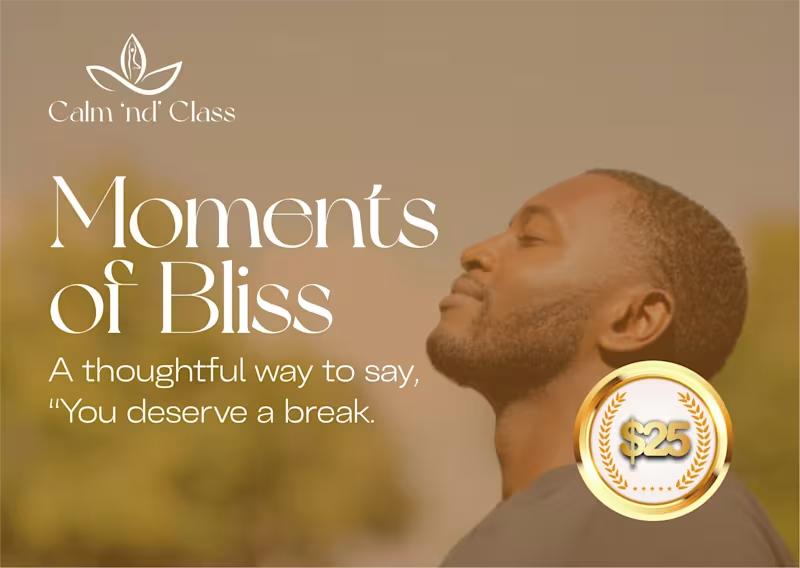
Instant Value Clarity: To ensure immediate transparency for customers skimming the store, I implemented a high-contrast gold laurel-wreath badge system highlighting the exact monetary denominations ($25, $50, $200) across all variants (
Targeted Microcopy: Sub-text hooks were tailored to gifting psychology, using direct phrasing like "Give the gift of deep relaxation" and "A thoughtful way to say, 'You deserve a break'" to lower purchase friction.
2
86


Framer Expert & Creative Web Designer | Sleek, Modern UI/UX
Framer Expert & Creative Web Designer | Sleek, Modern UI/UX


Brand Strategist & Personalized Marketing



Brand & Merch Designer

Crafting User-Centric Designs with Framer & React



Surreal Editorial Collage Artist & Cinematic Visuals

Love Me Not
Independent Film Poster Design
Project Overview
"Love Me Not" is a custom promotional poster created for an independent filmmaker seeking a visually compelling identity for her film project.
The client provided photographs of the lead actress along with visual inspiration references. Using those materials, I developed a mood board, established the color direction, and created a digital collage that combined cinematic storytelling, editorial aesthetics, and promotional design.
The goal was to create a poster that felt emotional, memorable, and visually distinctive while highlighting the lead actress as the focal point of the composition.
My Role
Creative Direction
Mood Board Development
Visual Concept Creation
Digital Collage Composition
Color Palette Development
Poster Layout Design
Typography Integration
Creative Approach
For this project, I focused on creating a romantic yet dramatic visual language through layered collage elements, floral symbolism, bold typography, and a carefully curated color palette.
The floral crown surrounding the actress was used as a visual storytelling device, reinforcing themes of beauty, emotion, and vulnerability while maintaining a strong promotional presence suitable for film marketing.
Deliverables
Custom Film Poster Design
High-Resolution Digital Artwork
Print-Ready Promotional Asset
Client Feedback
⭐⭐⭐⭐⭐
"So talented. Very communicative. 10/5."
— Independent Film Client
1
160

Queen of Nectar
Digital Collage
Crowned with blossoms and citrus, Queen of Nectar embodies the harmony between nature, transformation, and the sacred feminine. Her butterfly eyes perceive the world through dual lenses—clarity and mystery—while bees serve as symbols of community, devotion, and the intelligence woven throughout the natural world.
Encased in honeycomb-like armor, she wears sweetness not as fragility, but as strength. Surrounded by fertile landscapes and golden skies, the figure emerges as a guardian of abundance, intuition, and renewal, honoring the cyclical rhythms that connect growth, decay, and rebirth.
Created through an intuitive digital collage process, the work developed organically through the layering of symbolic imagery, allowing its narrative to emerge gradually through composition and atmosphere.
1
139


Tattooed Prayer of the Desert
Digital Collage
Tattooed Prayer of the Desert is a surreal collage where symbols of ink, nature, and memory converge within a dreamlike landscape. A tattooed hand reaches upward, grounded by earth and water, framed by an ancient archway and the presence of the full moon.
The gesture becomes an offering—quiet, powerful, and timeless. Suspended between the physical and the symbolic, the work explores the relationship between body and landscape, ritual and remembrance, revealing how personal marks can become vessels for story, identity, and transformation.
Created through an intuitive digital collage process, the piece emerged through the layering of symbolic imagery, allowing meaning to unfold organically as the composition took shape.
0
164

Graphic Designer | Visual Storytelling & Brand Design

This presentation was developed to communicate Femfresh's brand strategy, consumer understanding, product offerings, and future growth opportunities. Through a combination of data visualization, branded storytelling, and thoughtful presentation design, complex information is transformed into an engaging and easy-to-navigate experience.
0
47


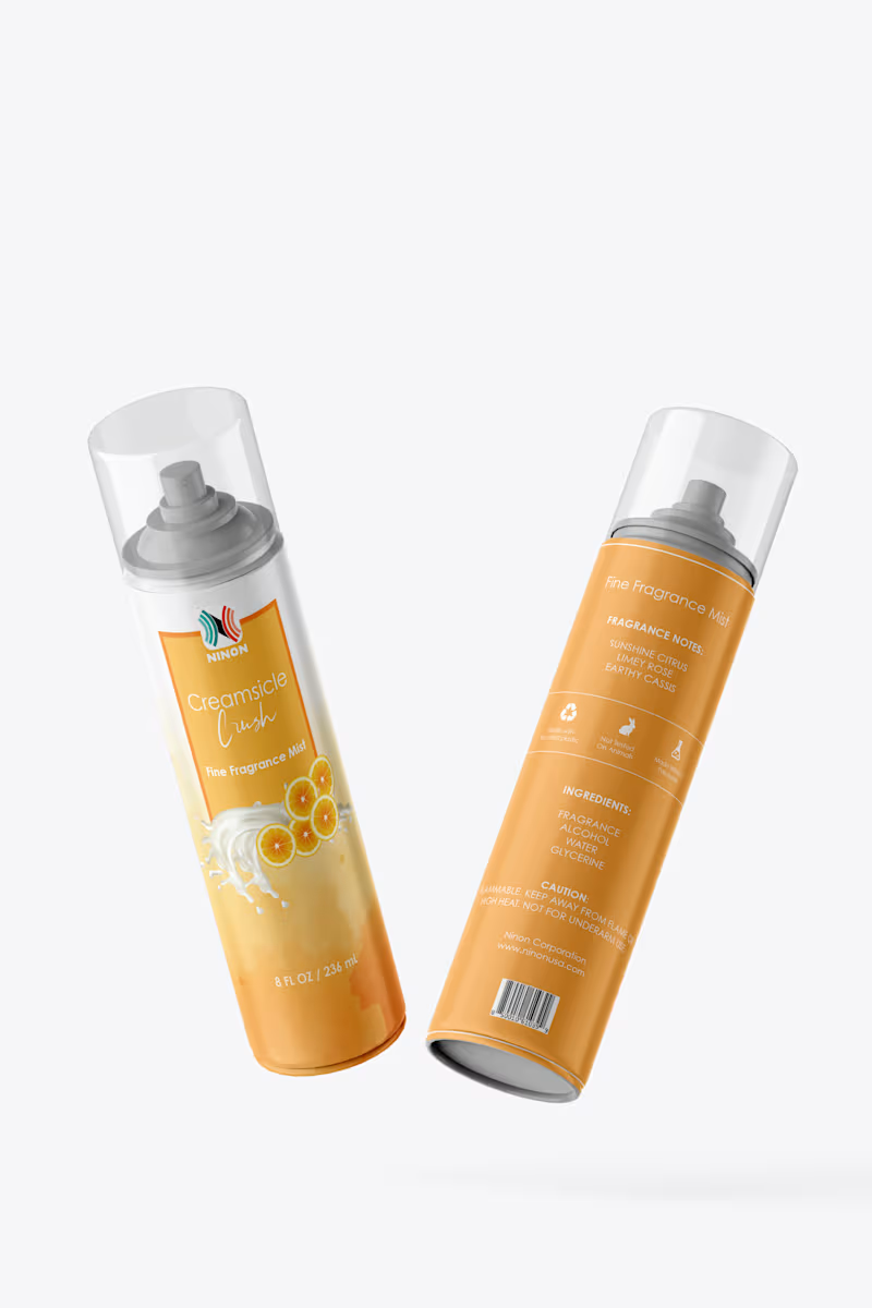
This collection features label designs for Ninon Corporation's Fine Fragrance Mist line. Each body mist was developed with a unique visual identity inspired by its fragrance profile, using custom color palettes, imagery, typography, and product branding to create a distinct shelf presence. The designs balance aesthetic appeal with clear product communication while maintaining consistency across the overall product line and brand identity.
1
84