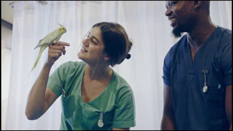
Product Designer — UI/UX, Branding & AI Visuals
Product Designer — UI/UX, Branding & AI Visuals
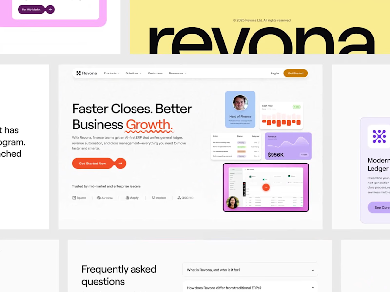
UX-led product design & dev agency for b2b saas and AI
UX-led product design & dev agency for b2b saas and AI
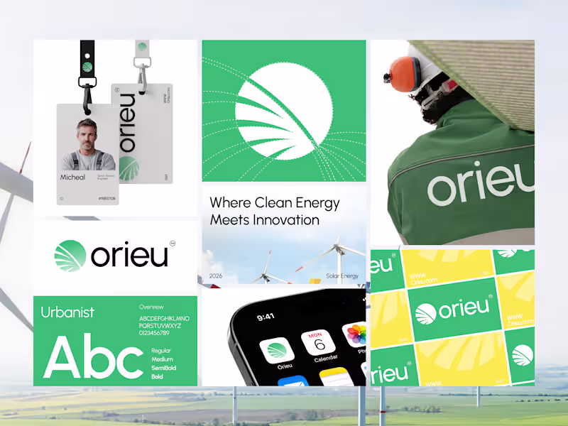
Branding & Logo Designer | Visual Identity Specialist
- $1k+
- Earned
- 1x
- Hired
- 5.0
- Rating
- 24
- Followers
Branding & Logo Designer | Visual Identity Specialist
Product Designer & No-code Developer
Minimal and Timeless Logo and Brand Identity Designer
- 5.0
- Rating
- 10
- Followers
Minimal and Timeless Logo and Brand Identity Designer
Brand Strategist, Founder and Creative Head @graytive.com
Brand Strategist, Founder and Creative Head @graytive.com
Logo & Brand Identity Designer - Top 5% on Contra
- 5.0
- Rating
- 347
- Followers
Logo & Brand Identity Designer - Top 5% on Contra
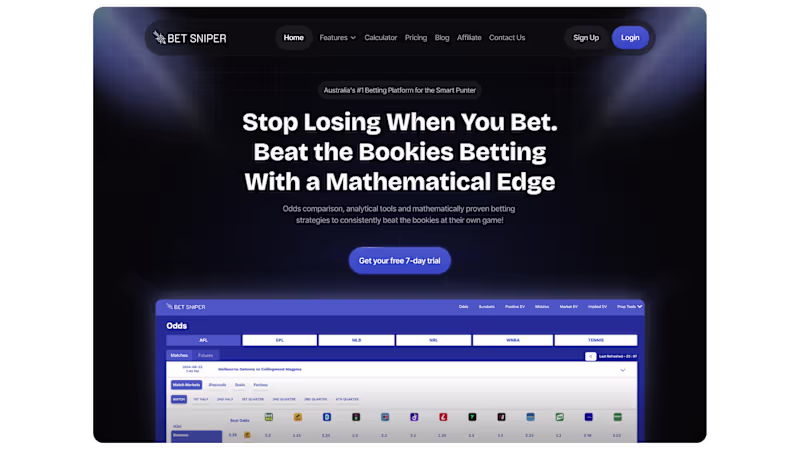
Only 3 Slots Left - Get 30% Off Your First SaaS Project.
- 53
- Followers
Only 3 Slots Left - Get 30% Off Your First SaaS Project.