Brand Identity Design for Somewhere Else
Samsuzzoha Nion
Somewhere Else on what it really takes to break through the noise
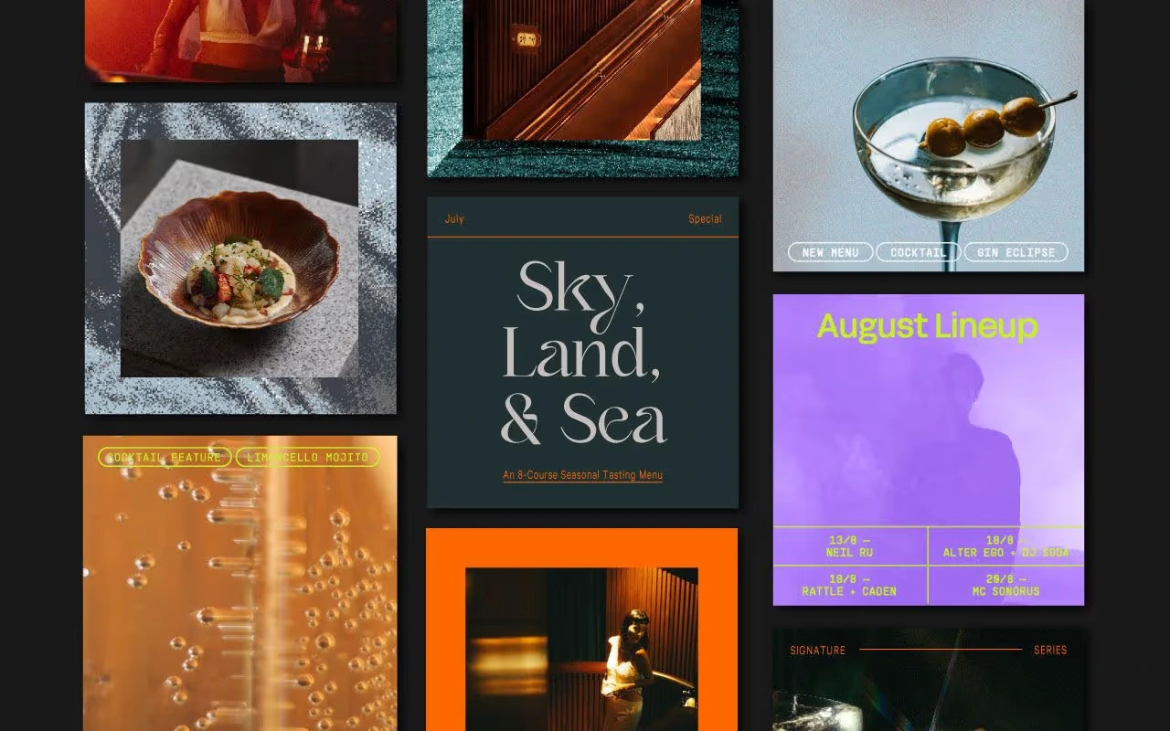
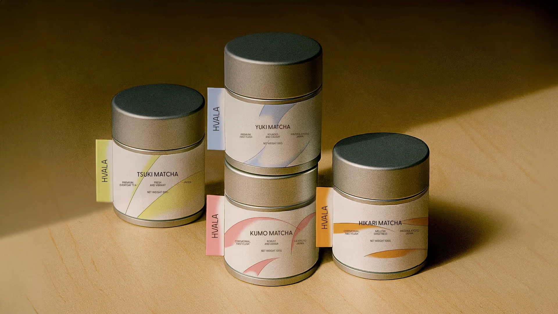
As a designer, I am continually inspired by the work of talented creators and the evolving design landscape. For this project, Somewhere Else presented a unique challenge: developing a brand identity that stands out amidst the noise, but with subtlety and purpose.
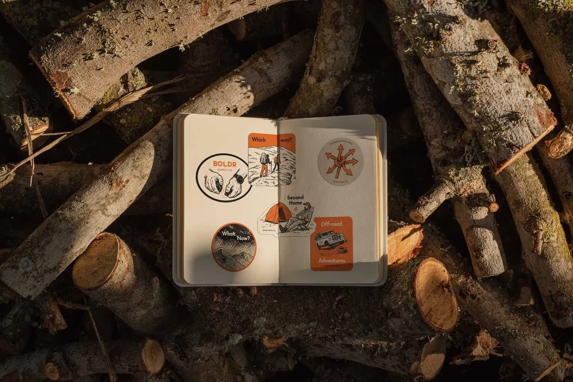
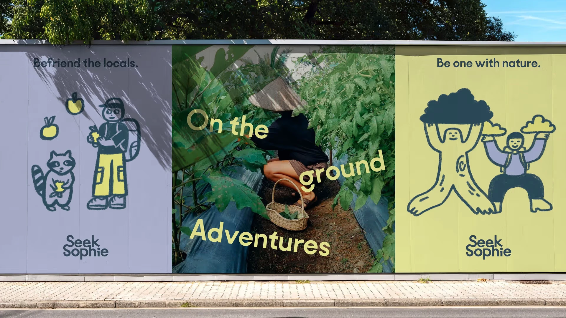
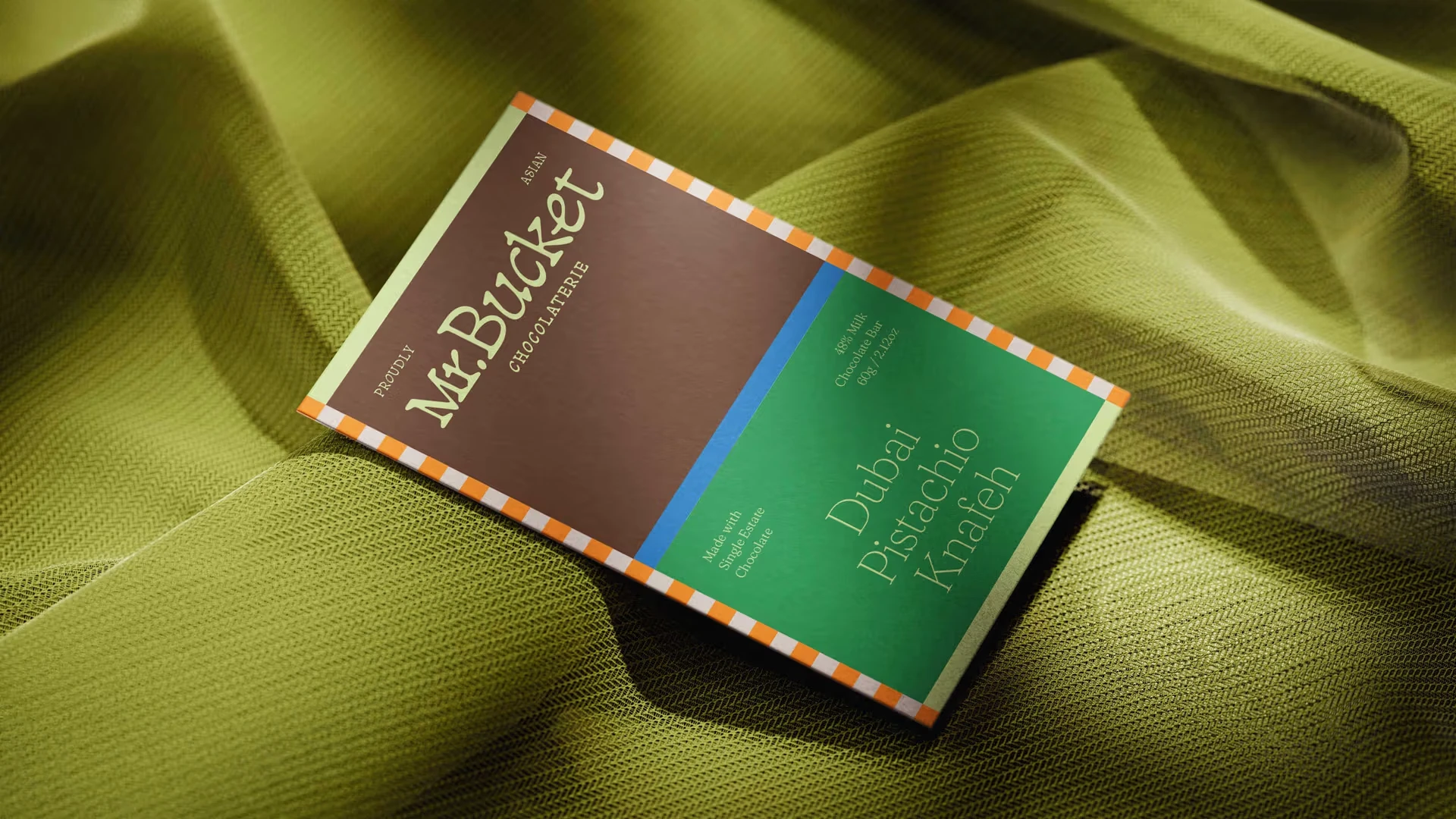
While this particular design is inspired by industry trends and successful visual languages I admire, it reflects the approach I frequently take in my own projects. I often draw from minimalist principles, creating designs that are both modern and timeless. The simplicity of the typography, the thoughtful color choices, and the straightforward logo are all hallmarks of design strategies that I often implement in my work.
These inspirations showcase my dedication to creating clarity and impact through design. It’s important to note that these examples are inspired by the design principles that I deeply respect and often implement, and not direct replications. In my projects, I always strive to adapt and innovate based on client needs, bringing a personal touch that ensures the final design is unique and tailored to each brand.
By incorporating these inspirations into my portfolio, I aim to show potential clients the quality and style of work I can deliver while remaining respectful of the creative work that inspires me. Ultimately, my goal is to create original, meaningful designs that are authentic to the brand and unique to the vision of the client.

Process:
Initial Research & Discovery:
I start by immersing myself in understanding the brand and its values. This involves discussions with clients to understand their vision, goals, and the audience they want to reach. For Somewhere Else, this involved exploring their mission to create a standout brand identity with a minimalist and purposeful approach.
I also look at competitors and industry trends, as well as gathering inspiration from successful designs that resonate with me and the project's requirements.
Conceptualization & Ideation:
After gathering all necessary insights, I begin brainstorming and sketching ideas. This is where I explore different typography, color schemes, and logo ideas. For this project, I focused on creating designs that are simple yet impactful, allowing for versatility across various platforms while maintaining a sense of uniqueness.
I also experiment with different shapes, styles, and visual metaphors to ensure the brand identity feels authentic and reflects the essence of the business.
Refining & Digital Execution:
Once I have a few strong concepts, I start refining the best options using design tools like Figma and Adobe XD. At this stage, I focus on creating a clean and cohesive design system that includes color palettes, typography, and iconography.
I also pay close attention to the scalability of the design, ensuring it looks great across both small and large formats, from digital screens to physical materials.
Feedback & Iteration:
After presenting initial designs to the client, I collect feedback and iterate on the designs. This is an essential part of my process, as client input often helps shape the final product. For Somewhere Else, I worked closely with the client to ensure the designs aligned with their vision and to make sure the final brand identity felt authentic and cohesive.
I refine the design elements based on their preferences while ensuring that the brand identity remains visually clear and effective.
Finalization & Delivery:
After refining the design, I prepare the final brand identity package. This includes delivering all the necessary assets in various formats (e.g., logos, color palettes, typography guidelines) and providing documentation to ensure that the brand can be consistently applied across all platforms.
For this project, I ensured that the brand identity was adaptable, modern, and timeless—able to stand the test of time and grow with the brand.
Brand Guidelines & Handoff:
I create a comprehensive set of brand guidelines to ensure that the brand can be used consistently across all mediums. This includes specific instructions on how to use the logo, colors, typography, and imagery. It ensures that everyone, from designers to marketing teams, can maintain a unified brand experience.
I provide clear handoff documents to developers and any teams involved in the implementation, making sure all design elements are easy to integrate.

Like this project
Posted Dec 4, 2025
A minimalist, modern brand identity for Somewhere Else, focusing on clarity, timeless design, and impactful visual elements tailored to the brand's essence.
Likes
1
Views
11
Clients
Somewhere Else