Glamorize Brand Identity-packaging Design
Jerin Nusrat
BRAND IDENTITY
Glamorize
Elevate Your Beauty
Project Overview
Glamorize is a luxury beauty brand built around a simple
But a powerful belief: every individual deserves to feel confident and radiant.
The brand offers a curated collection of high-quality makeup essentials- from
vibrant eyeshadows and long-lasting lipsticks to flawless foundations and
illuminating highlighters- crafted with the finest ingredients for all skin types
types and tones.
The challenge was to create a complete visual identity that communicates this promise at every touchpoint: one that feels premium without being cold, elegant without being inaccessible, and timeless while still feeling fresh and modern
The Design Challenge
Brand Problem
Glamorize needed a brand identity capable of competing in
The crowded luxury beauty space- a market where visual language is everything.
The brand required:
A distinctive logo that works across physical and digital mediums
A color palette that communicates luxury, femininity, and warmth
Typography that balances editorial elegance with legibility
Collateral (business cards, signage) that translates the brand into real-world experiences
A cohesive brand language that scales consistently from small print to large-format signage
Design Strategy & Approach
Positioning
Glamorize was positioned at the intersection of classic
beauty principles and contemporary trends — a brand that empowers
self-expression with grace. The visual strategy needed to reflect this duality:
rooted in timeless elegance, alive with modern confidence.
Mood & Direction
The creative direction drew inspiration from editorial fashion, Parisian beauty aesthetics, and the quiet luxury movement. The result is a brand identity that feels like a high-end perfume counter or a curated boutique: understated yet unmistakable.
Typography
The typeface selection plays a critical role: a
high-contrast serif with editorial character carries the headings and logomark,
while the supporting body copy uses a clean, refined sans-serif for
readability. Together, they create a hierarchy that feels curated rather than
constructed- the way a well-designed magazine page feels intentional at every
level.
Signage & Environmental Branding
The reception wall mockup demonstrates how the brand
scales into architectural space. Against a blush-toned, marble-floored salon
interior with gold accents, the dark wordmark holds authority without
overwhelming the environment. The logo reads clearly at large scale,
maintaining its refined character and proving that the identity was designed
with real-world application in mind from the start.
Business Card Design
The business cards carry the full brand language onto a
physical format. The composition combines the logo, botanical line-art
illustrations, abstract geometric color blocks (blush and rose), and minimal
contact information. The rounded corners soften the card’s feel and align with
the brand’s approachable elegance. The overall design avoids busyness:
Generous white space lets each element breathe, making the card itself feel
like a premium object.
Design Decisions
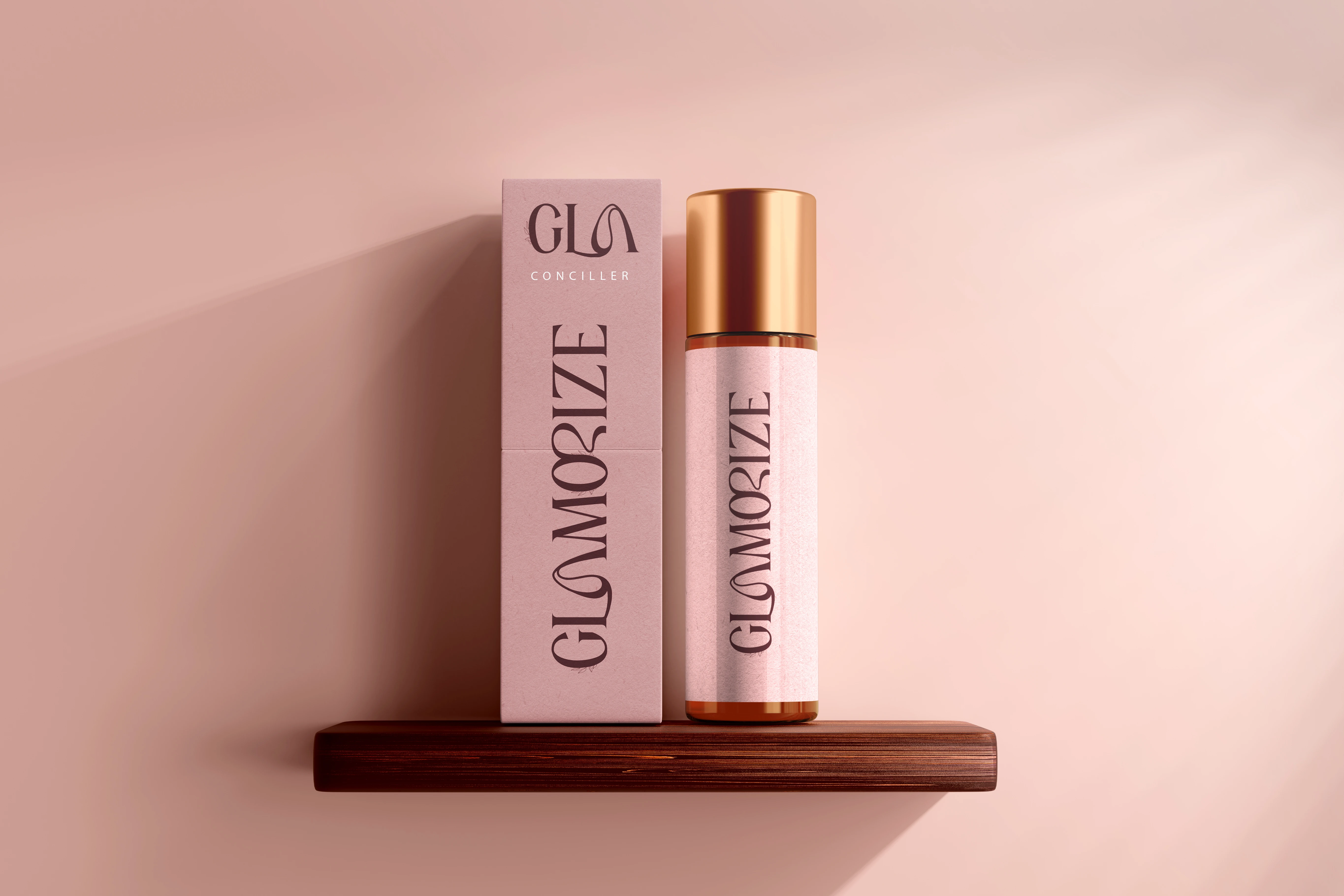
Logo & Wordmark
The logo pairs a bold, expressive typographic monogram-
“GLA” with the full wordmark “Glamorize” beneath it, creating a two-tier
identity system. The monogram functions as a compact icon for small-scale usage
(packaging, social avatars, stamps), while the full lockup works for signage
and formal brand applications.
The letterforms carry personality through subtle
stylistic flourishes: open counters, elegant stroke contrast, and a custom leaf
motif woven into the composition that nods to nature, purity, and botanical
beauty. This detail elevates the logo from purely typographic to something more
considered and hand-crafted.
Color Palette
The palette is built around a deep, rich dark burgundy-brown- a color that communicates sophistication and depth without defaulting to predictable beauty-brand pinks. This anchors the brand in luxury. Soft blush and warm cream tones provide lightness and femininity, used as backgrounds and secondary elements. Dusty rose accents- visible in the geometric detail elements on the business cards- add warmth and modernity
Outcome & Deliverables
The completed Glamorize brand identity system includes:
• Primary logo lockup (monogram + wordmark)
• Scalable logo variations for digital and print
• Full color palette with defined usage hierarchy
• Typography system with editorial heading and body typefaces
• Business card front and back design with dual-sided layout
• Large-format reception signage mockup for environmental branding
• Brand guidelines page establishing tone, copy style, and brand voice
The result is a visual identity that Glamorize can carry
confidently across every customer touchpoint- from the first glance at a
business card to the experience of walking into a branded space.
Designer’s Note
This project was an exercise in restraint as much as
creativity. Luxury branding lives and dies by what you choose not to include.
Every element on the page, the botanical detail, the geometric accent, the
choice to let the logo breathe against white space, was a deliberate decision
to honor the brand’s promise of elegance without excess.
Glamorize is a brand built for people who see beauty as
both personal and universal. That belief guided every design choice made here.
Like this project
Posted Jun 19, 2026
Developed a complete brand identity for Glamorize, a luxury beauty brand. Glamorize is a luxury beauty brand built around a simple- But a powerful belief.