Freelance Graphic Designers in Naples
Sign Up
Post a job
Sign Up
Log In
Filters
2
Projects
People
Costanza Fava
84085 Mercato San Severino, Italy
Brand & Packaging Designer for Luxury, Beauty & Wellness
22
Followers
Follow
Message
Brand & Packaging Designer for Luxury, Beauty & Wellness
2
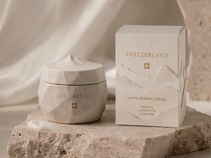
Switzerland - Alpine Renewal Cream Inspired by the purity and serenity of the Swiss Alps. The formula combines edelweiss, glacier water, and alpine rose, ingredients chosen for their association with resilience, freshness, and high-altitude botanicals. The palette is bright and understated, blending soft whites, cool blues, and delicate floral tones. The bottle design is minimal and refined, reflecting precision, luxury, and timeless elegance. A concept rooted in purity, performance, and Alpine beauty. #beautybranding #packagingdesign #brandingdesign #luxurybeauty #switzerland #WorldCupDesign
2
174
1
South Korea - Seoul Glow Ampoule Inspired by the innovation and layering culture of K-beauty. The formula features probiotics and peptides, reflecting science-led skincare focused on skin health and repair. The visual direction is luminous and glass-like, built around clarity, hydration, and skin transparency. The bottle form is sleek and precise, designed like a clinical ampoule with a futuristic edge. A fusion of beauty, technology, and performance.
1
162
0
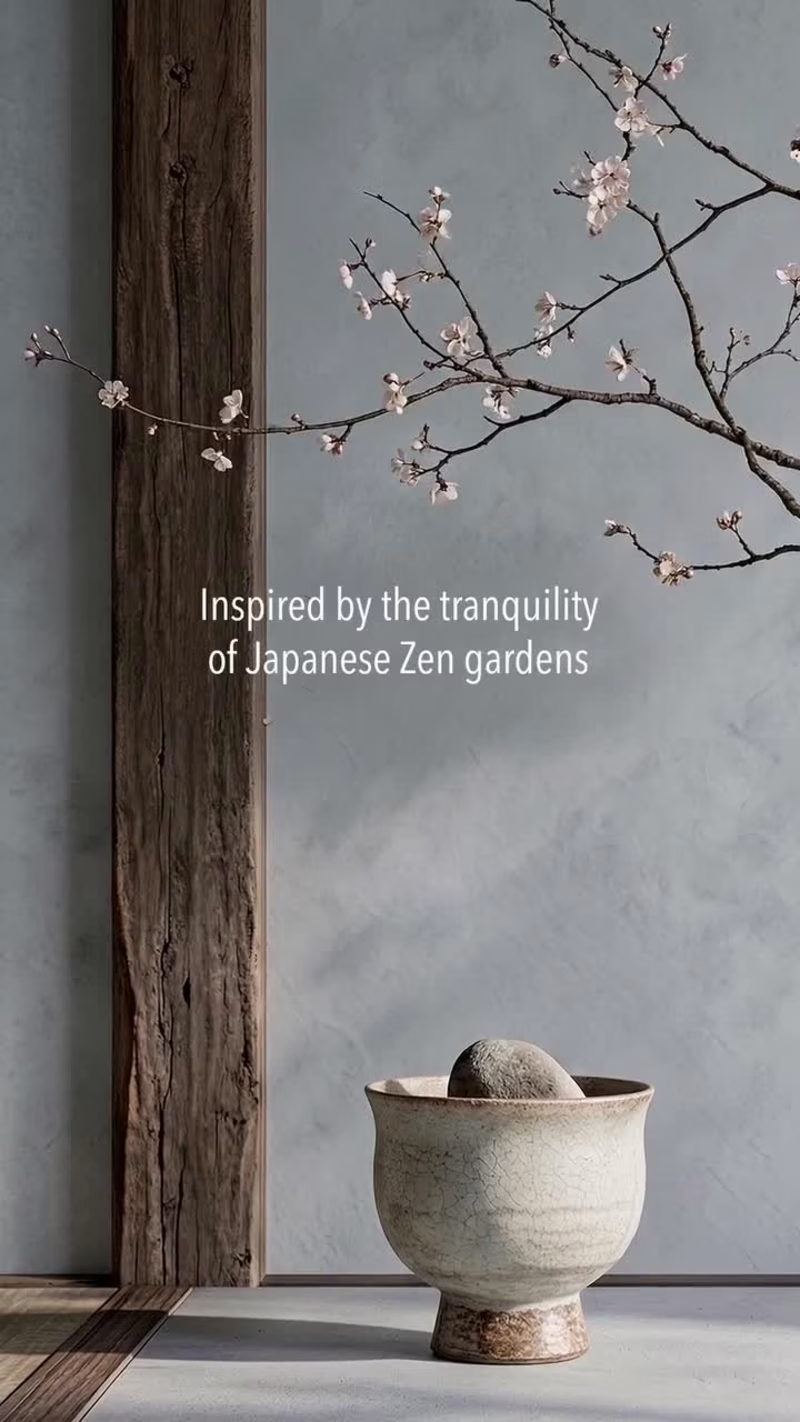
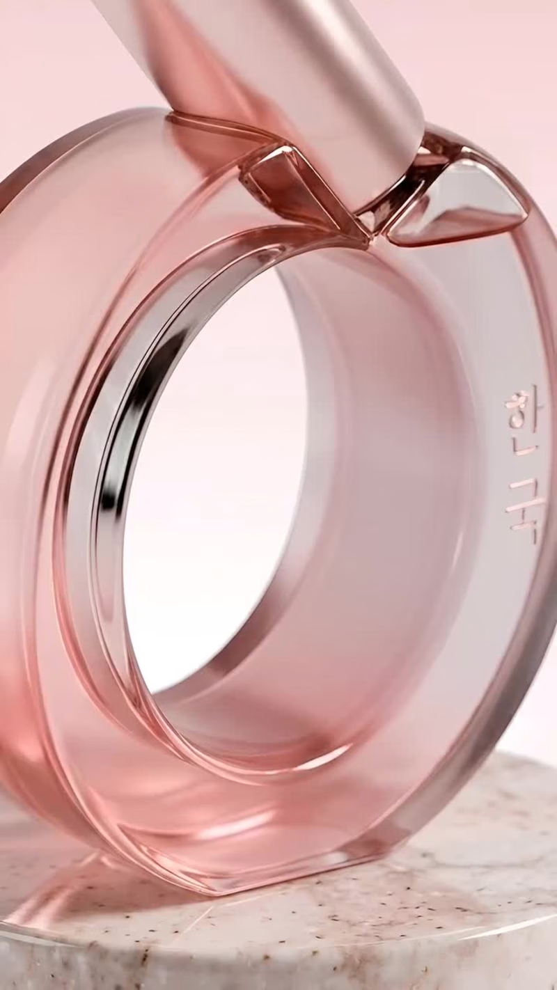
Japan - Renewing Essence A minimal, refined interpretation of Japanese skincare philosophy. The formula combines cherry blossom and rice bran, chosen for their symbolism of renewal, softness, and skin nourishment. The palette is subtle and desaturated, focused on calm pinks and neutral tones that reflect balance and purity. The bottle design is clean and intentional, with a structured silhouette that emphasizes clarity and restraint. A concept where less becomes more, and every detail has purpose.
0
143
13
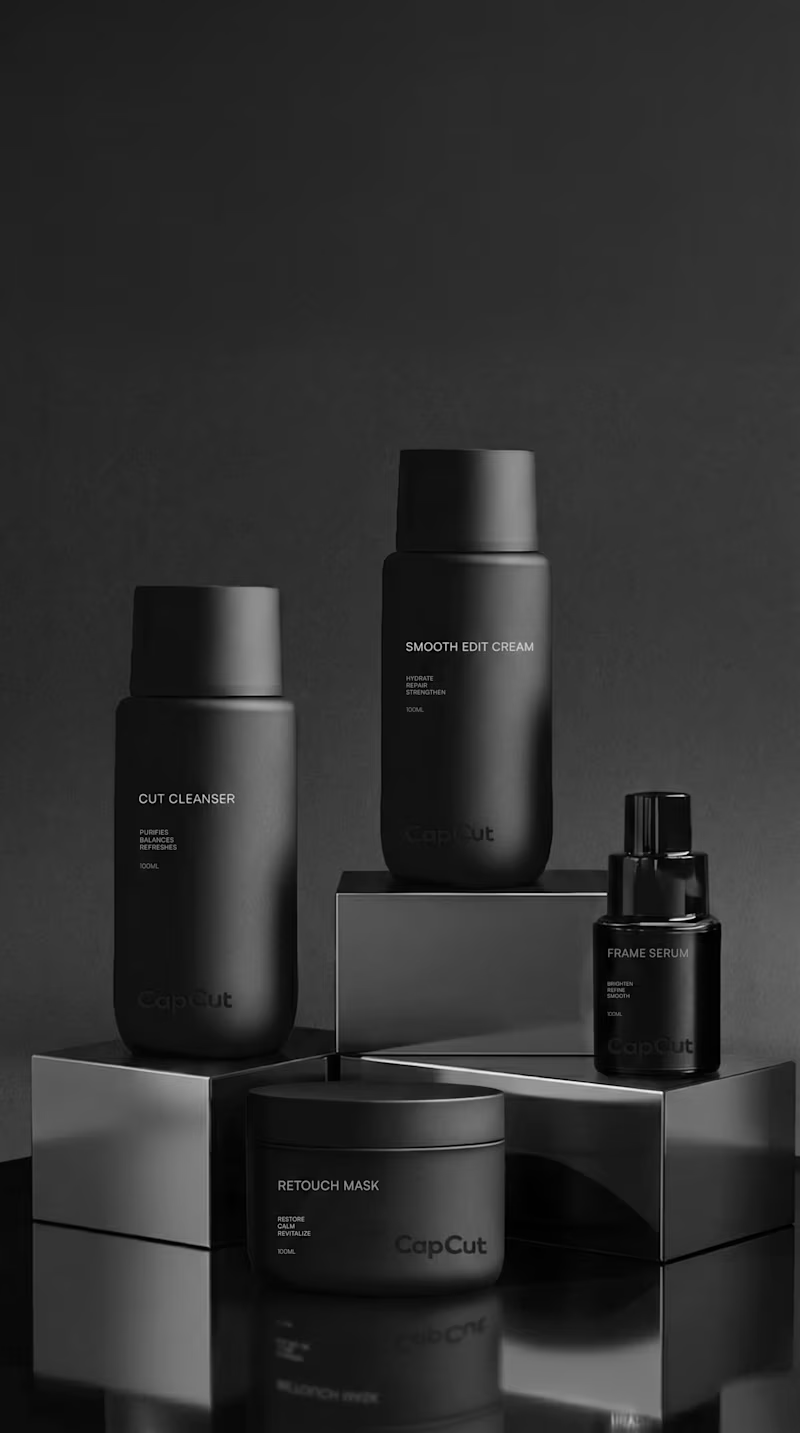
What if CapCut entered the skincare industry? ✨ Would you add it to your routine? I explored how CapCut could evolve beyond content creation and become a premium skincare brand. CONCEPT CapCut Skin translates CapCut's core values of simplicity, efficiency, and creativity into a modern skincare experience. Inspired by the idea of editing and enhancing content, the brand applies the same philosophy to skincare through streamlined routines, multifunctional products, and visible results. VISUAL IDENTITY The identity combines minimalist packaging, clean typography, and fresh mint-green accents inspired by digital interfaces. The goal was to create a brand that feels modern, approachable, and technology-driven while maintaining a premium aesthetic. PRODUCTS The collection includes Cut Cleanser, Frame Serum, and Smooth Edit Cream, a simplified routine designed to cleanse, refine, and hydrate the skin. Product names are inspired by the language of content creation, creating a direct connection to the CapCut universe. POSITIONING Designed for people who want effective skincare without complicated routines. Smart formulas, clean design, and results-focused products for modern lifestyles.
13
13
904
Graphic Designer
(7)
Follow
Message
Domenico Amalfitano
Naples, Italy
Designer
$10k+
Earned
41
Followers
Follow
Message
Designer
3
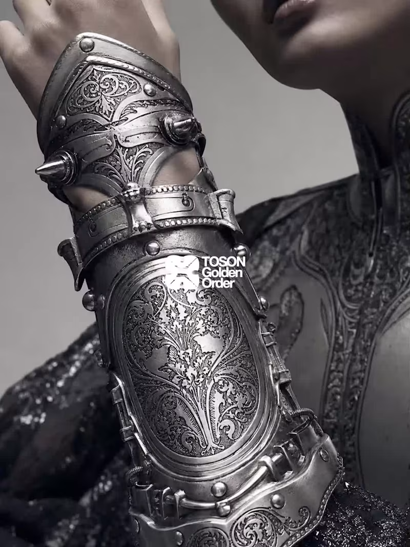
TOSON — Golden Order Inspired by the Armor of Emperor Ferdinand I (1549) by Kunz Lochner at The Metropolitan Museum of Art, Public Domain, whose backplate bears the crossed staves and firesteels of the Order of the Golden Fleece, an elite chivalric society Ferdinand belonged to. TOSON imagines what that same logic of induction would look like today, built as a fashion house rather than a museum object. TOSON, 2026. A speculative luxury house built from an armor that once certified belonging to an order money could not buy. That rank was inherited, earned, awarded, never purchased. TOSON borrows the language of induction, the seals, the insignia, the architecture of admission, and turns it into a brand, which is exactly the tension at its center: can rank still mean anything once anyone with enough money can acquire it? Every piece is designed to look like membership. None of them can actually grant it. - Original Artwork: https://www.metmuseum.org/art/collection/search/23944
2
3
321
56
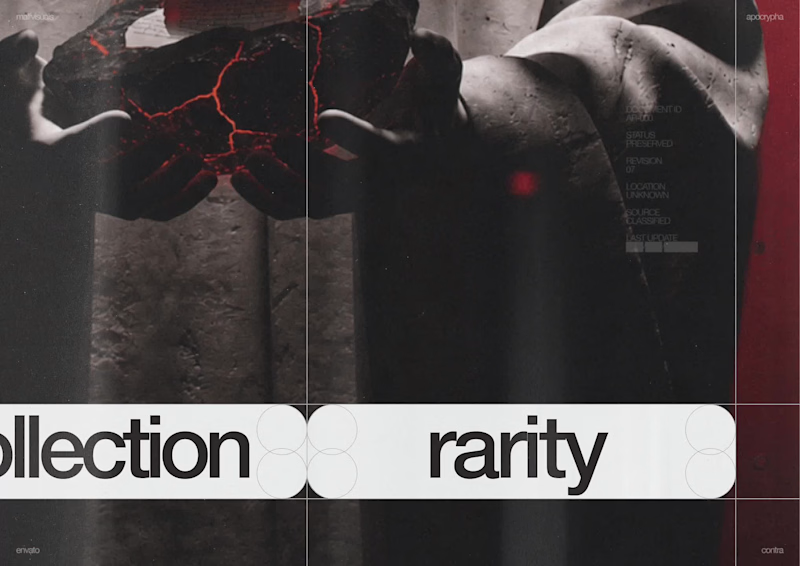
Apocrypha: Human by Design For the EnvatoChallenge, I wanted to explore a different relationship between AI and creativity. I created Apocrypha, a collectible card universe where every artifact begins as an AI-assisted concept but only becomes part of the archive through human taste, creative direction, and design. Instead of asking AI to create finished pieces, I used Envato as the main creative toolkit throughout the entire project. I explored its stock image and video library to build moodboards, collect textures, study compositions, and define the visual language of the world. I also used Envato AI to generate concepts for characters, artifacts, and environments, then refined, combined, and reworked them into a cohesive universe. Some of the concepts were even manually painted over to push them beyond the original AI output. Alongside the cards, I designed ArchiveOS, a living creative bible where I organize collections, lore, references, prompts, and every creative decision behind the project. It became the place where the entire world of Apocrypha could grow consistently. The biggest creative decision wasn't generating images. It was deciding what deserved to exist. Knowing when an idea felt wrong, when an artwork needed more work, when a concept should evolve, or when it should be discarded completely. AI gave me possibilities, but every final artifact exists because of human judgment. I'd love to hear what you think about this approach to AI-assisted worldbuilding.
19
56
4.7K
11
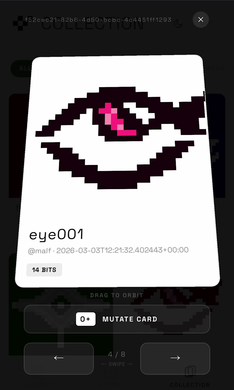
BITMOS — design, share, mutate, collect. A living card system where every creation can evolve. Build your own cards, explore others, and watch them transform through interaction. Not just collecting — mutating ideas. Try it here: https://bitmos.figma.site/ Trailer (https://www.instagram.com/p/DVaf6CziIET/?hl=en)
2
11
828
20
A Quiet Ecosystem is a short AI fashion film exploring the subtle relationship between human presence and nature. Through minimal composition, poetic imagery, transitions, the video builds a quiet visual narrative where landscapes, bodies, and natural elements coexist in balance. Typography appears as fragments of poetry, guiding the viewer and reinforcing the contemplative atmosphere of the film. Trailer Video on X (https://x.com/malfvisuals/status/2033222967052628454?s=20) Project Link (https://app.kittl.com/project/cmmo5ksi64fah0i86stxchmw4)
8
20
1.4K
Graphic Designer
(4)
Follow
Message
Valeria Miele
Naples, Italy
Branding and creative creator
Follow
Message
Branding and creative creator
0
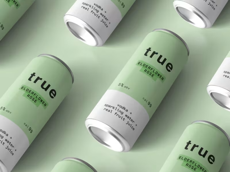
True Can Packaging Design
0
33
0
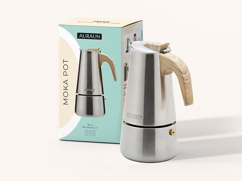
Moka Pot Packaging Design
0
38
0
Declea Brand Identity Design
0
50
2
Leno Brand Identity Design
2
31
Graphic Designer
(5)
Follow
Message
Luigi Falibretti
Naples, Italy
Fresh identity for brands, graphic & visual design
Follow
Message
Fresh identity for brands, graphic & visual design
0
Wick Illustration on Behance
0
6
0
Logos & Marks, Vol. 1
0
8
0
WRAPPETTOZZO! - Brand Identity on Behance
0
19
0
Pollyne Studios on Behance
0
7
Graphic Designer
(3)
Follow
Message
Emanuele Perilli
Naples, Italy
Graphic Designer,Illustrator,Motion designer,web designer
Follow
Message
Graphic Designer,Illustrator,Motion designer,web designer
0
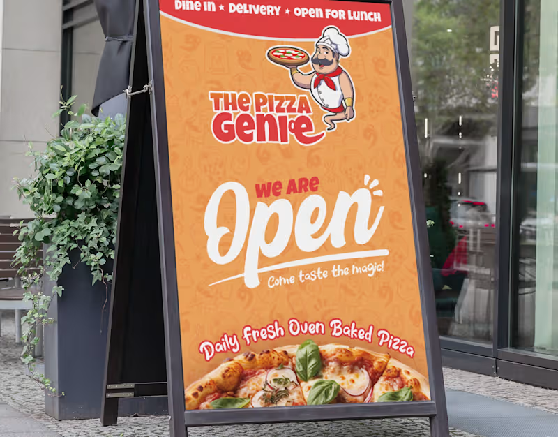
The Pizza Genie
0
7
0
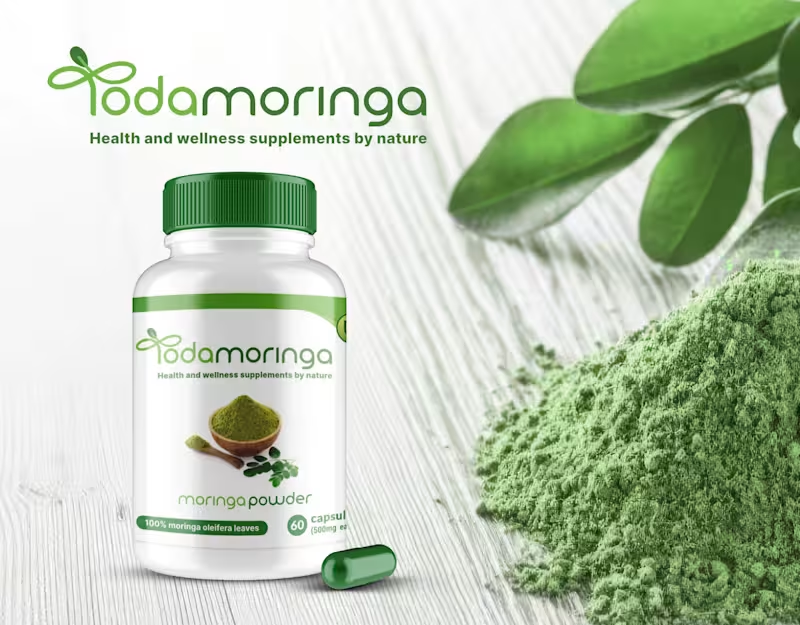
Todamoringa
0
7
0
Giulia
0
5
0
Lifenichel
0
7
Graphic Designer
(9)
Follow
Message
Lorenzo Rocco
pro
Naples, Italy
Brand Identity Designer | Strategy, Logo & Visual Systems
6
Followers
Follow
Message
Brand Identity Designer | Strategy, Logo & Visual Systems
1
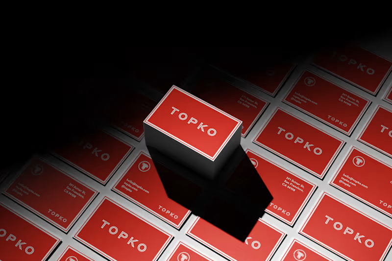
Brand Identity for Topko. Check my works at www.ellevisual.com
1
299
2
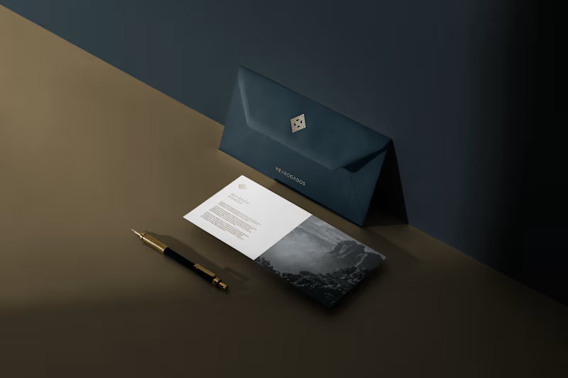
Brand Identity for VE Abogados
2
250
0
Certosa di San Martino
0
47
10
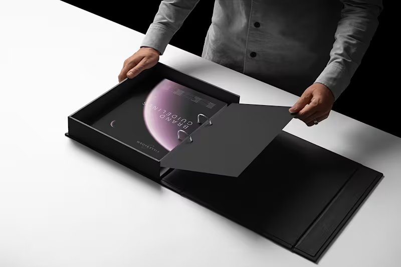
Fillerkosm Brand Identity Fillerkosm is a brand identity project built at the intersection of science, beauty and precision. The creative process started from the meaning behind the name itself: Fillerkosm combines the world of aesthetic medicine with kosmos, the Greek idea of order and harmony. From there, I explored visual references connected to chemistry, space and refined beauty, with the goal of creating an identity that could feel technical, authoritative and premium without becoming cold or overly clinical. The logo was developed as a direct extension of this concept. Two elliptical forms move through the wordmark like planetary orbits, while the circular elements at their extremities also suggest a molecular structure. The result creates a deliberate duality between the scientific precision of aesthetic medicine and the broader idea of harmony, balance and universal beauty. Rather than designing a logo in isolation, the objective was to build a coherent visual language capable of expressing reliability, innovation and elegance across every brand touchpoint.
10
10
162
Graphic Designer
(3)
Follow
Message
Alessandro Piscopo
Metropolitan City of Naples, Italy
Creative Graphic Designer for Brands and artists
Follow
Message
Creative Graphic Designer for Brands and artists

0
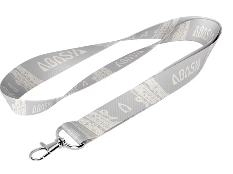
Abasia
0
11
0
Filler: Logo and brand identity
0
7
0
Portfolio
0
11
View more →
Graphic Designer
(3)
Follow
Message
Angelica Galeone
Naples, Italy
B.A. & M.A. in Design – Art That Communicates
Follow
Message
B.A. & M.A. in Design – Art That Communicates
1
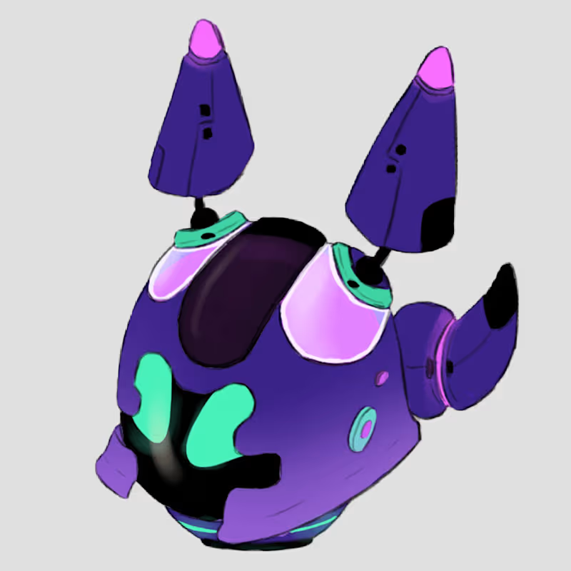
Concept Art for Indie Game "Project A.R.M."
1
3
0
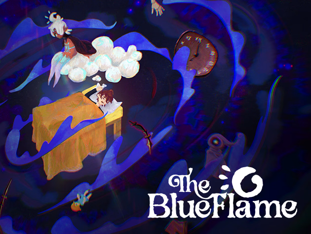
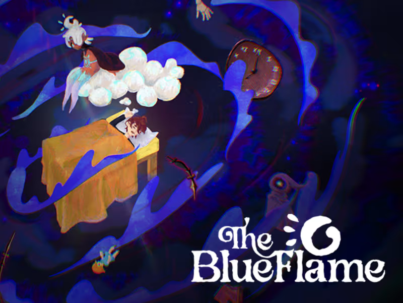
The Blue Flame (game demo)
0
6
0
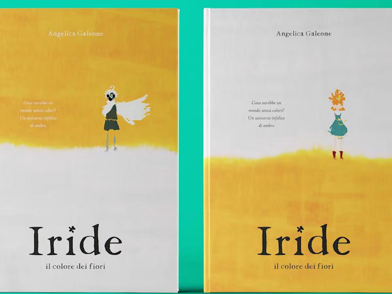
Iride | An Illustrated Book :: Behance
0
5
View more →
Graphic Designer
(1)
Follow
Message
Explore people