Todamoringa
Emanuele Perilli

Todamoringa
Todamoringa is a brand that produces a line of food supplements primarily based on the "Moringa Oleifera" plant, a powerhouse of nutrition and versatility.
Harvested from the lush fields of tropical regions, this remarkable plant offers a wide array of benefits.
Originally intended for the American market, the project faced an unfortunate setback due to a devastating flood in the cultivating area, forcing the owners to put it on hiatus.
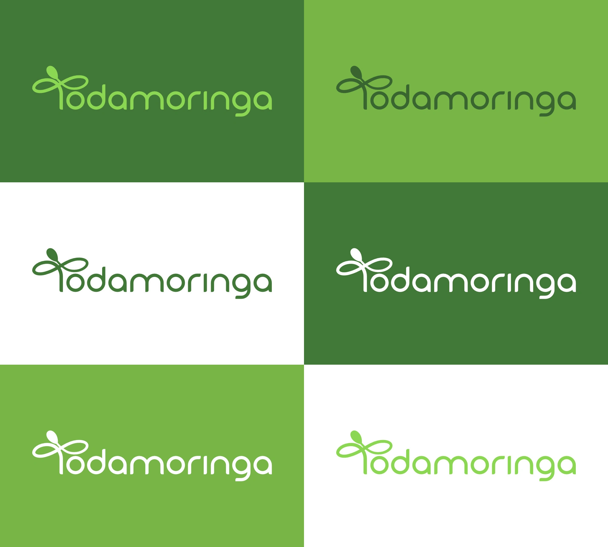
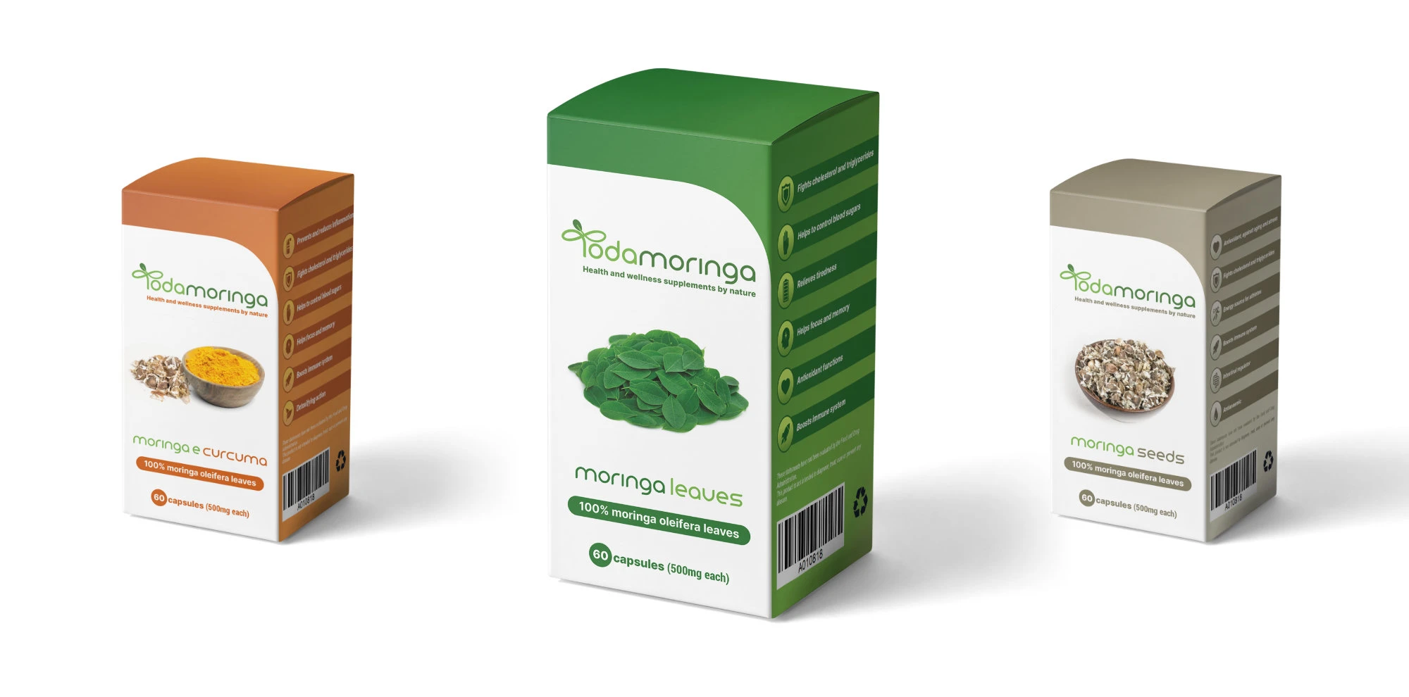
The Todamoringa logo achieves its purpose by effectively communicating the brand’s strong connection to the Moringa Oleifera plant and its unwavering commitment to health and well-being.
Crafted in a clean, modern font (Lead), the letter “T” integrates a stylized moringa leaf, emphasizing the plant’s significance and reinforcing the brand’s identity.
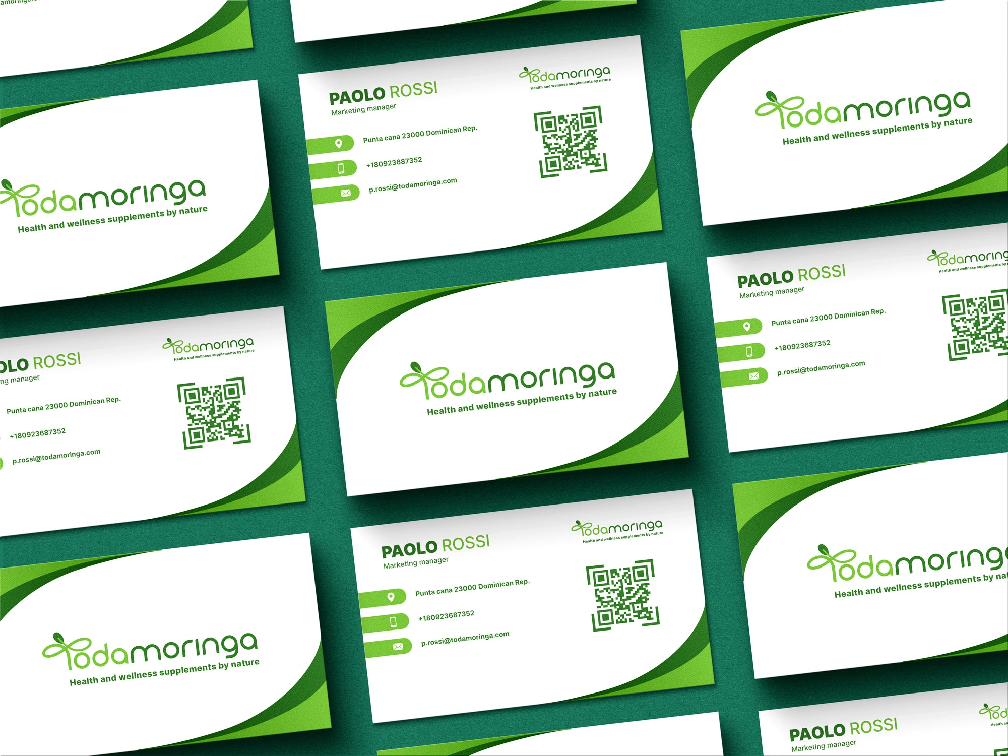
The packaging design predominantly features the colors from the logo, maintaining visual consistency. However, variations occur when additional ingredients (such as curcuma and moringa seeds) are incorporated.


For inquiries write to
info@mannyarts.com
Check my website
www.mannyarts.com
Like this project
Posted May 11, 2025
Brand identity