Logo Design Projects in NairobiLogo Design Projects in NairobiTSUNGU COFFEE — Complete Brand Identity & Packaging Design
Project Overview
Premium Coffee Brand Identity | Logo Design | Brand Strategy | Packaging Design | Launch Campaign
Tsungu Coffee is a premium coffee brand that required a complete visual identity system from initial logo concept to market-ready packaging and launch materials. This comprehensive branding project showcases the full spectrum of brand development for a speciality coffee company targeting discerning coffee enthusiasts who value quality, tradition, and elegance.
The Challenge
Create a sophisticated, memorable brand identity for a new premium coffee brand that would:
Stand out in the competitive speciality coffee market
Communicate premium quality and rich tradition
Work across multiple touchpoints (packaging, digital, social media)
Appeal to coffee connoisseurs who appreciate craftsmanship
Balance timeless elegance with modern appeal
The Solution
Phase 1: Logo Design & Brand Mark Development
I developed two distinct logo variations to explore different creative directions for the Tsungu Coffee brand identity:
Variation 1: A refined monogram featuring the letter "T" integrated with organic coffee plant elements, coffee beans and leaves, encased in an elegant oval frame with Art Deco-inspired details.
Variation 2: An evolved concept incorporating a coffee cup silhouette at the base, creating a complete visual narrative from plant to cup while maintaining the sophisticated monogram structure.
Final Selection: The second variation was chosen for its ability to tell a complete brand story, representing the journey from farm to cup, while maintaining the luxurious, premium aesthetic essential for the brand positioning.
Phase 2: Comprehensive Brand Kit Development
With the logo finalised, I created a complete brand identity system including:
Colour Palette:
Rich chocolate browns (#2A1B13, #6B4424)
Warm golds and amber tones (#D4A54A, #9C6A3A)
Cream/ivory accent (#F5F0E6)
Strategic colour hierarchy for premium positioning
Typography System:
Heading Font: CINZEL -Classical elegance with modern refinement
Body Font: MONTSERRAT - Clean, contemporary readability
Brand Elements:
Decorative dividers and ornaments
Coffee leaf motifs and patterns
Sparkle/star accent elements
Standalone "T" monogram for versatile applications
Brand Story & Messaging:
"Tsungu Coffee is crafted from the finest beans, blending tradition, quality, and passion in every cup."
Phase 3: Packaging Design
I designed premium coffee packaging for multiple product lines:
Signature Blend Package (Black):
Matte black finish with gold foil accents
Medium roast positioning
Decorative leaf pattern on side panels
Clear product hierarchy and information architecture
Single Origin Ethiopia Package (Cream):
Light, natural cream colourway
Light roast positioning
Maintains brand consistency while differentiating product line
Premium unboxing experience
Packaging Features:
Stand-up pouch format for retail readiness
Resealable functionality
Net weight: 250g / 8.8 oz
Roast level indicators
Origin transparency
Process information (Washed)
Ingredient declarations
Barcode integration
Best before dating
Phase 4: Launch Social Media Campaign
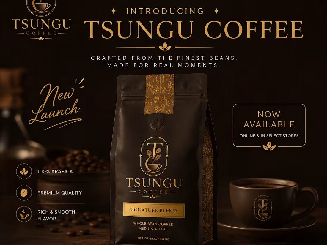
To support the market introduction, I created a comprehensive launch campaign asset featuring:
Key Messaging:
"Introducing Tsungu Coffee"
"Crafted from the finest beans. Made for real moments."
"Premium Coffee. Rich in Tradition."
"New Launch — Now Available Online & In Select Stores"
Product Highlights:
100% Arabica
Premium Quality
Rich & Smooth Flavour
Call-to-Action Elements:
"Order Now" button
Website: Tentative ( www.tsungucoffee.com (http://www.tsungucoffee.com))
Social handles: @tsungucoffee
Multi-platform-ready format
Design Process
Discovery & Research -Understanding the premium coffee market, target audience, and competitive landscape
Concept Development -Creating multiple logo directions, exploring different visual narratives
Refinement - Iterating on selected concepts based on brand strategy
Brand System Creation - Developing comprehensive guidelines, colour systems, and typography
Packaging Application -Applying brand identity to functional, retail-ready packaging
Launch Materials - Creating marketing assets for successful market introduction
Results & Deliverables
✅ 2 Logo Concepts with strategic rationale
✅ Final Brand Identity System with complete guidelines
✅ Color Palette & Typography System
✅ Brand Elements Library (patterns, ornaments, icons)
✅ 2 Packaging Designs (Signature Blend + Single Origin)
✅ Launch Social Media Campaign
✅ Brand Story & Messaging Framework
✅ Retail-Ready Product Labels with full compliance
Let's Work Together
I'm available for logo design projects, complete brand identity systems, packaging design, and launch campaign creative. Whether you're launching a new product, refreshing an existing brand, or need comprehensive visual identity work, I bring strategic thinking and creative excellence to every project.
Ready to create something exceptional? Let's discuss your next branding project. Crock Haven — From Local Kitchenware to Curated Living
Brand Identity • Visual Strategy • Logo Transformation
Project Details
Client: Crock Haven
Sector: Consumer / Lifestyle / Kitchenware
Scope: Brand Identity Development
Services: Visual Strategy, Logo Development, Monogram, Typography, Colour Direction, Brand Applications
Role: Brand & Identity Development
Crock Haven began with a visual identity that communicated its category clearly: food, dining and kitchenware.
But the identity felt relatively broad and functional. It did not fully communicate the direction the brand was intended to take — a more curated, discerning proposition built around premium kitchenware and lifestyle.
The challenge was therefore not simply to create a new logo.
It was to elevate the perceived value of the brand without losing its connection to the world of dining and the home.
The identity was rethought around a more refined proposition:
From kitchenware → to curated living.
The redesign moved away from a literal category-led treatment toward a more restrained visual language.
The new identity introduced:
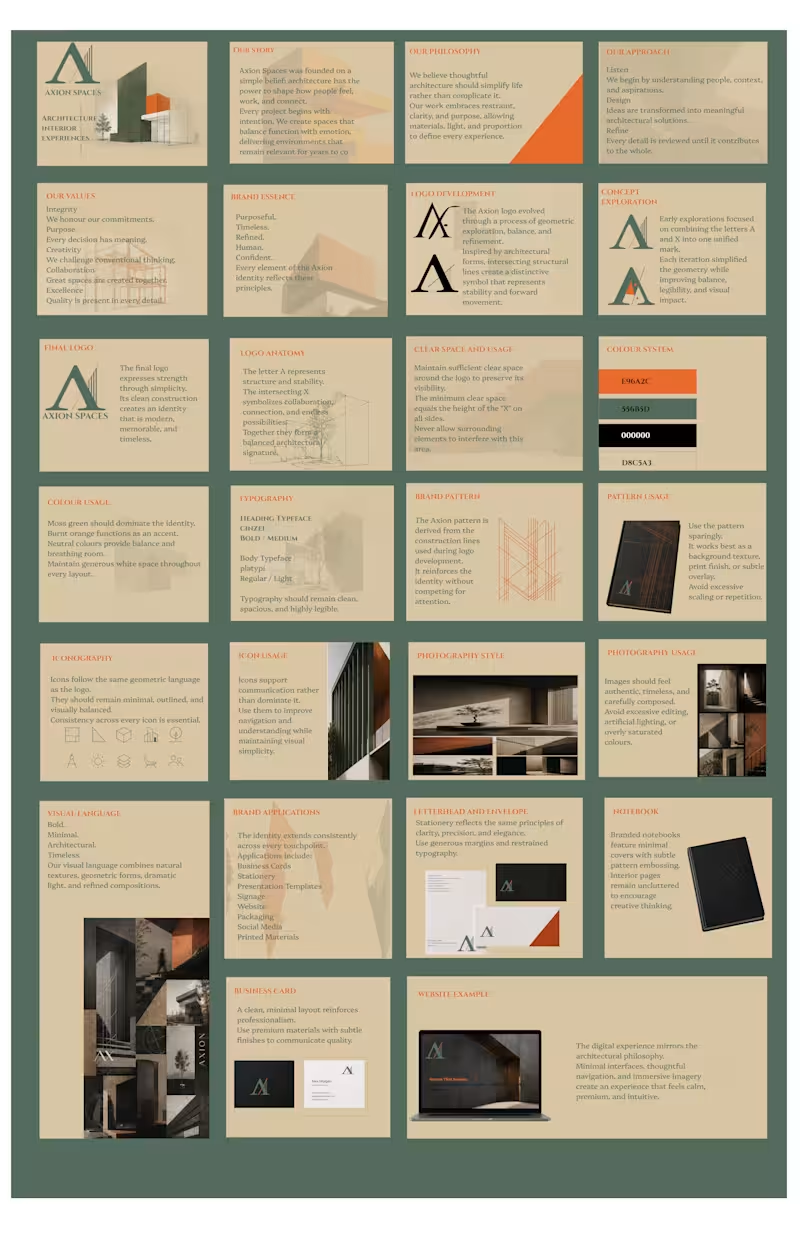
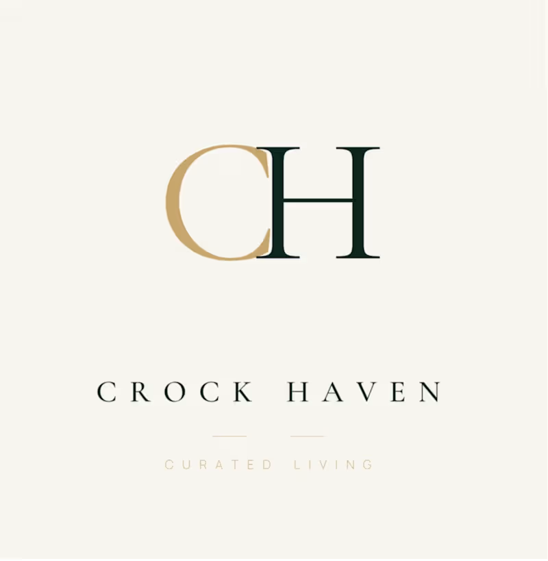
A bespoke CH monogram
A refined serif-led typographic system
Deep green as the principal brand environment
Warm metallic gold as an accent
Greater use of negative space
A more restrained, editorial composition
A new positioning line: Curated Living
The result is an identity designed to feel less mass-market and more considered, selective and lifestyle-led.
The CH monogram gives Crock Haven a proprietary visual asset that can exist independently of the full wordmark.
That matters because a strong brand mark needs to work beyond the primary logo — from product applications and packaging to social profiles, digital interfaces and future physical touchpoints.
The mark was developed to give the brand an identifiable shorthand while retaining the elegance of the full Crock Haven name. 🚀 Struggling with Manual Reports? Automate Your Data & Unlock Real Insights Today
Are you looking for a Data Analyst / BI Expert to automate reports, streamline workflows, and turn raw data into powerful business insights? At Intersect Analytics, we specialize in building scalable, automated reporting systems that eliminate manual work and drive smarter decisions.
🔍 What We Do (Tailored to Your Needs)
We help businesses move from spreadsheet chaos to intelligent dashboards by delivering:
✅ Automated Reporting Solutions (Excel, SQL, Python, R)
✅ Interactive Dashboards (Power BI, Tableau, Looker Studio)
✅ Advanced Data Analysis (trend analysis, anomaly detection, forecasting)
✅ SQL Data Extraction & Transformation (large datasets, multi-source integration)
✅ Statistical Analysis (regression, A/B testing, correlation insights)
✅ Excel Optimization (Pivot Tables, VLOOKUP, dynamic dashboards)
📊 Why Choose Intersect Analytics?
✔️ End-to-End Expertise – From raw data extraction to executive dashboards
✔️ Automation First Approach – Save hours of manual reporting every week
✔️ Business-Focused Insights – We don’t just analyze data, we solve problems
✔️ Scalable Solutions – Built to grow with your business
✔️ Clear Communication – Translating complex data into simple, actionable insights
💡 The Value We Deliver
We help you:
Identify hidden trends and performance gaps
Replace repetitive reporting with automated pipelines
Make faster, data-driven decisions
Gain a clear, real-time view of your business
📈 Perfect For:
Businesses needing automated analytics reports, dashboard development, SQL data handling, and advanced data insights.
📩 Let’s transform your data into a competitive advantage.
📱 WhatsApp: +254 723 632 207
Intersect Analytics – Turning Data into Decisions. Sookk: Logo Design & Brand Identity
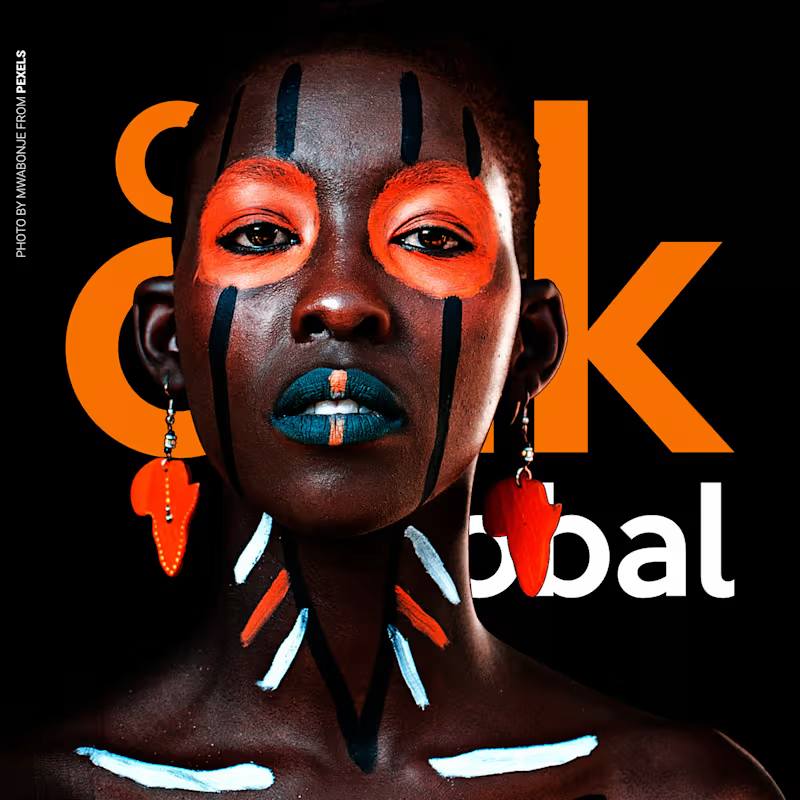
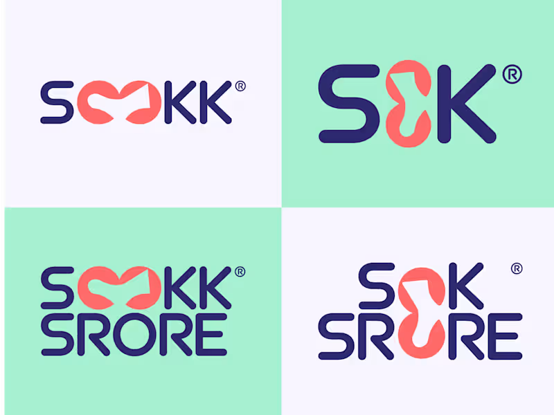
Sookk is a fashion accessories company that sells modern socks made with affordable materials. The client came to me needing a logo and a complete brand identity.
Research: I started by studying the brand and looking at what its competitors were doing. My goal was to create something completely different, so Sookk would stand out in a crowded market.
Target audience: Sookk targets budget-conscious shoppers, mostly younger, style-aware consumers such as students and early-career professionals. They want their outfits to look considered without paying premium prices. They value affordability, but they still care about aesthetics. They want to feel they got something stylish, not something cheap.
Moodboard and logo exploration: With this in mind, I created a moodboard that matched the client's needs, and this is where my logo exploration began. I went for a design that is modern, clean, and easy to identify, with colors that appeal to the target audience.
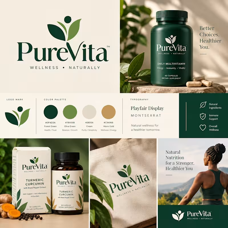
Variations and mockups: Once the logo was approved, I created variations for use across different areas of the brand. I made mockups for sock labels, packaging boxes, the store sign, and other touchpoints. This step shows the client how the brand will look in real-life scenarios. PureVita is a premium direct-to-consumer wellness brand I designed from scratch to create a modern, trustworthy, and natural identity for the supplement market.
The logo mark combines a person figure with two leaves, representing wellness, natural ingredients, and growth. The dot above symbolizes vitality. The design is simple, memorable, and works at small scale on packaging.
Deliverables: Complete brand identity and logo system, color palette (Forest Green #0F4D3A, Olive Green #7BA95B, Cream #E8E0D5, Warm Gold #C9A96B), typography (Playfair Display + Montserrat), packaging for Daily Multivitamin and Turmeric Curcumin, merch (tote bag), and social campaign templates.