The network for creativity
Join 1.25M professional creatives like you
Connect with clients, get discovered, and run your business 100% commission-free
Creatives on Contra have earned over $150M and we are just getting started
Back to feedPost
Sookk: Logo Design & Brand Identity
Sookk is a fashion accessories company that sells modern socks made with affordable materials. The client came to me needing a logo and a complete brand identity.
Research: I started by studying the brand and looking at what its competitors were doing. My goal was to create something completely different, so Sookk would stand out in a crowded market.
Target audience: Sookk targets budget-conscious shoppers, mostly younger, style-aware consumers such as students and early-career professionals. They want their outfits to look considered without paying premium prices. They value affordability, but they still care about aesthetics. They want to feel they got something stylish, not something cheap.
Moodboard and logo exploration: With this in mind, I created a moodboard that matched the client's needs, and this is where my logo exploration began. I went for a design that is modern, clean, and easy to identify, with colors that appeal to the target audience.
Variations and mockups: Once the logo was approved, I created variations for use across different areas of the brand. I made mockups for sock labels, packaging boxes, the store sign, and other touchpoints. This step shows the client how the brand will look in real-life scenarios.


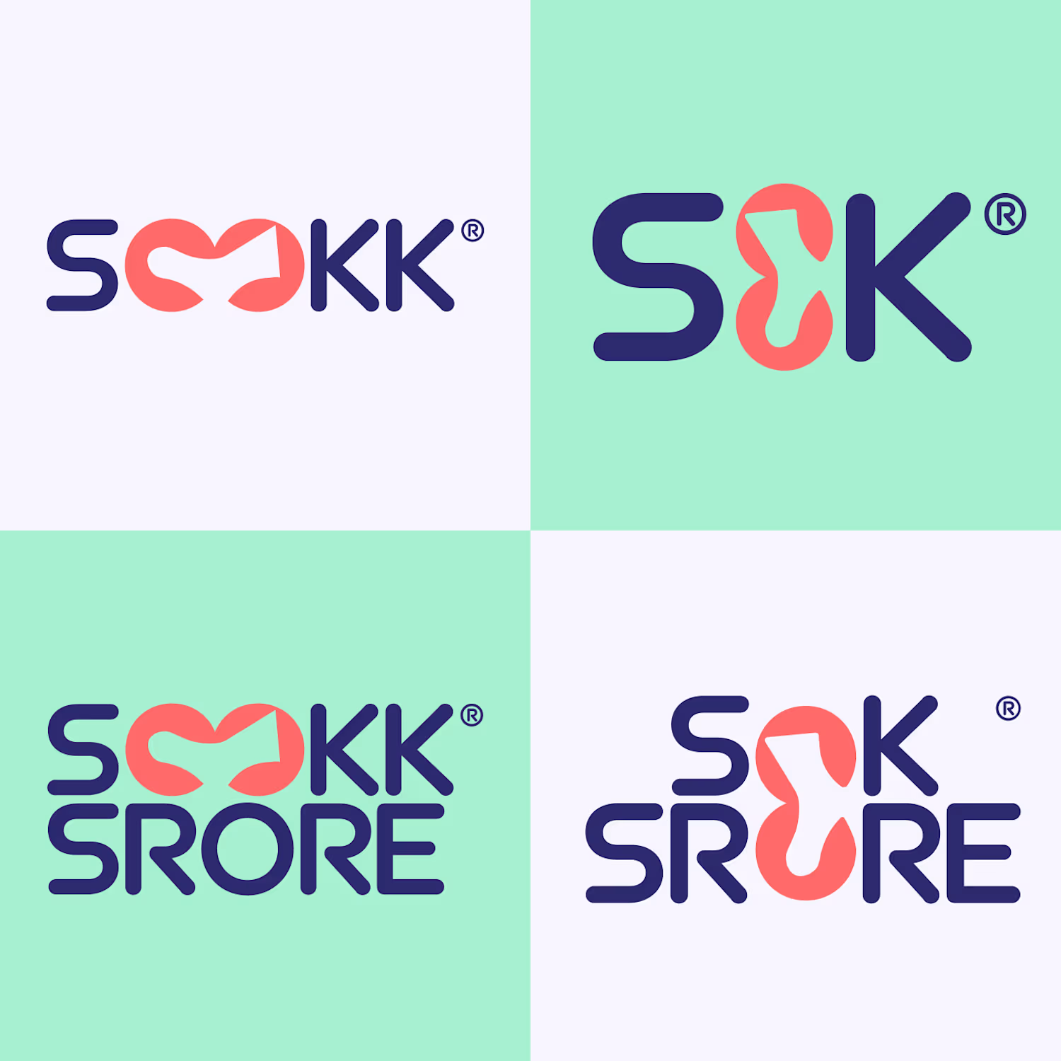
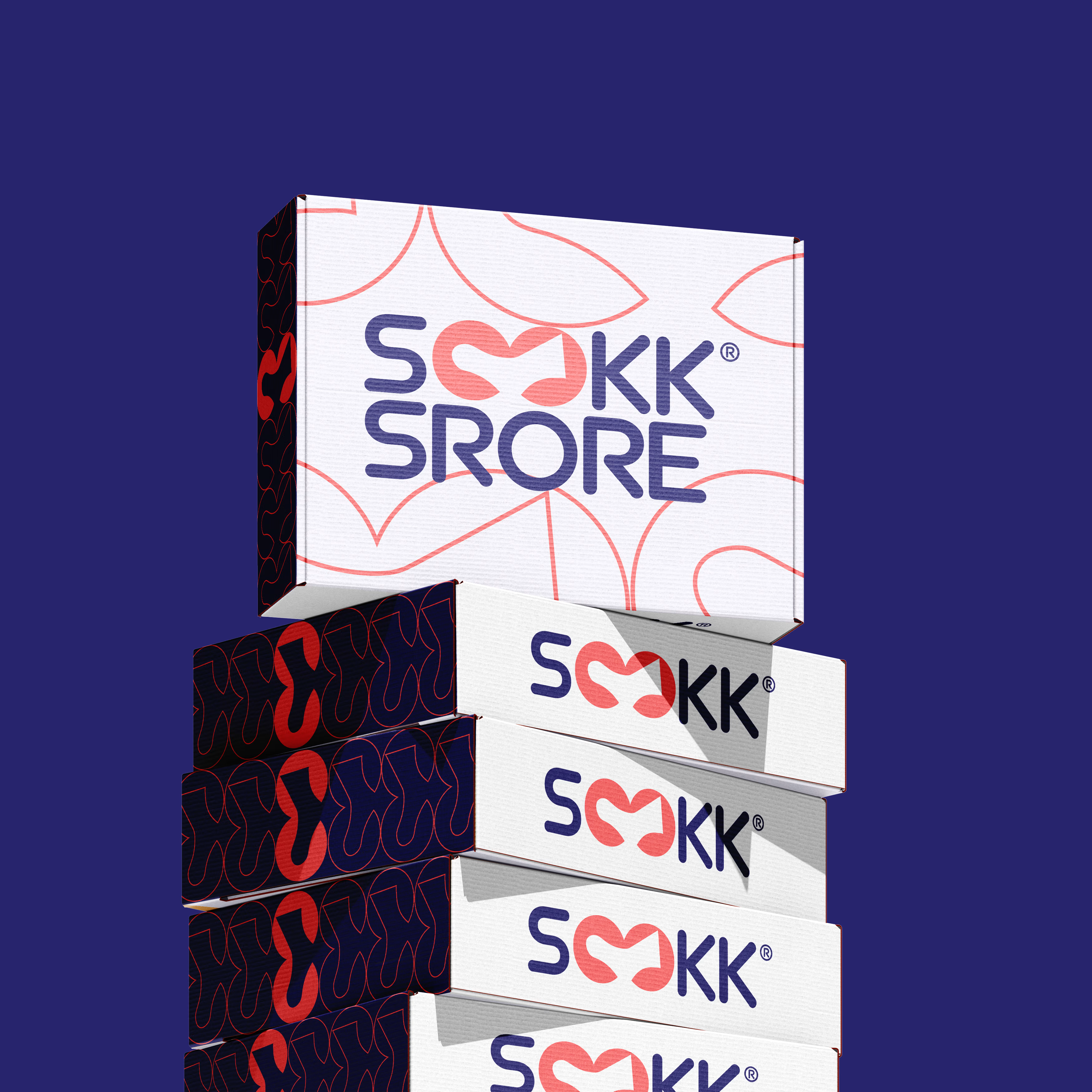
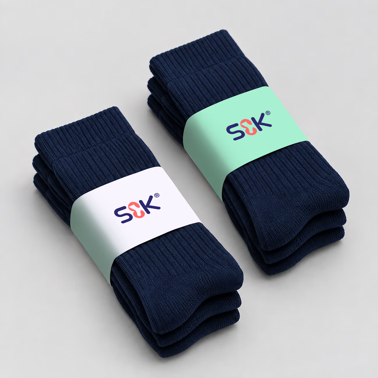
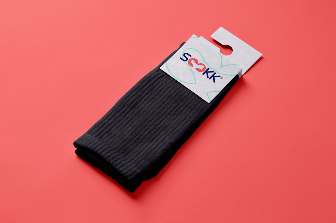

Using a shortened SOK lockup on the sock bands while the full wordmark lives on the packaging is a practical call for a product this small. Did the client ask to keep the looped O in colour on the labels, or did the navy-on-mint version win out?

Thank you Artur. This was a self-initiated concept project, so there was no client in the loop. I chose navy on mint for the labels because it gave the cleanest contrast at that small size, and I kept the short SOK lockup for the sock bands for the same reason.

THat a pretty good design concept ✨
The network for creativity
Join 1.25M professional creatives like you
Connect with clients, get discovered, and run your business 100% commission-free
Creatives on Contra have earned over $150M and we are just getting started





Related posts

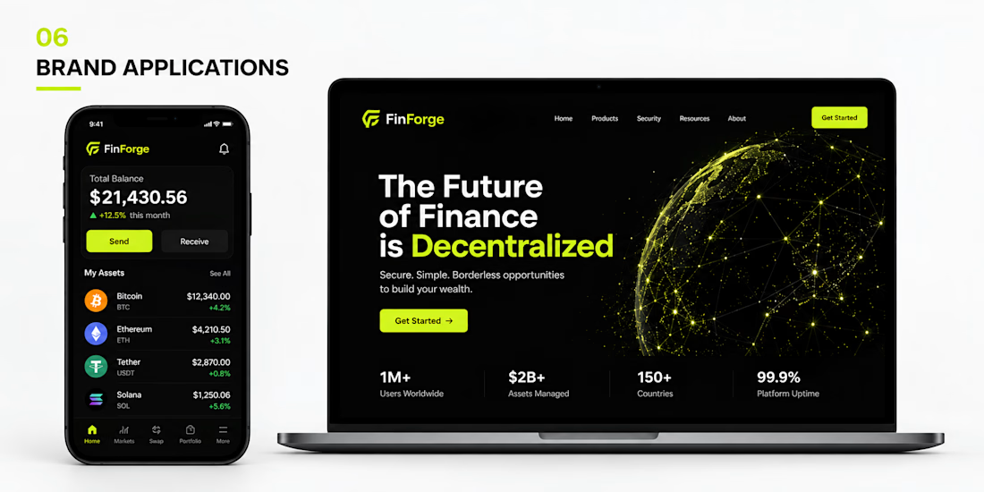
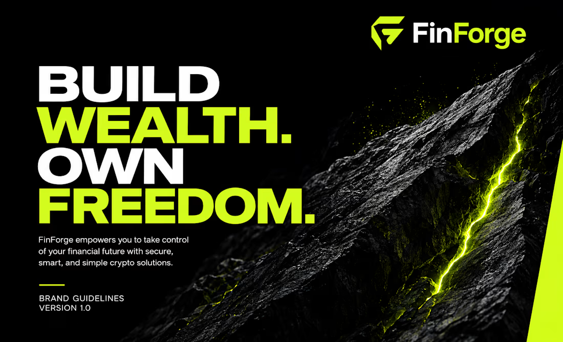
FinForge needed more than a logo, it needed a Corporate Brand Identity that could make a complex crypto platform feel trustworthy, innovative, and easy to understand in a highly competitive digital market.
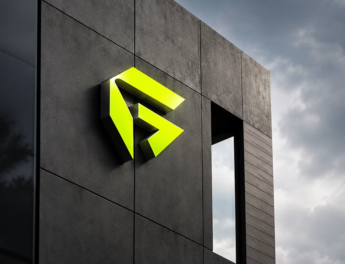
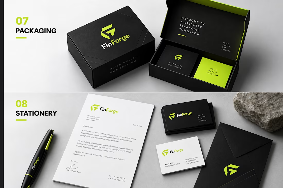
I approached the project through Brand Strategy, Brand Positioning, and Brand Design, creating a distinctive visual direction around a bold geometric Logo Design, futuristic typography, and a high contrast visual system. The solution was expanded into Brand Identity & Guidelines, covering the Brand Style Guide, color system, typography, Brand Book, brand patterns, social media, digital applications, packaging, and stationery.
The result is a scalable Brand Identity system that gives FinForge consistency across every touchpoint allowing the team to maintain a recognizable, professional presence as the business grows, without needing to redesign its visual language for every new application.
Building a brand that stays consistent, recognizable, and relevant as your business grows? Let’s create an identity designed to work beyond the logo.

Perfect contrast between green and black it feels powerful
Congratulations nice job🎉🎉

AMSW — Brand Art Direction & Visual Identity
A visual direction developed for AMSW, combining premium sportswear with a dark, minimal, and performance-driven aesthetic.
The concept focuses on discipline, intensity, and controlled energy, using cinematic photography, deep blacks, cool blue tones, bold negative space, and minimal typography to create a strong and recognizable visual language.
I developed the art direction across campaign imagery, brand compositions, typography, logo applications, and lifestyle visuals, with the goal of creating a premium identity that can translate across apparel, digital content, packaging, and future collections.
Role: Art Direction · Graphic Design · Brand Identity · Visual Direction · Campaign Design
Tools: Adobe Photoshop · Illustrator


Is this made with AI?

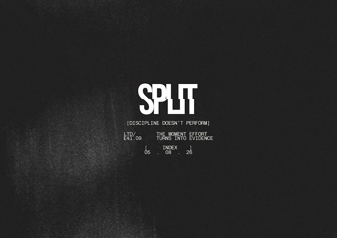
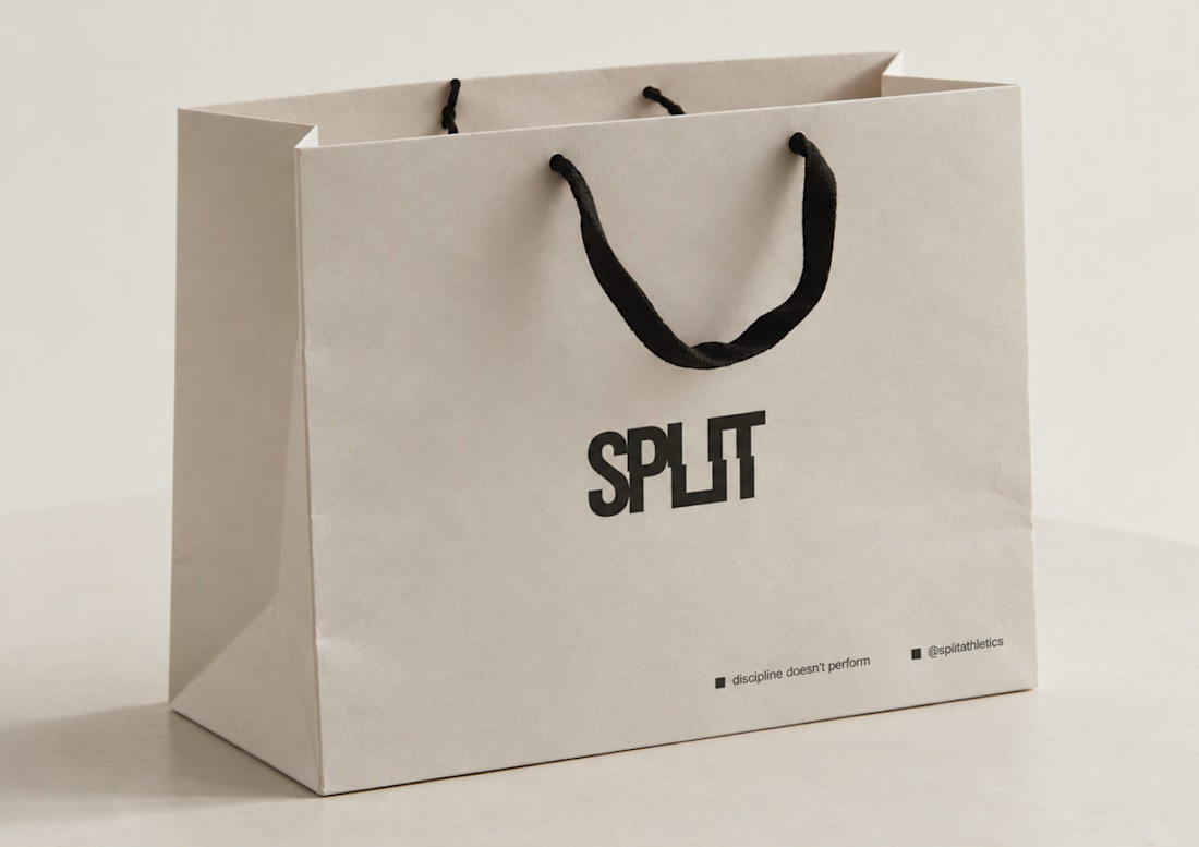
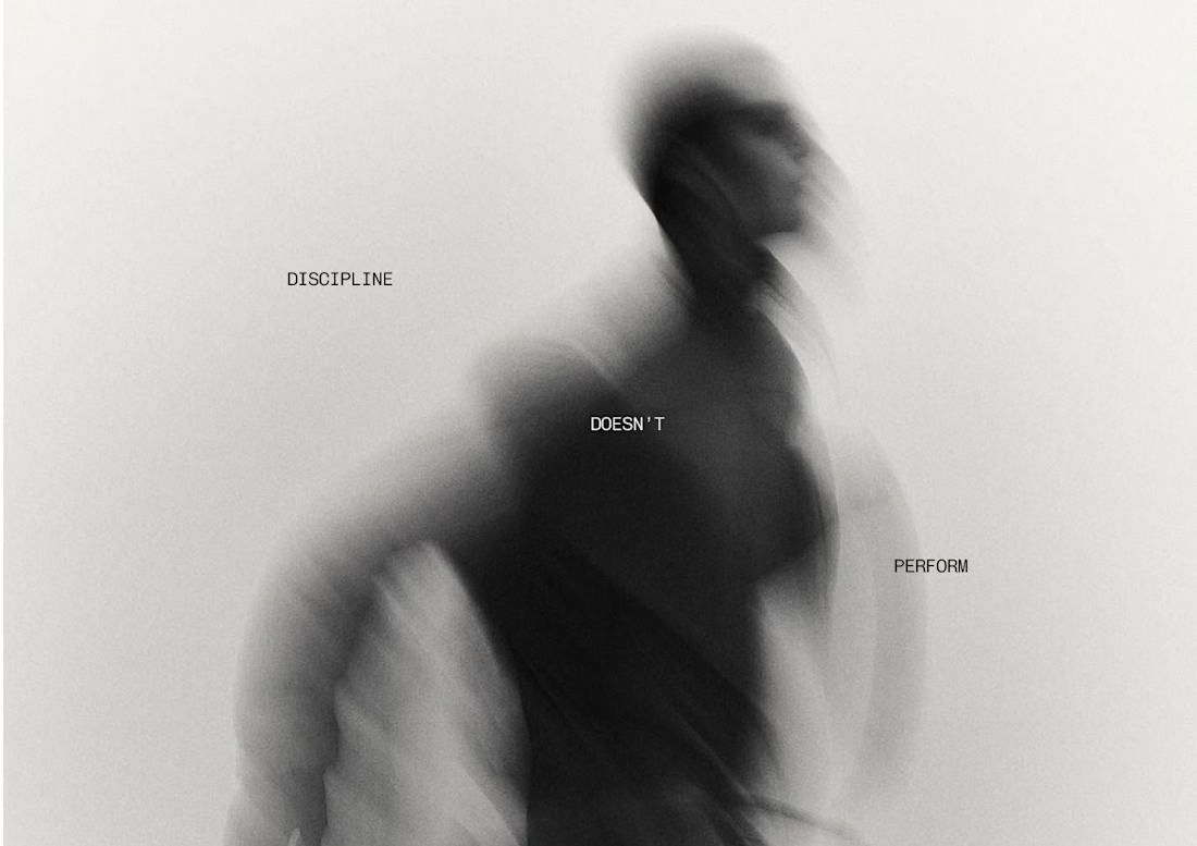
SPLIT is a self-directed brand system that demonstrates end-to-end thinking, strategy through motion, applied consistently across every format.


So cool!!