The network for creativity
Join 1.25M professional creatives like you
Connect with clients, get discovered, and run your business 100% commission-free
Creatives on Contra have earned over $150M and we are just getting started
Back to feedPost

What if an architectural firm looked as intentional as the spaces it designed?
Axion Spaces answers that question through a complete visual identity built on geometric precision, restrained elegance, and timeless design principles. From logo development and typography to photography direction and brand applications, every decision reinforces a single idea: purposeful architecture creates meaningful experiences.


The network for creativity
Join 1.25M professional creatives like you
Connect with clients, get discovered, and run your business 100% commission-free
Creatives on Contra have earned over $150M and we are just getting started



Related posts

One pixel grid. A whole brand.
For Appy, a London product studio for impact-driven startups, the wordmark, icons, 3D smile and Appy Pixel, its custom typeface, all come from the same grid.
Appy Pixel won Typography at the Online Design Awards.
Type first or symbol first: where do you start a rebrand?


thats so nice, i loveee

working on a case study for my latest project - brand identity for Coral Pay.
need your help choosing the best cover video for it:
35 voted
23%
118 voted
77%
153 votes
Closed

Lilac looks amazing with the 3D shining.

"Is it too late to eat?"
"Not yet."
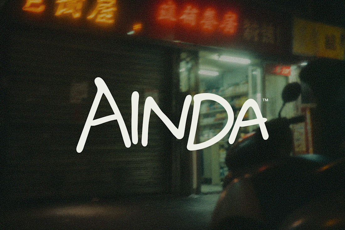
That's pretty much where AINDA started.
It's a fictional Chinese neighborhood restaurant I'm designing around the hours between today and tomorrow. Somewhere to have a proper meal, sit for a while, and maybe stay a little longer if the conversation isn't over.
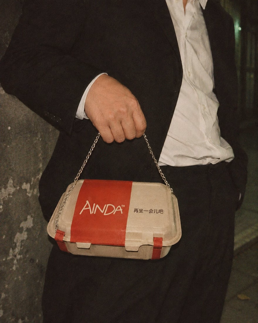
I've been developing its identity around that everyday feeling, from the hand-drawn lettering and late-night atmosphere to the packaging and service objects, some of which have gotten a little out of hand.
Here are a few experiments from the project so far. Still a lot to explore.
The restaurant doesn't exist, but apparently its takeout already has places to be.

Love this! Turning a takeout box into a handbag is genius — strong brand storytelling. I do brand & packaging concepts like this too, my DMs are open for collabs. 🔥