The network for creativity
Join 1.25M professional creatives like you
Connect with clients, get discovered, and run your business 100% commission-free
Creatives on Contra have earned over $150M and we are just getting started
Back to feedPost

Crock Haven — From Local Kitchenware to Curated Living
Brand Identity • Visual Strategy • Logo Transformation
Project Details
Client: Crock Haven
Sector: Consumer / Lifestyle / Kitchenware
Scope: Brand Identity Development
Services: Visual Strategy, Logo Development, Monogram, Typography, Colour Direction, Brand Applications
Role: Brand & Identity Development
Crock Haven began with a visual identity that communicated its category clearly: food, dining and kitchenware.
But the identity felt relatively broad and functional. It did not fully communicate the direction the brand was intended to take — a more curated, discerning proposition built around premium kitchenware and lifestyle.
The challenge was therefore not simply to create a new logo.
It was to elevate the perceived value of the brand without losing its connection to the world of dining and the home.
The identity was rethought around a more refined proposition:
From kitchenware → to curated living.
The redesign moved away from a literal category-led treatment toward a more restrained visual language.
The new identity introduced:
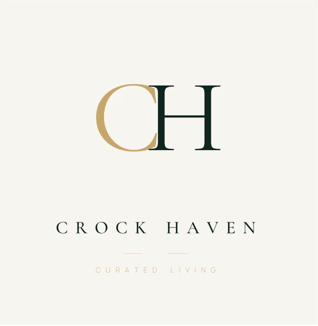
A bespoke CH monogram
A refined serif-led typographic system
Deep green as the principal brand environment
Warm metallic gold as an accent
Greater use of negative space
A more restrained, editorial composition
A new positioning line: Curated Living
The result is an identity designed to feel less mass-market and more considered, selective and lifestyle-led.
The CH monogram gives Crock Haven a proprietary visual asset that can exist independently of the full wordmark.
That matters because a strong brand mark needs to work beyond the primary logo — from product applications and packaging to social profiles, digital interfaces and future physical touchpoints.
The mark was developed to give the brand an identifiable shorthand while retaining the elegance of the full Crock Haven name.


The network for creativity
Join 1.25M professional creatives like you
Connect with clients, get discovered, and run your business 100% commission-free
Creatives on Contra have earned over $150M and we are just getting started





Related posts

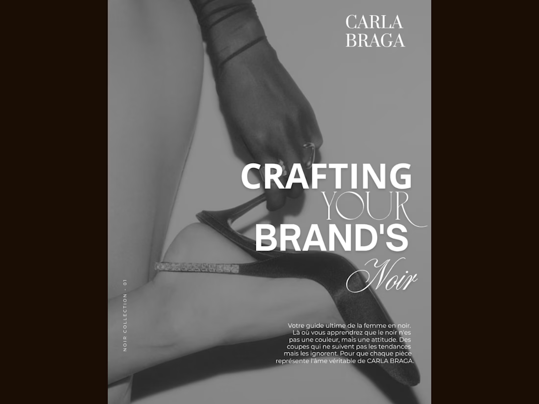
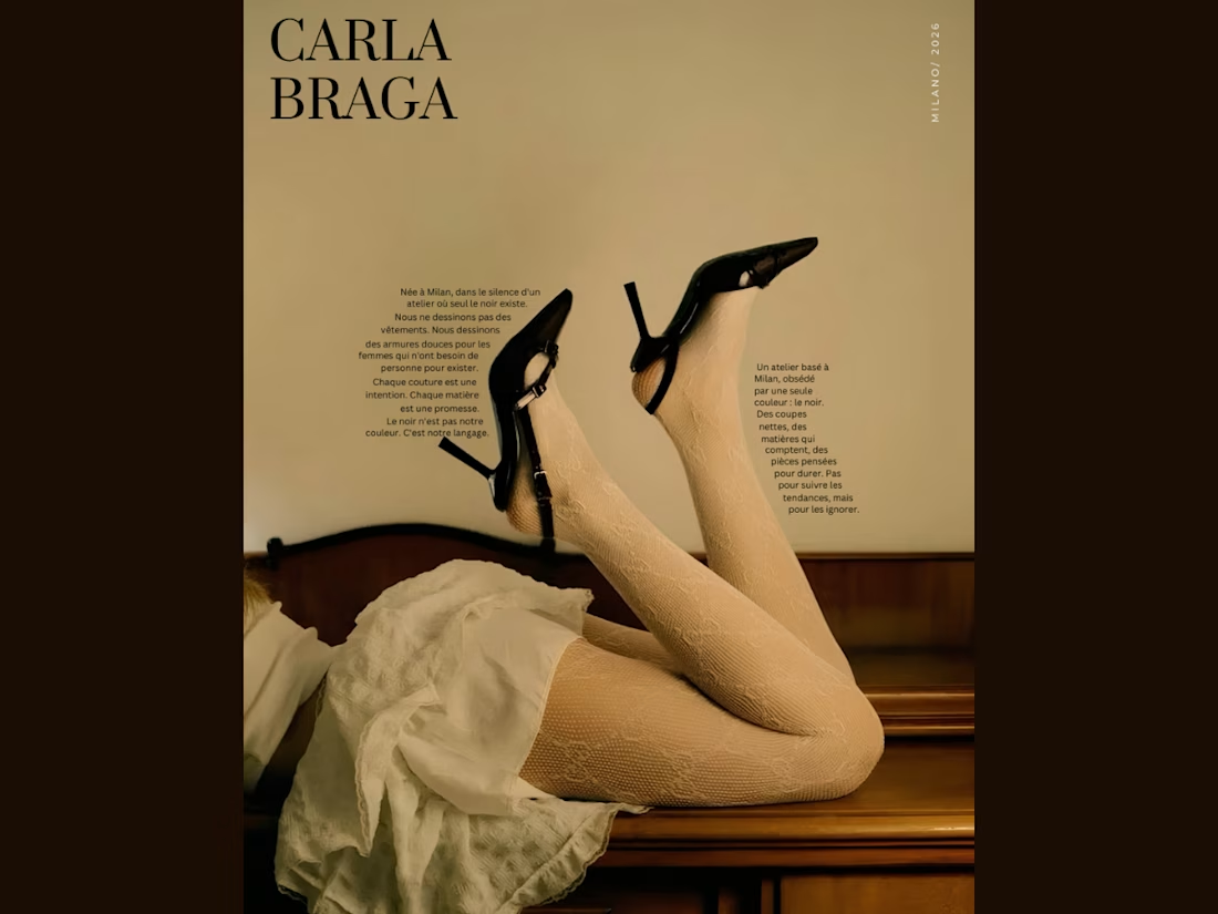
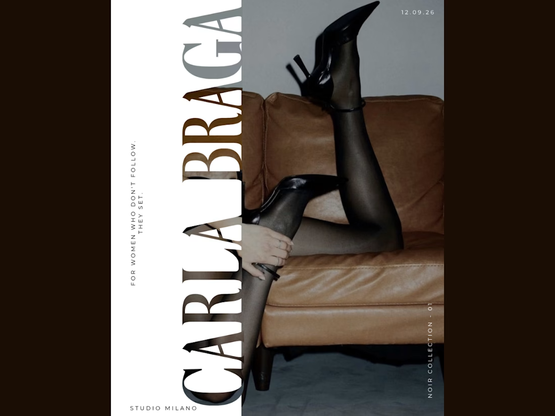
An editorial poster series I designed for CARLA BRAGA, exploring fashion through bold typography, vintage tones, and monochrome imagery. Each layout takes a different approach—from text following the contours of the image to oversized vertical lettering and layered font combinations. Black heels connect the series visually, while warm browns, soft neutrals, and spacious compositions create a cohesive luxury feel. Created in Canva with a focus on typography, contrast, and visual storytelling.

BEAUTIFUL WORK.

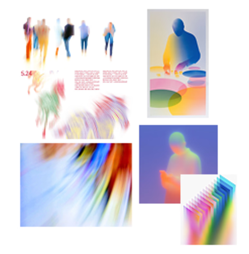
Exploring the visual mood for a new brand identity. Which direction feels more distinctive and has more potential to grow into a recognizable brand system?
2 voted
40%
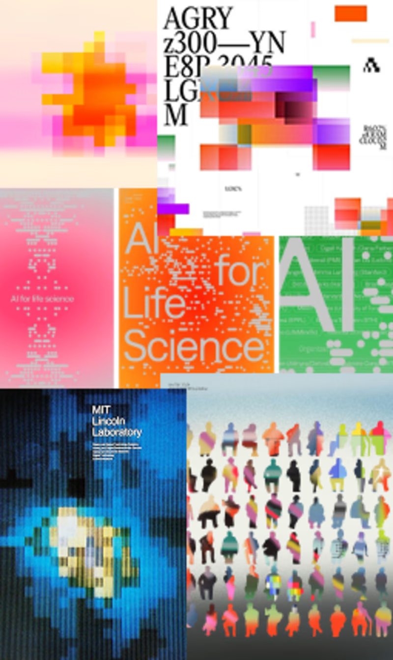
3 voted
60%
5 votes
Closed

Fluid is actually more easy to eyes ⭐ also because it have gradient colour, to be good second one needs less contrasting colours

Happy to start a new chapter in my career as a Social Media Manager.
I’m excited to share my portfolio, featuring some of my work in social media management, content planning, design, and creative strategy.
I’m looking forward to working with new brands, building strong content systems, and creating social media that feels consistent, engaging, and intentional.
Here’s a quick look at my portfolio 🎥
mrohmanudin.y.id


Congrats on the new chapter! Your portfolio looks like a great start.