
Creative Director, Brand Identity & AI Film
Ambra Travel
Independent by nature. Extraordinary by design.
Role: Creative direction, brand identity, website design, animated brand guidelines
The brief
Ambra is a global platform for independent luxury travel advisors. Its audience sells once-in-a-lifetime experiences, so the brand had to feel as considered as the journeys those advisors create. It also had to support advisors at every stage of their careers, from their first booking to an elite client list.
The idea: Shaped by time
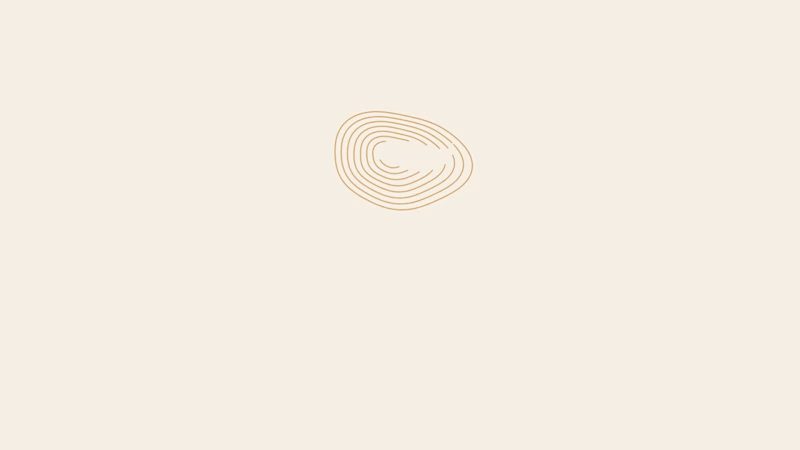
The identity grows from a single image: growth rings, the layers that time leaves in stone, wood and amber. Every journey, client relationship and year in the business adds a layer. The mark is a set of hand-drawn concentric rings, warm and organic rather than corporate.
The system
The mark becomes a language. The rings flex into six motif forms: core, open, tight, flow, stack and fragment. Gold contour patterns carry them across packaging, print and digital.
Ring density shows advisor tier. New to Industry carries a few open rings, Established more, and Elite the densest form, so progression is part of the identity itself.
A palette drawn from Mediterranean light. Amber gold, sand, ivory, terracotta, olive leaf, deep navy and charcoal.
Type with two voices. Cormorant Garamond gives an editorial, literary tone, and Jost adds modern clarity for labels and UI.
Imagery and materials. Golden-hour photography alongside marble, amber, walnut, olive leaf and open water. The tone is quiet luxury, never flashy.
The website
The site opens with emotion, then makes the case for the platform. It starts with "Independent by nature. Extraordinary by design," moves into "A platform built for what's next," then a career-stage selector ("Wherever you are in your career"). It closes on "More than travel. A lasting advantage."
Deliverables
Logo system and seal, color and type system, motif and pattern library, advisor tier identities, imagery direction, website design, and an animated brand guidelines film.
1
80
Overview
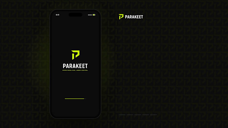
Parakeet is a brand concept created to demonstrate how a complex B2B software platform could be transformed into a modern, enterprise-grade technology brand. The objective was to move beyond generic SaaS aesthetics and position Parakeet as a trusted operational risk intelligence platform serving industrial, energy, manufacturing, and infrastructure organizations.
Challenge
Most risk and compliance platforms rely on outdated corporate branding that feels technical but lacks clarity, authority, and differentiation. The goal was to create a brand that communicated trust, precision, operational excellence, intelligence, and enterprise credibility while remaining visually modern and scalable.
Solution
I developed a complete brand system including:
Brand positioning
Logo and visual identity
Color palette and typography system
Iconography suite
Website direction
Product UI concepts
Social media assets
Sales deck and collateral design
The visual language combines industrial strength with technology-forward sophistication through a high-contrast black, carbon, and safety-lime palette inspired by control rooms, infrastructure, and mission-critical operations.
Result
The final concept demonstrates how strategic branding can elevate a technical software product into a premium enterprise platform with a clear market position, strong visual differentiation, and a cohesive customer experience.
Services: Brand Strategy, Creative Direction, Visual Identity, UI/UX Direction, Product Marketing, Sales Enablement Assets
0
79


Capturing your unique essence at just a glance.
- $1k+
- Earned
- 1x
- Hired
- 5.0
- Rating
- 11
- Followers
Capturing your unique essence at just a glance.


Crafting impactful brand identities and websites


Creative designer bringing whimsy to the table
Creative designer bringing whimsy to the table


Graphic Designer specializing in Brand Design.✨
- $1k+
- Earned
- 2x
- Hired
- 4
- Followers
Graphic Designer specializing in Brand Design.✨


Brand designer, Webflow & web designer
Brand designer, Webflow & web designer


View more →

Passionate graphic designer with a focus on innovation.


View more →

You live the dream, I take care of the aesthetics
You live the dream, I take care of the aesthetics


