CAIO MARE | ITALIAN RESTAURANT
This is an experimental project, I created it for fun based on my love for Italian food. However, if requested, I would make something similar for you. Let's discuss my creative process and this project in detail. I usually start every project with a notebook and pen to write down all my ideas. At this stage, every thought is valuable, you'll understand in a little bit. For example, the first sequence of words I wrote for this project was food- Italian-sea. The next sequence was a restaurant - bougie -new york city- unique cocktails. I made a third, fourth, fifth, and sixth sequence of words. Remember, every thought counts. After researching and getting inspiration. I formulate my final ideas and plan.
Here's my final sequence of words High-End -Italian Restaurant-Tribeca, NYC- Amalfi Coast -Seafood. I use these words to create the entire brand.
The plan | logo > logotype > brand colors > typography > brand idenitity
Logo and Brand Design
BRAND LOGO MAKING
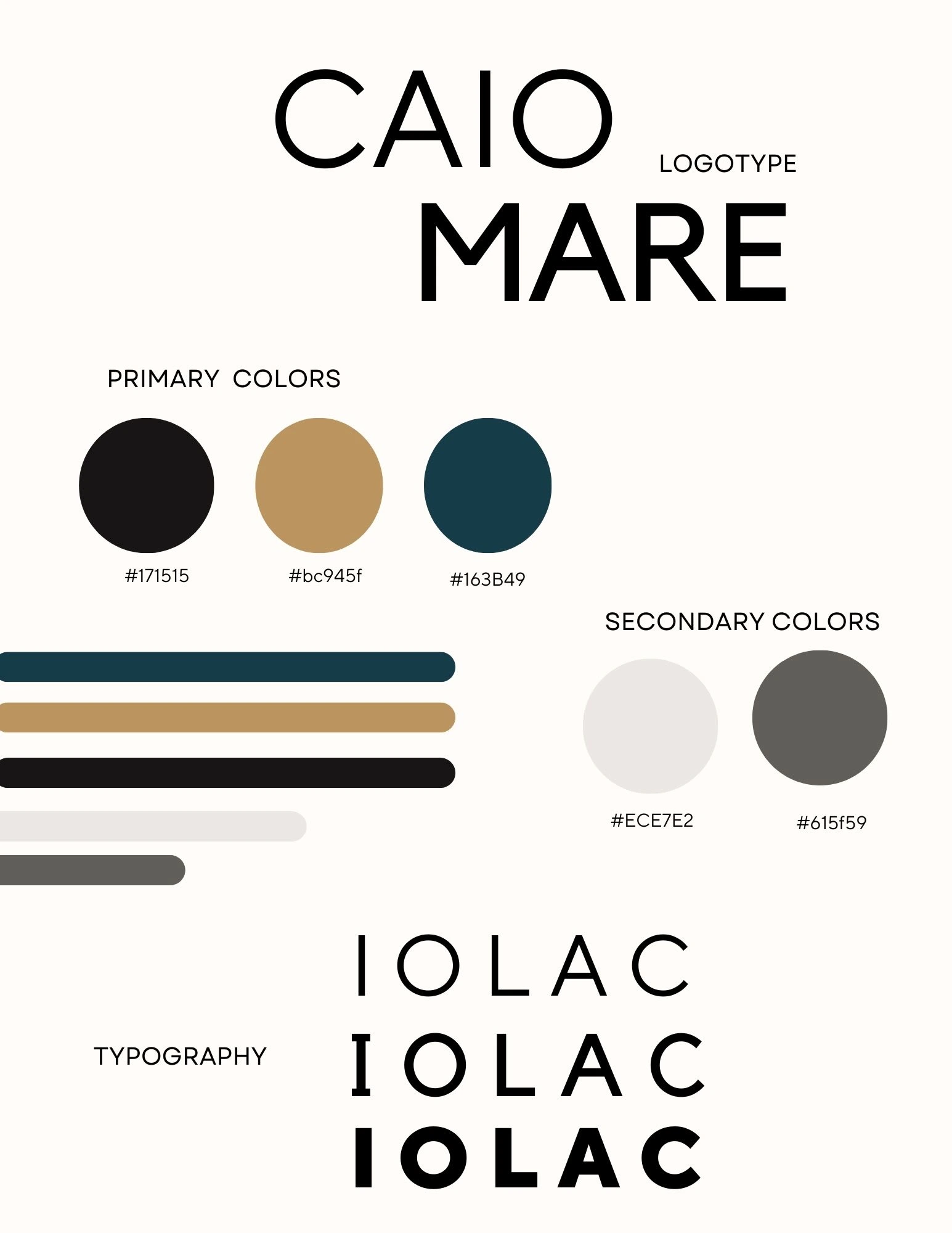
The Logotype: CAIO MARE is the brand name. CAIO MARE in English means hello sea. I wanted the top front (CAIO) to contrast with the bottom (MARE). The audience reading it would focus more on the bottom front because it's in bold. By making MARE bold, the word that stays with the audience means sea. Remember, this is a seafood restaurant so the audience must associate that with the brand. To add to this, CAIO is a common Italian word, the brand associates with Italy.
CAIO - TT Norms Typeface. Grotesk font family. Modern & Geometric
MARE - Sans-Serif Typeface. Kollektif font family. Bold & Geometric
PLEASE NOTE: I'm very intentional about the audience understanding the brand simply by looking at the logo and logotype. As a creative, it's my responsibility to make sure that the world knows what is being sold by a client without them having to explain.
Brand Colors: The primary colors are black (#171515), gold (#bc945f), and dark teal (#163B49). These are the colors that are featured prominently in the brand. The secondary colors are beige (#ECE7E2) and gray (#615f59) both complement the primary colors. The colors of CIAO MARE describe the brand as modern, and sophisticated with a relaxed coastal feel.
Typography: the front and style of text used throughout the brand. CAIO MARE uses TT Norms, TT Norms Bold, and Kollektif
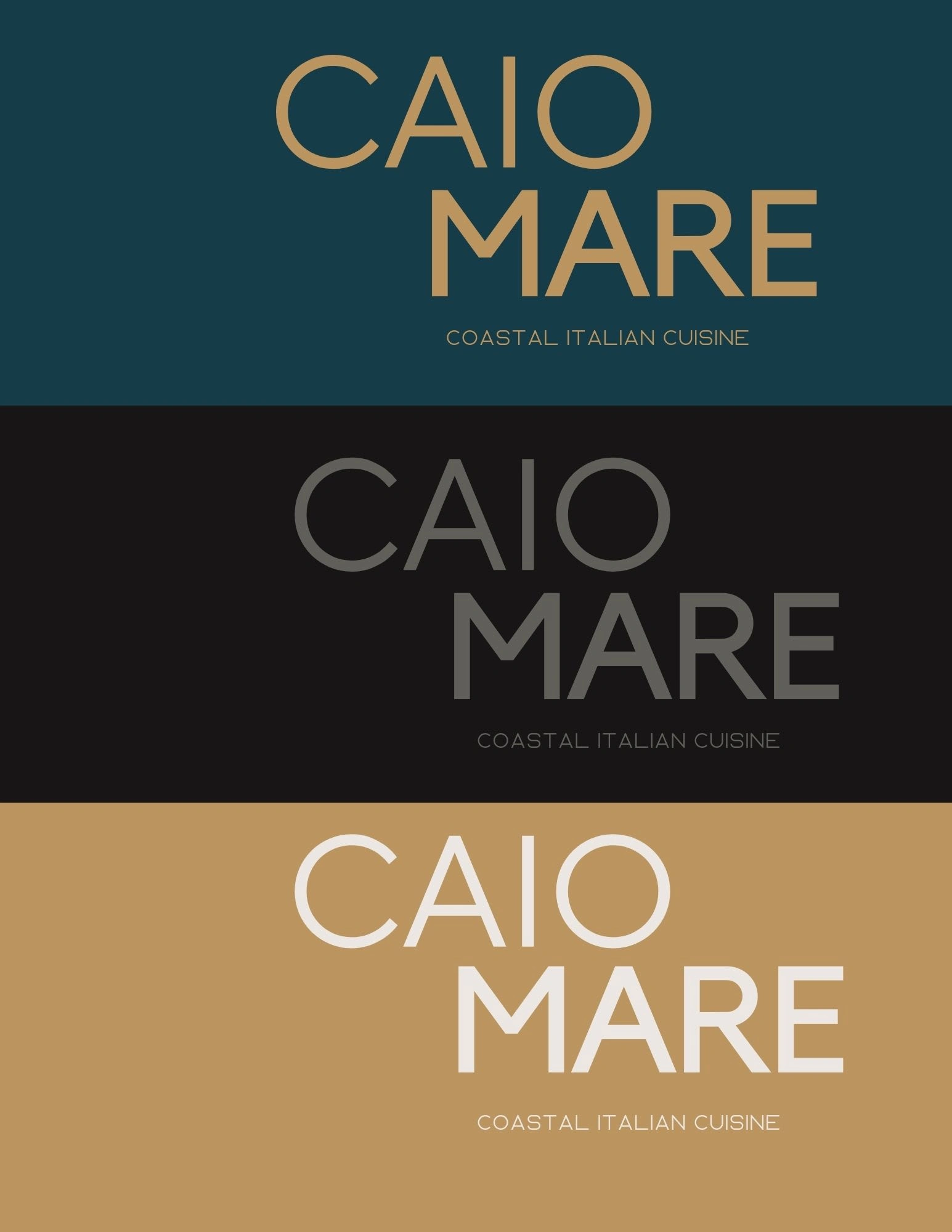
Brand logo
BRAND IDENTITY
The purpose of brand identity is to differentiate, establish recognition, build trust, create an emotional connection, and ensure consistency with the brand. It helps build a strong and meaningful relationship between the brand and its target audience ultimately driving brand loyalty, preference, and business success.
Brand Identifiers: Brand name, logo, colors, typography, imagery, messaging, tone of voice, and overall brand experience. For CAIO MARE, the coastal cuisine, drinks, interior and exterior restaurant aesthetics, colors, and logo are all identifiers.
Brand Voice and Tone: Refers to the style of communication that a brand uses to express its personality and connect with its target audience. It includes the language, vocabulary, and overall messaging approach that reflects the brand's values, mission, and desired perception. CAIO MARE, voice is welcoming but authoritative because the brand needs to show expertise and authority within its space (hospitality industry). It has to demonstrate an understanding of fine dining and rich Italian coastal cuisines of the Amalfi Coast to a mostly American audience.
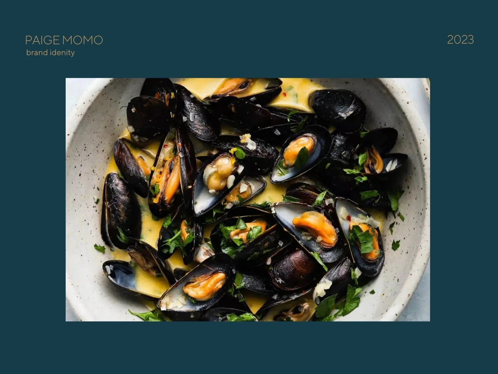
Brand Identifiers / Sauteed Mussels
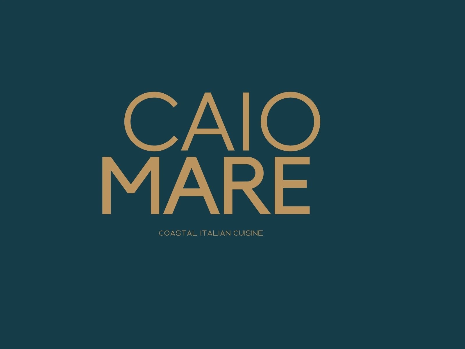
Band Logo
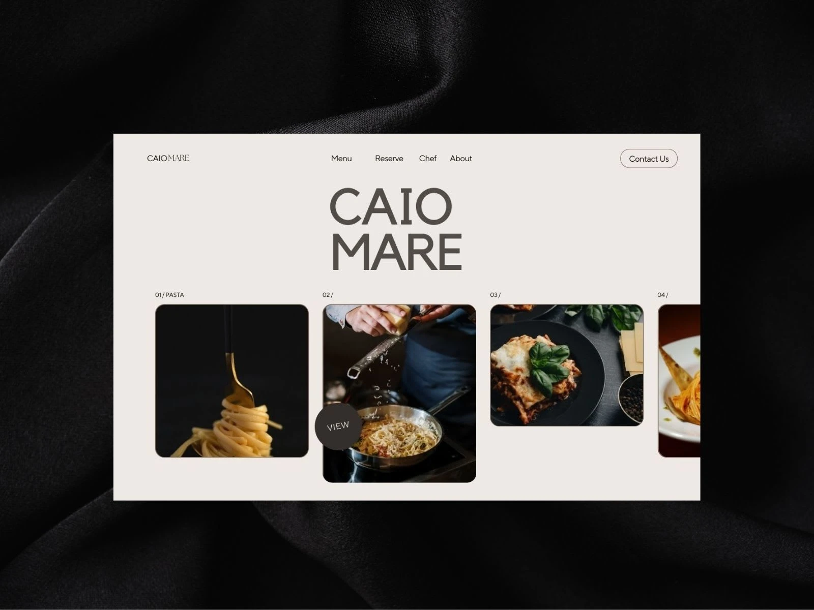
Brand Website
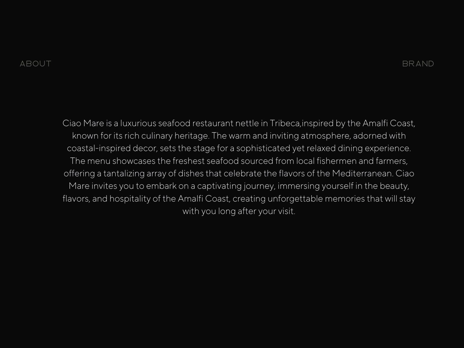
Brand Tone & Voice/ Identifiers
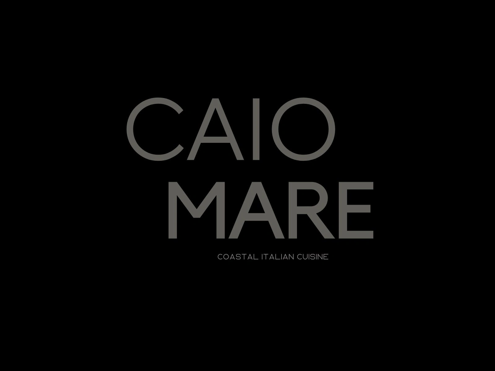
Brand Logo
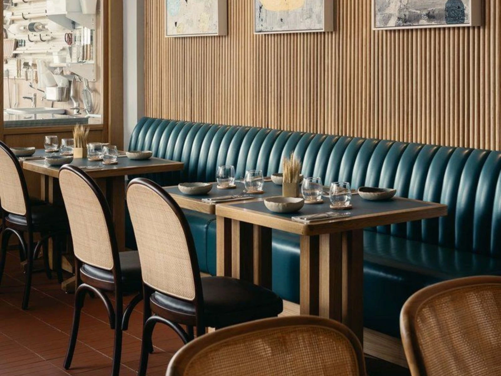
Restaurant Interior
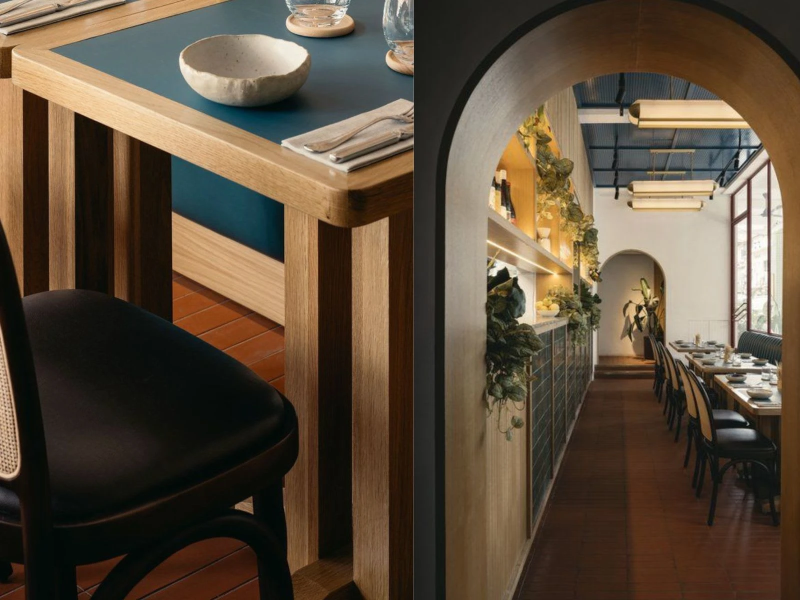
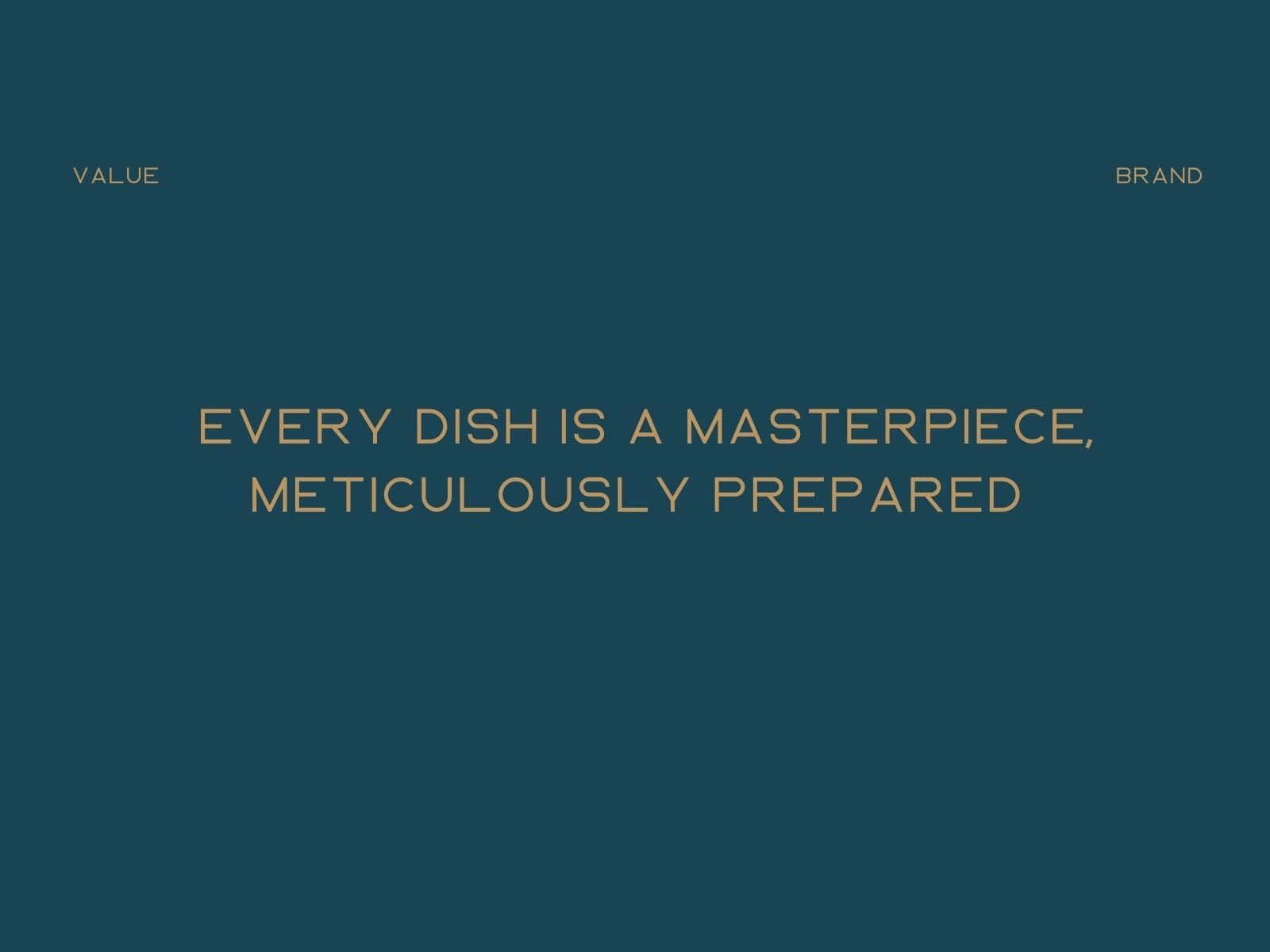
Brand Value/ Identifiers
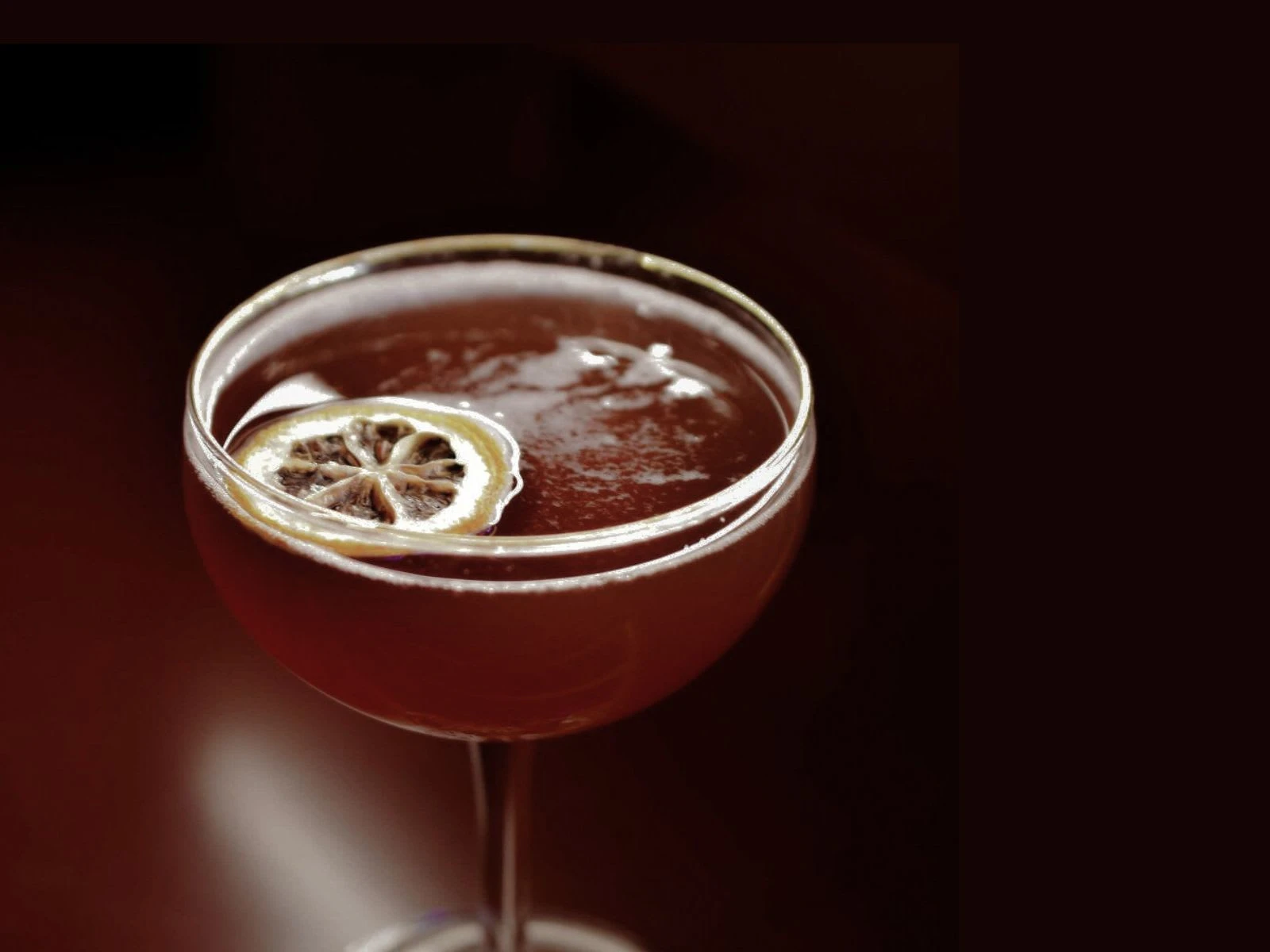
Cocktail / Identifier
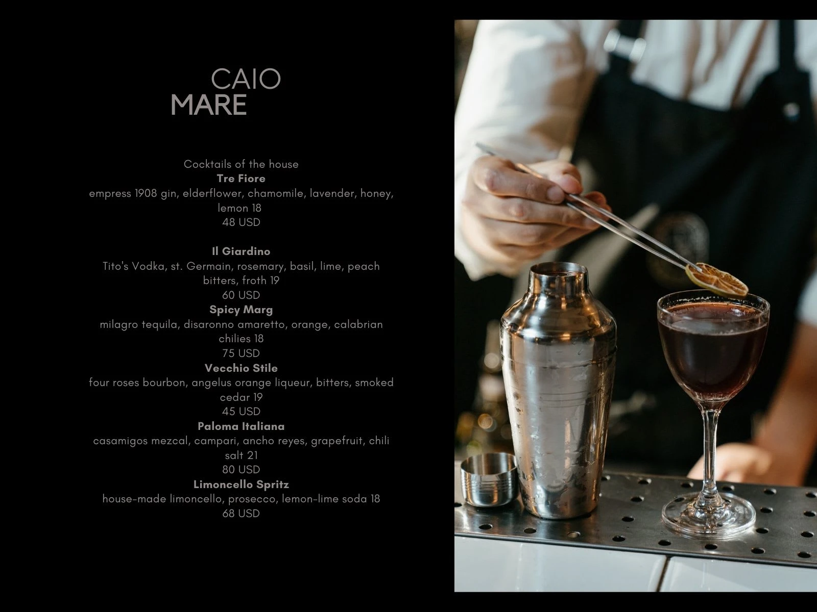
Cocktail Menu
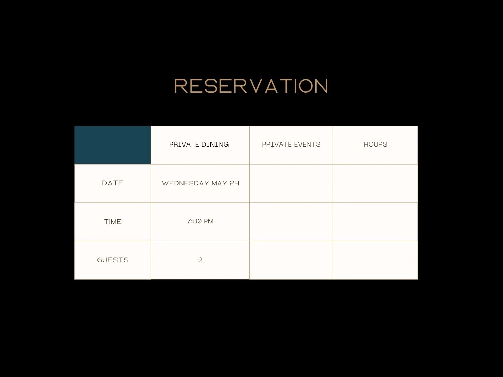
Reservation / Booking
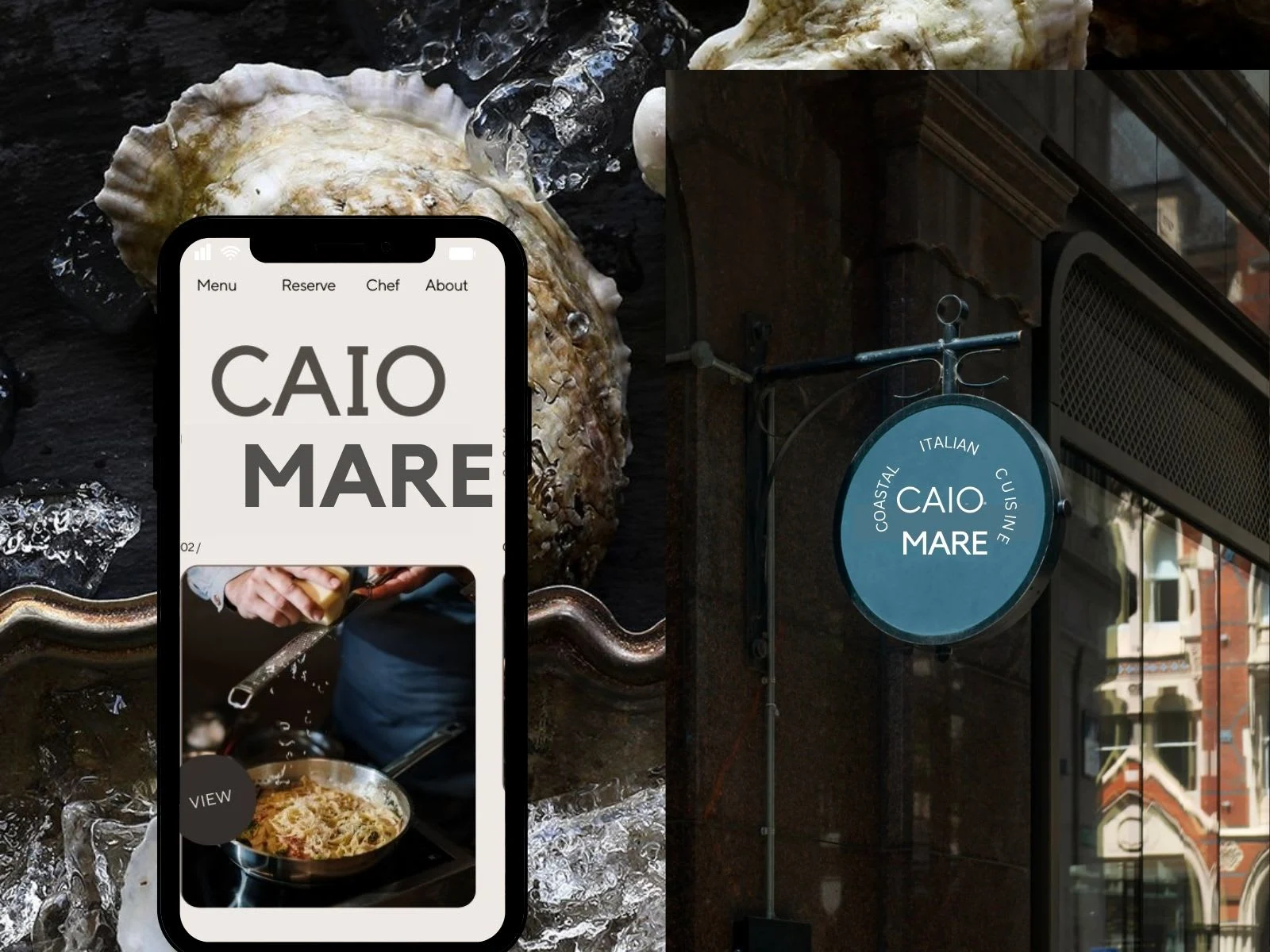
Mobile Website / Restaurant Exterior
Like this project
Posted Jun 13, 2023
Restaurant concept, I created the brand identity. This includes brand logo, typography, colors, and message.

