Projects using Adobe After Effects in MinneapolisProjects using Adobe After Effects in MinneapolisOverview
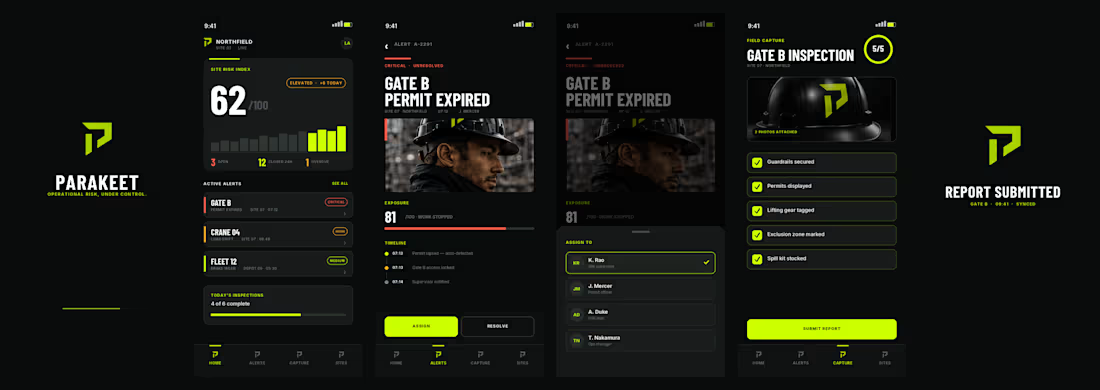
Parakeet is a speculative brand concept created to demonstrate how a complex B2B software platform could be transformed into a modern, enterprise-grade technology brand. The objective was to move beyond generic SaaS aesthetics and position Parakeet as a trusted operational risk intelligence platform serving industrial, energy, manufacturing, and infrastructure organizations.
Challenge
Most risk and compliance platforms rely on outdated corporate branding that feels technical but lacks clarity, authority, and differentiation. The goal was to create a brand that communicated trust, precision, operational excellence, intelligence, and enterprise credibility while remaining visually modern and scalable.
Solution
I developed a complete brand system including:
Brand positioning
Logo and visual identity
Color palette and typography system
Iconography suite
Website direction
Product UI concepts
Social media assets
Sales deck and collateral design
The visual language combines industrial strength with technology-forward sophistication through a high-contrast black, carbon, and safety-lime palette inspired by control rooms, infrastructure, and mission-critical operations.
Result
The final concept demonstrates how strategic branding can elevate a technical software product into a premium enterprise platform with a clear market position, strong visual differentiation, and a cohesive customer experience.
Services: Brand Strategy, Creative Direction, Visual Identity, UI/UX Direction, Product Marketing, Sales Enablement Assets CHARGE — Brand Concept
Challenge
The focus gum category is crowded with products that rely on functional claims, lifestyle clichés, or overly clinical branding. CHARGE needed a visual identity that immediately communicated energy, confidence, and momentum while feeling premium enough to compete on modern digital shelves.
Idea
Energy. Focus. Go.
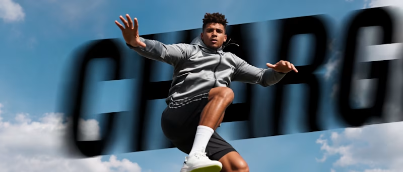
The concept treats focus as movement rather than concentration. Every graphic element—from bold typography and angular compositions to kinetic motion and athletic photography—reinforces the feeling of acceleration.
Rather than telling people they’ll feel energized, the brand is designed to make them feel energized the moment they encounter it.
Visual Language
A bold, high-contrast design system built around oversized typography, dynamic geometric forms, clean white space, and vibrant product colors creates an instantly recognizable identity. Bright lifestyle photography captures moments of determination, speed, and achievement, while the colorful packaging becomes a hero element across every touchpoint.
Motion System
The motion language is driven by momentum. Type slides with purpose, products snap into frame, athletes move through fast cinematic cuts, and macro product moments add tactile detail. Every transition is quick, precise, and intentional—mirroring the instant boost associated with the product.
Photography
Instead of generic fitness imagery, the photography celebrates peak performance across multiple sports and disciplines. Powerful portraits, dynamic action, and vibrant outdoor environments create a feeling of optimism and forward motion while reflecting a diverse community of high performers.
Outcome
The result is a contemporary consumer brand that feels energetic, premium, and highly scalable. The identity extends seamlessly across packaging, social media, motion graphics, advertising, digital experiences, and retail—creating a cohesive brand system that is memorable both on shelf and on screen.