
Game Development, VR, AR & Animation
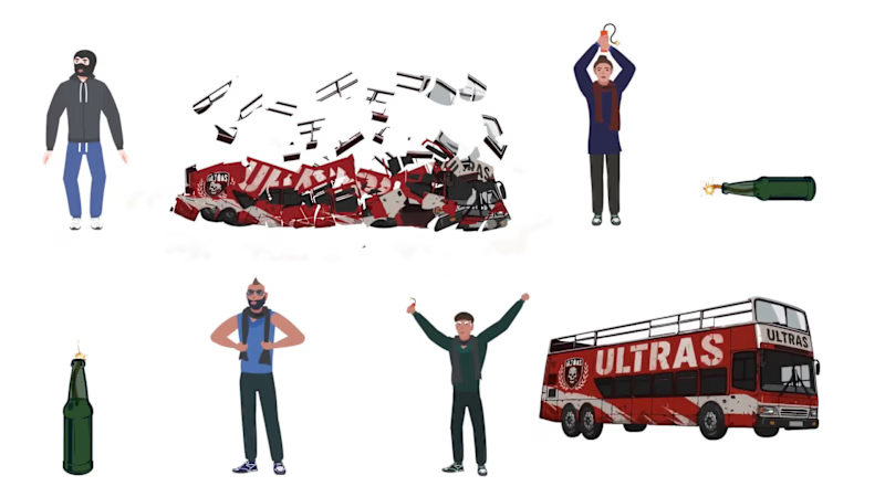
Recently, we Blue Creazione - A Gaming & Animation company had the opportunity to work on in-game animations demo for Mutlu Benmutlu
Every animation, whether it's an idle pose, a jumping animation, a prop getting destroyed or a character reaction contributes to the player's experience in Gaming.
For this demo, the focus was on creating smooth, responsive animations that felt natural and blended seamlessly into the gameplay.
Assets designed in @Adobe Illustrator
Animated in Adobe Animate
#GameDevelopment #GameAnimation #AdobeAnimate #2DAnimation #Animation #IndieGames #GameDesign #BlueCreazione #WebGames #SpriteAnimation #CharacterAnimation #SlotGames #CasinoGames
0
64

In game development, genre isn’t just a category.
It defines mechanics, player psychology, and monetisation.
Match-3 is Simple, addictive, high retention.
Endless Runner Games are Fast, reflex-based, replay driven.
Fighting Games are Skill, competition, character mastery.
Racing Games are all about Speed, upgrades, leaderboard ambition.
Great games aren’t built by chance.
They’re built by understanding what players feel when they play.
Which genre do you think is the hardest to build well?
#GameDevelopment #Unity3d #GameLevelDesigning #Gamification #B2B #GlobalReach #Gaming #Match3FruitGame #PuzzleGame #EndlessRunnerGame #FightGame #CarRacingGame #MultiplayerGame
1
73

2025 has been a year of some long term collaborations, where we finally have some great value clients. And as we welcome the new year , we also complete 8 years of Blue Creazione.
Pinterest gave us good reach and some platforms like Trustpilot helped us with good reviews.
The journey began in 2017 with a young team of interns and a promising project . . and now we have developers & designers from different parts of India.. With a small team & big dreams, we welcome 2026 and wish to collaborate for projects with Companies who want to build unique #Games #Gamifications #Animations #VR #AR #MotionGraphics #XR projects for their business .
We will be more than happy to connect and help clients across the globe, reach their goal ..
Cheers to welcoming 2026 .. !!
#B2B #2025 #2026 #GlobalReach #ClientRelations #LongTermClients
2
104


Game Designer
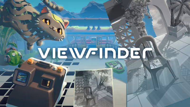
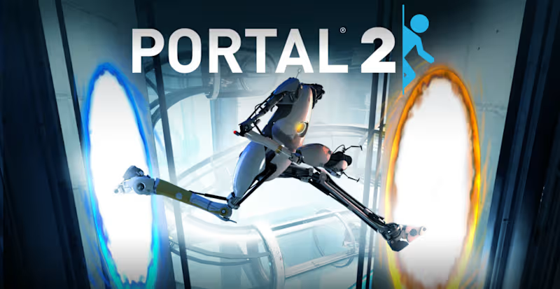
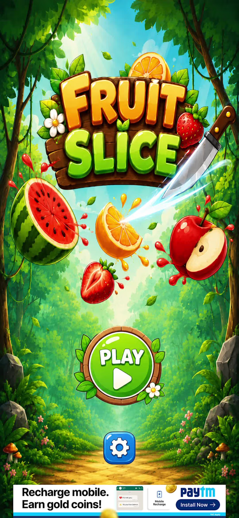
Fruit Slice is a fast-paced mobile game built around an immediately understandable fruit-slicing mechanic and short, replayable gameplay sessions.
I designed the core experience around:
Fruits Appear → Slice → Build Score → Avoid Mistakes → Beat High Score → Repeat
My work included the core gameplay loop, difficulty progression, pacing, scoring, player feedback, UI/UX flow, game feel and gameplay iteration.
The design challenge was keeping an extremely simple mechanic satisfying over repeated sessions by using increasing pressure, responsive feedback and score-driven motivation.
0
35
Voices Beneath is an atmospheric game experience focused on exploration, environmental storytelling and carefully controlled player progression.
My design work focused on how the environment itself could guide the player without relying heavily on explicit instructions.
I worked on level layouts, player flow, pacing, environmental storytelling, progression, gameplay encounters and iteration.
The core design goal was to make layout, atmosphere and progression work together, naturally directing the player's attention while maintaining immersion and curiosity.
0
39

Building fun interactions and impactful strategies.
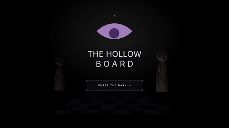
Three eyes. One fading light. And a doorway that may never be reached.
Welcome to The Hollow Board, an atmospheric horror puzzle where every move comes at a cost.
The rules are simple. Move forward. Watch where you step. And whatever you do, don't trust the darkness.
Your light is running out, but you have three eyes to spare. Open one to see what the shadows conceal, or save it for the ghosts that stand in your way. Every choice is a gamble, and every sacrifice brings you closer to escape. Or something far worse.
Built using Rive CLI, Luau scripting, data binding, and GPU Canvas, the game combines strategic movement, shifting visibility, eerie encounters, and trap-specific death animations.
The doorway is waiting. The question is, what will you have left when you reach it?
Dare to play? 👁️
🎮 https://the-hollow-board-0cuv77.rive.to/
@rive_app #rivehalloweenchallenge
1
2
201

Jugnu is an inclusive clay-play concept designed for neurotypical and neurodivergent children.
The project explored how a product could make creative play more engaging, tactile, and inclusive through its sensory experience. Inspired by the firefly, or jugnu, the brand represents the light and individuality within every child. The clay itself glows in the dark, adding an element of surprise and playfulness to the experience while reinforcing this idea of finding and expressing the light within.
I developed the brand identity, kit materials, packaging, and brand photography, with the packaging designed to transform into an interactive board game, giving it a second life as part of the play experience.
Designed across: Branding · Packaging · Visual Identity · Product Experience · Photography
A project where I fell in love with brand identity design. JUGNU has a piece of my heart.
7
14
1.5K

Challenged myself to create a Brand Identity in a single day.
Presenting Legacy works.
Legacy Works is a brand identity concept for an antique furniture store, built around the idea of bringing heritage and craftsmanship into a more bold, contemporary visual language.
Rather than leaning into the typical browns and earthy tones associated with antique furniture, I explored a sharper palette of charcoal, warm beige and red. The custom wordmark draws directly from the forms of antique furniture, with the “L” inspired by the curved leg of a vintage piece.
2
240

Poké : Branding & Visual Identity
Poké was my first self-initiated branding project, developed from a brief I found on Designer Briefs back in 2023. Not bad for a first branding project, considering I drew the illustration using a mousepad and sheer determination haha.
I played with the typography to turn the letters themselves into visual elements, using the shapes of a poké bowl and chopsticks to build the logo and create a playful, recognizable identity.
My Process
I started by exploring the visual world of poké culture- fresh seafood, tropical elements, the ocean, and playful food imagery. From there, I developed a colour palette inspired by tropical foliage, fresh fish, sea and waves, and tropical florals. I then built a supporting illustration system around these ideas using hand-drawn elements like fish, shells, flowers, lemons, and coconuts.
2
294

AI-first Product Designer
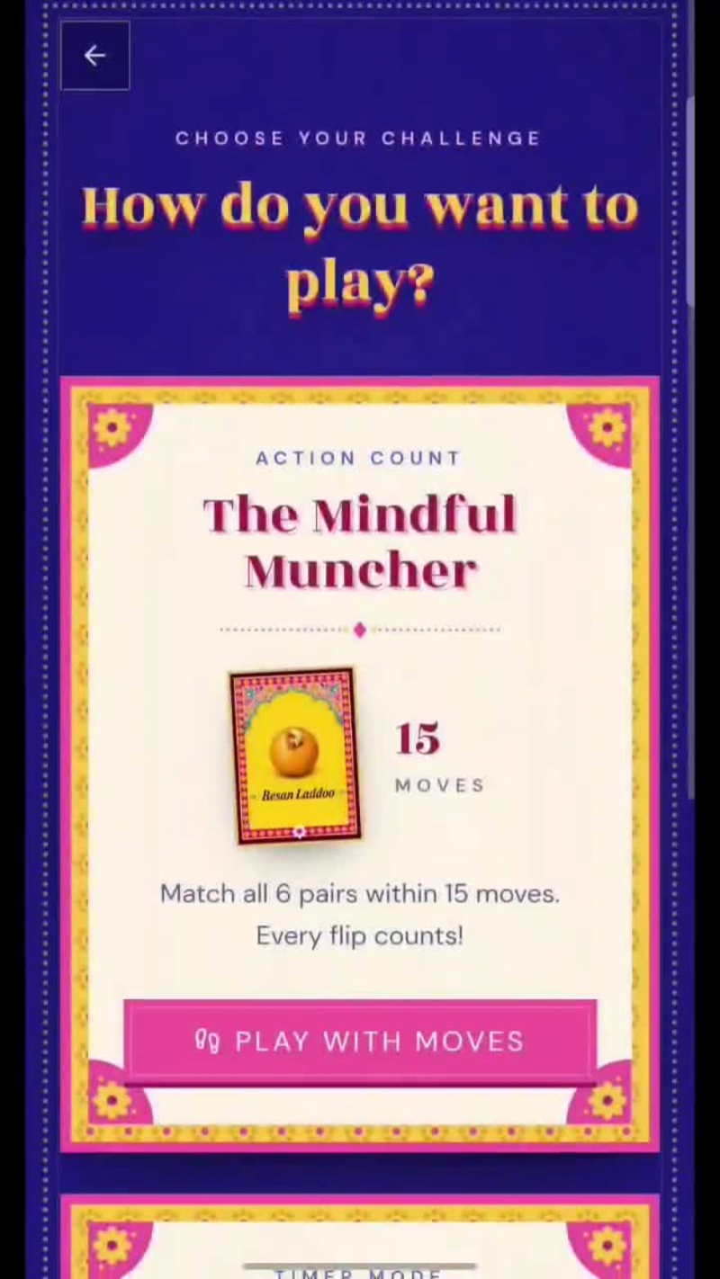
What if your Diwali faral came with a little competition?
We all love our chakli, kaju katli, and the whole faral gang. So I thought, why not turn these familiar Diwali treats into a fun little game?
Introducing फराळ Faral 🪔
A Diwali-themed memory game where you:
🃏 Flip cards and match your favourite faral.
⚡ Test your memory and quick reflexes.
🏆 Get your very own faral personality badge.
😈 And if you lose? Well, there's a fun little Diwali dare waiting for you!
But here's the fun part: you can challenge your friends with a dare and see if they can beat your score.
Because what's a game if you can't make your friends play it too? 😂
Give it a try: https://faral.vercel.app/
(https://faral.vercel.app/)And don't forget to share a screenshot of your result in the comments. I want to see who's the ultimate Faral champion!
0
16
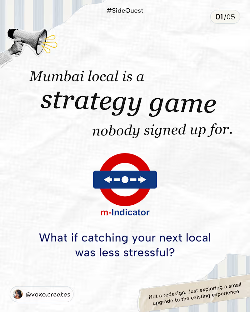
A few weeks ago, I was at Thane station, trying to figure out which train I can catch to CSMT… and let’s just say, it involved a LOT of mental maths.💀
That got me thinking about a couple of small UX improvements I’d love to see in M-Indicator.
This is not a redesign or revamp of M-Indicator! I just wanted to explore how a few small changes could make the existing experience a little easier.
• Clearer train statuses so you know whether you can still board.
• A Next trains toggle that’s easier to access.
• A destination filter you can change anytime.
I’ve tried to account for as many edge cases as I could think of. If I’ve missed any, feel free to share!
What do you think of these improvements? 👀
1
1
44
A little website concept I wanted to try 👀
Just an idea I had and a Figma file to see where it could go.
Played around with the layout, visuals, interactions and overall vibe until it started feeling like a real product.
#Sidequest #UIDesign #WebDesign #Figma #UXDesign #ProductDesign #DesignConcept #DesignExploration #UIInspiration
0
36
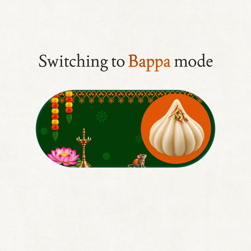
Ganesh Chaturthi = Bappa Mode ON ✨
A little @Figma motion experiment inspired by that festive feeling when everything just switches to Bappa mode.
Less stress. More modaks.
Ganpati Bappa Morya ❤️
#BappaMode (https://www.linkedin.com/search/results/all/?keywords=%23bappamode&origin=HASH_TAG_FROM_FEED) hashtag#GaneshChaturthi (https://www.linkedin.com/search/results/all/?keywords=%23ganeshchaturthi&origin=HASH_TAG_FROM_FEED) hashtag#FigmaMotion (https://www.linkedin.com/search/results/all/?keywords=%23figmamotion&origin=HASH_TAG_FROM_FEED) hashtag#MotionDesign (https://www.linkedin.com/search/results/all/?keywords=%23motiondesign&origin=HASH_TAG_FROM_FEED) hashtag#DesignExperiment (https://www.linkedin.com/search/results/all/?keywords=%23designexperiment&origin=HASH_TAG_FROM_FEED)
0
66

Transforming ideas into intuitive digital experiences.
- $1k+
- Earned
- 1x
- Hired
- 13
- Followers
Transforming ideas into intuitive digital experiences.


View more →

Can’t explain my job to relatives, but it’s creative.
Can’t explain my job to relatives, but it’s creative.


Motion Designer with Character & Flair ✨
Motion Designer with Character & Flair ✨


Holistic Product Designer crafting exceptional experiences
Holistic Product Designer crafting exceptional experiences


View more →